Accessible inline links and the extra accessibility features

Hello!
When checking the artifacts generated in our build by WCAG validation, I came upon one violation quite often and the solution is not straightforward:

Links must be distinguishable without relying on color.

Example of such a violation:
Example of such a violation

See this ticket for more details on this example.

This issue does not happen if the Enable Extra Accessibility Features are toggled ON in the user profile. The Extra Accessibility Features are a user related setting that toggles the use of the accessibility.css style sheet. For reference, here is the ticket where the accessibility stylesheet has been created: XWIKI-5543. This style sheet has a few rules, one of which is to make anchors always underlined. You can see the difference between Extra Accessibility Features ON (left) and OFF (right) here under:
AccessibilityFeaturesOnoff


There is a few possible ways to solve the above ticket:

  • (1) consider a disabled user always has the accessibility features ON: when running functional tests, the test user should have accessibility features ON.
  • Any user should be able to differentiate the inline links: change the default link display.
  • (4) Change the link color so that it has enough contrast with the regular text color. This can be very tricky because of the conjoined need to keep the contrast high between the link and the background. The margin (if any at all) is very slim. Here is an example: with a white background (most favorable case, on the color theme Iceberg the background is usually very-light gray or light gray), the lightest color we’re allowed for links would be #3d79b8 (lavish blue) with a contrast of 4.5 (WCAG background contrast requirement). The lightest possible color for regular text to keep a contrast of 3 (WCAG link contrast requirement if only color change) in this case would be #2d2d2d (dark gray, lightness 18%). Considering the links are used in a large variety of elements in the interface, we can’t really count on one link color satisfying all situations. I think using multiple link colors depending on the context would be terribly difficult and ugly in the interface.

Regarding the second bullet point above, I think accessibility on XWiki should not be hidden behind a user setting because:

  • (2) All users can benefit from accessibility fixes, as they can improve readability of the content for anyone.
  • (3) A disabled user as of now cannot know easily about this feature of XWiki, and the setting is OFF by default so any user needs to toggle ON this setting by navigating through an “unaccessible” XWiki at least once.

Considering (2), I think we have two possible solutions:

  • (2.1) Just remove the accessibility parameter and use the changes for all users. This might change the interface too much and annoy some users: making the font size bigger allows less content on the same space, and links everywhere might make some navigation regions look janky compared to the usual (see the settings category selection panel where all the links are underlined, it feels more cluttered and harder to read than non-underlined).
  • (2.2) Keep the accessibility parameter but add a default style to solve the accessibility violation we have for any user. To do so, we need to find out what are and are not inline links. Here under is a graphic showing which links I’d consider inline (light green) and out of a line (orange). With (2.2), the light green blocks would be changed to always display with an underline, while the orange ones would only show an underline when the accessibility features are ON.

We could fix (3) by adding a keyboard shortcut to turn accessibility features ON (or OFF). This shortcut, in order to be useful, would need to be easily known by any user. A good way to do this is to add a stable help element in the UI redirecting to the help page, which itself contains information about the shortcut, or redirects to a page that does. Note that there’s already a help page, but it’s not always available since the link for it is in the Applications panel. This panel does not appear on edit pages for example.
At last, similarly to (1), we could trigger the accessibility features ON in the functional tests.

Here is a summary of the different ways I found so far to tackle this issue:

  • (1) The default functional test user activates its Extra Accessibility Features.
  • (2.1) The accessibility setting is removed and everyone uses these changes.
  • (2.2) Some of the behavior of the accessibility setting is used for everyone.
  • (3) We implement a shortcut to trigger accessibility settings and then (1).
  • (4) We change the color of the links to enable enough contrast with the text around it and the background.

My order of preference is (4) < (1) < (2.1) < (3) < (2.2).
So +1 for (2.2) and (3), +0 for (2.1) and -1 for (4) and (1).

What do you think of these solutions? Which one do you think would be appropriate to solve this accessibility issue and make XWiki more accessible?

Thank you in advance for your feedback and have a good day,
Lucas

Hi Lucas,

IMO (1) is enough. It’s meant for that.

I don’t agree with (2). I’ll give you an example: imagine someone only sees white and black color. Thus for this user, the best would be to have shades of grey to distinguish stuff. Why would you want everyone to see only shades of grey if they can have colors? The same goes for links and underline. Having underline is a pain when you don’t need it. BTW, that’s why it’s called “Extra Accessbility”, because it’s some subcategory of accessibility that we don’t want for everyone.

I consider (3) a nice option (but it doesn’t “need” to be known, that’s true for any feature of XWiki and why we have documentation on xwiki.org).

we could trigger the accessibility features ON in the functional tests.

I don’t think we should do that by default (we need to validate accessibility when it’s off) but we can have a test that sets it on and then navigates to a page to perform some checks related to accessibility.

Thanks!

This is not enough imho. XWiki needs to be accessible for anonymous visitors of a public XWiki instance where registration is disabled and thus the visitor cannot enable the accessibility feature. If we want to go this route, we need a global, wiki- or instance-level accessibility setting that admins who care about accessibility can enable.

If we want that XWiki is WCAG compliant, we cannot just say we ignore this rule for public wikis and XWiki is only compliant if the user is registered, logged in and has enabled a specific setting. Also, this will make testing a mess.

That’s not a good example, imho. Good color themes already take care of this problem by making sure that colors are distinguishable when converted to grayscale (which is also important for printing) while still being nice colors for those who can see them.

Reading some recommendations regarding link appearance, I think there is no really good reason to not to follow the recommendation which is to underline links. Therefore my preferences are as follows:

+1 for (2.2), +0 for (4) (as it’s another way to meet the accessibility criterion, but not sure how usable it will be in the end).

I would also be +0 for introducing a global setting to enable accessibility features (for all users) which should be enabled by default as XWiki needs to be accessible by default imho. I’m -1 for (1) as it doesn’t meet the goal of making XWiki WCAG-compliant (which, in my understanding, means making XWiki WCAG-compliant in its default configuration for all users including guests).

We VOTEd to not have underline in the past, so we’ll need a new VOTE if we want to change that.

I don’t think this is true. Underline for example is not a must have for being WCAG compliant. Extra accessibility features are… extra…ie not required to be WCAG compatible.

Also (1) is not correctly phrased. It’s not about having accessibility features ON by default or not. They’re always on as otherwise it doesn’t make sense. So there’s no question there. Now extra accessibility is something else, it’s optional and on top of accessibility features.

From my reading, to be WCAG-compliant, you need to have one of the following:

  1. The link text must have a 3:1 contrast ratio from the surrounding non-link text.
  2. A “non-color designator” to differentiate links from the rest of the text where the recommended option is underlining.

According to axe-core, this is a WCAG 2.0/2.1 level A criterion and therefore absolutely not optional. Maybe @CharpentierLucas has a better link where that rule is described.

If there are so strong opinions against underlining links, we need to further investigate the color option I think, but this may be challenging as explained by Lucas as links are used with gray background. Btw., do you have a link to the vote so we can understand the reasoning?

It can definitely be a hindrance for some users with a reduced vision such as achromatopsia (1 on 30 000): no colors.
LinkInlinesAchromatopsia

A low contrast can also hinder the navigation of aging users who might experience contrast loss:
ContrastlossInlineLinks

Those simulation of visual impairments were made using NoCoffee.


I got a couple of sources :slight_smile:
This is a violation to the Success Criterion 1.4.1 of WCAG 2.1 (level A):

Color is not used as the only visual means of conveying information, indicating an action, prompting a response, or distinguishing a visual element.

From Web Content Accessibility Guidelines (WCAG) 2.1
Anchors have an action (usually redirect to their href when the user clicks on them). So they should be distinct visually from the rest of the text. The usual solution is to underline the link. It works whatever the context around the link, except if the text around it is also underlined (which pretty much never happens).
However, the WAI publishes Failures and Techniques to clear up edge cases. One of those Techniques is G183: Using a contrast ratio of 3:1 with surrounding text and providing additional visual cues on hover for links or controls where color alone is used to identify them | WAI | W3C :

To meet success criterion 1.4.1: Use of Color a relative luminance (lightness) difference of 3:1 or greater with the text around can be used.

The current link color is already set to match the lightest possible value in regards to the background. See this forum post about color theme changes for minimum contrast. This means we can easily make the links darker, but not lighter since this would violate SC 1.4.3: contrast mininum. Making it lighter would be complex since we’d need to also change the color of ALL the backgrounds where this link color is used.
Supposing we use a black text and white background, we can have a lightness that’s typically between 0.36 and 0.47 (depends on the saturation but that’s approximately the same size of the range whatever the saturation).
contrastAnchors

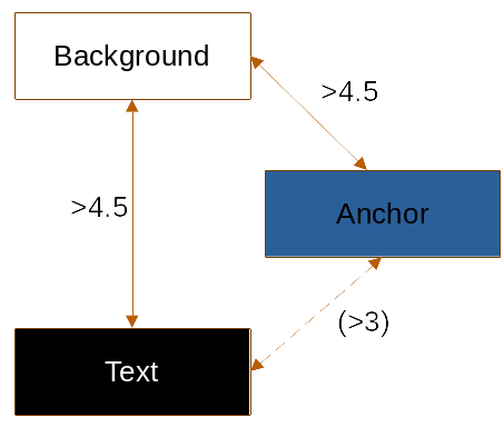
We don’t use black text in XWiki but a dark grey #333333 lightness 0.2 (e.g. text on the Home page with the Iceberg color-theme). This is enough to reduce the “correct” range for link color to nothing even if we suppose the background is white (we’d need colors with a luminosity of at least 0.5 and at most 0.47).
I played a bit with different lightness/saturation values but couldn’t find a pair that’d match #333333-dark grey text and #ffffff-white background.

In order for the current color to be appropriate, we could make the regular text darker:
from #333333 (lightness 0.2) to #222222 (lightness 0.13). Again, we’d need to make sure ALL text with inline links would be written with this color. For example, the user name in the “Last modified by” text should be changed too.
anchorLightnessLimits

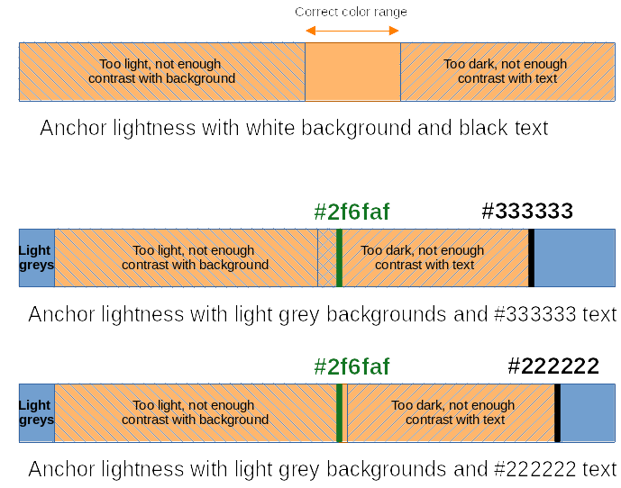
From bottom to top: black, #222222, #333333, #2f6faf = link color
Color Hunt Palette 2f6faf333333222222000000

+1


Summing up the possibilities that seem correct so far:

  • 3:1 contrast: Make the default text darker and change text color too where inline links are used.
  • Underlining links but we’d need at least a vote and it’ll probably be heavier to implement if we decide to only underline inline links.

I just found out a nice tool to make contrast tables on A11y Colour Contrast Table.
This table might help in understanding my explanations about the contrasts above:
inlineLinkContrastTable

The examples used for the two last lines of this table come from Links with a 3:1 contrast ratio with surrounding text.

+1 for 2.2 . I think we can safely underline links that are inside .wikilink when the .wikilink wrapper is not the only child of a block container:

span.wikilink > a {
  /* Underline */
}

div > span.wikilink:only-child > a,
...
li > span.wikilink:only-child > a {
  /* Don't underline */
}

Links that are generated from Velocity templates or from the HTML macro are rarely inline (i.e. they are part of the XWiki UI most of the time, not part of the user content) so we can leave then not underlined by default.

Thanks,
Marius

1 Like

For reference, here is the solution to this problem adopted by wikipedia.
They already had a darker default text color than our current, much closer to the change I described in this above post.

They decided to make the anchors slightly lighter (changing both regular color and :visited color).

Unfortunately, it seems like this selector does not work with text nodes. This only-child rule works for some cases, but in most cases, all the content next to the link is in a <p> and is just plain text:
underlinedLinkLastChildNotworking
Here, we can see it work twice in the ‘Extend your wiki’ and ‘Create your aplication’ sections, since these hold some emphasized text that triggers the selector. Unemphasized text is not contained in a span so it’s not taken into account by CSS.

EDIT: Continuing reflexions about the implementation of solution 2.2 on the Jira issue

Somehow I forgot to put the picture here (it was on the Jira):
InlineAndOutlineLinksExample

As seen on the initial PR to fix this issue, it was not possible to use a clean selector to find ‘inline links’. Henceforth we continued on another solution proposed here. This new solution involves two changes:

  • Making regular text darker to increase contrast with anchors.
  • Underlining anchors in muted-text blocks.

We can’t make .muted-text as dark as regular text, so I think the best alternative is to underline anchors that are inline in blocks using this mixin.
As seen on the new PR, the change to the regular text color is not highly noticeable, and overall, it only provides more contrast with other colors (text-muted, white background, grey background, …) .

Do you think the use of the .muted-text mixin is appropriate for this style change?

Thank you for all the feedback on this topic, it’s coming along great! :slight_smile: