With a hard refresh the [+] from the tags dropdown is properly changed and does not return a contrast violation anymore. 
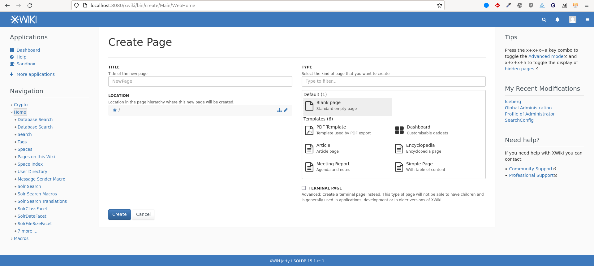
When creating a page (http://localhost:8080/xwiki/bin/create/Main/WebHome), the xHint becomes too light (because set up as a text-smaller-muted→text-muted→ color:@light-gray which was made a bit lighter) when the type of its parent is “selected” .xwiki-select-option-selected so the background becomes a bit darker.
This can be solved in two ways:
• by making the text-muted get a darker shade of gray, namely @gray instead of @light-gray. The advantage is that there will probably be less accessibility issues with all kinds of elements using this text-muted formatting. However making it darker also makes it less muted and reduces the effectiveness of this formatting. In our example, the non muted text color is in dark grey #333, and we go from #777 to #555 for the muted text
• By making the .xform .xHint follow only .text-smaller (no .text-muted anymore) and color: @gray. While this solves our issue, this will have less consequences on the other parts of the interface.
So far, from my observations, the first solution doesn’t trigger unexpected contrast issues elsewhere.
On http://localhost:8080/xwiki/bin/view/Help/Applications/ , this issue of button contrast was found again, but this time with the “success” variation of the button.
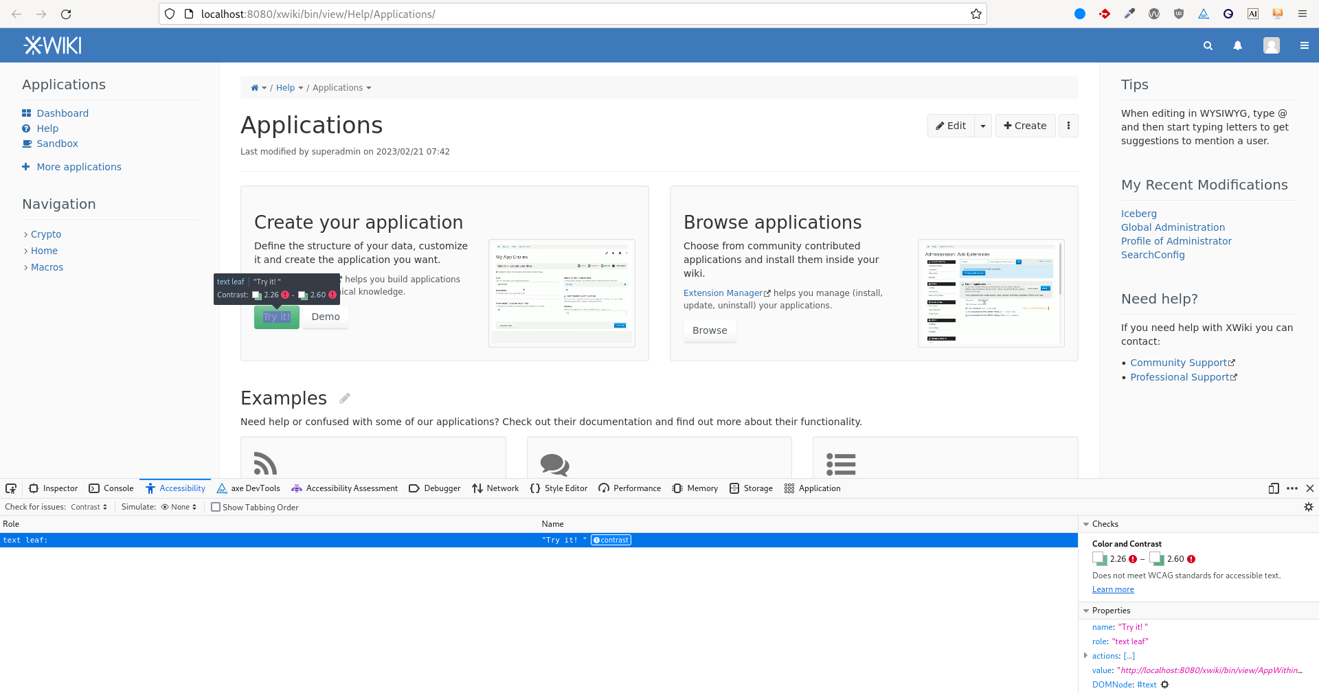
The white text doesn’t have enough contrast on the light green gradient.
There is a need to make even the darker color of this gradient darker (on the violation, we can see that both the sides of the gradient fail the need for contrast).
However, on the contrary to the regular button where a -0.05 shift in lightness (using HSL) was needed, this one needs a -0.20 shift in lightness. Instead of being barely noticeable, this shift in color becomes quite noticeable.
Removing the gradient on this button and making it flat would still need a lightness shift to fulfill the WCAG 2AA contrast criterion of -0.16.
This is the result for the minimal change needed ( -0.20 ):

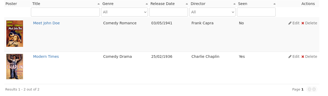
When viewing a livetable e.g. http://localhost:8080/xwiki/bin/view/Help/Applications/Movies/
The cross to delete the entry does not have sufficient contrast.
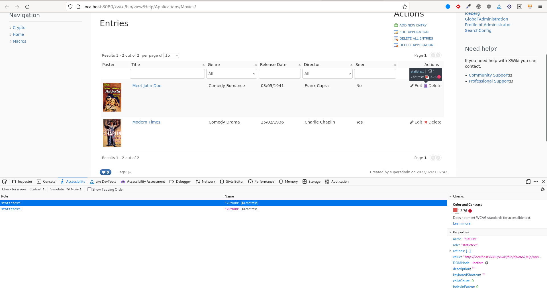
This can be changed from within the livetable presentation, or with the @brand-danger variable. When hovered, the background of the entry becomes darker. The foreground color of
tbody.xwiki-livetable-display-body td a.actiondelete .action-icon is set by the variable $theme.notificationErrorColor mapped to the current variable @brand-danger.There are two solutions, the first one has a lighter impact but does not ensure the contrast validity on :hover :
- @brand-danger #d9534f → #d33935 (-0.06 lightness)
- @brand-danger #d9534f → #ca302c (-0.10 lightness)
Here is an updated interface with the second solution:
New changes proposed:
- @text-muted: @light-gray → @gray;
- @btn-succes-bg: @brand-success (#56b881) → #31754f
- @brand-danger → #ca302c
Note: Those changes are not about the main view. I suppose they are still relevant enough to be part of this discussion / issue.