Global Administration UI Revamp

Hey @amilica, nice work you’ve been doing here, thank you!

I especially agree with a visual overhaul and more powerful search bar. However, I feel this last one would need a lot of development effort.

Sometimes the admin section feels very cramped, because the sidebars remain visible and some pages of the admin section are very space intensive. Stuff like Panels List, Application Panel and Navigation Panel, these pages are very reliant on horizontal space. If we need to keep the sidebars visible, I would revamp these pages specifically also (they are on my personal todo/someday list).

Also, there is an UX precedent for this. When trying to customize the theme, the user is led to a completely different part of the wiki, without sidebars and outside the Admin section.

“Look and Layout” for me is a little bit strange. Maybe “Appearance” would be more generic.
I also find “Rights” an odd choice in current XWiki. In every app and software that I use, this function is always called “Permissions”. But changing this now would open a whole Pandora Box of changes from documentation, to videos to other interface elements and translations :sweat_smile:.

While I agree on principle, it will be very hard to find specific names that encompass all the features that we have on each section. But then again, a powerful Search Box would also help to mitigate this problem.

I would go to version 1, with a few caveats:

On your proposal you put every category and sub category inside the navigation and content areas. As you mentioned on “cons”, it feels very cramped. I would choose only one way of navigating.

  1. Change the current navigation: Keep main categories only on the sidebar. Sub categories would be listed on the content area (to the right). When navigating to one of them, a back arrow would be needed on top of the page to go back to the sub list (MacOS, Windows and Gnome do this way). In this case it would also be important to update the location on the breadcrumb, today it remains fixed in “Global Administration”. In this case we could do without the accordion as every access would be only one level.
  2. Keep the current one: Keep everything on the sidebar, but do a visual revamp. Accessing the Admin page also access the first page that is available. In this case, I would also keep the accordion component. It is a quick way of giving the user a quick glance over the available categories while still maintaining the sub categories easily accessible. With a regular navigation tree, the user will get a lot of manual opening and closing of menus and possibly some scroll issues when the menu is very tall, but the content on the right is very small.

I think this is it for me.
Nice work, and thank you again for working on this.

Note that there’s currently a PR to improve the consistency between this UI and other dropdowns in XWiki. It’s still a custom UI, but from what I could see (details in the PR), we don’t have a good consistency on any dropdown in XWiki anyways, so there’s some generic work to do :slight_smile: .

  1. Personally, I pretty much only use the accordeon, so I don’t mind too much the #6 and #7. They might be useful for new admins, but when I started with them about a year ago, I barely ever read the category description from what I can remember. Most of the description are not in depth enough to be relevant, and the icons in the righthand side are really inconsistent/oldish.
    In my opinion links to documentation would better fit inside the subsection UIs, so I don’t think #8 is a need.
    • I think that on 16.0.0, the Users category is already renamed to Users and rights :slight_smile:
  • In my opinion, the extension rights section fits right in between the two categories. So we could have this subsection appear in the two sections. I don’t think moving it from one section to the other is really an improvement, we have more to lose by adding an inconsistency in the UI between versions.
  • Look & feel is an english noun (look and feel - Wiktionary, the free dictionary). It holds its own meaning beyond juxtaposition of the nouns look and feel. If we want to replace this section name, I’d replace it completely. IMO Presentation or Style are better alternatives than Look and layout.
  • I didn’t review every renaming, but for the ones I know and use the most in the Look and feel section, I think the Lightbox rename is just adding unecessary fluff around the main message. The Panels subsection new name is too long too, it just repeats the content of the description. We might consider removing the description for subsections with new names that became very wordy. The Theme name is way more suited than Customize your wiki (which could fit pretty much any subsection :smiley: ).
  • There’s some colored bubbles on the bottom left of the picture, was there any plans on using them?
  1. I prefer version 2:
  • version 1 adds a lot of repeated info on the main page content, it makes it more difficult to understand what’s in each section. Maybe this could be mitigated by having clearer subsections, with boxes around them…
  • version 3 gives too much details. IMO it could be contained in a dropdown so that it doesn’t flood the user interface with info that will be in most cases irrelevant to the use case.

I don’t like too much replacing the accordion with a tree. In my opinion this UI was special, and for a good reason, it was the single most important piece of UI for admins. The chunky aspect of the accordion gave it focus, meanwhile the tree is just as attention grabbing as the navigation tree, which is a loss IMO. Moreover, the accordion takes advantage of a specific data structure and conveys it to the user: we only have section and subsections. Trees are way more generic. I’d advocate to have a more specific UI so that the new user already knows that they didn’t miss any subsubsection anywhere. My opinion is not objective, it might be interesting to get feedback from people who are not used to this accordion already :slight_smile: For version 2 and 3, it might make sense to explain what the global admininstration is with a short message above the sections, something like:
Welcome to the main administration center! Start browsing through sections to discover how to customize your wiki to your needs.


One last idea, for discovery, we could also add a tour of the admin features.


Thanks for you work on this topic!
Lucas C.

1 Like

Version 1 has no main page content :slight_smile: (you’re directly inside a section). Did you mean version 2?

From what I understand, all the subsection titles are repeated in the new content of the section (default page too). I think this is not necessary. In my opinion subsection content can already be difficult enough to read to not put multiple of them in a single view, and use them as collapsable blocks. I think that if we want to keep collapsable subsections in the section content, the subsections in the tree on the left should be removed to avoid cluttering.
reworkAdminUI

oh indeed, you’re right :slight_smile: I hadn’t noticed. I don’t really understand why the menu is copied, I don’t see the point since there’s a menu on the left already.

So I change my answer: I don’t like 1, 2 or 3 but 1 is the closest if you remove the menu in the main content area.

1 Like

No, no, this is extremely valuable feedback, thanks a lot! I can see why you say it’s the better navigation in terms of experience.

Yep, totally relate to that, lol. It’s one of the search patterns I’ve documented in the proposal and I’m trying to take this into consideration, but still offering something bonus. Thanks again for your opinions, this is really helpful! ^^

Yep, agreed. Thanks again for your opinions, they were all really insightful!

With the proposals I’ve tried to make something that is familiar to the admins experienced with XWiki, but also something for new admins/ new clients that are just discovering XWiki.

What do you think would make it more suitable for all admins? Or do you think there is no need for improvements?

Also, thanks a lot for your input, Nikita! Means a lot!

These are are solid points, thanks a lot, I’ll add them to the proposal right away!

The idea with the description appearing when you hover on a section seems pretty good, I’ll add it in the proposal just to keep it in mind, even if they won’t end up being the version we move forward with.

Yep, User & rights was just an example.

I do agree on the rename of Rights to Permissions, it’s actually a much more self-explanatory name, but I understand what you mean with “opening a Pandora box” with this one :)))

Thanks a lot for the ideas, Thiago! IThey are really valuable and definetly worth exploring in the next iterations! :star_struck:

Yep, I agree. It was a mistake ( I forgot to update the tree from the previous iterations, this version was actually the last one designed in my workflow)

Will modify Version 1 in the proposal

1 Like

I missed this bit: agreed, good idea :+1:

Hello everyone again! :blush: I’ve looked into the feedback for the initial versions and worked on 4 more that either add to or polish the previous mockups.

I’d very happy to hear feedback from the people that already got here (@watery , @nikpetrenko , @vmassol , @tkrieck , @CharpentierLucas ), but also from anyone who will join the discussion from now on!

New versions (second round)

Common things :white_check_mark:

  • there is a tooltip in the top-right side for quick links (forum, documentation, FAQ)
  • anything collapsable is auto-closing when clicking another collapsable
  • the versions that have side navigation are close in style to the navigation tree but with small differences to make it stand out still and, also, auto-closing

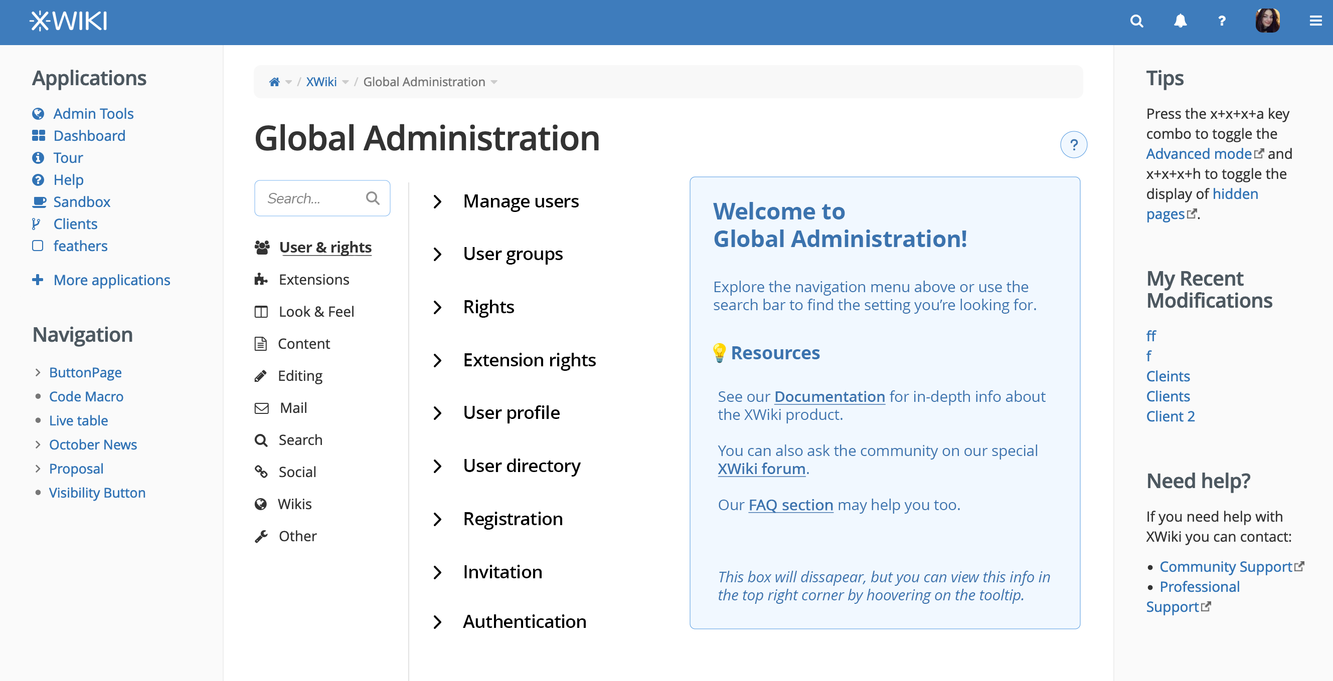
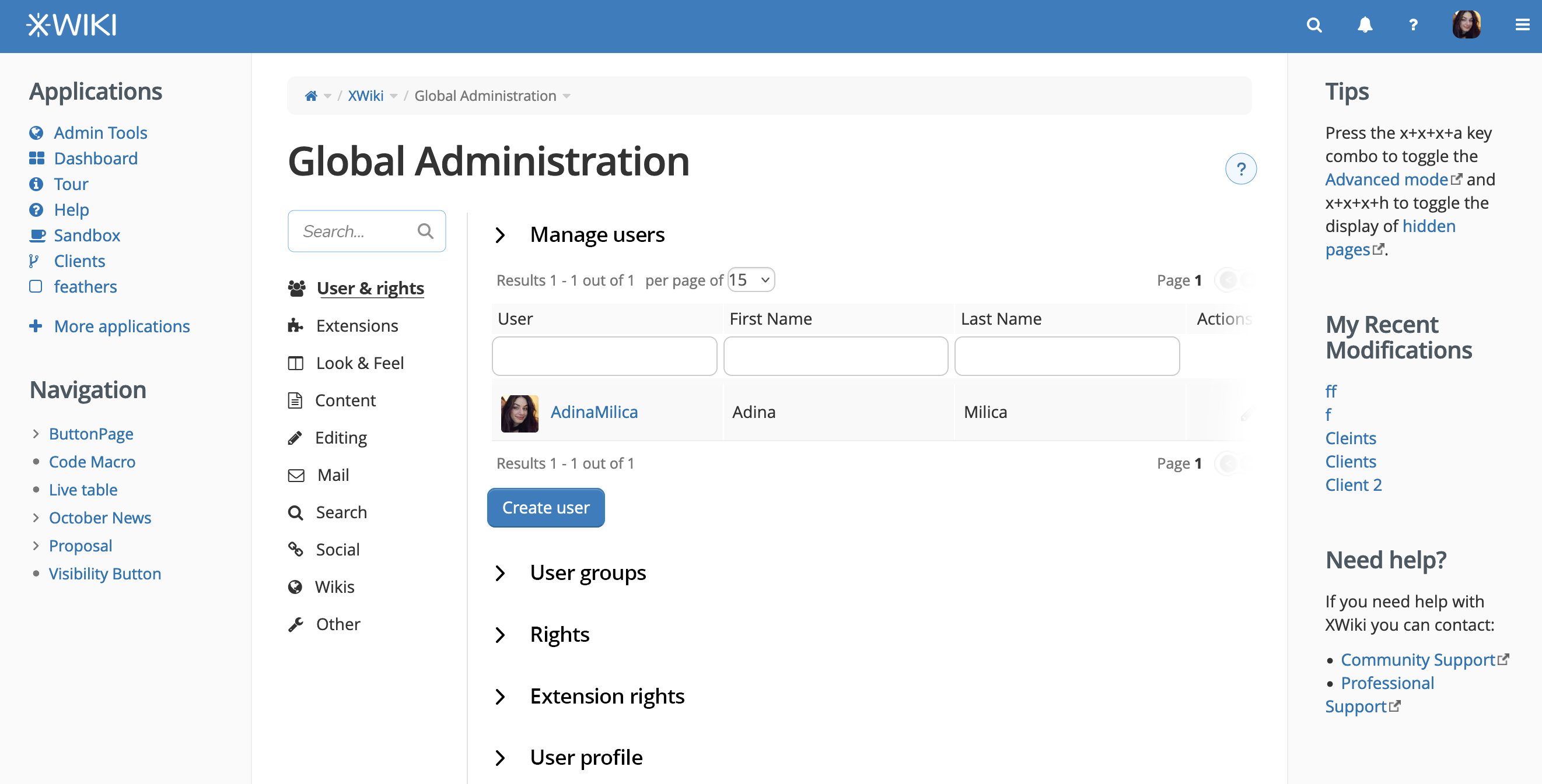
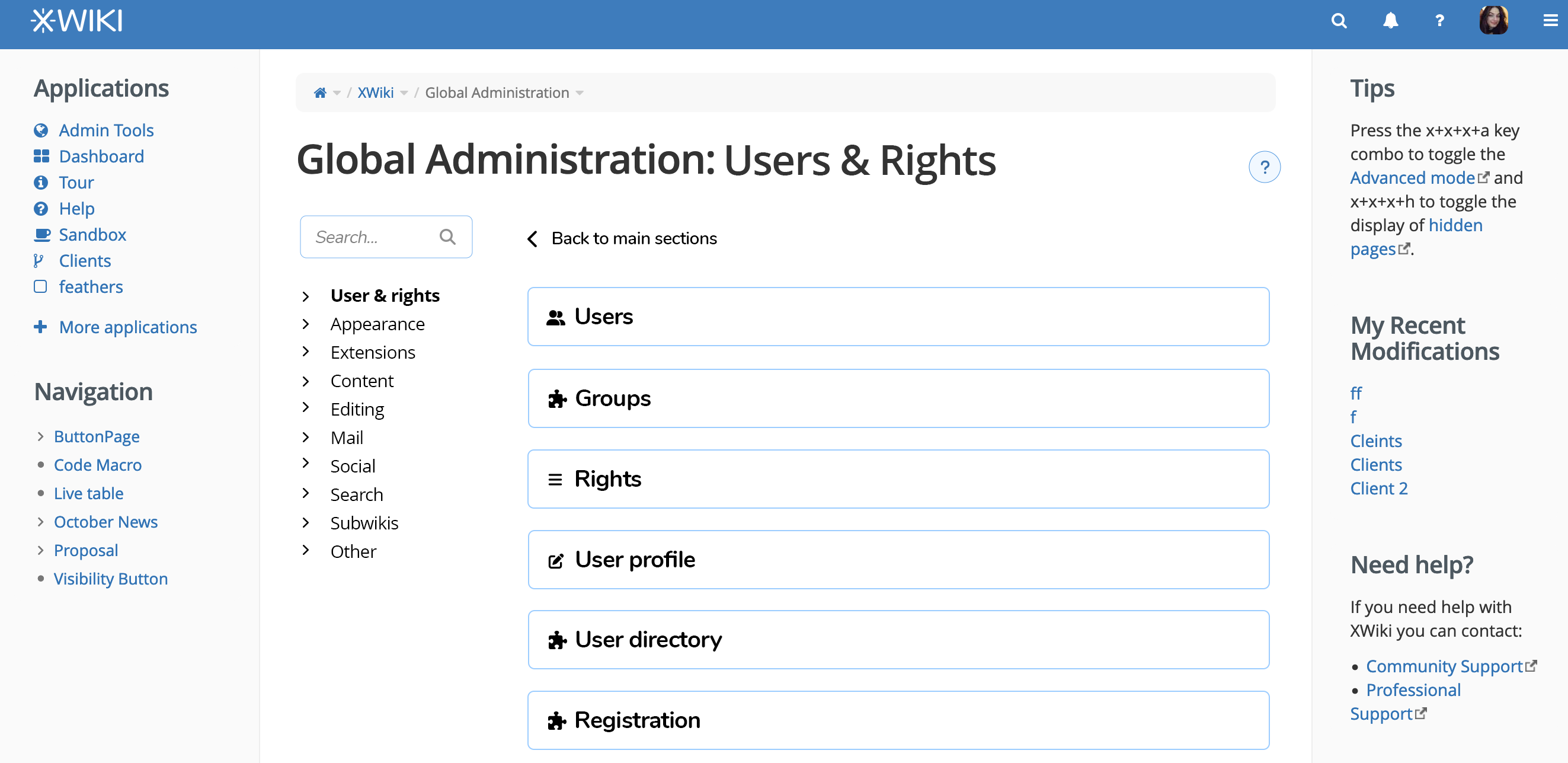
Version 5 - side sub-sections :star:

  • See detailed pros, cons and full views for this version here.

Right side contains subsections. Left side only contains the sections.

1707469229131-883.png

Extending a sub-section.

1707480793204-329.png

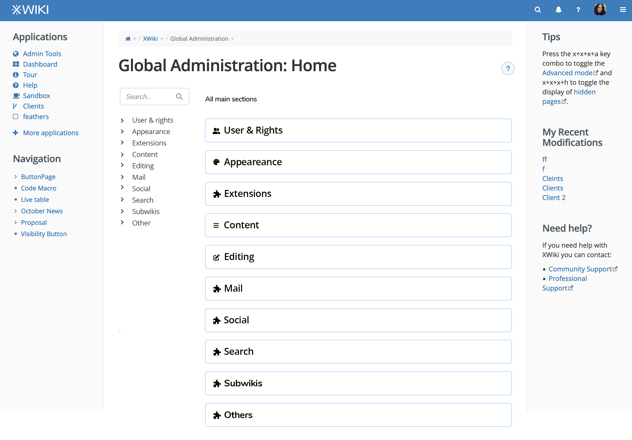
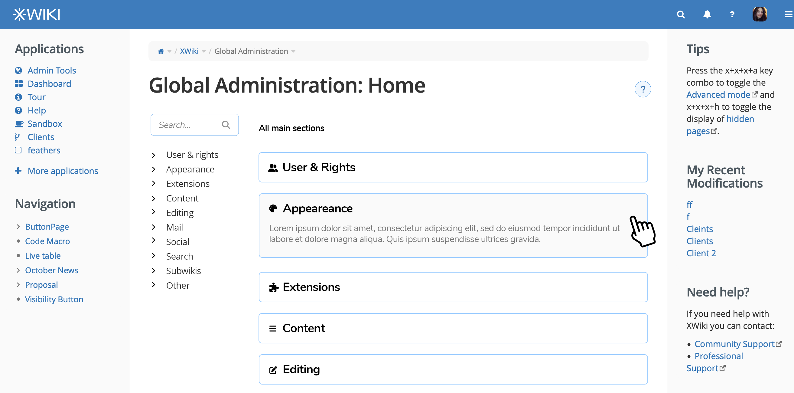
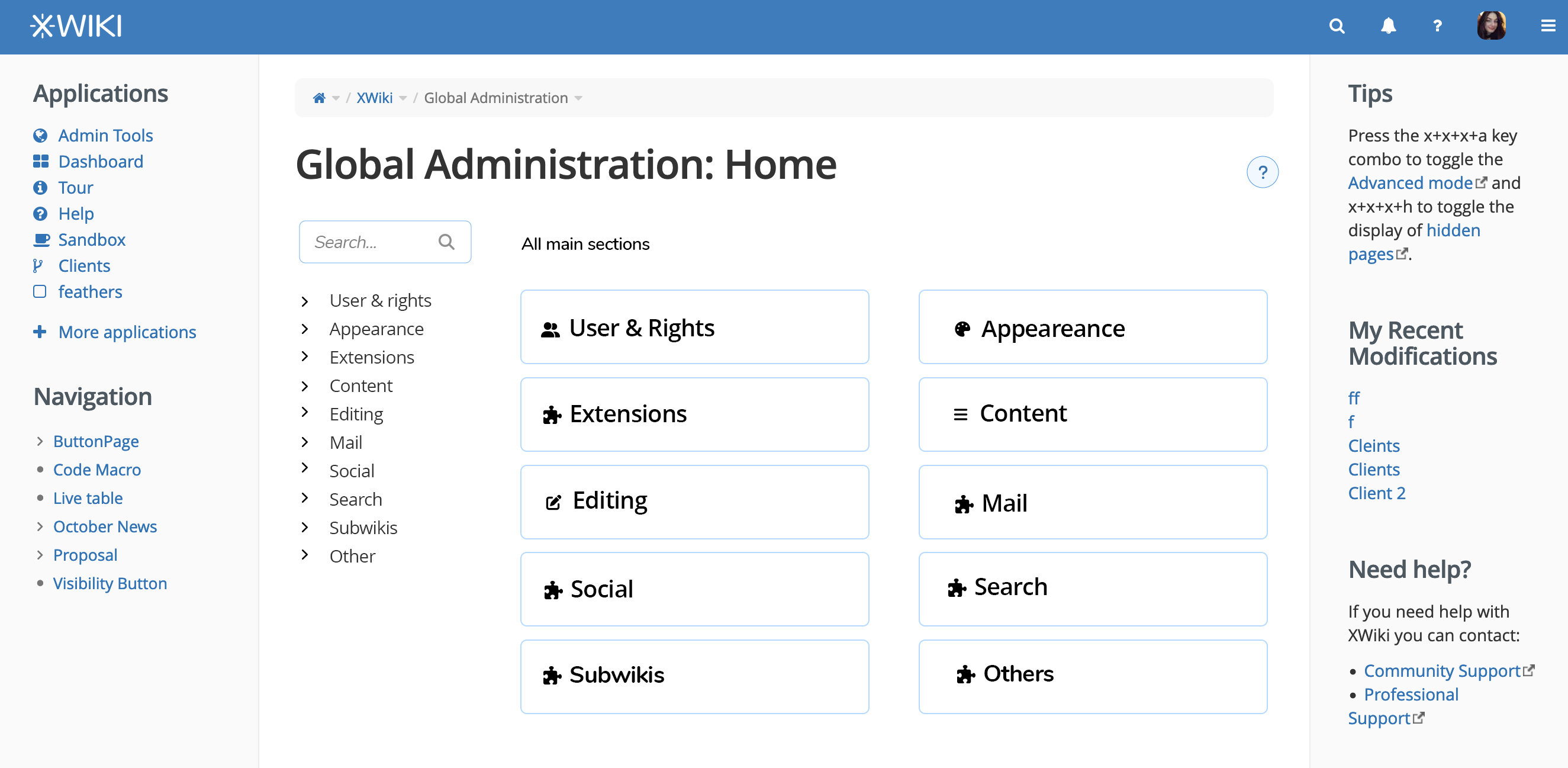
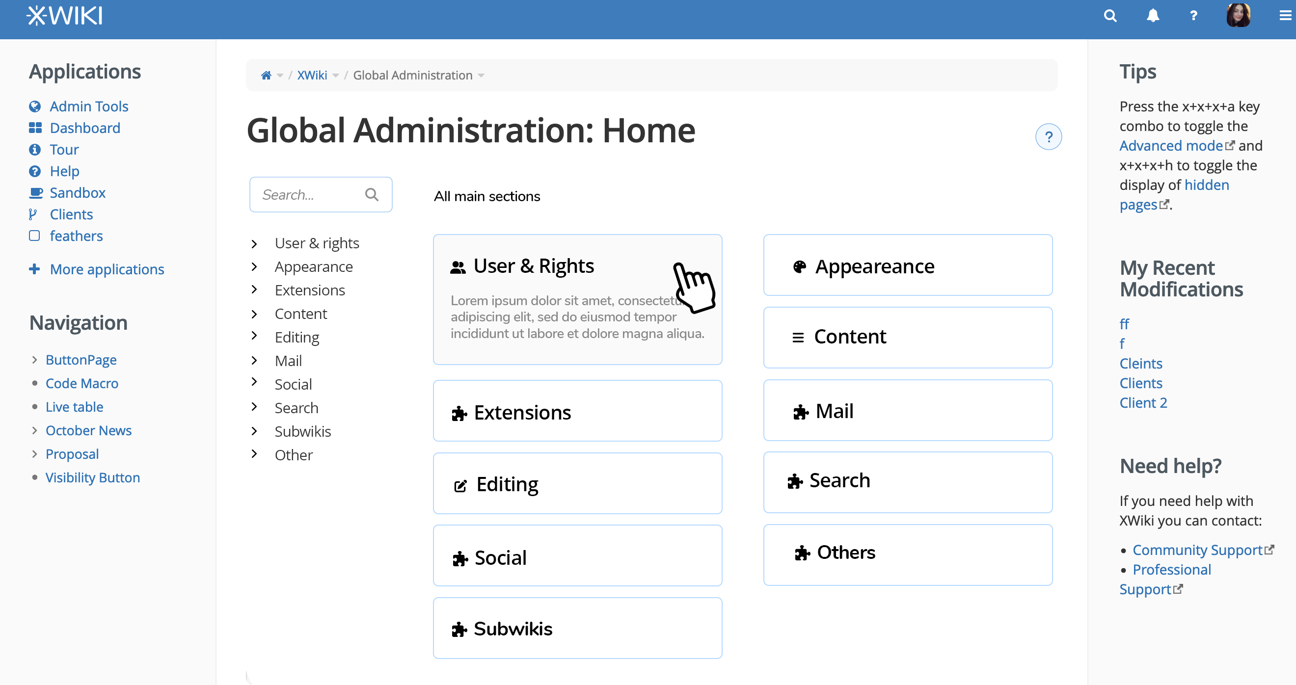
Version 6 - visual revamp :star:

  • See detailed pros, cons and full views for this version here.

Initial view with all the sections each on their row

1707470218101-539.png

Hovering on a section reveals description

1707470504453-636.png

Entering a section reveals the subsections

1707470834143-239.png

Version 7 - visual revamp + initial 2 columns :star:

  • See detailed pros, cons and full views for this version here.

Main view displays the sections on two colums

1707471650371-315.png

Hovering on a section extends description

1707471725338-231.png

Clicking on a section will reveal the page of all subsections looking and working like in the previos version.

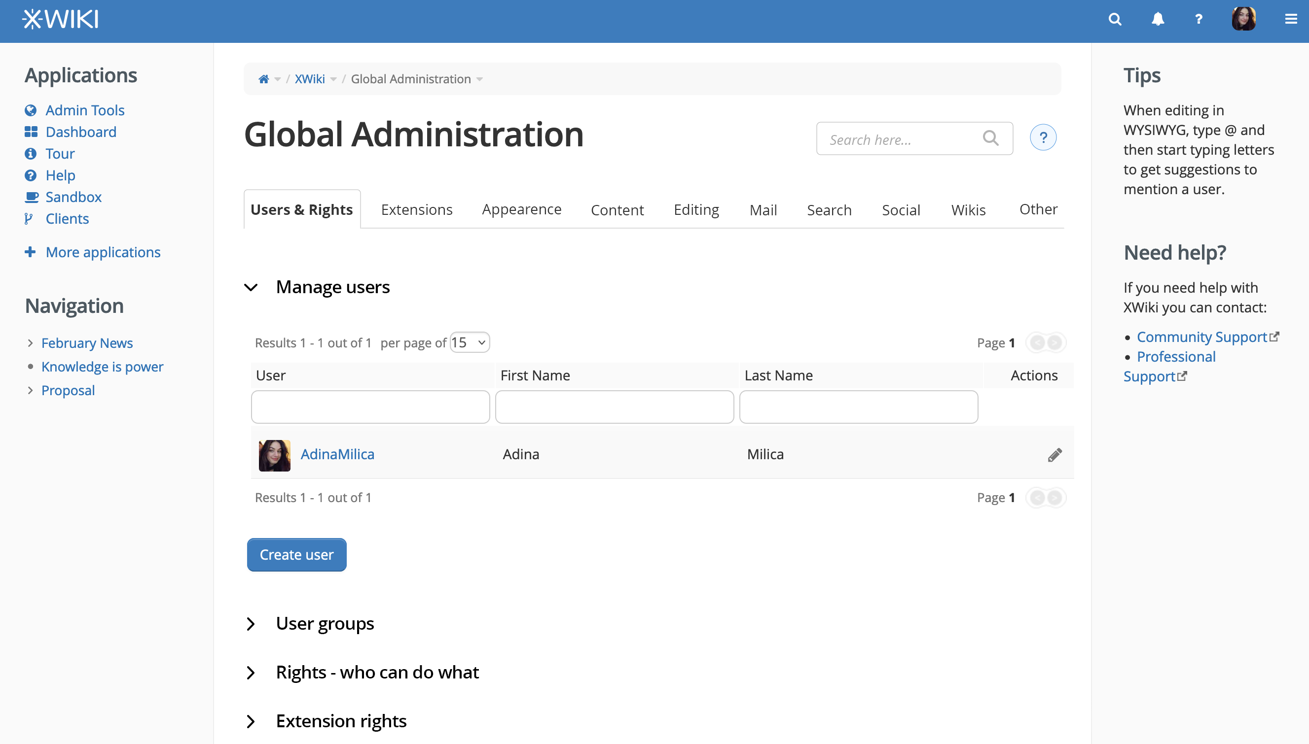
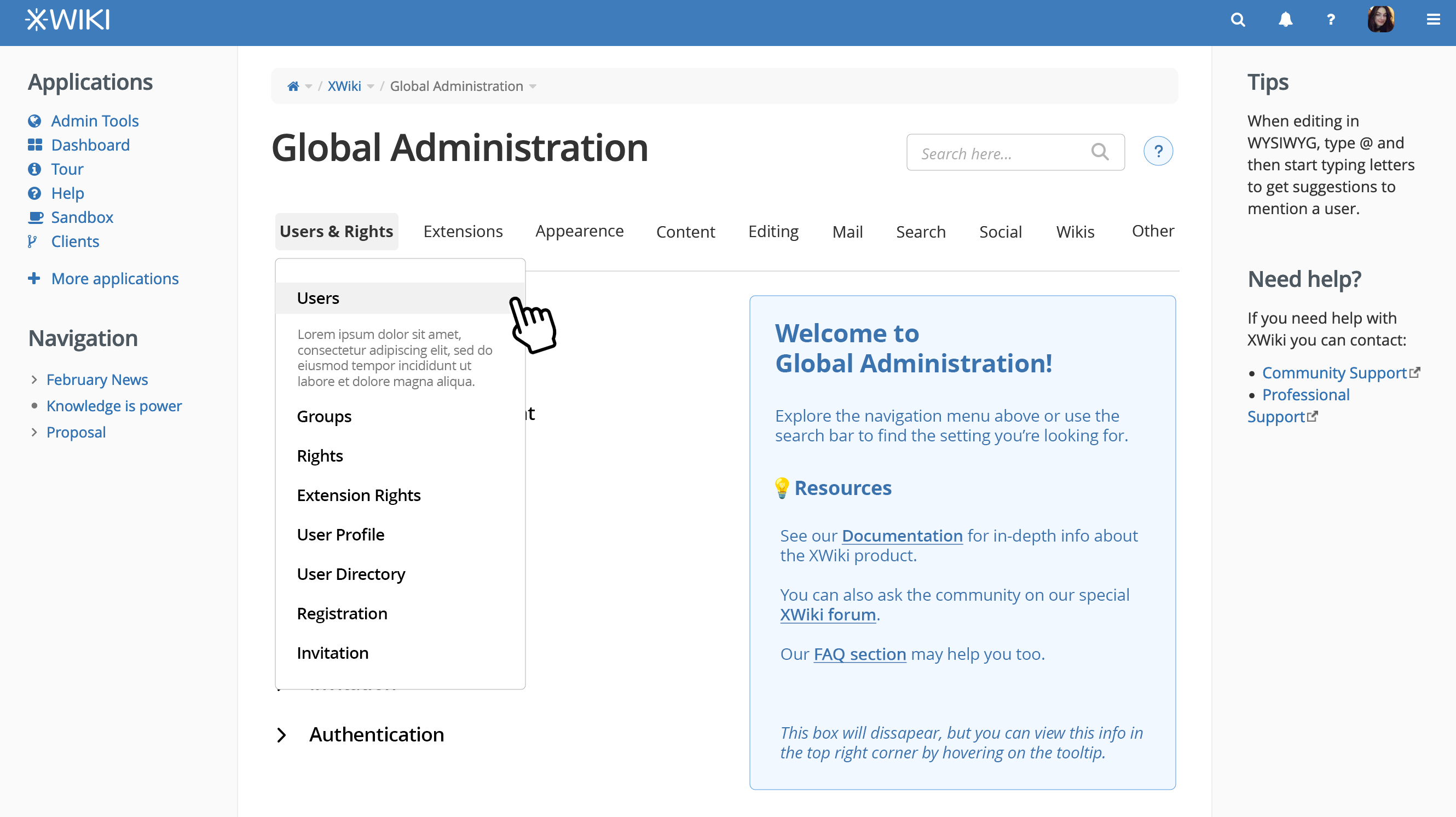
Version 8 - horizontal tabs :star:

  • See detailed pros, cons and full views for this version here.

The navigation is horizontal and subsections ocupy all of the main content.

1707472004263-328.png

Extended sub-section

1707474418189-520.png

Sub-version (horizontal tabs with gray background)

1707475452208-962.png

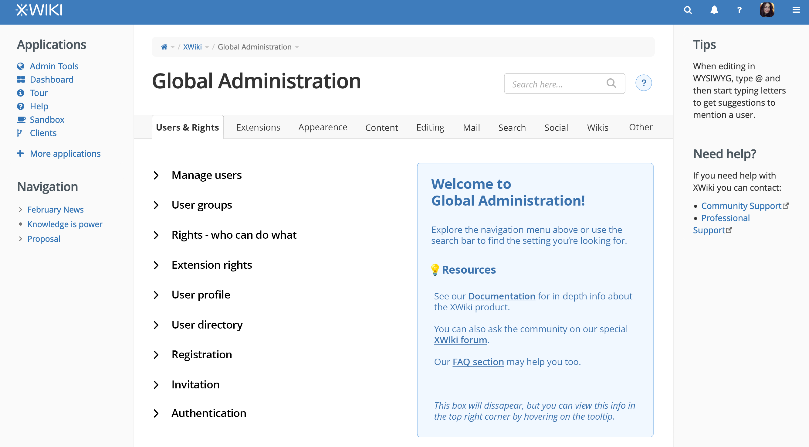
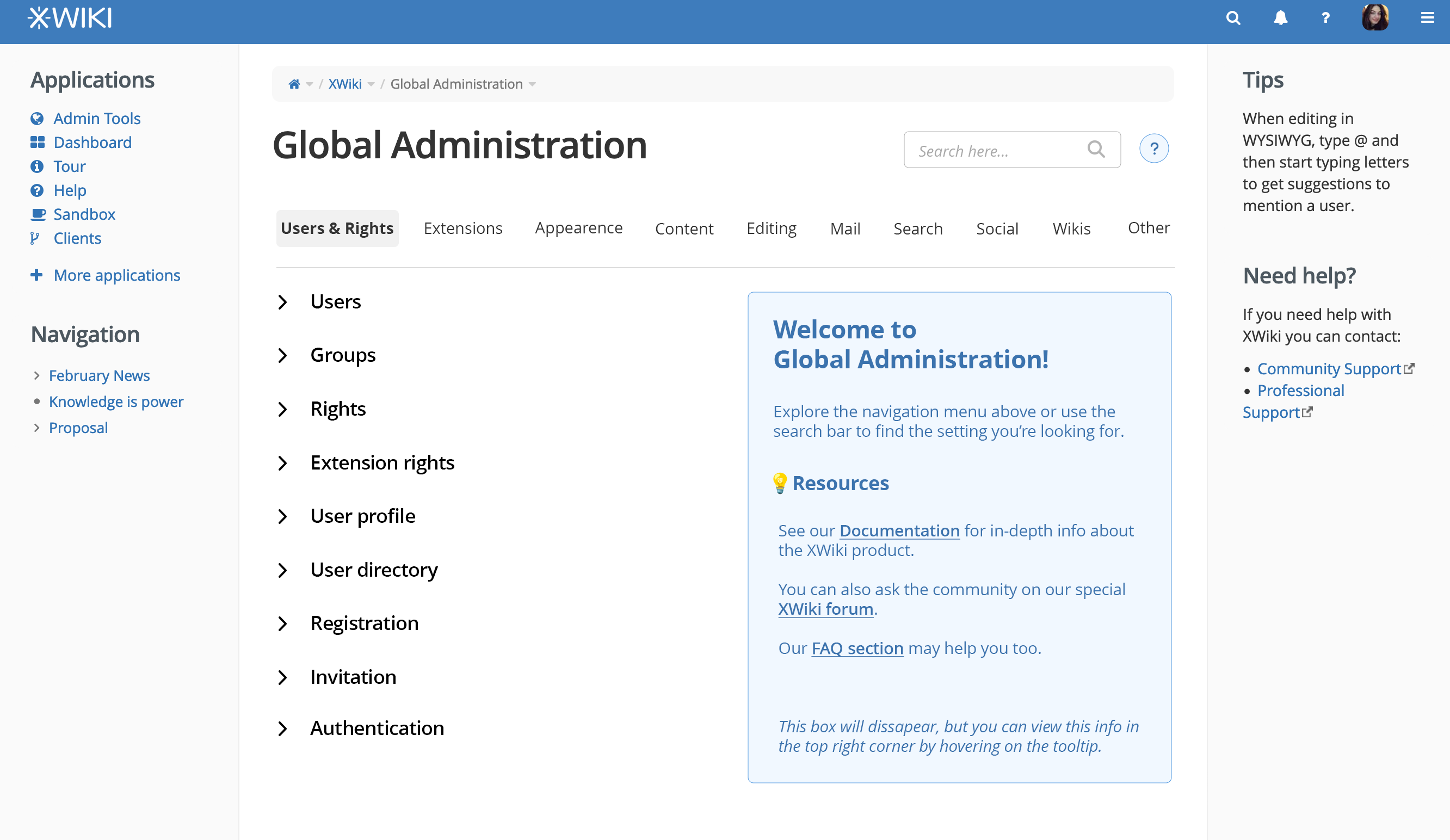
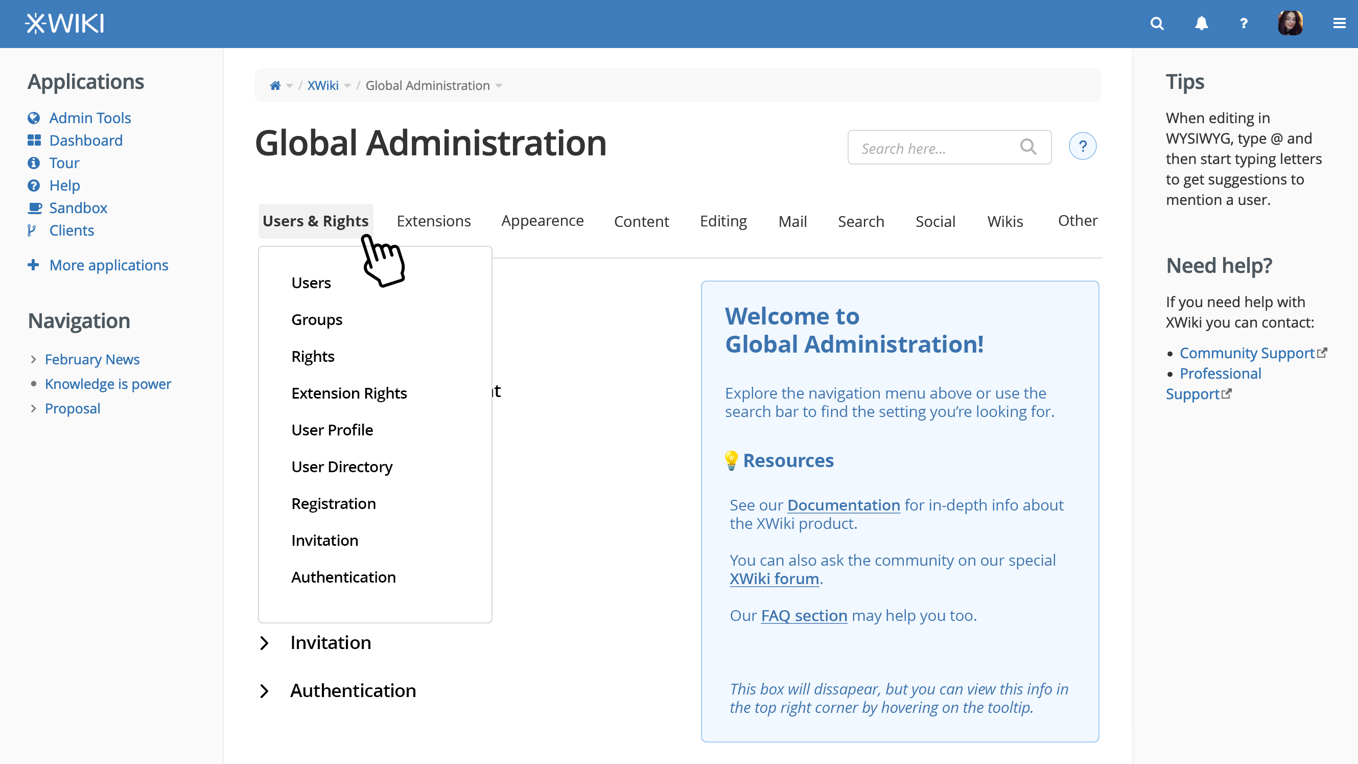
Version 9 - a lot of hovering :star:

  • See detailed pros, cons and full views for this version here.

Mimimized sub-sections view

1707469134942-772.png

Hover on a menu section will reveal subsections

1707467867443-219.png

Hovering on sub-menu will extend a description about the sub-section

1707467975562-763.png

Conclusion

These are all the versions that I’ve worked on so far. You can see the updated proposal here.

Let me know what you think about all of these and which version is the closest to what you’d like to see.

Thanks a lot for reading everything, I know it’s quite a lot! :sweat_smile:

Thanks @amilica !

Personally I still prefer option 1 (without the extra menu in the content area). Option 1 is to directly navigate to a subsection and display its content, ie no special home page for the Admin UI.

My problem with the new proposals are:

  • Most of them duplicate what’s already in the left menu
  • The horizontal tabs layout doesn’t scale

Thanks!

Thanks for the work on this!

Just to add on Vincent’s remark, a way to provide scaling for the horizontal layout could be to use stacked tabs, like Keycloak used to do:
image

Now, I’m pretty mixed on the idea, but it might be interesting to discuss it.

I like the best version 6, except for a nitpick :slight_smile:
Version 5 is good too. I don’t think version 7 is better than version 6.

The info panel for the admin landing page looks neat!

+1 I doubt we can make it as nice to use as a vertical section picker when there’s a lot of sections.


My nitpick for versions 6 and 7: showing description on hover will make half the page content move every time you hover a new item. This can make it annoying to reach some descriptions. Here is a worst case scenario:
I want to see the description for the Extension section. My mouse was in the top right corner (accessed administration menu from the drawer). I go towards the ‘Extension’ block. I hover over the corner of the Appearance block. This one displays its huge description, and now the place where I wanted to click the Extension block is just the description. I reassess my action and start moving towards the new position of the Extension block. As soon as I reach the bottom of the expanded Extension block, this one collapses back to what it used to be. All the sections under it go back up, and now I have my mouse on the Content block, displaying its description and shifting all items under to a new position. But more importantly, the Extension block got above my mouse position… So I reassess my action again and move up. I exit the Content block and all of the content under it moves back up. I finally reach the Extension block and I can see the description.

Not only did the user need to reassess twice its movement, the layout of the page also moved 4 times around for this simple use case. Moreover, even users that expect this would need to perform unintuitive actions to quickly get access to the info they want:

  • Go through this whole thing quickly. Needs precision and a lot of getting used to.
  • Don’t hover the Appearance section and access the Extension block from the side or bottom. This makes a pretty complex mouse path for almost no benefits.

I think we should avoid such use case.

Some alternatives would be:

  • Add some delay on the hover - but it can be unintuitive and the right amount of delay would be difficult to find. Too much and no one figures out that there’s a description toggled by hover. Too few and we get back to the use case above.
  • Add an ‘info’ button on the right of every section panel to expand them. I don’t really see a drawback to this, except that it can create a bit of friction… in any case less than what’s described above.

Thanks!
Lucas

I like version 8 very much. Because of it’s horizontal space for the entries. This is the first version where I think, that it’s worth all that much work in revamping.

I would like to see how a search will present it’s result in this version.

What is important for me that I can link (e.g. by query) to each opened sub-section. I find this important for guiding other admins and for internal documentation.

Simpel

1 Like

Hello! To come back on this:

I disagree a bit with this, if we are referring to scaling in the sense of responsivity.
Even if we are referring to the idea that we might add other sections in the future or the space gets smaller because of different widths on side panels, we can still apply the following 2 ideas to keep the horizontal layout (which I believe would the ideal one).

Responsive layout

Current mobile version

This is how the mobile version of the current version looks:

global admin UI mobile initial

Main issue is that it’s hard to see all the main sections. You have to scroll quite a lot to see everything.

Alternative mobile versions

What the horizontal layout enables us to do is something along the following layouts:

  1. Something along the lines of what @pjeanjean suggested (wrapping the sections)
    global admin UI mobile 1

  2. Having an arrow that on tap (on mobile) shifts the list to the right and shows the next items

global admin UI mobile 2

Version 5 is the polished version 1. I’m curious: why do you prefer version 1 over version 5?

This is a quick comparison between the two:
v1 vs v5

It’s not about responsiveness but about the space it takes on the screen and the fact that the more elements you add the more cumbersome it is.

What I also don’t like is the submenus shown in the page content. I think it’s cumbersome to fold/unfold an entry.

Overall I feel that the current menu is a better UI that is easier to understand and navigate. The downside is that it takes more horizontal space but ATM I haven’t seen a proposal where I thought to myself that the tradeoff was better. It’s good to have more horizontal space but not at the expense of usability.

I’ve never liked option 1! For the same reason mentioned above. I don’t understand at all the need to have the submenus in the main content area since there’s a menu on the left. You loose everything! Both screen estate and usability.

What I said I like the best so far is option 1, but without the extra menu in the content area (what I call the submenus), which is what we have now basically but with a difference: directly navigate to a subsection and display its content, ie no special home page for the Admin UI.

I currently really don’t like the accordions used for the submenus, in the main content area.

One alternative that wasn’t shown I think, is the ability to somehow fold/hide the current menu when you’re on a topic, with the ability to hover over (or something like this) to unfold/unhide it and navigate to some other section.

I also want to mention that when I talked to you about improving the Admin UI, it was mostly about changing/removing the main content area (which currently duplicates what’s in the menu and should be removed IMO), more than other changes (I find the current menu to be really nice and usable).

Thanks!

Okay, so at last, I came back on this.

I tried to reunite the feedback of everyone and take into consideration what everyone what liked and didn’t.

I hope this is a good compromise.

Default state / Initial view of Global Administration

first view of global Admin

Explanations:

  • when the user enters GA he sees the info box pointing him to documentation, forum and a FAQ
  • the menu is not yet opened
  • the menu main-sections don’t have a border
  • the menu main-sections have bolded text for better visual hierarchy
  • the menu occupies only 1/5 of the available space (in this panel configuration - probably the most common)
  • the search bar doesn’t have a shadow in the default state
  • the search bar has light font-weight to differentiate better from the menu sections.

User clicks a sub-section of the menu

selected sub-menu

Explanations:

  • the friendly/expanded title of the sub-section gets rendered above the actual content. Why?
    • to improve visual hierarchy
    • to make very clear which sub-section is clicked (the current way this is shown in the menu is not ideal. The most prominent element is the main section, not the sub-section clicked)
  • there is an easily available link to documentation for the specific section
  • the menu can be collapsed
  • if the user hovers over the icon besides “Global Adminstration”, a tooltip will appear on top of the content with the info box from default box
  • the sub-sections in the menu have a border unlike the main sections

User collapses the menu

  • note: the chevron needed to be reversed in the mock-up (will update the final proposal on the design wiki)

collapsed menu

Visual explanations (if you need more)

analisys

Advantages of this version

  • doesn’t duplicate the content (as the current version does)
  • it enables to view the content in a larger space if the user wants that
  • makes product information easier to access
  • doesn’t change a lot of things
  • the changes are not very hard to implement
    • the menu look can be updated based on CSS (probably even just from Advanced Customization)
    • the state of the menu (collapsed or not) doesn’t need to be retained if the page is reloaded, so the collapse button essentially just hides the menu and resets the width of the content to take the whole available space (and reverse)
    • the tooltip is… a tooltip, so hopefully it doesn’t imply any difficulties (if we don’t like tooltips, we can always go with a modal appearing if the user clicks the icon)
    • the title of the sub-section and the documentation link need to be rendered based on the sub-section clicked, but, as we only have a limited number of subsections, it’s just a static list of info.

What do you think?

Thanks a lot for reading this and let me know your thoughts on this version! :blush:
I’d really want to get a decision on this proposal until the end of the month. ^^

Tagging the people that already got involved a lot in this proposal (lots of thanks again): @watery , @nikpetrenko , @vmassol , @tkrieck , @CharpentierLucas , @pjeanjean

1 Like

Thanks @amilica

Some thoughts:

  • Sounds good
  • Still wondering if we could display something more interesting in the GA home page than documentation links. Admin-only news might be more interesting, idk (this would be what can be seen at https://www.xwiki.org/xwiki/bin/view/Blog/What's%20New%20for%20XWiki%3A%20Admin%20User ).
    • At least that will let admins know about new releases (of XWiki and extensions). My only hesitation is that this info is already available in the what’s new feature (but not just admin news there, even if currently most news are admin news).
  • I’d point to the Administration Guide instead of general documentation.
  • I think we need to discuss more globally your idea of putting question mark icons after the title (and doc link to the right of level 2 headings) since this is not something we’re doing elsewhere AFAIK and if we want to go in this direction, we need to generalize it (for example, in user profiles view just to name one other place).
  • If I understand correctly, when clicking a section (like “Users & Rights”), the “Welcome to Global Administration” box will appear or remain, right? And users need to click a subsection to see the content change.

Thanks

Looks good to me overall :+1:

I have a couple small comments though:

For the style used for the expand/collapse button. IMO we should use standard button styles, i.e. rounded corners and default colors. Nothing prevents us from putting the text into the button itself, to get a final style similar to the page create button:
image

The tooltip is displayed on hover but we should also give a way to display it for keyboard only users (or any user that can’t hover, like a touchscreen user). This is a detail that might come only for implementation but I figured it’s still important to mentation. This activation could be on focus or when pressing enter (“clicking” the button with the keyboard).

From what I remember one idea for Loading... was to create a Panel and just put this panel in the drawer. We could use a similar panel in the GA Home Page. We can probably use the time spent to make a panel for both :+1:

Some thoughts on this:

From what I experienced, our current navigation in the administration is not easy to discover for users. New users I watched were using the icons in the main part of the screen, not the menu on the left. Maybe removing the entries in the main part helps to put focus on the navigation, but I’m not sure. Maybe this kind of UI pattern is not obvious/well known enough? In that same direction, I’m wondering if that “Collapse menu” link is discoverable enough and if users will easily find how to expand the menu again. Also, this link seems to take quite some vertical space also for the main content. How would this collapse menu button work on mobile?

The white space left of the “info box” and the white space inside the info box looks quite strange. How would this white space change depending on the screen size?

Also, I’m missing the use of common design system. For example, you suggest removing a shadow from the search bar. In my opinion, we should keep this consistent with all other inputs in XWiki - we could change them, but then we need to change all of them. Same for the placeholder. XWiki needs to have a consistent look and feel to be recognizable as one application and not a mix of many independently designed components.

This is not true. Extensions can add their own subsections. We need a proposal how the documentation link should be provided.