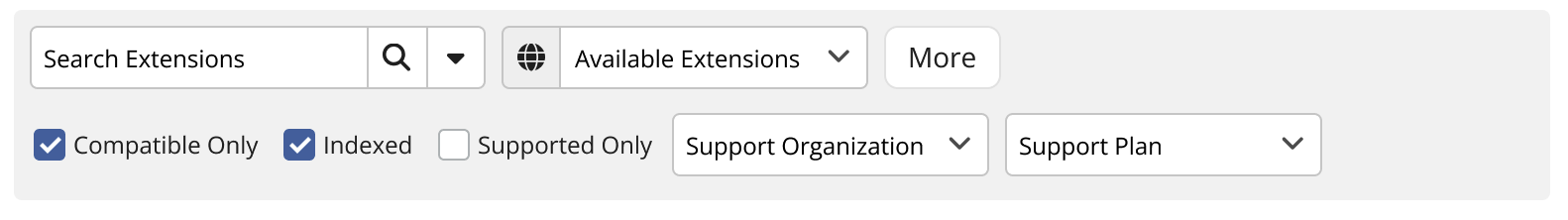
I started doing some layout options using the horizontal bar, but no matter what I did, it always felt very cramped.
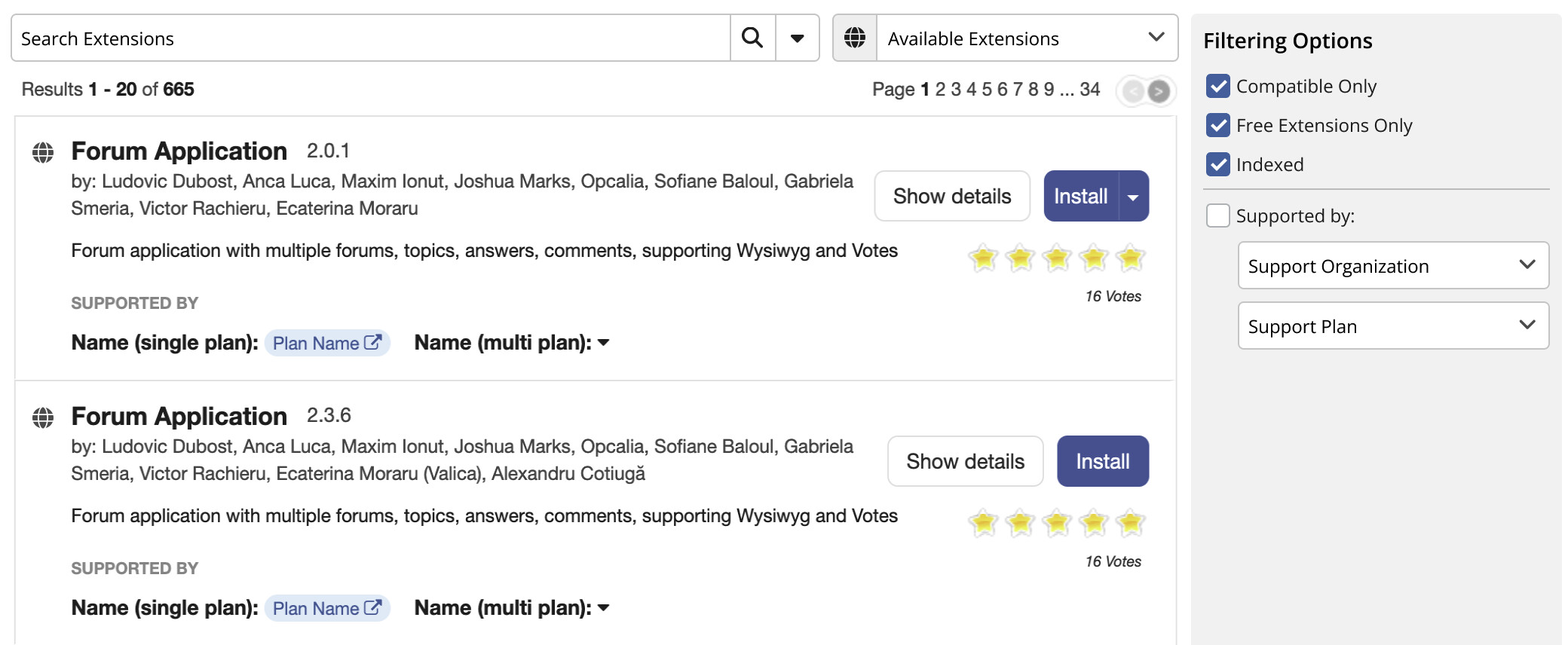
So how about we change it to a filtering sidebar instead? This has the additional bonus of maintaining the overall design of the default search.
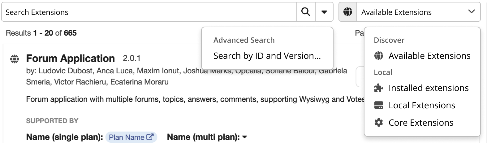
There are some other changes in this UI, like moving the search button, advanced search popover and including icons on the “Discover and Local” dropdown.
What’s your opinion on this?