An error box is definitely too much I agree. Maybe a warning is more appropriate? I wanted to make sure users always understood that there’s something wrong with the line they’re reading. The error or warning colors next to the line of deprecated doc conveys that the info on this line is not true in all conditions. This is mostly a subjective point though, the info color with the special layout could be enough to convey. I don’t have a strong opinion on the matter.
Yes but there’s nothing wrong with the line they’re reading ![]()
There’s only something wrong if they use it. But if they don’t, there’s no reason to warn them or make them worried.
YMMV.
1 Like
This is what I have ATM. WDYT?
FTR the color is probaby wrong. Let me know what to use:
.badge.deprecated {
  background-color: #ffc107;
  color: #000;
}
Thanks
Hi! It does look very nice. I would display a “+” after the version number (just as it’s displayed in the version macro for the since parameter), as it’s implying that starting with that version and beyond. WYT? Re the color I’m not sure either, I would use something grey-ish (not too close to the version macro color, and not too similar to the box macro), e.g., #495057, or #343A40? I would choose something grey-ish since it has been agreed above that this is not a warning. WYT? Thanks!
@elenicojocariu Thx. WDYT of using “Deprecated in .” instead?
Re the color I’d like @mleduc or @CharpentierLucas 's opinion as I’d like to reuse some existing color four our official palette. There’s probably some css variable that I can reuse. Don’t you think we should use something a bit more visible than grey though?
“Deprecated in” sounds good as well to me.
Definitely.
If I’m documenting an entire page about something deprecated, it doesn’t really make sense to use a yellow-ish highlight to draw attention to the deprecated content inside the deprecated macro IMO. In this case the whole content is already flagged from the beginning as deprecated from the title (e.g. Use Colibri ColorTheme Variables (Deprecated) ). However, in a Page where I’m documenting a feature and need to include just a section to point out some deprecated content, it makes more sense indeed to highlight it slightly so it doesn’t blend with the rest of the content.
I’m not sure which of these cases will be more frequent. (In any case, I think we should use a single color consistently, I’m not proposing to use 2 different colors for the 2 cases.)
When I suggested using grey, I had in mind this case Use Colibri ColorTheme Variables (Deprecated) where the entire page is already clearly marked from the beginning as derpecated & there’s no need to draw even more attention with a color.
Actually I don’t think that putting “Deprecated” in the page name or title is the best because:
- it’s not consistent with the style we’re going to use for the deprecated macro
- it doesn’t say when it was deprecated (
sinceparameter) - it doesn’t say what to use instead (
useInsteadparameter)
We could surround the whole content with the deprecated macro. It wouldn’t cover the FAQ section though, and for rendering macros and UIXP, we also can’t cover all the fields. We already have this problem for the version macro, see https://www.xwiki.org/xwiki/bin/view/documentation/extensions/user/documentation/version-macro/ where I’ve put the version macro only in the first xproperty displayed.
So we need to find a way to apply the version and deprecated macros to the whole content. I need to think more about it but if someone has an idea, let me know!
Thx
For the “Deprectated …” text, the closest I could find is btn-warning-bg (#ffd483 in Iceberg).
We’ll need to be careful of the contrast with the text though.
For the background color, I guess body-bg (#fafafa in Iceberg) is light enough to not hurt readability.
To ensure the contrast is good, we can use both --btn-warning-bg for the background and --btn-warning-color for the text.
For the grey background option, --body-bg while keeping the default --text-color is good ![]()
Or we could decide to go with the --btn-default-bg and --btn-default-color (in practice on xwiki.org the pair has almost the same values).
I don’t have much to add to the discussion. I think any of the two options would be good in the context of Xorg.
Maybe --brand-primary-bg (dark blue for xorg doc) and --brand-primary-color would work well:
- It’s usually kept for key information (more visible than
--btn-default-bg) - It does not come with a clear meaning that isn’t applicable (like the warning or error palettes)
The main con I see is that it could disturb the reading flow a lot if we use it multiple times in the same page.
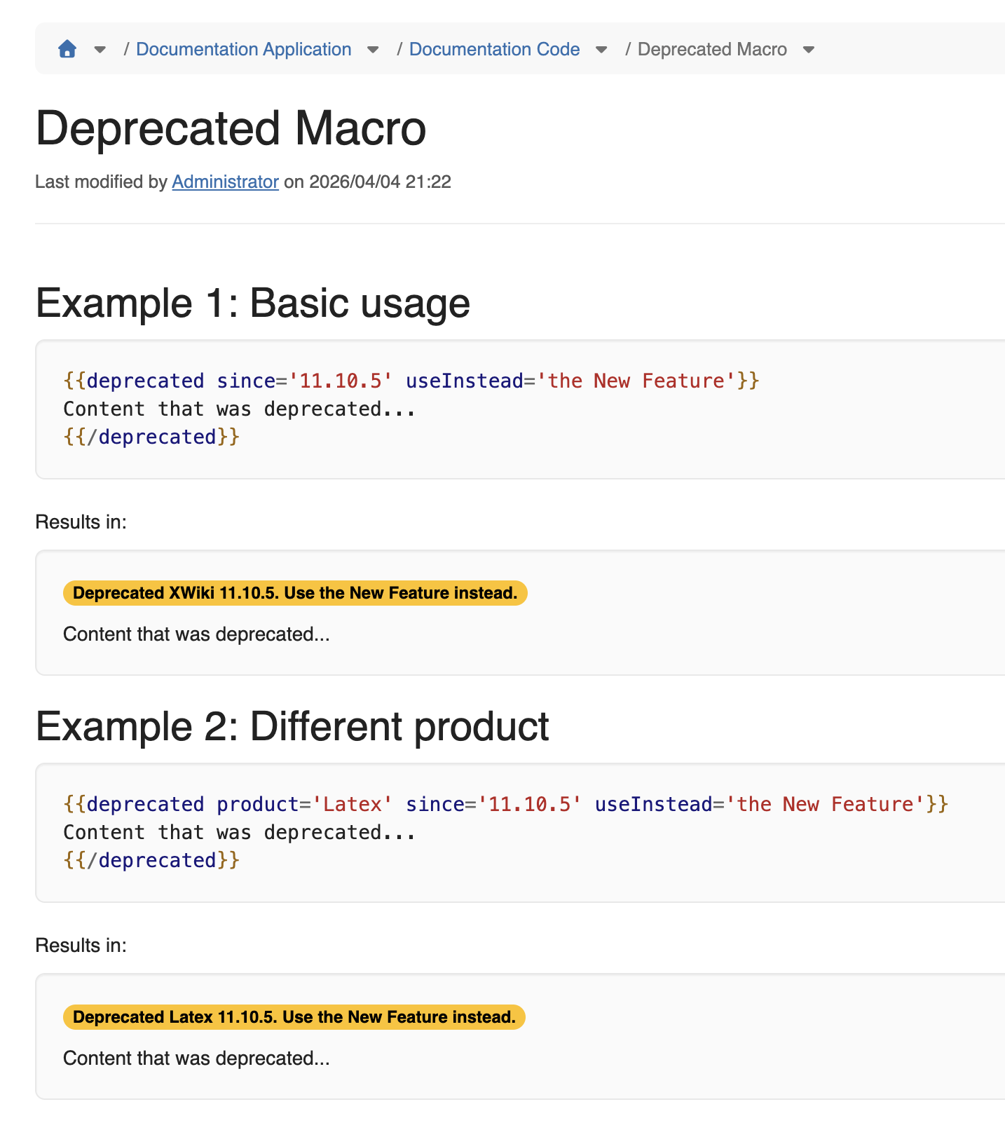
I’ve now implemented it, see https://www.xwiki.org/xwiki/bin/view/documentation/extensions/user/documentation/deprecated-macro/
Note: I still need to change the colors, that’s Improvement: Improve colors for the deprecated macro (#105) |
However, we’ll see how we use it but I believe we’ll need to support either wiki markup inside the useInstead parameter (but that’s not very nice IMO), or, better, add another parameter like useInsteadURL to point to a page documenting what should be used instead.
It’s not very nice to use wiki markup because 1) it’s a security liability to handle, and 2) it’s a string so it’s not convenient to put multiple lines in it and certainly not enough to explain something a bit lengthy.
WDYT?