I’ve replied above to Michael. I don’t see how this would work as there’s no order. What order do you put in a FAQ item list?
If you’re talking about having a reading list (ie some tracks depending on large topics that you want to achieve like “Getting Started” - for users -, “Write your first Application” - for developers -, “Advanced XWiki features”, etc), I’ve also tried to answer that in my answer to Michael’s post above. For these, I agree that there can be a previous/next order.
Cool since that’s part of the proposal already… See Proposal 6 above
We’re retracting this part since we don’t think it’s needed:
The landing pages are not doc pages
We can’t reuse the Doc XClass anyway since some landing pages are for several doc types (like the main landing page)
The option 2 of proposal 7 is already showing all landing pages so there’s no need to categorize them to provide a list somewhere. If that need ever appears, we’ll just add a new XClass.
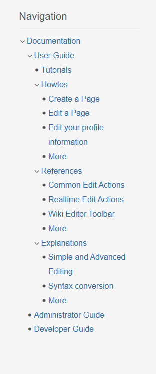
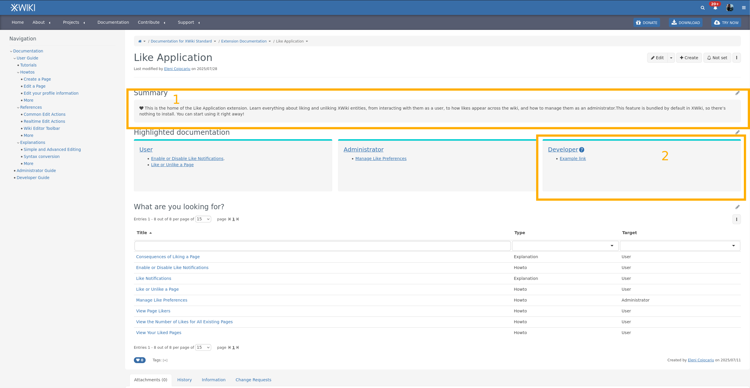
The majority voted for option 2 of the Navigation Tree proposal, and this is how the Navigation Panel looks so far when grouping the documentation pages by type and listing highlighted pages for each type:
on each documentation type displaying the children: Edit a Page.
The XSheet bound to the doc XClass has been implemented to automatically add a section at the bottom of doc pages displaying children pages. This applied only to doc pages that use the doc XClass (landing pages are excluded).
Still pending
The “Other navigation improvements and cleanup” part of the proposal hasn’t been tackled yet.
If you feel some things are missing/ can be improved, feel free to propose! Thanks!
I don’t understand why this is in a box. From a first look, it only makes things look heavier. Completely subjective comment, feel free to ignore it if you already spent time thinking about this. With time I’ll get used to it Note that this goes for option 1. too.
When there’s no documentation for one user type, I think it’d be quite important to not display the box, or at least put a Create documentation here button inside.
2.bis. The semantics of the cards here could use some improvement. AFAIU, this is a list of cards, each corresponding to a user type. There is no list semantic in the generated HTML and it’s not the best for accessibility. It’s not critical but not negligible, it makes the experience of assistive tech users navigating the documentation a bit worse. Note that this goes for option 1. too.
2.ter. The color of the top bar is weird, it looks like the only place where we use it currently in the main documentation. Now that I thought a bit about it, it might be a reminder of the extension doc theme, but if that’s it, it’s not a trivial information, and I doubt many users would understand it. I personally think option 1. makes more sense on this point, as the links in those cards are all going towards the main wiki and there’s no place where we explicitely associate this color with the concept of extension.
Small detail: I’d have put Highlighted Topics or Recommended Reading instead of Highlighted documentation (missing an uppercase D btw). I’m fine with Highlighted Documentation too.
I think it was meant as an example but for sure the box should not be there if there’s no content.
-1 to keep a box with “Create Documentation” since there’s no reason to focus doc creation just for the Category that doesn’t have any entry yet.
Note: Originally I was envisioning one topic per card, possibly with some pills or image showing the category. But I don’t have a strong opinion.
I feel it’s too much on every landing page, unless you can find an unobstructive location for it but I don’t see where. We could have it on the top level landing page to explain that we value contributions and link to the guidelines as you suggested.
I don’t have any strong opinions. However, I have a slight preference for option 1, with the mention that I don’t think the summary should be put inside a box.
Other than that, I feel like the new documentation pages are coming together nicely! Great job!
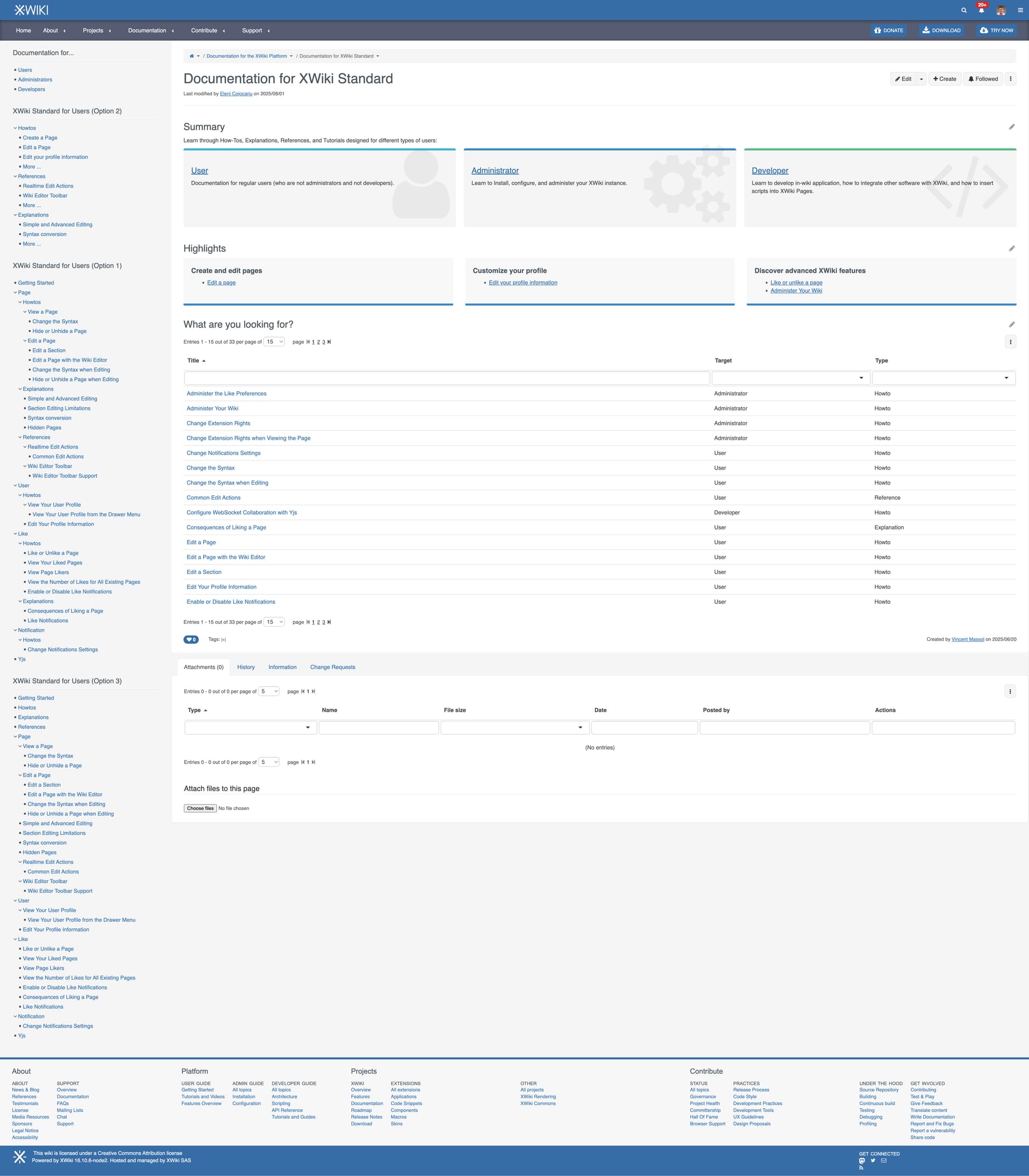
So we have now tried to implement option 1 and 2 for the navigation, based on about 30 doc pages we created. We have also added an option 3 to answer @MichaelHamann comment.
In addition, we’ve moved the Product and Target concepts outside of the nav in the following manner:
You choose the doc for a product directly in the horizontal navigation under Documentation (the new doc is temporarily under a sub menu)
You choose the target (user, admin, dev) using a dedicated panel
To summarize:
Option 1: Nav ordered by Topic and then by type
Option 2: Nav ordered by Type only (with some highlights)
Option 3: Nav ordered by Topic only (with 4 extra entries for the types)
Since Proposal 8: Landing Pages got +1 from everyone, the next steps are agreeing on what documentation pages are included in the “Highlights” section of Landing Pages. Please check this proposal and let us know what you think.
+1 for option 2 - for me it’s compact and user-friendly format that minimizes visual clutter. It significantly reduces the time required to locate the desired page without relying on navigation hotkeys
Important note: For option 1, we can also have the 4 top level entries for the types (Tutorials, Howtos, Explanations and References), same as what is shown in option 3.
As a continuation of the proposal regarding the Navigation Tree, here are some more clearly defined rules for positioning pages within the navigation:
Positioning Pages in the Nav Tree
Once it has been decided which extension or subject a page belongs to, for Option 1 and 3, we need a strategy to decide its position within the navigation tree. Choosing the order can be quite subjective, but the following criteria should be considered:
List pages from most useful to less useful, considering how often a feature is used.
For example, both “Hide a Page” and “Change the Syntax” belong under “Page”. “Hide a Page” is listed before “Change the Syntax” because hiding a page is used more frequently, while choosing a syntax usually happens only when creating a page.
Another example: the standalone WYSIWYG editor, also under “Page”, has a very specific use case, so it should be listed lower in the tree.
I don’t understand this part @nikpetrenko . For me option 2 is the option that is the simplest to implement but it can only increase navigation time since the pages are no listed in the tree at all (you need to search in the LDs and if you don’t know what to look for, it’s less easy). Options 1 and 3 OTOH offer both nav in the tree and in LDs.
I think it is important to have direct access to the topics (e.g., how to) because the navigation tree is not going to scale (unless we propose a search and filter feature).
I’m expecting users to click on “how to” then filter for the topic they want to know.
A few pre-selected pages like “getting started” are also important for new users that are not sure where to start or what the interesting topics are.
So overall I’d rank the options in the following order (from preferred to least preferred):
Option 1 (assuming there are hardcoded top-level entries) because it feels difficult to identify what distinguishes the different kinds of topics from the page title.
Option 3
Option 2 because it is not highlighting existing domains at the root level.
Note that option 2 doesn’t highlight existing domains at the root. It only highlights a few (max 5) pages from all the domains for each type. Option 2 was made to have a fixed nav and make it easy to maintain. Readers need to use the LDs to navigate.
Right after it would come option 1 as a preference, but I like option 3 more because it has less sub-levels.
Pauline: Option 3
Vincent: Option 1, because without the type in the nav we’re mixing different types of docs and it makes it harder for reader to understand what each link is about.
Option 2: Simon, Manuel, Nikita, Gabriel but his comments seem to indicate he actually preferred option 1:
Having a navigation tree visible on each page. I’m imagining it being on the left side panel.
So taking all that into account, we can safely say that the contenders are options 1 and 3, and that option 2 is now the less chosen option.
What we would need to have is the new opinions of @CharpentierLucas and @MichaelHamann who previously chose option 1 but who could prefer option 3 now?
And of course would be nice to have opinions from committers who didn’t reply: @mflorea and @tmortagne for example.
For Option 1 of Navigation Tree (i.e by topic and then by type), each type that is under a topic needs to redirect to a Landing Page (see Proposal Landing Page and Continuation of Proposal Landing Pages). To do so, there are two options:
Creating dedicated Landing Pages directly under each topic.
Pros:
Nice navigation and breadcrumb.
Cons:
Too many landing pages.
Readers can already filter from the LD on the topic Landing Page the type, for example check the LD on this Landing Page of a topic.
IMO the fact that readers can already filter by type in the LD of the topic Landing Page makes listing the type again in the navigation redundant, and to me this is generally a con of choosing the Option 1 Nav Tree, (but as you already know, I prefer Option 3 ).
This can be implemented I think (recognize the URL and highlight the right node in the nav).
Note: we haven’t started to implement the correct opening/closing of nav tree nodes nor the highlighting of the current node where you are. I’ll need help for this (@mflorea or anyone knowing javascript and the document tree enough).