Hello all,
I’d like to propose a breaking change in the way the menu element is used in the Abstract Design System, for accessibility motivations that I will present below.
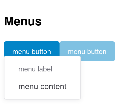
Currently, defining a menu is done like that:
<x-menu>
  <template #activator>
    <x-btn variant="primary">menu button</x-btn>
  </template>
  <x-menu-label>menu label</x-menu-label>
  <x-menu-item>menu content</x-menu-item>
</x-menu>
And will look like the screenshot below when displayed with Vuetify.
To give some context, we currently use this Menu element in two places in Cristal.
- For the “more actions” dropdown of a page, in the same was as we do in the flamingo skin for XWiki
- To show the list of available configurations in a Cristal instance.
In the first case, the interactive UI element that toggles the dropdown looks like a button. In the second case, it looks like a text, but is still a clickable element (we even have some dedicated cursor: pointer; CSS style to make it look like a button).
But ultimately, the user of the Menu UI element is currently free to provide anything in the #activator slot. And this leads to many kind of issues:
- As highlighted by the second example above, developers have to introduce tweaks to make the menu look good
- The
ariaattributes (e.g.,aria-expanded) are badly located, which is causing accessibility issues (raised by axe-core).
To address this issue, we have two options:
- Keep the slot unconstrained, but let the developers be responsible for making what they provide accessible
- Force the slot to be a button, and only allow developers to provide the inner content of this button.
The second option is less flexible, but as anyone with experience working on accessibility knows, option 1 pushed a lot of work towards users of the design system.
As I believe, we’d want to make sure that using a design system is as easy as possible, I’m +1 for option 1.
We could consider introducing a mechanism to bypass the default button to allow more flexibility for developers (at the cost of not having accessibility for free).
Here is how the example from above would look like after the proposed changes
<!-- buttons-props supports any props the button UI element supports -->
<x-menu :buttons-props="{ variant: 'primary'}">
  <!-- Only the button text is not passed by the user. -->
  <template #activator>menu button</template>
  <x-menu-label>menu label</x-menu-label>
  <x-menu-item>menu content</x-menu-item>
</x-menu>
WDTY? cc @pjeanjean
And that @CharpentierLucas for the accessibility advices!