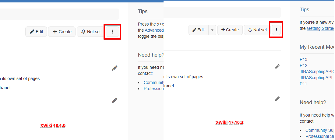
a regression was recently reported by @ilie.andriuta related to small UI changes created by the upgrade to Font Awesome 7: Loading...
There’s 2 issues in the ticket:
the more action menu button is now larger with more white space around the kebab icon
the icon button for closing a modal is slightly moved to the top when using Chrome engine
So, I want to highlight first that the second issue regarding the closing modal icon is really discrete: @ilie.andriuta is really good at spotting small changes I doubt I’d seen it. Also it “only” concerns Webkit engine apparently: the problem doesn’t appear with Firefox where the vertical alignment is perfect. Now I confess I don’t truly understand why it appears differently in Chromium as the rules are apparently the same.
Then for the more action button menu I confirm that the change is visible and it appears in both Firefox and Chromium: the change is related to the content of the icon itself which changes. The kebab icon used to not contain any whitespace, and now it contains whitespaces on left and right adding mechanically to the existing padding left and right.
Now my proposition for those two issues is to accept the change and not provide any fixes.
The reason is that for fixing those issues we would need to craft custom CSS rules, while here we’re entirely relying on very standard stuff. CSS is not easy to maintain, it highly depends on the devices where the output is performed etc. IMO it’s better to rely on standard rules as much as possible.
I know that the change might be a bit surprising at first for the more action button, since we’re used to see it thinner, but honestly I think it’s ok, and it might actually makes it easier to use on mobile devices. For the close modal button, as I said for me it’s barely visible so I really don’t think it would be an issue.
Are you sure we can’t have a CSS that is rendering the button well on all browsers?
I hope the answer is yes. If not, I would be (sadly) +1 to fix with an option rendering well on all browsers but Firefox.
According to the Usage share of web browsers of Wikipedia, Firefox is used by 2 to 5% of users, so it would leave about 95% of users with a slightly odd rendering.
I might be wrong but I’ve the feeling you focused on close button modal problem where it’s indeed more a browser rendering issue. And I don’t have an answer on this, what I’m sure is that even if we have a rule it means we won’t use the standard classes but add something on top of them, meaning having to also maintain them etc.
For the more action button menu, it’s not a browser rendering issue: it’s rendered the same everywhere, and for me we cannot that the button is not rendered well. It’s rendered the way it should with standard rule, it’s just that we used to see it thinner.
For the close button, the main root cause seems to be that we’re forcing a minimum width/height on the button without centering the content. That’s our skin. I’m not sure what’s the best way to center the content here, but it’s our code that causes this, not Bootstrap or Font Awesome.
For me what’s important is that the left and right margins between the border of the buttons and the first and last characters in the button text is the same for all buttons, for consistency. This needs to be measured but at first glance it feels like there’s more margins for the “more” button.
I checked this morning and the padding is strictly the same. The only difference is that the character itself contains a transparent box giving this feeling of more whitespace.
Neither --fa-display nor --fa-width are defined, so the default values are used. We need inline-block display, so can’t change that, but we can tweak the --fa-width value. Note that all icons are affected, but it’s not as visible as with the More actions button.
Yeah, from what I understand, FA7 made efforts to have all the icons have the same dimensions (17.5 * 14 px). Some icons before had aspect ratios that were really off, vertical ellipsis is one of the most important change.This is a problem right now for us but this change goes in the right direction IMO.
+1 to ignore the width change in the “more action” button
+0 to ignore the misalignment on the button, it looks a bit odd. I looked at it quickly and the issue is that our buttons are made to be inline: their content is aligned on the baseline, which is different from the center. If we want to change this align-content, it will have a noticeable impact on buttons containing text. Not sure if that would look bad, but this is a wide-scope so we should be very careful with it.