Accessible Fonts | Typography

Hey everyone! This is more of a discussion/debate/ question round. :grin:

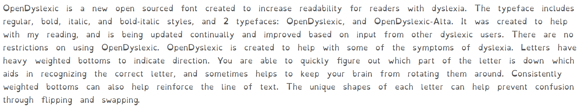
Question 1: When the Extra Accessibility Features are enabled should we change the font to something that accommodates better visually impaired persons?

Question 2: Should we just update the general font for body text to something that has more personality AND is better in terms of legibility & readability?

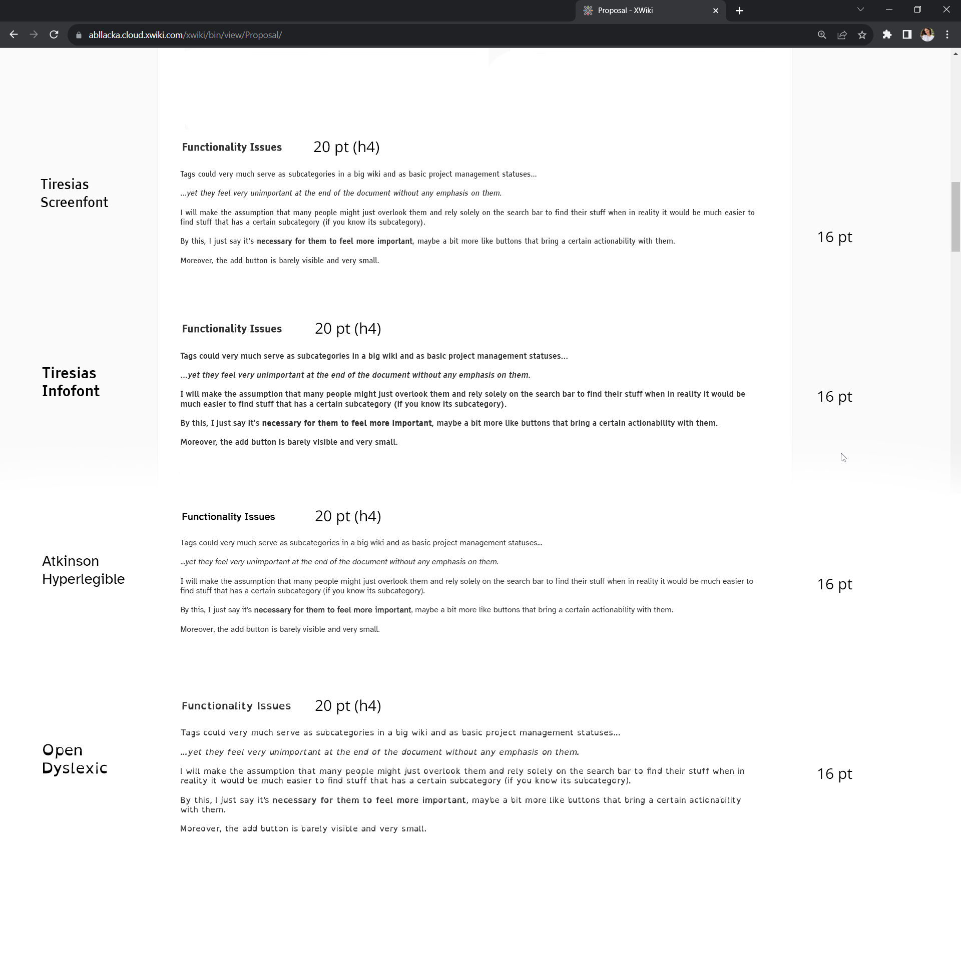
There are fonts like Atkinson Hyperlegible that was designed by the Braille Institute & Applied Design Works that clearly have accessibility in mind and actually have a bit of personality:

Atkinson Hyperlegible, named after the founder of the Braille Institute, has been developed specifically to increase legibility for readers with low vision, and to improve comprehension.
Having a traditional grotesque sans-serif at its core, it departs from tradition to incorporate unambiguous, distinctive elements—and at times, unexpected forms—always with the goal of increasing character recognition and ultimately improve reading.

This is how it looks:

image

Of course, we could stick with Open Sans as well:

Open Sans is a humanist sans serif typeface designed by Steve Matteson, Type Director of Ascender Corp. This version contains the complete 897 character set, which includes the standard ISO Latin 1, Latin CE, Greek and Cyrillic character sets. Open Sans was designed with an upright stress, open forms and a neutral, yet friendly appearance. It was optimized for print, web, and mobile interfaces, and has excellent legibility characteristics in its letterforms.

This is how it looks:

image

Question 3: Do you know other fonts that have been researched upon, have any stats or have been designed having accessibility in mind?

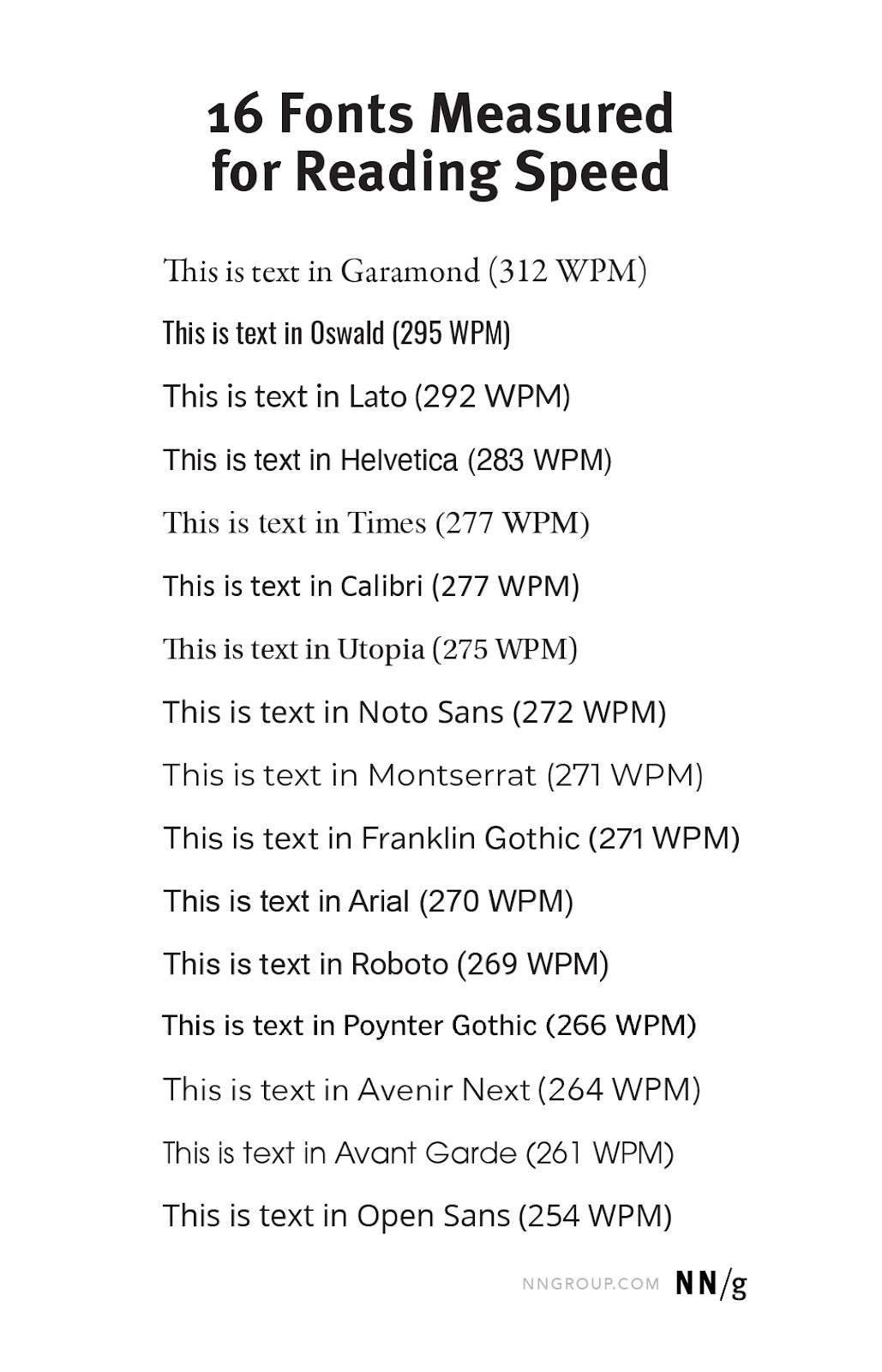
I’ve read researches like the one from Adobe where they’ve tested 16 fonts on 352 participants, but the conclusion weren’t very… conclusive. They did find that, yes, fonts generally matter a lot when it comes to reading speed and that certain fonts did work better… on average.

Among high-legibility fonts, a study found 35% difference in reading speeds between the best and the worst. People read 11% slower for every 20 years they age.

Average scores:

The article is very interesting and I can paste more if you’d like, but I don’t wanna make a 5 page forum post :sweat_smile:

1 Like

What about OpenDyslexic?

image

I think it would make sense considering the two features currently bound to ‘Extra Accessibility Features’ are:

  • Increase text size
  • Underline links

There is Tiresias. For us, Tiresias Infofont would be the one appropriate:

preview of the tiresias font

I think OpenDyslexic could be appropriate for a ‘Extra Accessibility Features’ user, but overkill for the generic user. :slight_smile:


Have a good day!
Lucas

Thank you for the suggestions! :grin:

@Simpel you had a good idea with OpenDyslexic. I was actually wondering if we could have a special option in the extra accessibility dropdown specific to dyslexia that when clicked does everything that the normal accessibility option does, but also adds this font. @CharpentierLucas , wdyt?

On Tiresias: it is a shame that Tiresias Screenfont is not open-source. The Infofont one seems to have its regular font-weight a bit too big. That means italic or bold text will be hard to get.

I’ve put all these options together to visualize:

Accessible font

As of now, we use a select element to toggle extra accessibility features.
accessibilityOptions
The simplest solution would be to add an option in this select. I’m not sure that’s the one we’ll keep since it doesn’t allow to select this font without the other accessibility changes.
The best solution might be to separate all of those different accessibility options and gather them in a new category in preferences.

I opened a ticket about it :+1:
Feel free to update the description if I missed something important :slight_smile:

1 Like

I’d be -1 for this as the goal of this select is to enable/disable the extra accessibility features only, not what it means. For that we need to list the extra accessibility options separately as you mentioned in:

It could be in a separate category or in the same one as now but in a section related to accessibility. That seems better since all the displayed options are all about preferences.

Is it necessary? I’ve customized my fonts by providing local ttf files and setting user-friendly size.

I was thinking not every user has the time to research what font might help his vision in the best way. Maybe they don’t even want to spend time doing that, postponing it endlessly doubting it would help them much.

Especially when talking accessibility in the context of long blocks of information, fonts are very important improving significantly the time spent on reading the content and thus on processing the new info.

Also, as researched by Adobe people don’t always choose the best readable text for themselves even if they think it’s visually good for their eyes.