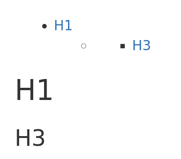
In a table of content, when the level between two consecutive heading is more than one, a superfluous item marker is displayed for the skipped level.
For instance, for the following content:
{{toc/}}

= H1 =

=== H3 ===
The current result is
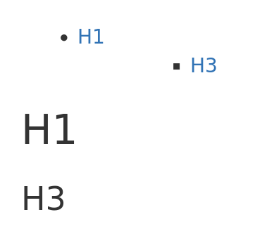
But should be
The proposed approach (see the PRs below) it to annotate skipped level with the nodirectchild class during rendering. And, to use this class to hide the item marker of those elements in css.
The main point to discuss is imo the choice of the css class which would become part of the macro API.
I’m currently proposing nodirectchild.
We ourselves thought about that point whether to hide those bullet points not having a header. But we decided against it. We decided to give editors a chance to fix it because the toc will look ugly otherwise.
To keep you posted, in the absence of activity on this discussion I’ve merged what I proposed a few hours before your answer. As the next release is not too close, it is still time to improve this change though.
Your point is interesting but imo having a “bad” document structure should not have a impact on the document presentation in read mode.
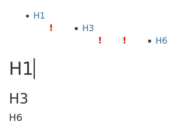
What we could do though it highlight the nodirectchild bullets by having a visual clue in edit mode. To help editor spot the issue.
For instance, with the css below, the toc looks like this in edit mode when headings are skipped:
That’s a good idea. I like this kind of warning. Will this warning appear on empty headings too? (Some users try to style gaps between paragraphs with empty headings. That’s not good for screenreaders.)
I don’t agree with this. I’m -0 to hide this from the table of contents, for the reasons that @Simpel mentioned. On the contrary, I would make that missing heading more obvious, something like:
Imho we shouldn’t force users to create accessible documents (the same way we, e.g., don’t force users to enter a sensible alternative text for images even though images without useful alternative text are not accessible). While I agree it is good to push them, if a heading level is skipped for whatever reason, the TOC should still look nice for users viewing the document. Regarding the editor, this is different of course, I’m +1 for displaying a warning in the editor, though I think there should be more than an exclamation mark such that the user really understands what’s the problem.
Alternatively, we could add a “force accessibility” setting where we would, e.g., display errors for images without explicitly set alternative text (as the filename really isn’t a proper alternative text) and either display errors for missing headings or insert them automatically with some “(missing)” text such that editors are forced to fix them.
I think users aren’t teached to use headers. They will use whatever will look nice. So +1 for a clear statement what’s wrong while in edit mode and have a nice view while reading only.
Second I like the idea of a “push accessibility” setting. Things like missing alt text, empty headers or wrong header levels could be “marked” and teached. Even empty paragraphs (2 new lines or more) could be easily avoided.
Maybe while this setting the ckeditor plugin a11ychecker then could be standard and one step further even started when saving. We have this plugin and aware people use it. I myself very aware of a11y forget things and I am lucky to be reminded.