Hello everyone! I’m here to talk about some improvements we could make to the Attachment Selector modal. ![]()
Current situation
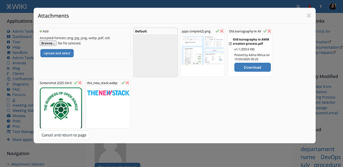
Modal version (there is a in-page version too, but they look the same)
Identified issues:
- after browsing and choosing the file, the user still needs to click Upload and Select, which is not a normal UX pattern and also prelongs the action that the user wanted to achieve.
- the X icon is not cohesive with the icon that we use now for forever delete (the trash)
- the check icon isn’t clear in its meaning, especially when it’s near the X icon.
- visually unbalanced layout, not enough space between elements (UI / aesthetics issue)
- there is no functionality for replacing files with their latest version.
- opening images in their full size is not clearly defined as an action. It is not intuitive that clicking on the thumbnail will open the image in full.
Redesign
Explanations
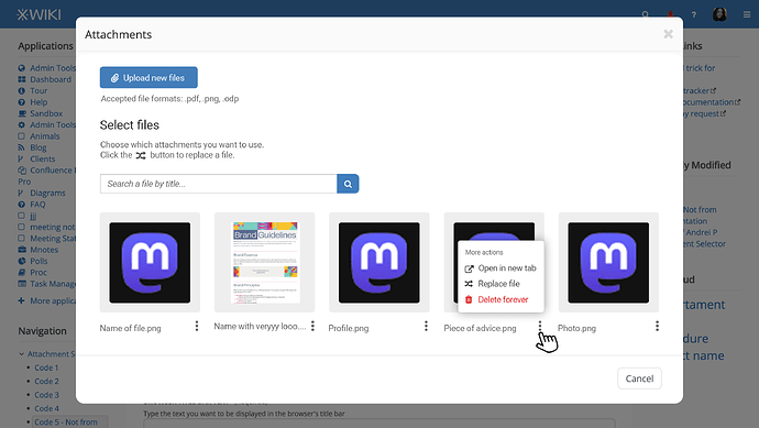
Globally, the redesign keeps elements on a vertical layout that’s easily scalable for mobile, with lots of breathing space between elements.
Opening the modal, the first action that the user is shown is the Upload one.
Clicking on the Upload button, a file dialogue opens, the user chooses the file and it gets directly uploaded without needing to click another button like in the current version.
While uploading the file, we can replace the button with a standard loading bar.
If the file can’t be uploaded, an error message box will appear after the file format.
In the Select Files section, the files are sorted based on date they were uploaded (the newly uploaded ones first).
All files have a relevant thumbnail: images are just scaled down in their gray (panel-colored) boxes and documents have their first page shown as thumbnail. If the latter involves more development effort than anticipated, we can just generate a thumbnail showing the icon of the format, the full title and the date of the upload.
In this section, 3 actions can be done:
#1 Searching for a file - In case we have a big variety of files, a simple search bar allowing the user to filter by title/ keywords will prove useful.
#2 Choosing a file - In the updated version, clicking on the thumbnail of the file will immediately choose the corresponding file and exit the UI. Choosing the file is the main action of the UI so it should be as simple as possible.
The following actions are available from the 3 dots menu:
#3 Opening the file in a new tab / Downloading it - This action should be clearly defined so the user can perform it with intent not just by guessing (as it currently is for images).
#4 Selecting a file for replacement - In the current version, the user can’t replace a file. I believe that for internal usage in an organization, the functionality of replacing a file in an attachment selector is important to avoid file duplication and to keep a single of truth. Clicking the switch icon will open a file dialogue. After upload, the user is returned to the current UI where he can see the replaced file in the list. When replacing a file, the title stays the same.
#5 Deleting a file - Clicking the trash icon, the file is deleted forever. We make the delete action red, together with its icon, to signal a distructive action.
At the bottom right of the whole modal we move the Cancel button so we’d be more cohesive with all other modal UI’s in the XS.

