It’s such a minor cosmetic thing, but it really gets on my nerves. It started when I upgraded to XWiki 15 if I remember correctly
btw, when the mouse goes over the bell, the light gray square around it becomes a little darker
It’s such a minor cosmetic thing, but it really gets on my nerves. It started when I upgraded to XWiki 15 if I remember correctly
btw, when the mouse goes over the bell, the light gray square around it becomes a little darker
Hi!
This is probably related to the changes made in XWIKI-18004: Alert menu cannot be activated with keyboard + hover message not accessible with keyboard by Sereza7 · Pull Request #2125 · xwiki/xwiki-platform · GitHub that solves an accessibility issue made on 15.4.
Could you check that the SSX (skinsheet extension) on the page NotificationDisplayerUIX got properly migrated? My guess is that you made a change on it, so the migrator did not update it to not overwrite your changes, and now you have the old style rules with the new HTML.
If you cannot see a block targeting #tmNotifications in the stylesheet, try to add the changes from the PR above, it should work better after that (note that you should probably unescape the > if you update your object with the UI ![]() ).
).
Thanks,
Lucas C.
Charpentier, I posted the question because I was trying to fix it through the Theme LESS Code and I was failing, so I thought I could not fix it there.
But after posting, I realized I was targeting the wrong class. There was a class BEHIND the icon.
Added this to the LESS Code of the Advanced Tab of Theme Editing
/* Ensure the parent elements of the bell icon have a transparent background /
#tmNotifications.dropdown,
#tmNotifications.dropdown button.dropdown-toggle {
background-color: transparent !important;
border: none !important;
box-shadow: none !important;
position: relative;
top: 7px; / Adjust this value to move the icon vertically */
}
/* Set the bell icon color to white with transparent background /
#tmNotifications.dropdown .fa-bell {
color: #FFFFFF !important;
background-color: transparent !important;
transform: scale(1.2); / Increase the size by 5% */
}
/* Change the bell icon color to #383838 when hovered with transparent background */
#tmNotifications.dropdown .fa-bell:hover {
color: #383838 !important;
background-color: transparent !important;
}
notice that not only I corrected the colors as I also made it bigger (about same size as magnifying glass) and pulled it some 6 pixels down to align.
All of that on the administrative area that in theory should change only COLORS lol.
As we can see, in the advanced tab, with LESS code, we can change a lot more than just colors.
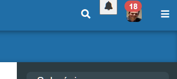
how it was
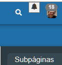
how it became

edit: I just noticed the notifications number was pulled down over my avatar face.