Brainstorm: UX Guidelines for XWiki and Cristal

Hello everybody. This is probably something that’s long overdue but I’m thinking on starting to write down some basic UX guidelines to be used for XS and Cristal. The objetive is to have a central repository with our UX decisions.

This comes as a result while checking the proposals for the link dialog on CK and XWiki and BN and Cristal and also the recent Improve the L&F of places using Hints about input Hints.

Why just not use the proposals page?
This is, for me, different than the proposals which have a beggining and, eventually, reach an end, also they tend to be more specific in their contents. The guidelines should be an end on themselves, a repository of documentation for anyone wanting to develop UIs for XWiki/Cristal.

The documentation would intentionally feature minimal visual design, as this is determined by the design system or theme used in each project. This also makes it more future proof.

Something like this:
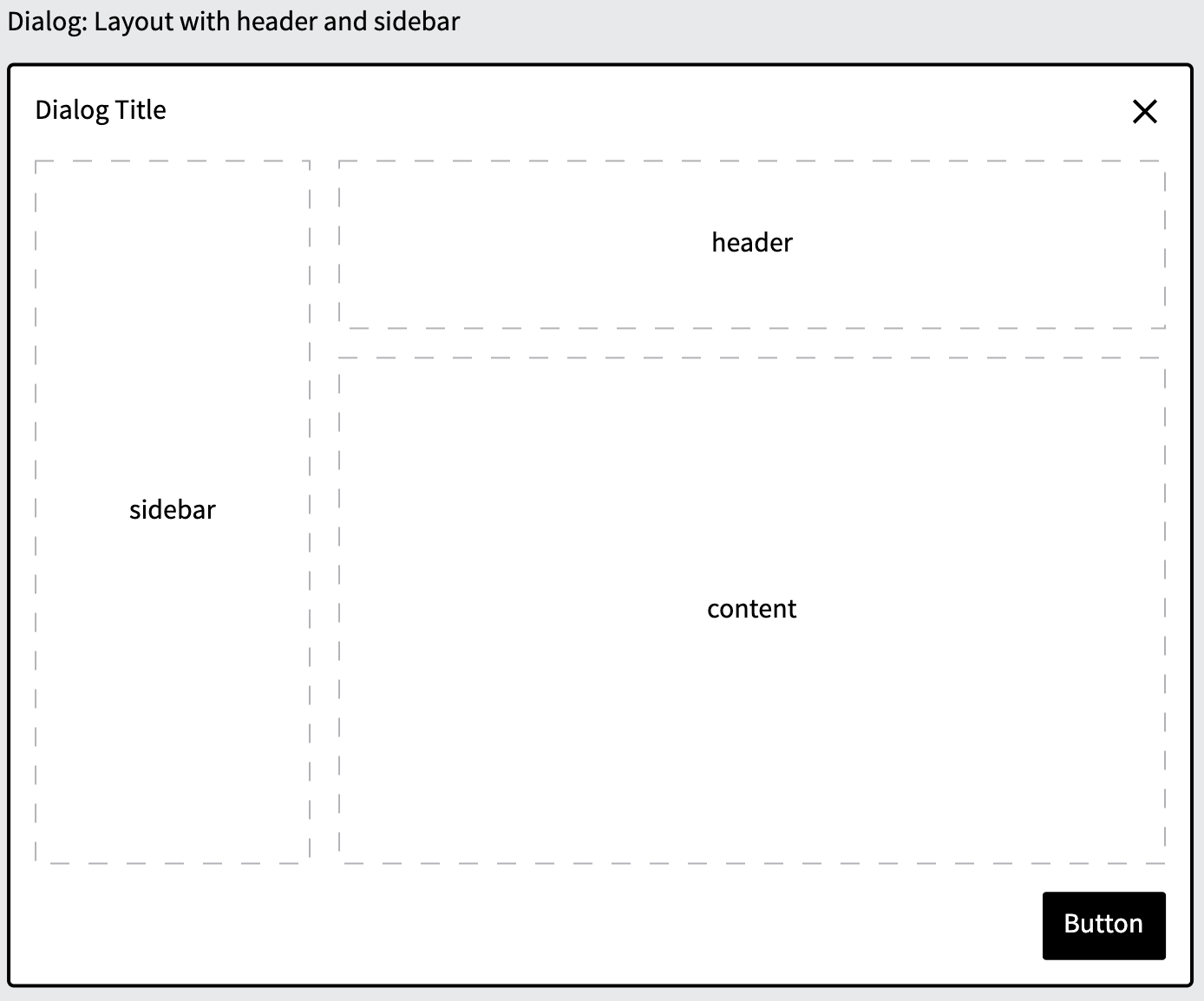
Just some pictures?

No, in each document we’d have:

  • Use cases
  • Best practices
  • What to avoid
  • Examples

This can be extensive depending on the number of subjects we want to cover, but we have to start somewhere. My idea is to begin with the Dialog component and then expand to other subjects. Each new addition would get its own discussion here on the forum.

What to avoid
The documentation should avoid being overly strict, as this could limit UI design flexibility. Instead, we should aim for balance. For example, rather than “Hints should be placed below each input label,” we could say “Inputs should include a hint, when appropriate, to demonstrate how the field is used.”

Where do we put it?
I propose we use this page as a starting point: https://dev.xwiki.org/xwiki/bin/view/UserExperience/ since it’s public and already on the same subject.

Dont we already have something like this?
Sort of, we do have https://design.xwiki.org/xwiki/bin/view/Standards/ but the approach in this is a bit different since it’s a lot more specific than what I’m proposing. It’s also way outdated and should be reviewed anyway.

So, what do you think? Would you find it useful? Do you have any subject that I didn’t touched above? Or maybe is too much work for little benefit?

Thanks

1 Like

From what I could read, those guidelines are grouped based on the Abstract Design System. It was not clear to me initially.

Maybe only for some complex components, but it might be interesting to have a section for edge cases: there can be a lot of unexpected ways to interact with interfaces or combinations of inputs that are not as important to know about as “the main use cases”. But keeping some traces about how we handle those edge cases can help make a full implementation more consistent.
E.g. for the dialog sidebar, what do we do if its content is too long? Do we add a scrollbar, do we add an ellipsis with a “details” button, do we just make it big enough to fit everything and have a mostly empty dialog screenspace…

This kind of info is not necessary for a first implementation of the component, but any advanced implementation of the component could use those to improve consistency.

I agree. Personally the fact that it’s called guidelines is enough for me to understand that it’s not strict rules, but keeping a clear tone on this would be even better :slight_smile:

From what I understand, this is very related to the design system project. Shouldn’t we include it in the new developer documentation, somewhere under https://www.xwiki.org/xwiki/bin/view/documentation/xs/dev/front-end/design-systems/ ?

I’m not sure I understand the main point as a guideline. As some documentation for standard components of our design system, it makes more sense to me.

I want to use a UX guideline when I’m developing a new component. AFAIK this could be used twice at most, once for the current XWiki Standard UI and once for Cristal. But in the end devs implementing those will very likely contribute to writing the guidelines so they would probably be part of the people that would need it the least.

A documentation of the component is something I’d look for when I try to understand:

  • How to extend an existing component to add a feature (either something standard or a customization for my instance).
  • If an edge case behaviour is a bug or a feature. Some legacy UIs in XWiki support weird edge cases that we usually always keep as features because we don’t have enough traces off the thinking done about them.
  • How to reuse this component in my custom UI or in another standard component.

I don’t think I understood the whole idea yet, I’m looking forward to continue the discussion :slight_smile:

Thank you for making progress on this important topic!
Lucas C.

Hey Lucas, thanks for the inputs.

Well, the idea is to have an XWiki version of Human Interface Guidelines | Apple Developer Documentation. It probably wouldn’t be as extensive though.

It’s related, but the front end section is very technically oriented, while the guidelines would be more conceptual. I see the target users of the guidelines to be developers and non-devolopers. So if a new designer, for example, wants to contribute to XWiki, we already have some sort of starting point on how to proceed and what our standards are.

I’m not sure I understand. If Dev A is implementing and helping to document some guidelines for component Z. But that doesn’t mean that Dev B is aware of those, or even Dev C, two years later and new at the ecosystem. Dev B and C would certainly appreciate the doc when the time comes.

Thanks again :slight_smile:

Thanks for pointing out an example. Now I understand better what you are aiming for.
+1 for the idea. We definitely have parts of this kind of documentation scattered around, but having a structured and exhaustive documentation is definitely interesting.