Change the splitting of documentation from Product > Target > Topic to Product > Topic > Target

Hello! :waving_hand:

This proposal is about changing the navigation and page hierarchy of the documentation of XWiki.org.

Context

Currently, documentation is splitted by Product (XWiki Standard and Extensions), then by Target (User, Administrator, Developer). The navigation changes based on what Product and Target the user selects. So, after selecting the Product and Target, a list of topics is displayed below in the navigation. This helps users filter the page they might be looking for based on their role in the wiki. Topic pages (top level pages) are pinned in the navigation by relevance.

Documentation is splitted by target before topic. It was not considered before to not have targets before topics. In the forum proposal for navigation tree: Proposal 7, the two options proposed were:

  • Option 1: Target > Topic > Type,
  • Option 2: Target > Type > Topic.

The majority voted for option 2 of the Navigation Tree proposal.

The target and product concepts were then moved outside of the navigation, (as we currently have), and a third option was proposed:

  • Option 3: Nav ordered by Topic only (with 4 extra entries for the types), (see Vincent’s comment.)

Option 3: having documentation split by topic only in the navigation was then agreed: Forum comment, while also having another navigation panel for the targets. To get all documentation for an extension, you need to go on the Extensions wiki page and click on the “Documentation” button (Forum solution).

Advantages of having target > topic

The advantages discussed on the forum highlight why is better to have documentation splitted by topics only, considering the fact that targets are already selected in another panel, before topics. However, some advantages of having Target > Topic:

  • Not having an extra level in the navigation under the topic. E.g., avoiding this:

        ├─ Page
        │  ├─ User
        │  ├─ ├─ Edit a Page
        │  ├─ ├─ Simple and Advanced Editing
        │  ├─ ├─ ...
        │  ├─ Administrator
        │  ├─ ├─ Administer a Page
  • Readers look for different things, a regular user who just uses the feature in XWiki would not be interested in APIs, etc. Some topics are only relevant to specific targets and don’t have documentation for all roles.
  • Improved on-boarding experience for readers.
  • Not mixing targets within the same page hierarchy. (Instead, the “Related” section is used in a documentation page to point to additional documentation that could be for other targets).
  • This split, combined with the order (User > Administrator > Developer), also conveys the idea of levels of responsibility, where the administrator role includes user capabilities, and the developer is the highest level.

Disadvantages

  • Harder to get a complete view of the topic.
  • Unable to export a PDF for example for a topic with the full documentation.
  • Readers may not always identify with a single target.

Thus, the following is proposed:

Proposal: Have documentation split by topic and only then by target

In “/documentation/xs”, or in “/documentation/extensions” instead of having cards for each target there will be cards for each existing topic, no matter the target (e.g.: “Base”, “User”, Notifications", “Installation”, “Applications”, “Like”, “Data Model”,…etc). When clicking on a topic, there is the possibility to split again documentation by target. Below, option 1 is for adding an extra level in the navigation for each target, option 2 is for adding an extra level also in the page hierarchy, while option 3 is for not adding an extra level for the splitting.

Option 1

Adding a level for the target in the navigation, but not in the page hierarchy, by making the Target level not clickable.

Product
  |_ --- User Topics --- (not clickable)
  |_ topic 1
    |_ subtopic 1
  |_ topic N
  |_ --- Administrator Topics ---
  |_ topic 1
  |_ topic N
  |_ --- Developer Topics ---
  |_ topic 1
  |_ topic N

Advantages:

  • Easy to implement.

Disadvantages:

  • Creates confusion as some tree nodes are clickable, some are not.
  • Breadcrumb different from page hierarchy.

Option 2

Adding a level for the target in the navigation (and page hierarchy).

Advantages:

  • Easy to implement, just create new pages for each target for each topic/subtopic.
  • Documentation pages have a proper parent, making it not to mix documentation pages for different targets in the navigation or page hierarchy.

Disadvantages:

  • Raises the question: “Where in the hierarchy do we introduce the target level?” (e.g., under the topic, or under subtopics?), leading to potential duplicates in the navigation.
    • Example:

Target level inserted after subtopic:

├─ Base
│  ├─ Page
│  ├─ ├─ User
│  ├─ ├─ ├─ View a Page
│  ├─ ├─ ├─ Create a Page
│  ├─ ├─ ├─ ..
│  ├─ ├─ Administrator
│  ├─ ├─ ├─ Administer a Page
│  ├─ ├─ Developer
│  ├─ Wiki
│  ├─ ├─ User
│  ├─ ├─ ├─ ..
│  ├─ ├─ Administrator
│  ├─ ├─ ├─ ..

Target level inserted after topic:

├─ Base
│  ├─ User
│  ├─ ├─ Page
│  ├─ ├─ ├─ View a Page
│  ├─ ├─ ├─ Create a Page
│  ├─ ├─ ├─ ..
│  ├─ Administer
│  ├─ ├─ Page
│  ├─ ├─ ├─ Administer a Page
│  ├─ ├─ ├─ ... 
  • Does not solve the issue of exporting documentation in a single PDF for a topic/subtopic, since content is fragmented across targets.
  • Too many levels => too nested.
  • Can duplicate subtopics (e.g. “Page”) under each target.
  • Not all topics/subtopics have documentation pages for all the targets.
  • Targets would be under each topic/subtopic the levels => redundant.
  • If we stick with this, there is no path to improve (as in option 3).

Option 3

Not adding a level for the target in the navigation and convey the separation using other methods: having in the page title the target, use some styling (icons). The major advantage of selecting this option is that it allows to build additional improvements on top of it.

Idea 1: Mixing the pages in the navigation

Having the pages just below the topic, without any other level. The breadcrumb will list all topic pages for all targets at the same level. After mixing all the doc pages for all targets under the same topic, we would probably re-group the children pages where it makes sense.

Retired section, check the *Update of proposal* section below instead.

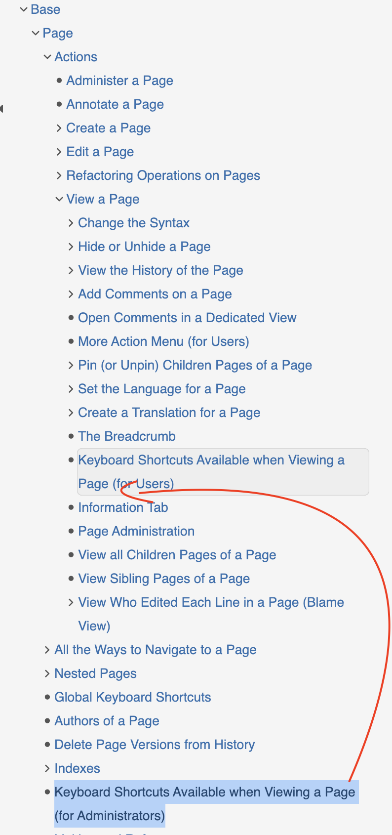
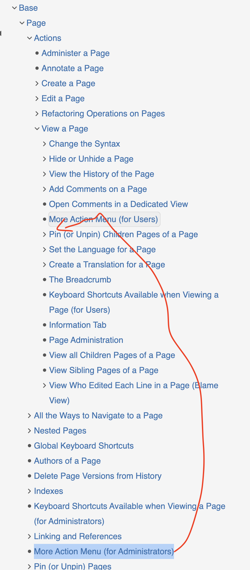
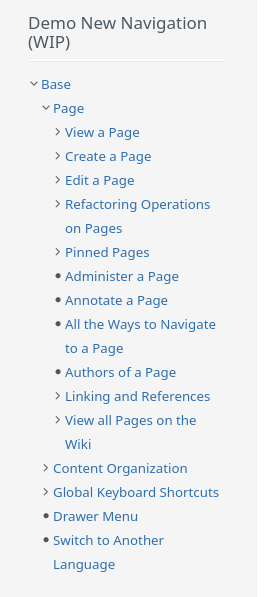
I’ve made a slight modification to the existing navigation to simulate Option 3, where we mix the pages for all targets. Specifically, I’ve adjusted the navigation for the “Base” topic and the “Page” subtopic by moving the child pages from the Administer section to the User section. This modification is a demo to visualize how this option would work in practice.

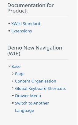
Update of proposal: I’ve implemented a Demo New Navigation in the panel, where Option 3 is simulated, mixing the pages for all targets. I’ve adjusted the navigation for the “Base” topic and the “Page” subtopic by moving the child pages from the Administer section to the User section.

Observations:

  • There are too many subtopics, which might make the navigation too complicate. After mixing all the documentation pages for all target groups under the same topic, we’ll likely need to reorganize the child pages where it makes sense. For example, I’ve grouped related page actions under the “Actions” subtopic, added “Indexes”, etc.

Advantages:

  • Can be combined with Idea 2 in the future to have a visual separation of doc pages.
  • Can be combined with pinning the pages per targets (display user doc first, then admin, ..).
  • Can be combined with Idea 3 in the future to filter the target.

For example:

├─ Page
│  ├─ Edit a Page
│  ├─ Simple and Advanced Editing
│  ├─ Administer a Page
├─ Like
│  ├─ Like (or Unlike) a Page
│  ├─ Administer Like Preferences
│  ├─ Like API

Issues:

  • Sorting the pages to display first pages for Users, then for Administrators, then for Developers is needed, meaning custom code is needed. This can be achieved also by pinning the pages, but then every page must be pinned => Hard to maintain.
  • Many irrelevant pages for the user displayed in the page hierarchy, making it harder to find what they are looking for.

Idea 2: Use icons per targets

For example:

  • user​ for user documentation pages,
  • wrench​for administrator documentation pages,
  • One of the following options for developer documentation pages: bug​/ database​/ bricks​/ application_put .

Advantages:

  • Nice visual separation for each target.

Issues:

  • Custom code is needed to display in the navigation the icons.
  • Sorting the pages to display pages in order (User > Admin > Devs) / or having to pin them.

Idea 3: Filter in a separate section of the panel the target

Add a dedicated section in the panel with three target options (User, Admin, Developer), each with a checkbox. Readers can select one or more targets, and the content tree below dynamically updates based on the selected audience. This allows to have all docs under the same topic, without adding a separate level. If no target is selected, all docs are displayed in the navigation.

Advantages:

  • Probably the best solution for the readers as it’s flexible.
  • Keeps all related documentation under a single topic
  • Can be combined with idea 1 and idea 2.

Issues:

  • Complex to implement and creates a lot of issues to solve.
  • Custom code is needed for implementing the filtering (extending or reworking the documentation tree macro).
  • Clarifications for the filtering behaviour are needed, as these factors introduce complexity in the system’s design and implementation:
    • What if a selected target has no pages in a topic? Should empty topics be shown or hidden?
      • For example: What happens if the reader selects “Developer”, but the topic has no developer pages. → Do we keep the topic and display nothing under it? Do we filter out also the topics that have no subpages for that target?
    • If a child page matches the filter but the parent does not, should the parent be displayed?
      • For example: The user selects “Administrator” as the target. The navigation lists “Administer a Page” targeted for admins, but the parent page “Page” is dedicated for Users. Is “Page” also displayed in the navigation?
    • When navigating to a page outside the selected target, should the navigation filter reset, update, remain the same?
      • For example: If a reader selects “User” (filtering the navigation to User documentation ) and then clicks a link to a page targeted for Administrators, how should the navigation behave? Should the filter reset, adapt to the new page, remain the same as selected previously ?
  • Different breadcrumb than the navigation if at least one target is selected. (The breadcrumb will list all topic pages for all targets at the same level).
  • Currently, each topic page (e.g. “Base” has a type and a target (check proposal: When to use landing pages ). Landing pages for topic pages were originally removed to allow topic pages to have the DocClass object and appear as proper documentation entries in the LiveData. The topics and subtopics pages targeted for users are different from the ones targeted for administrator, (e.g. “Page” for Users is different from the “Page”). This raises a key question: should we revert to using landing pages again for topic pages, or support multi-target topic pages (i.e., allow a single page to be associated with multiple targets)?

Note: The options above will apply to both documentation for “XS” and “Extensions”.

Our preference (mine and @vmassol 's) goes towards option 3, as it provides the most flexibility and can be further improved in the future by incorporating the ideas mentioned above. In contrast, the other options are more rigid and don’t offer the possibility to be improved.

WYT about this new approach of organizing documentation by topic and then by type? Which option do you consider more effective, and do you have any alternative suggestions?

Thanks!

It’s missing several other points:

  • When doc readers are on a topic, and want to see the admins options, they cannot switch to the admin docs. They need to click '“Administrators” and re-navigate to the topic in question.
  • Doc writers needs to write docs in 3 different navigation trees (users, admin, devs)
  • We had to create a special technical pages to link all docs for an extension on exo. For ex: https://www.xwiki.org/xwiki/bin/view/DocApp/Code/ExtensionLD?id=org.xwiki.platform%3Axwiki-platform-like-ui&name="Like" and:
    • It’s missing the left panels
    • When you click on a doc page in the table, you leave that special pages and cannot return to it

It’s not so easy to implement since the separator entries should not be clickable and should ideally be displayed differently than real tree entries.

Yes, and we’ve decided that the best was to group set of features together in the navigation, and have different tree levels to make it easier to navigate and not have 100 topics at the same level. Having User/Administrator/Developer at different level doesn’t work (since when you’re in “Users” for ex, you can no longer have User/Administrator/Developer at a lower level).

Note that this problem is also true for option 1!

I don’t see the tree, did you forget to add it? I’d really like to see what it looks like (we discussed that you’d show it in this proposal :)).

EDIT: oh I think you’ve done it live!!! Well we need to revert this quickly. We cannot do that to a production system, and it’s not been agreed anyway! Please add the tree view in this proposal (never depend on external systems in proposals since these systems can change and the proposal won’t be readable anymore).

This should be done manually with pinning IMO. We already need to do that and for all pages to guarantee an order.

We should find all doc pages matching the selected targets and display them, with the full hierarchy leading to them.

We should find all doc pages matching the selected targets and display them, with the full hierarchy leading to them.

You didn’t mention it above but with option 3, the filter would need to be remembered when navigating from page to page. Probably in the user session (or in the browser local storage).

So for me in the case you mentioned, the tree should not display a highlighted entry.

That’s not a problem. They’re actually in sync; it’s just that the nav is filtered.

This is not related to option 3 but is an issue we need to address for all options (it’s caused by the fact that Topics are displayed first).

My position is:

  • First, I think that Topics > Target solves some issues, even if it makes things a lot more complex to implement.
  • My preference is for option 3, idea 1 for now. Ideas 2 and 3 are interesting but quite complex to implement and I’d need to check with @mflorea to see what can be done and the complexity. Now, without idea 3, I don’t think we can say that we have a good solution for our readers.
  • I’m currently -0/-1 for options 1 and 2 as they’re broken for me and cannot work, because of the multi-level aspect of the doc hierarchy.

Thanks

Small detail, but you forgot to mention that we’d need to add a “Target” column to all doc page LDs, especially for option 3 (but also true at different levels for the other options). So that users can filter the docs by target in the various LDs.

Also note that with option 3, we can (and should probably) mix docs for different targets in the nav. It’s not users then admin then devs all the time.

For example:

Make more sense to me.

Another example:

PS: I don’t think “Actions” is a good level in the tree. Basically any Howto is an action. For ex you left pinning a page outside of action, but I’m not sure why. I think we need a better term or some other organization.

In a few words, I don’t agree that the disadvantages of the current system outweight the benefits.

IMO this is one of the best things we get with the new documentation. From my view this is especially important for the non tech-abled users because:

  • They need the least info out of all user types
  • They are on average the worst at finding the relevant info for them on a large page.

I pain to see a topic where the user wants to learn about Everything but cannot navigate a few pages.
Users never need admin or dev docs.
Admins never need dev docs.
Usually devs already know the features they want to extend when looking through the doc so they don’t need the user doc much.

In addition, IMO if we write the doc well, related pages should be linked:

  • Admin page to change an option links to the doc of the user case impacted by that option.
  • Developer pages to update/extend a feature should link to the admin pages with the options of this feature (if there’s some) and the user page describing the feature.

I understand this point :+1:
Note that 3 PDF for different kinds of users still make sense in a lot of use cases I could think of.

IMO it’s good for readers to understand when they do things that are of a “user” scope and when they do things that are of a “admin” or “developer” scope. Typically the three categories should not expect the same level of support and depth for features. “Dev” features are way more sensitive and the user needs to know they could break things badly if they prode at it too much. “User” features are safer to use and ‘play’ with, usually we have safeguards and if anything breaks from an unexpected use of those we treat it as a high priority bug. By comparison, a dev messing around with some developer features and breaking some of their instance will in a lot of cases just end up in an “improvement” ticket AFAIK.

So far I assumed the difference between types is obvious since those words are pretty generic, but we maybe we could have a page to make it clear?


-1, we don’t get the “unified doc” advantages and we make things more complicated for navigation.
I don’t like too much repeating topics in the same tree, I think it could lead me to a lot of confusion because the tree is large.

-0, I disagree with the base idea but I think this would be the best way to have the target info in the navigation (my personal preference is under sub-topics, this way we don’t mix Topic>Target>Topic).

By itself, I dislike the idea. It feels like targets are not even needed anymore (you can only see the target of a doc when reading it). With option 2 it could be okay.
In addition there’s even more sujective choices to make when updating the navigation: when do we make a group? How do we group items?,…

I agree with this idea. Note that this icon could be used in a few places in the UI to make it easier to identify the target from a glance. This idea can be useful with the current model.

A similar (or complementary) idea would be to use a color-code for user types.


OFC the colors in this quick draft are just a suggestion and should be thought about carefully.

I don’t have much to add. I’m not sure how relevant this idea is without option 1 but it doesn’t look to me like it’d be hurtful to the UX of our doc.

Thanks, that’s useful (please check the other downsides I’ve listed in my first reply, maybe there are points that could make you change your mind?).

Curious to see what other devs or community members think.

I feel it’s less needed with the current model because:

  1. We separate the docs with the different navigation (per target)
  2. We display the doc target already when viewing a page (it’s displayed in the tags area as a badge). You might say that it’s not very visible but that’s done voluntarily as I don’t believe it needs to be more visible.

Colors are always tricky. In any case that’d only be a minor improvement ATM since we already have some text naming the target.

This is true for XS bundled extensions that usually come with options and extensibility. I’m not sure this holds true for some basic extensions outside of XS for which the only Admin doc are standard extension management actions (install, update, remove).

IMO this is a very small problem, there’s quite a lot of things we now expect from doc writers (example: understand diataxis), navigating in a couple of different trees is far from the hardest thing to handle in my experience.

I’m not sure a reorganization of content is the simplest or best way to adress those. It looks like we could also rely more on this page: make the experience nicer on this page AND make it easier to access this page (maybe with a badge that links to it on the bottom of docs?). Is there a reason why you don’t want to rely more on this page?


EDIT: I forgot to address your first point

This problem could be reduced with a badge to the special page. Currently I think I’d do it by:
User doc → Extension page on EXO → Special page of the extension → Pick the in the breadcrumb of an admin doc.

In my current path, it would save me going back and forth from EXO, making the special page the only intermediary page left.

Yeah, with the current system I agree that it’s just a would be nice :+1:

Our use cases are a bit different but we try to hold all infos for a topic in one place/space more or less.

We have e.g. applications as root. There are a lot of applications inside. Each application can have informations for different users. We try to target the user with useful titles for the articles.

Sometimes it’s better to collect them all in one article but divide it in different sections/headers starting with low level and climbing up the levels.

As xwiki.org changed it’s documentation to product > target > topic I did struggle a lot with it. For me it’s more important to have a good search and a lot of useful tags.

Hi! I reverted. I created a Demo for New Navigation instead. I combined the docs from /xs/user/base with /xs/admin/base . You can explore it and compare it with the existing navigation for the two targets. Here’s how it looks:


A few observations while creating this:

  • Indeed displaying all docs for users first, then for admins, etc., doesn’t work well. Mixing them is more effective as it allows to really achieve what’s needed (topics> targets).
    • This allows for better topic grouping (e.g., in the demo, I created the “Global Keyboard Shortcuts” hierarchy, simplifying the nav tree for “Page”).
    • However, if we stick with it, we’ll need to rework the “Related” sections of the Documentation Pages and also potentially change the location of some pages (e.g., I moved “Keyboard Shortcuts” from “Page” to “Base”).
  • Some pages under “Administrator > Base > Page” were placed under “Page” because they didn’t have a more specific parent.

WYT? Thanks!

Hi!
Thanks for the feedback!

When you mentioned that you struggled a lot with the new system in xwiki.org, are you referring to the fact that you were more familiar with the previous documentation layout and had trouble finding the new location? Or do you feel the previous version was better?

Any feedback on the new documentation system would be greatly appreciated, especially from someone who has used both the current and the new layout. If you have a few minutes, it would be really helpful if you could share your thoughts on the new document system in this thread: Feedback on the New Documentation.

(Note: Just to clarify, when I say “previous”, I’m actually referring to the current documention, and the “new” one is the one from the recent reorganization. Thank you!

I’m not sure why this is. Maybe I changed the need for information a lot.

2022 we did release our xwiki. We 2 admins had a lot of questions but we learned the provided hierarchy fast because we used it very often.

Nowadays we don’t have to look that often for answers. And when we have they are very special. I often try the search but are overwhelmed by the mass of results. You have to click a lot on the “location” facets to find the right place.

So I do like the search input at https://www.xwiki.org/xwiki/bin/view/documentation/ (small letter d for documentation) as that fixes clicking for the right location.

Btw: I would present the search input much more prominent. “What are you looking for? should be top and a bigger gap before all the other stuff.

PS: The button “Documentation” in the top menu is highlighted when hovered but you can’t click them. You nearly have to point on the letters to click. That’s not aligning with all the other top menu entries having a pull down menu.

1 Like