Color theme: Panel content

Good afternoon!
This forum proposal is based on the reflection initiated by @lucaa on XWIKI-21105: Drop the panel-default-text color from the color theme and use the content colors for all panel content, to facilitate contrast .

The issue: as of now, we can define a couple colors for panels in the color theme. However, all the ‘special’ elements in panels do not have a specific color. So if we want a panel background vastly different from the main content background, there might be some contrast issues that can’t be solved.
This is a problem because panel personalization with the color theme is only partial: we can change the background and main text color (and even the title color with some custom LESS!) but it’s not possible to get a unique color for anchors in panels.
EDIT: Fixed this screenshot, there was a field that wasn’t in the standard flavor.

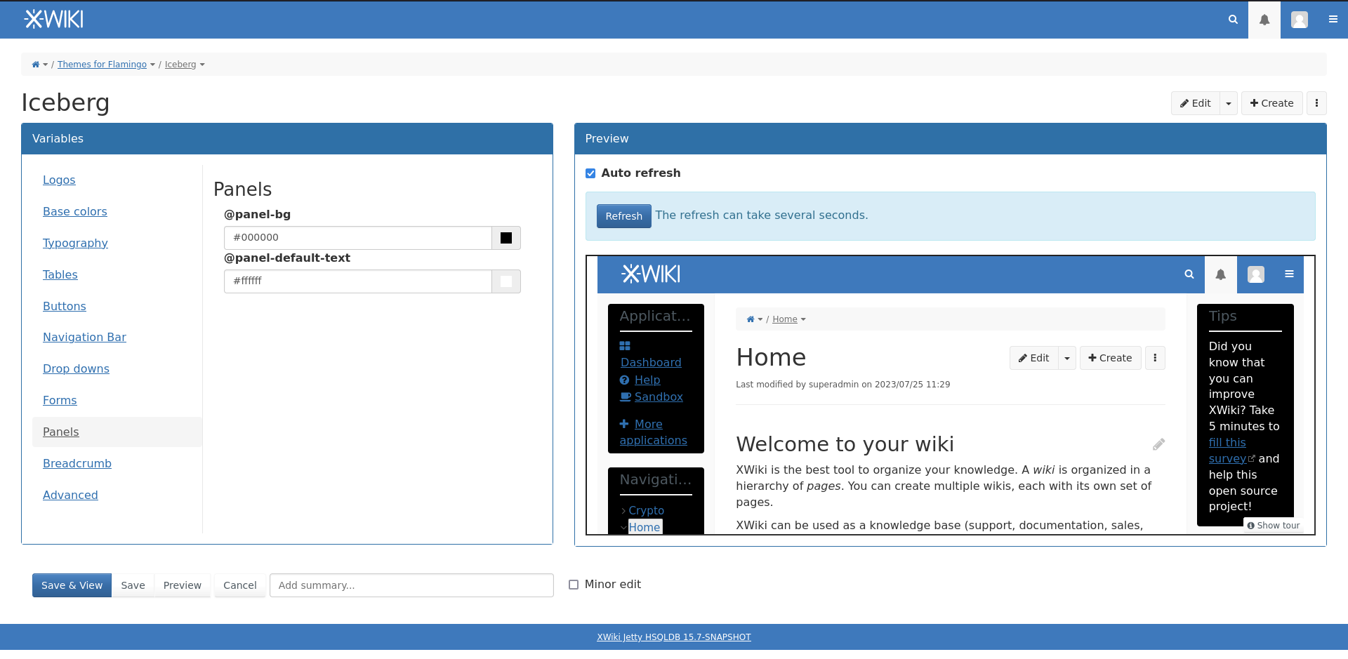
Here, I want a main content with a white background, and black background panel.
So obviously I change the main text to white in order to keep good contrast. However, a lot of the content in the panels we can see are links. Those links are really difficult to see on the black background, but I have no way to change their color without also changing the contrast with the main page content.

In the ticket, @lucaa proposed two solutions:

  1. Add a lot of variables for all the elements we might need: @panel-link-text, @panel-link-hovered-text, @btn-danger-bg, @btn-warning-text, @…
  2. Remove the main text variable, and change the panels so that they follow the main content color.

1
–>(+) Wider possibilities for custom panels
–>(-) a lot of new variables, need to know where we stop (livetable in a panel could have a lot of specific variables too);
Color theme variables need to be set twice if we want consistency between the main content and the panel themes
2
–>(+) Difficult to break the theme; Fast and easy configuration;
–>(-) Restricted possibilities; Need to replace the few variables that were used previously for panel text and header by some ‘main content values’ (e.g. @panel-default-text@text-color).

Out of those two, @lucaa thinks that 2 is the most reasonable.
I agree with her :+1:

After thinking a bit more about it, I figured it could be nice functionally to have a boolean to control wether the panel follows the main content style (option 2) or not (option 1), and each theme can follow a pattern or the other. I didn’t think about the technical aspect behind this, but this’d probably be the heaviest solution to implement. This would be option 3.

I propose to remove the @panel-default-text, @xwiki-panel-title-bg and @xwiki-panel-title-text from the color theme (2).

What do you think of this solution?
Thank you in advance for your feedback,
Lucas C.

As I wrote on XWIKI-21105, I’m +1 for this change, it makes things clearer and easier to manipulate.

Since selectors are still possible because classes are still present, it will be possible to write advanced less/css in the color theme to add specific colors, should anyone want this.

@CharpentierLucas what we can do is to keep those variables (@panel-default-text and @panel-header-text) in the skin code, if needed, and just set them to the colors used for the content, but remove them from the UI to avoid confusions.
We can also add an explanation text in the color theme UI for the panels section, to explain this behaviour (and point the user to the advanced section for further customizations).

Actually, it seems that panel-header-text does not exist in the color theme, it was a proposal to fix XWIKI-13912 .

So, from my pov, we can drop the panel content color alltogether, as described in XWIKI-21105.

For XWIKI-13912 - the panel headers - we have 1 problem (fixing the contrast) and 3 possiblities:

  • in the spirit of this proposal, don’t expose the variable in the color theme and:
    • either set the foreground to the @headings-color of the color theme for which we know there will be a contrast with the background of the panels
    • or set the foreground another color from the content area to ensure contrast, but which one? @text-color, @link-color ?
  • expose the variable in the color theme, to allow the user to set the color, as a feature to allow setting an accent color on the panel titles or let the user choose between the text color and the headings color, whichever they need for their specific need. Note: it is much simpler to allow the user to choose the panel header title color as the panel header is a simple element, it cannot have other items (links, buttons, warningboxes, etc), so it would not lead to the same color settings explosion as the panel-text is.

Lemme know what you think,
Anca

I agree that the current look & feel of the flamingo skin does not really welcome a background color for the panel titles. The panel cards are made to be boxes with just a thin separator line between the title and the content, without a highlight of the title area of the box (as it was in colibri color skin).
Thus, I’m all for not adding a background color for the panel titles.

So, let’s make it proposition 3:

Remove the UI for the panel variables, give them the default values of main content. Leave them available for modification using LESS.

I think that if we remove the variables from the UI, we should also remove the ‘panel’ tab altogether. Since it’s an advanced use, I think it’s okay to just put a couple lines about it on the Flamingo Theme App doc and avoid cluttering the UI with superfluous info.

My bad, I fixed the screenshot in the original post :+1:


I don’t like too much the last option, we discussed a bit about it live, but I think that the title is not the only important element in Panels that users could have a use changing the color of. The possibilities for correct panel customization wouldn’t get much wider with just the choice of the title color (e.g. links are very frequent in panels and follow a set of colors of their own).
I prefer the first option using @headings-color as this seems like the most meaningful (as in, semantically correct) variable for this context.

:+1:

So, just for the record, the user would always be able to customize the colors of all this (panel body & heading) from the advanced section of the color theme.
So what we’re trying to do here is to prevent them from doing bad stuff without being aware of it.

  • i’d like to keep the option of setting the background color, in order to allow implementing what the Iceberg theme is doing today - a slightly darker grey panels background - actually, transparent
  • we can keep the panel headings color setting as it’s not dangerous - when the user sets it and ensures contrast with the panels background, that contrast will apply in real life, for all standard panels (with standard titles)
    • if a user makes a fancy completely custom panel with a link in the heading, contrast may not be ensured but this is non-standard, so we can assume that they’d have their own non-standard CSS for it
  • we can’t really keep the panel text color setting as it’s a false promise for 90% (at least) of the standard panels which contain links and there is no way to color those links to ensure contrast. So the contrast that the user is configuring when choosing colors in the color theme UI is broken almost immediately, by the first panel displayed.

To me it’s more a matter of what kind of promise we make when we provide options on the UI of the color theme and for how many of the cases we’re able to keep that promise. If chances are high we’ll break that promise quickly, let’s not make it. If we can keep it for a reasonable amount of time, let’s not remove configuration options.

Thanks,
Anca

Started PRs for both of the changes:
XWIKI-21105: Drop the panel-default-text color from the color theme and use the content colors for all panel content, to facilitate contrast by Sereza7 · Pull Request #2485 · xwiki/xwiki-platform · GitHub & XWIKI-13912: Impossible to control contrast of the panel headers on Flamingo by Sereza7 · Pull Request #2497 · xwiki/xwiki-platform · GitHub

So what came of this? I am trying to understand the solution, it seems the solution was not change anything?

As in our company the Wiki being used as a Knowledge Base will be accessed from the main system which uses bootstrap, with dark side menus and white or bright pages, we wanted to use the same color scheme in XWiki. So a user clicking on the help link in our system, being taken to a Procedure document in XWiki, wouldn´t really notice the difference.

The best I achieved was this… since 80% of panel content is links, I had to use a color that was not too dark for the dark panels nor too bright for the main pages.

The result is readable, but really, the contrast between text and background became low on BOTH panels and main pages.

Where I have text instead of links on the side panels it gets even worse, as the main text I must keep a dark color in the pages…

The PRs are merged, so it should be in a correct state now.

From what I can remember, it was mostly about the way we showed the info.
Adding a whole set of colors for content in panels is too much and would in most cases just create confusion and issues. So we went along with the solution that the color of the panel background and the main text background should be similar. We discussed a lot about this topic with Anca and we definitely considered your use case when trying to find the best solution.

So, if that can be done without too much impact on your users, I’d advise to get a light blue background for your panels (or anything light), so the regular text color can match also in the panels. OR set your regular background for text to something dark, so that you can use light text on both regular content and panels.

If you really need to keep the panel color very different from the regular content background, that’d need some further customization of your skin. IMO this is not something everyone in XWiki can benefit from so it would not make much sense to include so much complexity in XWiki standard for such little benefit. Feel free to open a new topic if you want to discuss further adding this feature to XWiki standard :slight_smile:

If you’ve not done it already, feel free to read the discussions on the PRs and the jira tickets to understand why we chose to continue like this.

I hope you can understand my point of view and I look forward to your answer,
Thanks,
Lucas C.

It’s my bad here, I did not add a warning that we now expect the panel background to be of a lightness similar to the content background. Adding the warning :+1:

Edit: Done

this is the code I am doing to change the panels colors

/* Targeting regular links within the left panels /
#leftPanels a {
color: #E0E0E0; /
Regular menu item text color */
}

/* Hover state for links /
#leftPanels a:hover {
color: #FFFFFF; /
Change to white on hover for better visibility /
background-color: #2C3B41; /
Darker background color on hover */
}

/* Targeting selected or active menu item within the left panels /
#leftPanels .selected a, #leftPanels .active a,
#leftPanels li.selected a, #leftPanels li.active a {
color: #FFFFFF; /
Selected menu item text color /
background-color: #2C3B41; /
Background color for selected item */
}

/* To ensure that the parent items are visible when selected or active /
#leftPanels .selected a:hover, #leftPanels .active a:hover,
#leftPanels li.selected a:hover, #leftPanels li.active a:hover {
color: #FFFFFF; /
Ensure text remains white on hover /
background-color: #2C3B41; /
Keep background consistent */
}

/* Similarly, target the right panels if needed /
#rightPanels a {
color: #E0E0E0; /
Regular menu item text color */
}

/* Hover state for links in right panels /
#rightPanels a:hover {
color: #FFFFFF; /
Change to white on hover for better visibility /
background-color: #2C3B41; /
Darker background color on hover */
}

/* Targeting selected or active menu item within the right panels /
#rightPanels .selected a, #rightPanels .active a,
#rightPanels li.selected a, #rightPanels li.active a {
color: #FFFFFF; /
Selected menu item text color /
background-color: #2C3B41; /
Background color for selected item */
}

/* To ensure that the parent items are visible when selected or active /
#rightPanels .selected a:hover, #rightPanels .active a:hover,
#rightPanels li.selected a:hover, #rightPanels li.active a:hover {
color: #FFFFFF; /
Ensure text remains white on hover /
background-color: #2C3B41; /
Keep background consistent */
}

It results in this. Still trying to change color of the background of SELECTED itens on the left and right panel… because it’s almost white on white.

plus need to change normal text color mostly on the right panel

image

is there a place where I can find more info on the elements names,etc?

Your best bet would be to use the browser inspector:
on Firefox that’s right click + Q.

The inspector should give you all the info you need to get your custom CSS rolling.
If you still can’t find or understand something, I can only recommend looking through the source code, but it might be a bit more difficult to find what you’re looking for.

These are custom modifications, we don’t have a doc that sums up every CSS class we use or anything like that.
:thinking: It could be useful to avoid having style collisions though. I’ll add this idea to our front-end API idea pad https://design.xwiki.org/xwiki/bin/view/Proposal/FrontendXWikiAPIs

You should be close to getting a working solution, good job! :slight_smile:

Lucas C.

edit: after a lot of work, I was able to fix everything.

I will post the code here, because I guess anyone can use it and just change the color codes

/* Panel headers */
.panel-title, .xwikipaneltitle {
color: #F5F5F5 !important;
}

/* General styling for links in left panels */
#leftPanels a {
color: #B8C7CE;
}

#leftPanels a:hover {
color: #FFFFFF;
background-color: #2C3B41;
}

#leftPanels .selected a, #leftPanels .active a,
#leftPanels li.selected a, #leftPanels li.active a {
color: #FFFFFF;
background-color: #2C3B41;
}

#leftPanels .selected a:hover, #leftPanels .active a:hover,
#leftPanels li.selected a:hover, #leftPanels li.active a:hover {
color: #FFFFFF;
background-color: #2C3B41;
}

/* General text in left panels */
#leftPanels, #leftPanels .xwikipanelcontents {
color: #B8C7CE;
}

#leftPanels .xwikipanelcontents * {
color: #B8C7CE !important;
}

#leftPanels .applicationsPanel a:hover {
color: #FFFFFF;
background-color: #2C3B41;
}

#leftPanels .applicationsPanel .selected a, #leftPanels .applicationsPanel .active a,
#leftPanels .applicationsPanel li.selected a, #leftPanels .applicationsPanel li.active a {
color: #FFFFFF;
background-color: #2C3B41;
}

/* Specific for Aplicações menu */
#leftPanels .applicationsPanel a {
color: #B8C7CE;
}

#leftPanels .applicationsPanel .selected a:hover, #leftPanels .applicationsPanel .active a:hover,
#leftPanels .applicationsPanel li.selected a:hover, #leftPanels .applicationsPanel li.active a:hover {
color: #FFFFFF;
background-color: #2C3B41;
}

/* Specific button for “+ Mais Aplicações” */
.applicationPanelMoreButton {
color: #B8C7CE !important;
background-color: transparent !important;
border: none !important;
box-shadow: none !important;
}

/* General styling for links in right panels */
#rightPanels a {
color: #B8C7CE;
}

#rightPanels a:hover {
text-decoration: underline;
}

/* Ensure buttons and input fields within panels have correct text color */
#rightPanels .btn, #rightPanels .input, #rightPanels .textarea, #rightPanels .select {
color: #666666 !important;
}

/* Ensure background color for buttons and input fields within panels */
#rightPanels .btn, #rightPanels .input, #rightPanels .textarea, #rightPanels .select {
background-color: #FFFFFF !important;
border-color: #B8C7CE !important;
}

/* Specific for icons inside buttons */
#rightPanels .btn .glyphicon,
.breadcrumb-container .location-actions .fa, .breadcrumb-container .location-actions .fa * {
color: #666666 !important;
}

#rightPanels .btn-default {
color: #666666 !important;
background-color: #FFFFFF !important;
}

.panel input::placeholder, .panel textarea::placeholder {
color: #AAAAAA !important;
}

/* Static text in right panels */
#rightPanels p{
color: #849eac !important;
}

/* Specific targeting for Workflow panel text */
#rightPanels .xHint, #rightPanels label {
color: #849eac !important;
}

Left Menu

Right Menu

1 Like