Hi everyone, for a while now we have the configuration switcher based of a cog icon on the top of the sidebar. This is mostly for development reasons, and we don’t intent on making this the final version.
So I would like to take the opportunity to present a proposal for the configuration switcher and config management.
The new method being proposed includes a Quickswitch and an Admin page for config management.
Quickswitch
Quickswitch is the behavior of changing configs without going into the admin section. With this, users can select previously configured configs at any point in their navigation around Cristal.
Another benefit of having this component in all pages of the wiki is as a reminder of the config currently selected. Something that can get tricky (or too cumbersome) to see without it.
I propose two possible locations to place the switcher. At the top of the sidebar OR at the bottom. Both have their advantages and disadvantages.
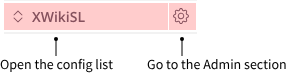
Switcher UI isolated:
![]()
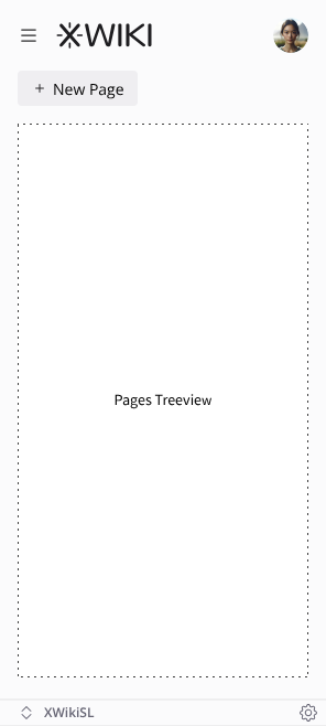
Option 1
Name of the config on the bottom of the sidebar (Obsidian like).
Pros:
- Out of the way, users don’t see the switcher constantly on a high traffic area of the app.
Cons:
- Can be too hidden, some users will likely miss the switcher for a while. But it should be easily accessible when they do see its location.
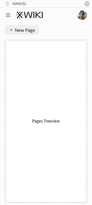
Option 2
Name of the config on the top of the sidebar.
Pros:
-
This brings the selector to a more prominent place.
-
Provides a more direct relation between the config and what it contains. As in, everything under this section belongs to the config, even the logo.
Cons:
-
Makes the UI a bit more convoluted.
-
Users might hit it when trying to click the logo to go to the home page.
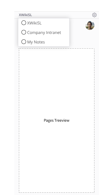
When clicking/touching the config name the rest of the available configs is shown for easy switching.
The circle in front of each config name is a placeholder only. The correct icon should be shown based on the type of each config (Github logo for Github based configs, for example.)
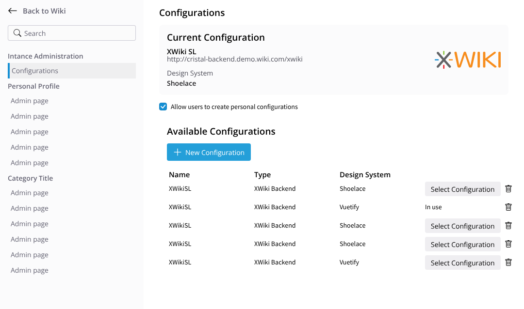
Admin Section
Clicking on the cog icon takes the user to the admin pages where a “Configurations” page exists. I propose this being in its own category (Instance Administration for example) perhaps in the future we’ll have more pages for this category but the idea is to separate options from the Cristal installation itself, options from the backend available to Cristal and personal options (Profile in XS).
Overview Page
This page shows the current selected config in the top with the following fields:
- Logo
- Name
- URL
- Design System in use
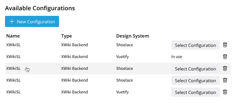
Below it comes a list of already configured configs
- each line can be clicked to bring the edit page
- at the end of each line there are two buttons, to select the configuration and delete it (with confirmation)
- at the top of the table, there’s a “New configuration” button.
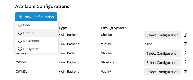
Adding a new configuration
Clicking the “New Configuration” button brings a list of types of backend to select.
On the image below, the circle at the start of each backend line is only a placeholder for icons.
When selecting a backend, the configuration dialog is shown with the type already selected and the cursor positioned in “Name” so the user can start inputting the rest of the fields.
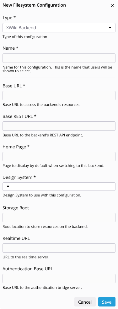
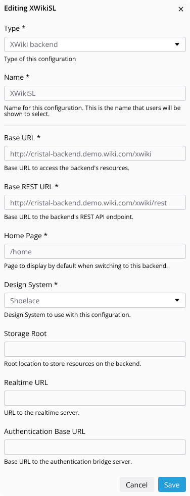
Editing a configuration
To start editing the configuration, the user must click or touch the line of the desired configuration. Note that there’s no “Edit” button, this makes the UI a bit cleaner while still providing functionality.
The same configuration dialog will be used when editing the config.
These are the main points of this proposal. I’m sure a lot more will come as we progress on the feature. But for now, I would really appreciate your feedback for this proposal