Cristal Editor Toolbar

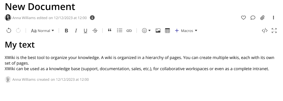
Hey everyone, here’s the proposal for the editor toolbar in Cristal. All in all it is heavily inspired by the one on XWiki Standard but with some improvements, discussed below.

It features a cleaner design with a white background and icons sourced from the Bootstrap Project. The icons are 20px in size within a 24px bounding box and are spaced with a 4px margin on each side.

Each button on the Cristal toolbar should have a hover state and a tooltip.

View in Context

Grouping of Toolbar Sections

The sections in the Cristal toolbar are organized differently from XWiki to improve usability, though the actions themselves remain identical to those on XWiki.

Toolbar Sections

  1. Undo/Redo
  2. Paragraph / Block Styles / Inline Styles
  3. Text Modifications / Formats
  4. Block Elements / Macros
  5. Dynamic Spacer
  6. Editor UI Features

Key Differences

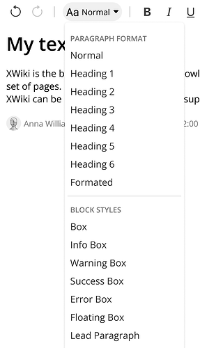
  • Text Styles Grouping: Paragraph, block, and inline styles are grouped under a single “Style” option for better organization.
  • Macros Label: The “+” icon is labeled “Macros” for clarity.
  • Editor UI Features Placement: Editor functions are placed at the end of the toolbar to separate them from text functions, making content-related functions more accessible.
  • Undo/Redo Placement: Unlike other editor functions, undo and redo are prominently placed at the start to emphasize their importance.

Text Styles Grouping

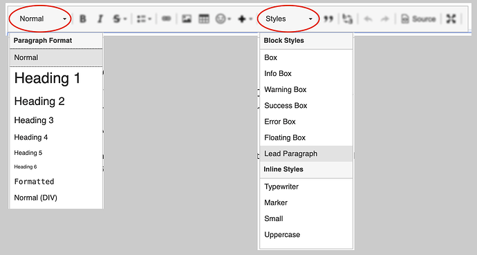
On XS there are two dropdowns that deals with text styles. One at the beginning, only for paragraph styles, and another one close to the macros buttons.

But their function is very related, so I am proposing to unify them under the same dropdown at the beginning.

On Restricted Viewports

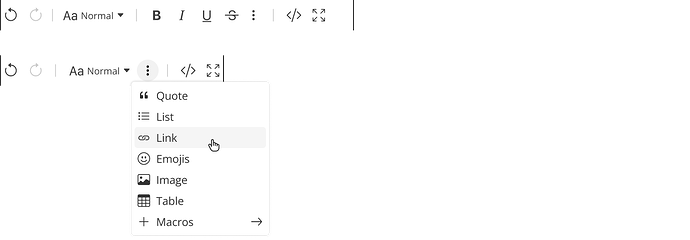
For mobile viewports, the toolbar should be able to truncate its contents. If there isn’t enough space for the entire toolbar, some actions should be grouped under a Vertical Ellipsis button. Here are two examples illustrating this approach:

Conclusion

As you can see, there’s not a lot of different features from the XS toolbar, but I would like to know your opinions on:

  • The overall look and feel of the proposal
  • The different groupings being proposed for the buttons
  • The mobile view of the toolbar, with features truncated under a common menu

Thank you all for reading!

LGTM, thanks.

Note that for the Block styles, we’d need to decide if we keep the Box, info, warning, success, error styles or not. Right now they’re styles but we have macros that do the same and users find it confusing (we have plenty of related questions on the forum). IMO either they should be removed and users should use macros or we keep them as shortcuts and when selected we use macros nonetheless. I know that this is out of scope for this proposal but wanted to mention it.

This looks good.

I completely agree for merging the styles. To me, it was always weird to have them separated, even more on each side of the bar.
Combined with the idea of Vincent, I think it will improve usability.

The only weird thing to me is the placement of the Vertical Ellipsis button in the mobile viewports. Having it not completely on the right and conceptually grouped with other buttons, leads me to think it’s a submenu of the group.
In your first example for instance, it wouldn’t surprise me if subscript and superscript styles were proposed instead of the missing buttons.

Hi Thiago,

Thanks for working on this.

The problem I see is with the displayed (selected) value. Normally, when you move the caret inside the edited text the toolbar needs to be updated to reflect the caret location. This works fine when the styles are exclusive. But some of them could be applied at the same time (at the same level). What do you display in this case?

I find the grouping of 3 and 4 a bit random. You say 4 is block elements, but emojis are inserted inline and images (and many macros) can also be inserted inline. Moreover, in group 3 the link is not a text format.

I fear that “Macros” is a technical term, and the users don’t necessarily have to be aware that some feature (e.g. an info box, a diagram, a live table) is implemented as a macro. But I don’t have a better name.

The problem with associating the “Macros” label with the + button is that you can’t add other stuff in the drop-down that are not macros. In XWiki we currently have the divider (horizontal line) and special character listed in the + drop down. We could also see the + button as the place where we collapse items that don’t fit the toolbar on devices with limited display width.

This is interesting, but it can cause confusion on displays with limited width when the dynamic spacer is basically missing (0 width), and, as @mpace noted, you get the editor features listed after the kebab button, which is unexpected.

I noticed that there are some features that were not included in the toolbar. Such as subscript, superscript, remove format, replace, divider, special characters. Did you do this on purpose because these features are not used very often or because you think we shouldn’t promote them? Or because they will be available in the quick action (slash) contextual drop down? (but the same could be said for other features that have been put on the toolbar). Or they will be available in the context (balloon) toolbar that is displayed near the selected text / caret.

This leads me to the following question: how do we decide if a feature is exposed in the top toolbar, the context (balloon) toolbar and / or the quick actions?

The quick actions have a limitation in that they can’t be used to target a selection of text. The text selection is always collapsed (caret) when you use the quick actions (slash), so you can’t select a piece of text and make it bold using quick actions for instance.

The context toolbar is obviously for context-sensitive actions, i.e. that depend on and affect the current text selection / caret. For instance, we could decide to show the inline text formatting options like bold, italic, underline, only in the context toolbar when some text is selected.

Also note that this proposal assumes Cristal will not use a block-type WYSIWYG editor, which normally doesn’t have a global toolbar (at least not with the text formatting feature we currently have in XWiki). Was there any decision about this? In such a block editor, each block you insert can have its own “toolbar” or context menu.

Thanks,
Marius