Hello everyone,
I’d like to propose the creation of a new, unique icon for Cristal. Currently, the icon appears to be a default one from Vite (a tool used in the tech stack of Cristal), which doesn’t provide Cristal with a distinct identity.
Since the icon is often one of the first points of contact for potential users, it’s important that we have something crafted a little bit more carefully.
Current icon
Key Considerations for the New Icon:
- Connection with XWiki – The new icon should visually or conceptually tie into the broader XWiki motif.
- Modularity – Given that Cristal emphasizes modularity (Design Systems and extensions), the icon should reflect this core aspect.
- A Physical Representation of a Cristal – The designs try to incorporate elements that resemble a crystal (Cristal’s namesake), reinforcing its identity.
Proposed Icon Options
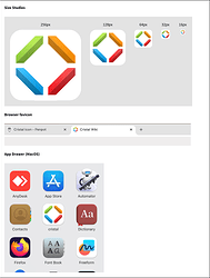
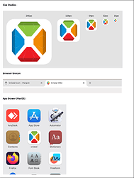
Based on these points, I’ve created two design options for discussion with the community. Both are pictured below:
Option 1
Pros:
- Feels lighter
- Individual pieces of crystal forming a larger crystal shape
- Uses colors from the XWiki logo, this also reinforces the different Design Systems that can be used
Cons:
- The connection to XWiki is weaker than in Option 2
- While lighter in feel, it may not be as visually striking
Option 2
Pros:
- Stronger connection to the XWiki logo, with the “X” visible in the negative (white) space
- Uses colors from the XWiki logo, this also reinforces the different Design Systems that can be used
- Each individual crystal is positioned in the same spot of the colored lines in the XWiki logo
- More visually impactful
Cons:
- Might be too strong or bold
- While the overall crystal shape is present, it’s slightly less emphasized
Both Versions in Context
You can check below how both versions look when used in different contexts and sizes.
Option 1
Option 2
I’d love to hear thoughts from the community on this! If anyone has design ideas or suggestions, feel free to share.
It’s also worth noting that we don’t necessarily need a new icon. We could continue using the current XWiki logo, as it has been used in different contexts for some time. However, I wanted to take this opportunity to suggest something a little different for your consideration.
And of course, you may not like either of these alternatives, and that’s completely fine too! Looking forward to your feedback.


