Hi,
just mentioning a few contrast issues with the Darkly theme:
- Dark grey on black:
The menu item titles (except for Box on top) are too dark grey to really see and read. - White on orange:
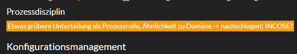
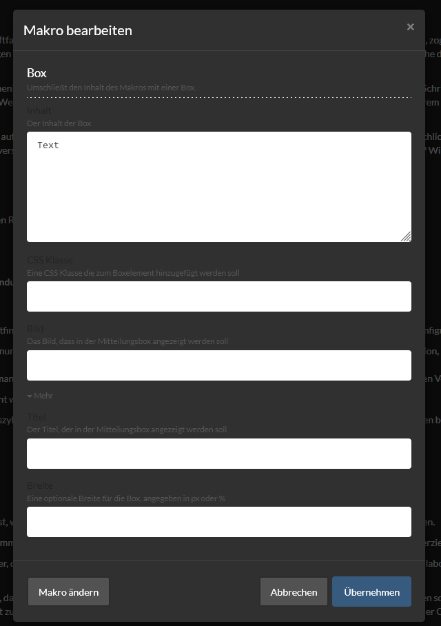
The block style Marker produces white on orange which is really also quite hard to read. Black or dark grey would be much easier on the eye IMHO. - When creating a page, the source code page is white on white:
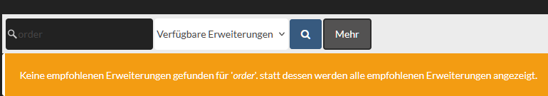
- Dark grey on black in the extensions search field:
- White on light grey when editing page title:
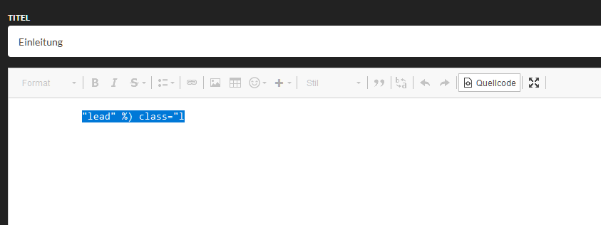
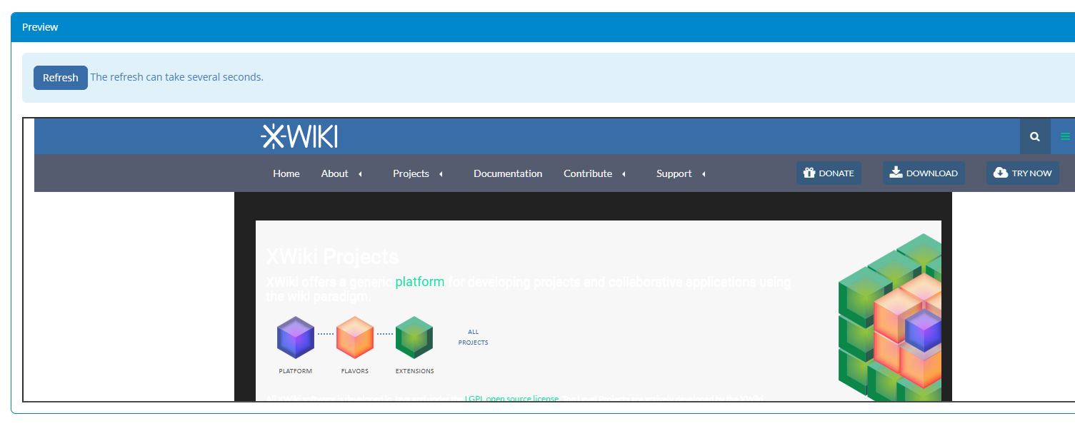
- Funny enough, on the theme’s homepage, there’s also a contrast of white on white issue:
Just a heads-up …