The virtual users superadmin and Guest have no user page and thus no avatar. Wherever a user’s avatar is displayed (page history, comments, notifications, Live Data user columns, user display macros, …) they get the same image as a regular user who simply didn’t set an avatar. One can’t tell at a glance that a change or a comment wasn’t made by a regular person.
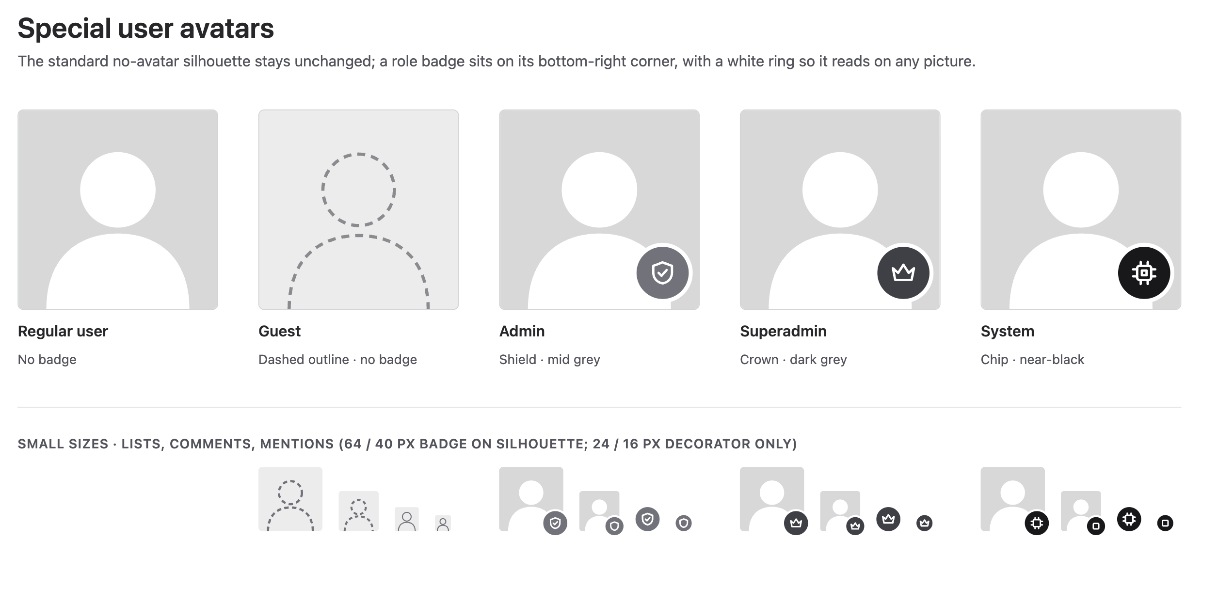
Give superadmin and Guest each a dedicated icon, different from each other and from the “no avatar” image.
If the System user proposal is accepted, the System user (the author displayed for automatic changes) gets its own dedicated icon too, so that the three are told apart.
This is about the need only: I’m not proposing any specific visual. @tkrieck, would you be OK to look into the design? Some questions that I think need answering:
Should these be icons from the icon themes (so that they follow the configured icon theme) or images like the current “no avatar” one?
How do they look next to real avatars, at the various sizes we use?
Anything else needed so that they’re recognized as “not a person” (e.g. a tooltip)?
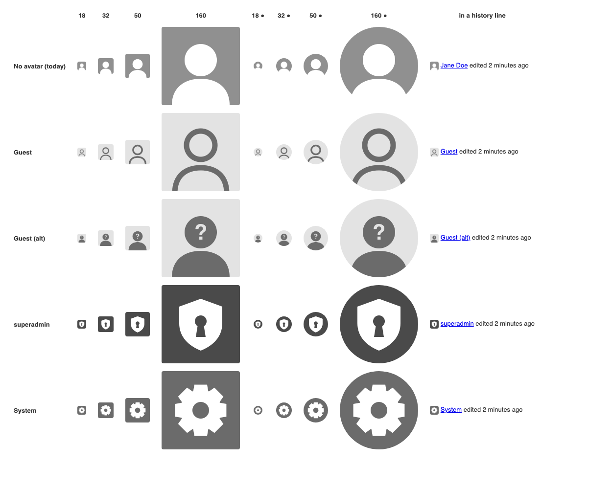
superadmin: white shield with a keyhole on dark grey. It reads as “the instance’s master key”, not a person.
Guest: outlined silhouette on light grey. Still a person, just an unknown one. The light background is what tells it apart from “no avatar” at 18px. My first try (white on the same grey as “no avatar”) looked just like it at small sizes.
Guest (alt): silhouette with a “?”. The meaning is clearer from 50px up, but the “?” disappears at 18px.
System: gear on grey, i.e. automatic processing.
I kept the style of the current noavatar.png (flat 160×160 square, one colour per shape, all greys), so they look like part of the same set.
My take on the questions from my first post:
Icon theme or image? I’d go with images (SVG + PNG next to noavatar.png). Avatars are passed around as image URLs (REST, the useravatar macro, getUserAvatarURL), and notification emails attach a PNG. An icon-theme glyph has no URL and can’t be emailed.
Recognised as “not a person”? I’d add alt text and a tooltip such as “Guest (not logged in)” or “System (automatic change)”, since screen readers get nothing from the picture.
We could use the Icon Theme to draw these programatically since we get dark mode support for free in the future. But this keeps us tied to icons present in FontAwesome free version and they are a bit limited.
Another option is to use SVGs embbeded directly on the page. The advantage here is that we are free to use any icons we want and not only the ones present in the Icon Theme and we get theme support for each color.
Edit: I forgot to add, tooltips are important for each.
I definitely would love to have icon theme compliant icons here (we can even use icon stacking to build them with FA), but I fear it would create bugs/visual inconsistencies in all the places where this icon could be used. Those have been standardized a bit in the latest cycles, but checking that all of them look great and responsive might still take a while. The easy solution would be to keep using pictures.
It depends a lot on the use case (some orgs might barely do user avatar, only rocking the default picture, some others use vectorial based avatars and some other actual pictures), not sure we can assert anything on this point and what it’d bring. The only comparison that’s worth is for the default user/group avatar, but at this point we might as well include those two in the avatar udpate.
Highlight: We shouldn’t forget the group default avatar when updating those.