Following the comment of @MichaelHamann on a recent PR, I want to open a discussion about our strategy moving forward regarding the base font size we use on XWiki.
Until now, following the strategy introduced in bootstrap, the base-font-size was a pixel value, by default 10px. This is nice for admins, which can change the font-size in the color theme edit interface, and be sure that every user will get the exact same interface.
However, since at least version 102 of Firefox (June 2022), before 2020 for Chromium, and even earlier for Safari, there is a browser level setting for font-size.
I think it would make sense to remove the parameter @font-base-size from the color theme interface and use the browser level user preference as a base instead.
Of course this would improve responsiveness for most content, but not everything. We would need to slowly replace the references to @base-font-size in the skin with rem units or percentage to provide a fully zoomable and user responsive UI. In the middle of the process, the default interface will still look okay but some elements might be disproportioned for users with non-default font-size settings.
Here is the view with a very basic replacement of the variable, for a user which base font-size is 22px instead of the default 16px:
For example we can see in the xwiki header that the bell icon is larger than its neighbors.
More examples and easier comparison can be found on this message.
In my opinion, this change is positive for the average User experience, and do not remove a very useful customization option from Administrators, so I’m in favor of it.
Do you agree with the removal of @font-base-size from the color theme to instead rely on user defined preferences?
Thank you for your interest in this topic!
Lucas C.
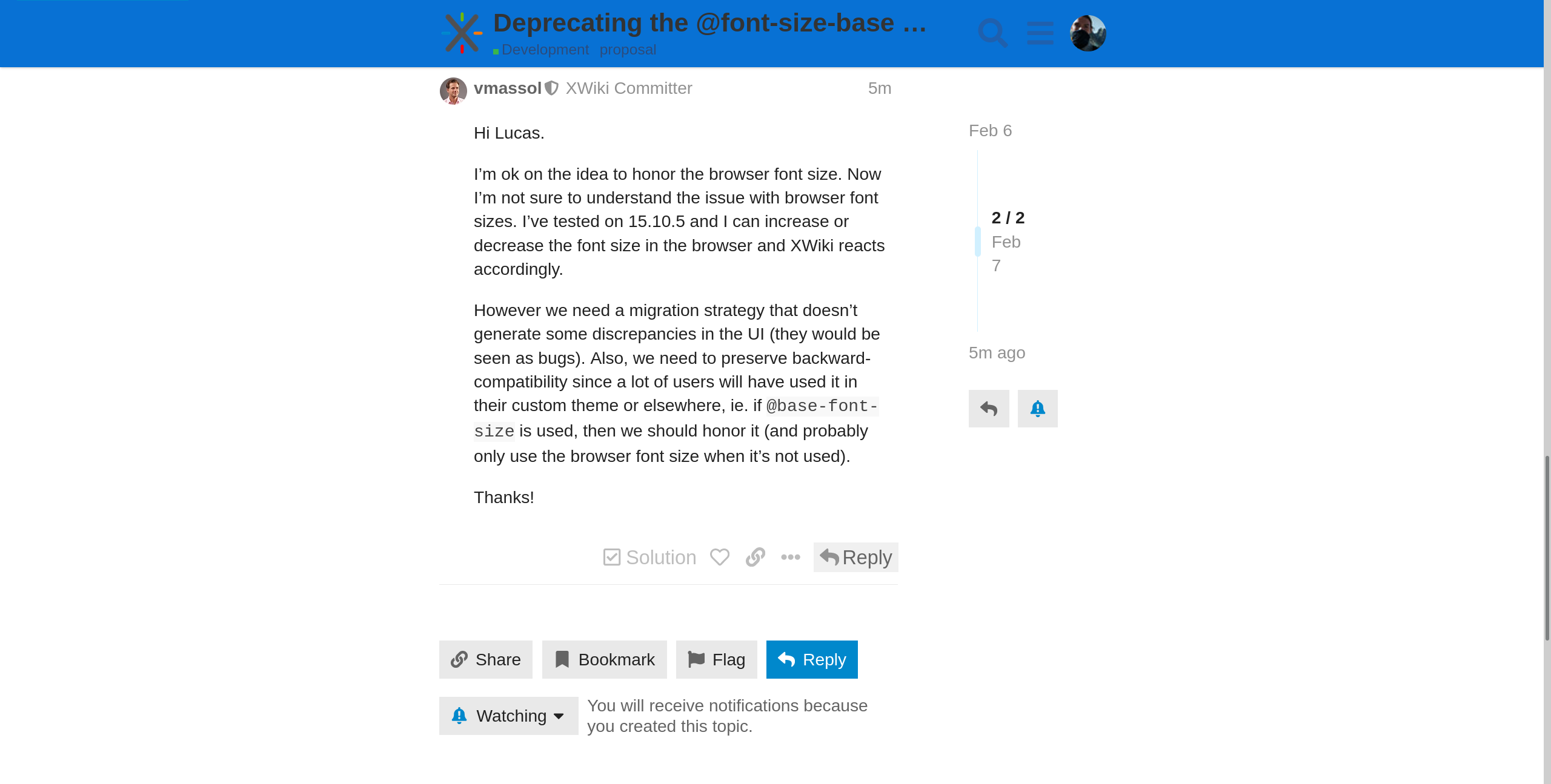
I’m ok on the idea to honor the browser font size. Now I’m not sure to understand the issue with browser font sizes. I’ve tested on 15.10.5 and I can increase or decrease the font size in the browser and XWiki reacts accordingly.
However we need a migration strategy that doesn’t generate some discrepancies in the UI (they would be seen as bugs). Also, we need to preserve backward-compatibility since a lot of users will have used it in their custom theme or elsewhere, ie. if @base-font-size is used, then we should honor it (and probably only use the browser font size when it’s not used).
For reference, here are a few screenshots to demonstrate the issue on a 16.1.0-SNAPSHOT standard flavor distribution.
First, I go in my browser (Firefox) settings and change the default font size from 16px to 30px.
Reload without cache of XWiki, no change visible on the UI (when looking at why, that’s because bootstrap sets the default size of the doc to 10px or the value of @base-font-size).
Reload this forum (works on a lot more pages). We can see that the text is way bigger than it uses to be and actually respects the 30px default font size.
I think removing the UI and adding a warning (with appropriate alternative solutions) in the doc is a good first step for this process. This way, users and developers will rely on it less and less and we can promote the creation of accessible UIs.
The second step would be to remove the dependencies on this variable in xwiki-platform. E.g. compute title size by using native CSS functionalities (rem units and percentages) instead of relying on this variable. This way, the whole XWiki UI will become responsive to the user font-size preference. We want to avoid disrepancies in the UI, so we should fix all of them in the same version (so probably as part of the fix for the same ticket). Note that with a default font-size, there isn’t any disrepancies, except for font-size that already did not rely on this variable. One issue I see left with this process is that extensions which did use percentage and rems for font-size before will have the basis of those units changed from the hard-coded 10px to the user default 16px. For example, see the changes I had to make in this commit. I was using percentages, and the 160% didn’t compute to the same final value, which did create an unexpected change in UI. I had to change the 160% back to 100% to match the new base.
Along this process, the variable is still here, it’s just less convenient to edit it and its use is discouraged. This way, no style gets broken and we can safely transition towards a user responsive interface.
I think we should aim to respect the font size that has been set in the browser. However, I fear we’re not there yet, and it is quite some work to get there.
What I mean by this is that as screenshots like the following (provided in the pull request) show, not all content follows the chosen font size. Not even all text, there is a lot of important text that remains unreadable small:
And this screenshot doesn’t even show more advanced UI elements like the WYSIWYG editor, tabs, Livetable, Live Data, …
To properly support different font sizes we need to make sure that:
All font sizes are relatively smaller/larger than the chosen font size.
Icon and button size is increased consistently
Spacing is scaled, too - this doesn’t need to be linear, but, e.g., icons shouldn’t overlap with text.
As long as these conditions aren’t fulfilled at least in most cases, I think we should keep @font-size-base and users that want a larger font size need to rely on zooming the whole webpage in the browser (I think this is what @vmassol tested). The reason for this is that I think it is worse to half-respect the font size that is set by the user than to ignore it. In the current state, the user can zoom and then have a consistent, larger UI. Browsers remember zoom levels per domain in my experience, so I think this is not too bad. However, with the proposed solution, this no longer works as none of the overlaps and discrepancies in font size can be fixed by zooming in. The only fix for the user would be to undo the font size preference in the browser - and for this the user would also need to understand first that this is the issue and XWiki doesn’t just use such a strange design.
For the very same reason, I’m also against creating a new user preference for font size in the current state as it just gives a false promise - it promises to make everything more readable while in reality it only makes some text more readable and at the same time breaks the overall design.
What I would suggest instead is to create guidelines that we need to follow to achieve the goal of having a UI that nicely responds to font size changes. Like guidelines for:
How do we define spacing?
How do you get the size of an icon or button?
Which font sizes do we use?
How do we scale panels, how do we define “breakpoints” when we stop displaying panels next to the content etc.
I suggest that we try to
Define such guidelines or adopt existing guidelines
Follow these guidelines for any new code and for the UI revamps that we’re doing at the moment.
Plan some time for applying the guidelines to the main UI elements.
Once we’re following these guidelines in most places and the UI looks nice on a wide range of font sizes, we can discuss again introducing a font size setting and respect the font size set in the browser.
yes, the way I tested was with “view” > “zoom in” or “zoom out” in Chrome, and the font size was adjusted. It’s probably relative to the font size chosen by XWiki.
IMO the hardest to define and implement will be the first one (spacing).
The size of a button depends on how we define spacing around its content, the size of an icon might change depending on the icon type (img vs font).
The panel breakpoints are too specific to be the subject of a guideline.
, and not using the @font-size-base might be one of those guidelines.
What I mean is that currently, all media queries, e.g., for deciding if we have enough space for panels for example, are based on pixel sizes. However, when we allow a dynamic font size, this could mean that there is a lot less space for content on the screen. So I’m wondering, should these breakpoints also depend on the font size?
Hi! I’m reviving this discussion to talk a bit more about what happened and discuss what will happen.
We implemented a new variable system in XWiki based on CSS properties. CSS properties pretty much mirror what we had in LESS variables. However, I think it’d be interesting to take this opportunity to change the font size system to match what we proposed here and in Reworking our font-size CSS: rem vs em
My idea is that we drop support of font-size-base in CSS variables completely (in favor of browser level user preference), it does not get a px value from the Flamingo colortheme anymore, while we keep @font-size-base in LESS.
This will mean that if the user changed their preference, or if the admin set a specific @font-size-base in the colorTheme, both basic font-sizes will not match.
This has a few implications:
All uses of font sizes in XS should be migrated in the same version, or at least they should all be in the same variable system for recommended versions.
When migrating to the CSS variable based versions of XWiki, the old customizations and extensions will not follow the same sizes as everything else for their font-sizes. By default, this should be the same, but if the admin or user customized them, it will be different. Migrating the styles to CSS should be easy (same variable names for font-sizes) and fix the difference in font-sizes.
I’m not sure how we could start using browser preferences for font-size better than this, please share your thoughts if you have a better plan or oppose to this change of font-size-base in CSS properties.
As I’ve said above, having inconsistent font sizes is not good and much worse than what we have now. While I’m not opposed to drop font-size-base in CSS properties (see below), I think we shouldn’t start using browser preferences for font-size right now but instead first make sure that XWiki is ready for it and we don’t get inconsistent font sizes.
What I propose is the following:
Set the root element’s font size to @font-size-base such that 1rem corresponds to @font-size-base in order to have consistent sizes.
Deprecate using @font-size-base, establish rules to use rem instead. Drop font-size-base in CSS variables as it’s still new and can easily be replaced by rem.
Migrate all code in XS that currently relies on @font-size-base to use rem/rem-based calculations instead.
Introduce a configuration/theme option to not set the font size of the root element to @font-size-base. This option would be enabled by default. We would still set the variable to a sensible value to ensure that LESS code that still uses it (e.g., in extensions) won’t be completely broken.
Does this make sense to you or do you see any problems with this approach?
[Edit] As part of step 3, we might discover that some LESS variables cannot be changed to use rem. In that case, I would suggest deprecating and replacing those LESS variables by CSS variables.
 , and not using the