Hello!
Since there is quite a bit of discussion on this topic on the live chat, let’s bring it here on the forum.
Context
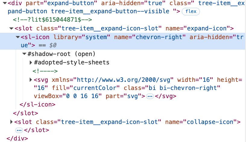
We have quite a few caret buttons in XWiki. Here is what they typically look like (details may vary based on implementation):

There’s two main ways to make a caret button in current day XWiki:
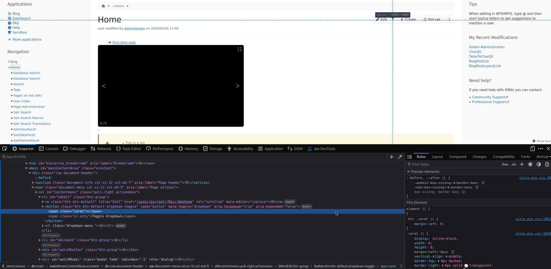
1. Use the caret bootstrap class
This uses the border to generate a caret purely from basic CSS. This is typically used in the edit dropdown (see screenshot below) and right now in the buttonGroup elements:
2. Use the caret icons
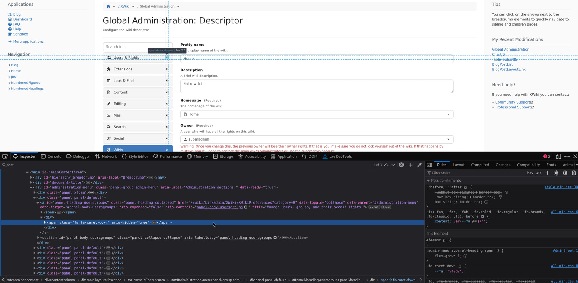
https://extensions.xwiki.org/xwiki/bin/view/Extension/Icon%20Theme%20Application#HJavaScriptAPI
This is typically used in the admin menu dropdowns and with various bootstrap collapse elements JavaScript · Bootstrap :
A third way to do that would be to hardcode an image source to get a caret icon from Silk but luckily we pretty much don’t have any carret like this in XS 
There’s probably at least a few more carets in XS like the navigation panel ones but I believe there’s no discussion about them, they should ideally look similar to one of the two above.
I recently pushed a change for buttonGroups to go from 1. to 2. . It’s been reverted for now because it introduced a regression (see Loading...). While discussing this regression it became clear that the change brought to the style of the button needed a discussion.
I believe we should unify the type of caret we use to improve consistency in our UI.
I don’t think there’s a way to make them look exactly the same without losing their respective advantages or making things way too complex.
From there, I believe we need to pick one of the two implementations to use everywhere in our UI.
Problem
Which one should become a standard caret?
Opinion
For 1., the advantages are:
- Native CSS, will always work even in very minimal configs
- Based on fairly simple geometry, complexity of the implementation is low and the tech debt it generates is very low.
The main disadvantage I see is:
- It needs a special style rule for its
border-colorto make it look like its’ neighboring text. It can be a bit counterintuitive to figure out for people who do not know about the technical implementation and want to style it.
For 2., the advantages are:
- Adaptability to the icon theme.
- For font-based icon themes, easy matching of the color of the caret. It will just be colored like its’ neighboring text.
- Most of the tech debt is shared with the icon theme and all the other icons.
The main disadvantages I see are: - For image-based icon themes, the color can only be changed with complex and specific CSS styles.
- It needs a working icon theme to operate smoothly.
Personally I see the caret as an icon like many others and I think solution 2. is better for a standard.
+1 for 2. from me
From a style point of view, I think having the caret work just like any other icon and change theme with its wiki makes more sense.
Conclusion
Do you think it makes sense to aim at using only one solution for those carets? Did I miss any pro or con for both solutions?
Which one would be more appropriate for a standard in your opinion?
If we agree on a solution I’ll consider this as a proposal passed and document the result of this discussion somewhere in https://www.xwiki.org/xwiki/bin/view/Documentation/DevGuide/FrontendResources/ .
@tkrieck @vmassol @ilie.andriuta @MichaelHamann We discussed some of it on the matrix chat (and also a bit on XWIKI-24398: Location pickers on new page or move page should have aria-label by Sereza5 · Pull Request #5611 · xwiki/xwiki-platform · GitHub), I’m looking forward to your opinion on the matter!
Thank you in advance for sharing your opinion on this topic!
Lucas C.
P.S. For your interest, for now carets in Cristal seem to be made from an SVG path:
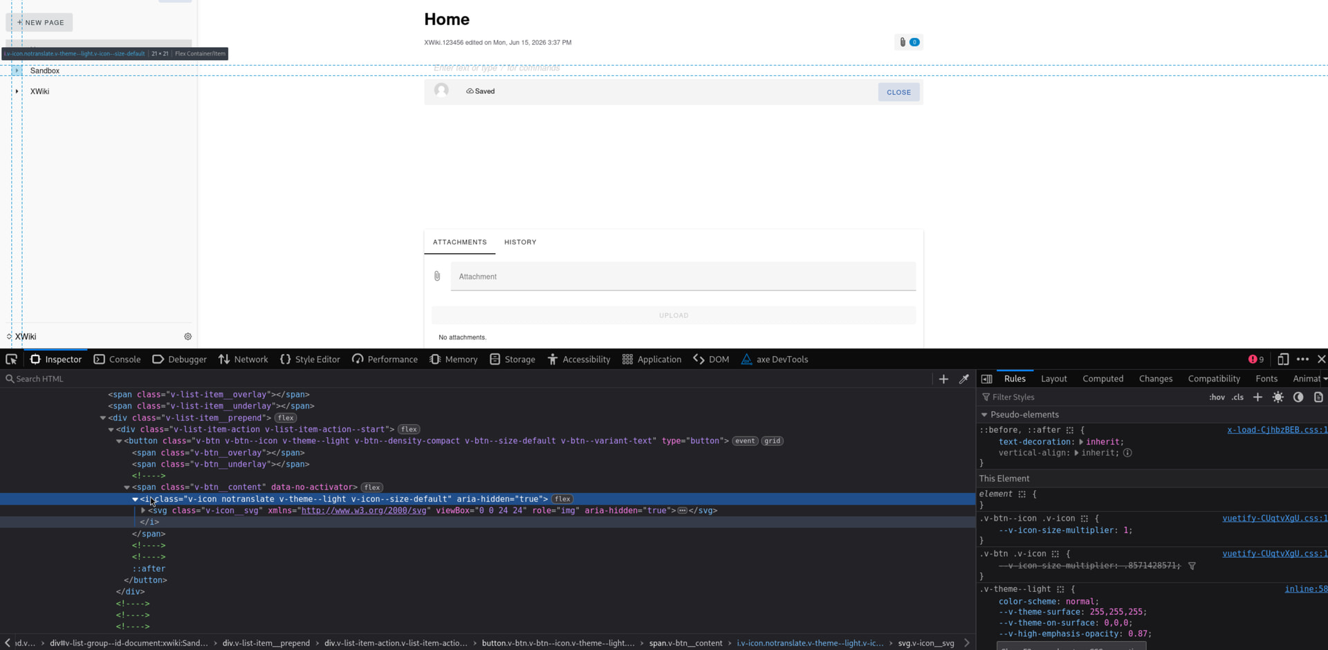
This is close enough to both 1. and 2. but still a bit different from both…