Export format selection

Hi all,

I created a design page to describe the problem with the current way of selecting the export format (i.e. the Export Modal) and to propose some alternative solutions. Please check it out and let me know which solution you prefer. Of course, if you want to propose a different solution, feel free to do it.

On my side I have the following preference: collapsible export menu > nested export menu > sequential export menu > export modal.

Please cast your votes.

Thanks,
Marius

Hello Marius,

thanks for looking into that.
To be honest I’m not entirely convinced by the different solutions involving to chose the export format from the menu for 2 reasons:

  1. this menu is already long and complex (especially since new actions can be added with various extensions) and I feel like it’s adding again more complexity in it, making it a bit overloaded
  2. I’m also not very convinced on the “mobile friendly experience”: the menu is not easy to manipulate on touch screen especially since it’s not quite clear what you select when you click with the finger, and the menu entries are a bit small

On the other hand, you’re saying that displaying the format in the export modal can lead to a vertical scroll, but that’s only true if you’re using the current widget to display the format: we could decide to display them using another way (e.g. a bootstrap select)

So all in all, I think my vote would be:

Export modal > Nested Export menu > Collapsible export menu > Sequential export menu

Thanks

By far my preference goes to the export modal (better UI, more description and explanation).

Note: We don’t need this action to be fast (i.e the mouse to not move much), since it’s not used often.

I can see how this applies to the Collapsible menu (although the Export menu would be collapsed by default so it won’t overcrowd the More Actions menu until it is expanded), but I don’t see how the Nested menu or the Sequential menu can overcrowd the More Actions menu because it’s a separate menu (especially in the case of the Sequential menu).

The Export Menu is not going to be more hard to use on mobile than the rest of XWiki’s menus (Edit and More Actions menus included, which provide access to features more important, and probably also more often used on mobile, than Export). If there is a problem with the usage of XWiki’s menus on mobile then we should fix it in a generic and consistent way. I don’t have a problem with increasing the font-size or spacing for all menu entries on small screens.

By “bootstrap select” you mean the widget used to select the Supported Languages in the Localization administration section? i.e. Examples | bootstrap-select · SnapAppointments Developer . This would add an additional click to trigger the export. If we choose the Export Modal then the export formats should be visible right away so that you need a single click to trigger the export. The main reason to choose the modal is the available space, but the problem is that if we use this space to show the hints then it makes it harder to scan the entire list of export formats, with or without a vertical scroll. And if we don’t show the hints, then the export modal acts as menu, but it requires considerable more mouse movement.

On my side the main reason for choosing a menu solution is the speed to access the export (low number or clicks and little mouse movement) and the quick overview (easy to scan the full list of export formats).

Thanks,
Marius

Thanks for the proposed solutions, Marius!

  1. I’d pick the Export Modal - it does not overcrowd by seeing only the modal pop up, and I like the ability to filter (which can be very useful when having many export types and especially on mobile). Then, on mobile it looks accessible, easy to select the option and to filter.
    It also looks consistent with other places in the wiki where a popup appears with the need to pick from several options and the existence of a filter (e.g. adding a macro on a page), thus it can bring a familiarity feeling resulting in an ease of usage.

  2. Nested modal - I like that it does not expand the more actions menu vertically, and that grouping is possible

  3. Collapsible export modal

  4. Sequential export menu - it can make the experience confusing when it comes to how to go back to the more actions menu

1 Like

Hello all,
@mflorea thanks a lot for looking into this.

From the menu options, the one that felt the most natural and expected for me is the “nested menu” one. The others, while interesting UI approaches, feel unnatural, unexpected, I had to make a mental effort to understand how to use them, especially on desktop. The collapsible is a really good idea, but maybe for something else.
I will postulate that users will use these features more on desktop than on mobile, but I would not be able to give you a source for this nor specific numbers about it, it’s just my feeling so I will have this bias in my choices.
I agree with you that if the “more actions” menu has an issue on mobile of menu options size or anything else, it would be a problem of the whole menu, not a problem of the export submenu itself, and we would need to think of a solution for the whole menu, so this is why I don’t consider that having an extra submenu unfold on mobile is not a significant blocker.

Now, as everyone said, the big choice would be between modal and nested menu.

Pro for menu: all options are visible on hover, discoverability++.
Discoverability is rather important here, from my pov, because there are actual 2 major needs that are addressed by this export:

  • export to office formats or other “doc” formats, which people will use in order to transport their content to a different system, or re-work it, or something else related to the content of that page; they will “get the content out of the wiki world” with these;
  • export to xar, which is used for backup, mainly, or transporting a page from an XWiki to another XWiki, and which is not related to getting the content of that page out of the wiki / the wiki format, it will stay in a format that is understandable only by XWiki and will be used only by XWiki.

Because these 2 needs are rather far from eachother and still under the same menu, it’s important, from my pov, that people can figure out easily how to achieve any of the 2 functions above.

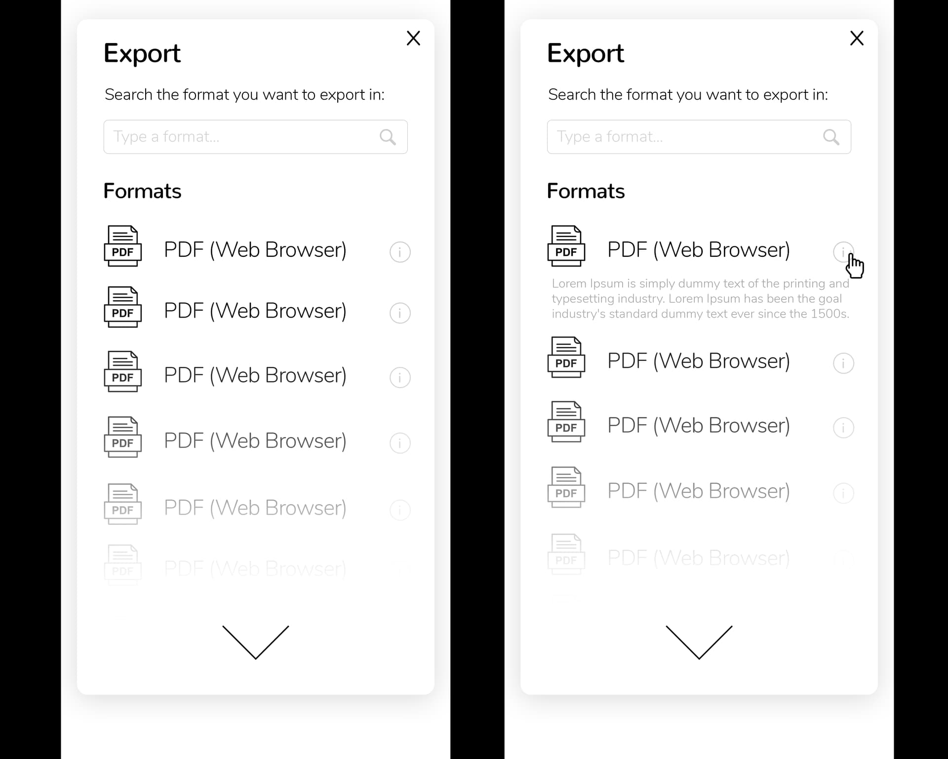
On the modal, I don’t know if it’s obvious, but because of the explanations and everything, not all options are visible in a glance, there is an exploration to be done (scroll down). For the discoverability of export as xar, this is especially bad (as it’s the last option).
Because the action is rather rare (as @vmassol said), people will not remember where they used it the last time they did, they will explore the menus in search for something that looks correct so we need to to make it easy for them.
I’m not sure the search in the modal is bringing much, except for people that know what they’re looking for. For those people, having a submenu directly and being able to choose quickly from the options of the submenu that opens up under their mouse is probably better than typing to search :wink: . Especially as I doubt that we’ll have hundreds of export options. In most cases there will be ~10.
Also in terms of discoverability, if we choose modal, a user will need to dare to click before they can explore the different options, which is not the case for the menu. I guess in all cases, the menu title should say “Export as” (similar to “save as”), to make it obvious that there is something following (a new question, a new screen).

The big pros of the modal are: room for explanation and integration with the next step - export options (page selection and parameters).

Regarding the explanations: I’m really wondering whether we really need to explain things that much here… I looked at the explanations in the mockups that you made on the design page and they are not really bringing much information: they explain the acronyms - which I would argue is not gonna teach anyone anything - and they give information about the technology that will be used (“docx using office server”). I am not sure the technology is something that is bringing much value to the user. The fact that there are 3 different pdf methods and they will probably issue different results is interesting but details about the specific method is “too much” for a simple user, they don’t need to know, they don’t care, it’s not gonna change anything for them. The name is enough to be able to distinguish between the 3 pdf methods and remember (or not) which one they like. If they don’t remember, they’ll try it out, because in the end it’s the result that they care about, not how it’s done.
Since it’s gonna be an extensible thing, it’s a bet, indeed, that we would be making, to say that all possible exports can be captured in one title. I guess we can always imagine a longer title or a hint below, for exceptional situations when extra explanation is really needed.

Regarding the integration with the next step: it’s interesting that showing a modal would take people’s attention where their attention will need to be anyway, for the next step of the process, in the middle of the screen. Because of this, I would say it’s not such a problem the move of focus that the modal would require. This doesn’t pose a specific problem for the menu, the focus will just move a little later, after having chosen the export option.

So, to me, the major discriminating point remains the discoverability / exploration of options. For this, I guess I like a little better the menu.
If we can display all the export options at once in a modal without scroll, then the discoverability for the modal would be fixed, there would be even less of a difference between the 2 choices.

Sorry for being long and lacking structure, I hope it brings some interesting information to the discussion.

Thanks,
Anca

1 Like

So it looks like we have a winner: export modal. I’ll go with that, trying to incorporate your suggestions.

Thanks,
Marius

Hello everyone,

I’m glad the modal approach was chosen and I thought about giving an input on how to visually incorporate most of the suggestions here.

The goal would be for the design to be simple, effective, familiar and helpful.

I especially agree with what @lucaa said about discoverability / exploration of options.

I believe it’s a good idea to have every format displayed and then if the user is confused he can choose to find out more clicking on the “info” button (the “i” in a circle from every item in the “formats” list).

Every format should have its own icon in the same esthetic, for ease of recognition.

The faded list with the arrow for moving downwards might be unnecessary if the formats list is not very long, but it can be an alternative to the usual vertical scrolling if it’s needed (technically wise). The scrolling would be the familiarity inducing approach so probably the better choice overall.

We should try to stay away from unnecessary lines in design (related to the horizontal line below the Export label and in the whole XWiki platform). Separation and structure is better visualized with differences in width of fonts or contrast of color. In my design I tried to limit the usage of lines or borders while using the bold version of the main font as a way of sectioning.

Last, but not least… would be to use everywhere softer shadows for containers, modals, etc. To achieve that, reduce the opacity of the shadow (or make it lighter colored) and increase its size.

Below you can see my version on the design:

Export Modal both

Thanks,
Adina