Extra Accessibility Enabled by Default & LF navbar button

Hello everyone! :grin:

Following a discussion on the accessibility of links in the #xwiki chat room, I wanted to discuss the idea of:

  1. having extra accessibility enabled by default
  2. improving the discoverability of customization & accessibility features by providing a special icon in the navbar

Accessibility enabled by default

I think we can all agree accessibility is important so I’m not gonna give arguments for that.
The question we need to answer is: Should we enable extra accessibility features by default?

I believe the answer is Yes. We have to take into consideration the fact that the accesability feature is not easily discoverable by normal users and neither is by admins.

Just because we have it and we have it documented, it doesn’t mean that any user will automatically think of searching Accessibility inside their instance or in our Documentation.

By having it enabled by default, it makes XWiki’s intention of being highly accessible clear and it makes the experience great for everyone, not only for the portion of people that have no vision problem or that somehow found our extra accesability features.

Esthetics & accessibility

Obviously, the idea of easily understanding what an element’s purpose is is much more important than how that element looks. Thing is, when you have a lot of the same element in the same page, the overall feel of the interface will be impacted.

In our case, underline links can feel like they clutter the interface (they add detail) in places like:

  • some panels
  • live data

Alternative ways of styling a link would impact a bit much the cohesiveness of the interface, without escaping the cluttering factor (tried adding an icon to links, it just looks weird in tables and a bit disruptive in the main content).

For people that have good or mostly good vision, the accessible mode may feel… just a tiny bit oldish or cluttered.

While other knowledge management tools make use of underlined links by default, they mostly use them in the main content, still having non-decorated links on panels, navigations, tables of contents, etc. The rule seems to be:

  • if the context explicitly implies that each of the text elements in the context have an action linked to them enabled by click → no underline
  • if the context doesn’t clearly specify the purpose of a text elements → links will have underline

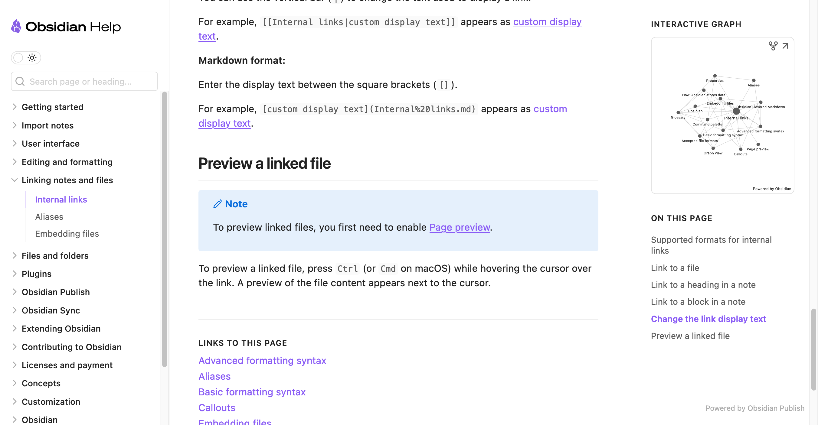
This is just based on several websites/software that I’ve come across and liked. Some examples: Obsidian, the french design system, Notion’s blog

Doing that, we simplify most cases.

image

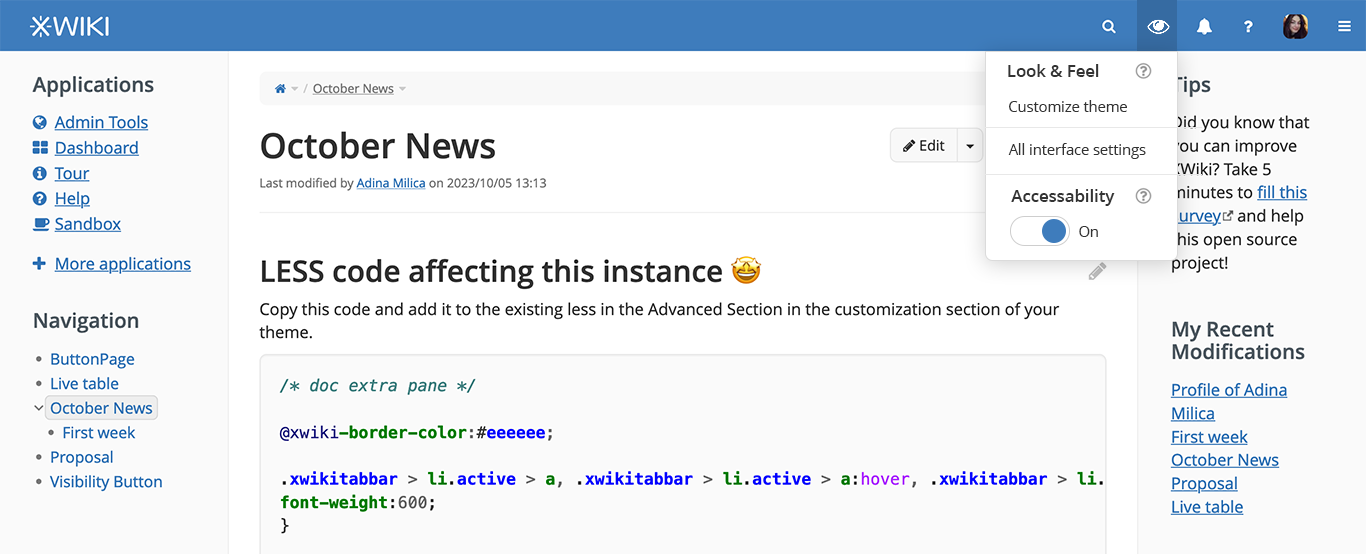
Discoverability of extra accessibility features (and not only)

I’m also proposing improving how easy it is to configure appeareance & accessibility related features for a newly registered user in an instance.

  • The idea would be to have a new icon in the navbar.
  • The icon could be an eye or a pencil.
  • Clicking on the icon will open a dropdown menu that will cover:
    – Customizing the theme (only for admins). Maybe even choosing the theme if we want to open a dropdown in a dropdown.
    – A link to all appearence settings (only for admins)
    – A toggle for extra accessibility features

We can choose to have this icon only be present for a a few weeks from the registration of the user in the instance. Truth be told, after the theme is chosen & customized and you’ve chosen if you turn on or off the accessibility features… you won’t need to see this category of features for a good while, so no need of keeping them in the navigation bar forever.

The functionality of this dropdown and the fact that it will stay in the nav bar for a limited amount of time can be explained in the initial tour.

Untitled-1

What do you think? :blush:

I am especially interested in:

  • knowing if the idea of only having the icon present for a dynamically computed amount of time based on the registration date is a hard to implement one (or how hard it is)
  • knowing if we ever had dropdowns opened in dropdowns implemented before (in an accessible way, too)
  • knowing if all underlines present ATM are necessary to adhere to WCAG or could we simplify things more in some cases (in the future)? @CharpentierLucas , your opinion would help out a lot

I haven’t read the full proposal yet, but a quick comment to say that we’ve been working for a long time to try to remove items from the UI (especially so that newcomers don’t see too many things at once and be overwhelmed) and adding this new icon would go against that. So I’d be inclined to find another solution. I’m not sure why we would need this menu at all TBH and why the Admin UI is not enough.

Also note that accessibility is already on by default. If you mean “extra accessibility” then it’s another matter and I’m not sure at all. We would need to discuss what it would change point by point.

Thanks!

Yep, that’s what I meant, edited for clarity. Thank you!

The thing is Admin UI hides the most interesting things about XWiki behind at least 2-3 clicks/decisions.

First you have to know to get to the drawer. This will come the most natural because you are looking for more features than you are already seeing.

Secondly you will have to decide in which category Customizing your instance and Extra accessability falls into. They fall into different categories ATM, in different places. Global administration will most likely feel like the right choice for theme customization (page index may come as a second option)

Third you will need to choose Look & feel, fourth themes, fifth customize theme (after maybe trying out some themes). After 5 clicks you get an interface with lots of elements and choices.

This all feels a bit much for a new user that probably just wanted some slight customization to feel more at “home” - choosing a theme or changing some colors and a logo (a new user probably will not go in deep customization the first time).

The extra accessibility feature is harder to find if you don’t just search externally (in our documentation). When clicking on your profile picture you don’t even know what to expect and then the menu in the left side (under the picture) is pretty small and doesn’t seem to cover important stuff.

I’m totally aware that this takes a lot of time to improve and there is a lot of stuff to cover in a comprehensive way without cluttering the initial screen that the user sees. I thought that maybe a temporary icon could work. We could also create a seperate drawer item for what I proposed so we have it seperate from the Global Administration, but still hidden from the main view.

Thank you for researching this topic!
I think you didn’t mention the right Luca* at the start of your post :face_with_hand_over_mouth:.
For reference, here is the inline link topic opened before.

Some accessibility features are not improvements for everyone. For example, if I remember correctly, we increase the default text size as part of the extra accessibility features. Some users might prefer it with the smaller text.

From my understanding, in those examples ‘consistency in the way links are displayed’ is lost in profit of ‘adaptability’ (similar to the solution proposed on XWIKI-20827: Inline links must be distinguishable without relying on color by Sereza7 · Pull Request #2313 · xwiki/xwiki-platform · GitHub :slight_smile: ). Seems like the solution we converged to is a compromise a lot have already chosen.

So for regular users it would mean having a dropdown with only one item. I think it’s a bit too much. Moreover, as things are now, there isn’t really ‘enough’ in the accessibility features to justify giving it so much importance.
I think this idea is nice, but we’d need more user-level customizations for it to be useful: toggle for a dark mode, high contrast mode, font selection, … Even with all of those, I don’t think it’s important to keep it on the page at all times, so I’d probably put it in the drawer in the section related to the user profile. This way, most users can see it, but it doesn’t clutter the page in most use cases.

Overall, I’m -1 for this, even though this concept is interesting for the future.

Navigation should be consistent, I don’t think having it disappear is a proper solution, even if we notice the user. An extreme case of this would be ‘The breadcrumb on every page disappears on the first of April.’ Users have their habits with the interface and breaking them for arbitrary reasons is not something we should plan on doing.

Yup, menus have accessible submenus since 15.3 :slight_smile:

ATM there’s no underlines, and for WCAG, we want to underline links that are inline (links that are surrounded by text). This is pretty much just the same as what they do in the screen you shared from Obsidian. See G183: Using a contrast ratio of 3:1 with surrounding text and providing additional visual cues on focus for links or controls where color alone is used to identify them | Techniques for WCAG 2.0 for more details about this criterion.
The two main issues we discussed that made this change difficult were:

  • underlining every link is ugly
  • if underlining only a few links, we have consistency issues
    We agree on the first one, and from what you showed, it seems to me like the second one is an acceptable drawback.

I think we can assume safely that the Admin users are able to navigate their way through the admin panel and search on the documentation.
And there’s a Help section on the default flavour to guide new Admin users through this process.

Thank you again!
Lucas C.

Yes and that’s normal. You cannot expect that all configuration options are just 1 or 2 click aways as you would swamp the UI!

This should be in the Tour.

This is easy as we’re providing a search in the Admin UI, you just need to type “acc” in it.

You don’t need to search for it if it’s on by default…

Also you didn’t say why, say accessibility should be exposed in 2 clicks while other Admin UI should not and why it’s more important. If you want to make some admin ui config option surface you need to sort them by priority. I think that’s very hard if not impossible to do as it depends what’s your UC.

I’d prefer that we focus on making the Admin UI simpler to use (although I think it’s already quite easy with the search). We do need to redesign the admin UI home page for sure though.

I really don’t think that turning off extra accessibility (or turning it off if it’s on by default) is the first thing a user will want to do when using XWiki, by far.

Thanks

PS: I wrote Admin UI above, but I realize it’s not there actually but in the user profile page :slight_smile: I don’t think it changes much my points though.

I forgot to mention it, but really thank you for proposing ideas, this is great! And your ideas are nicely presented with some screenshots which helps a lot. Kudos for that :slight_smile: Keep them coming.

Hi,

XWiki should be accessible by default and I don’t think we need a setting / UI to disable accessibility. Moreover, “extra accessibility” doesn’t make sense to me as a single setting that you enable or disable. As @CharpentierLucas puts it:

You can have users that need a bigger font, but that don’t want a dark theme or higher contrast. And other users that need higher contrast but not necessarily a bigger font. Thus, it makes more sense to:

  • have a good level of accessibility by default (that should be enough for most users)
  • have some additional configuration options to allow the users to improve the default accessibility for their special needs (bigger font size, higher contrast, etc.)

It’s not enough to put these additional accessibility configuration options in the user profile because we want guest users to be able to tweak them. At the same time it makes sense to have them in the user profile for registered users, along with the other user preferences. We could expose them in the navigation bar (as you proposed) or in the drawer (as @CharpentierLucas proposed, which I find better) but the issue I have with this is that these settings are not set very often. In practice, they are probably set only once, so I don’t think they deserve to be exposed at the same level with actions that you execute multiple times, daily.

Another option is to create a user profile UI for guest users that saves the user preferences in the browser local storage or as cookies. Currently, if a guest user opens the drawer and clicks on the user avatar they are taken to a missing page XWiki.XWikiGuest which is not nice. We could instead show a UI to configure the guest “profile”. Some of the preferences that a registered user can set make sense also for guest users (e.g. toggle hidden pages, timezone).

Thanks,
Marius

I like this idea. Thanks