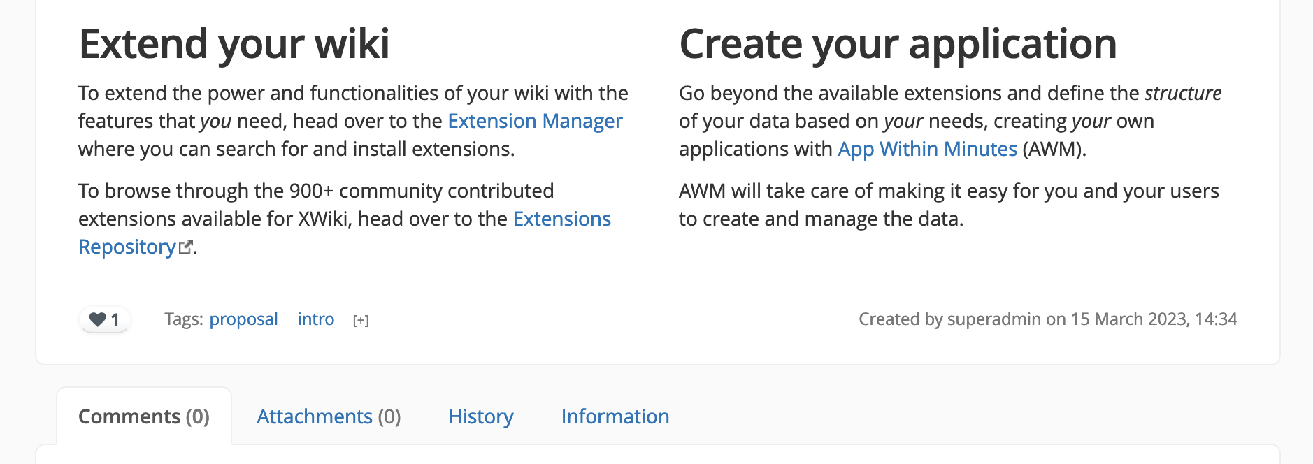
The extra info in the xDocFooter is used to specify the creator of the page and the date when the page was created. While this info is important, it doesn’t need to be seen everytime you reach the end of the page. It most likely is a type of info that one would want to know in specific cases. A better place for it would be the Information tab.
The idea would be to have here more useful information like:
how many people viewed this page (analytics) - this info would help in establishing interest on pages or checking if everyone saw a certain page. I don’t think we need to say who viewed the page.
how many times this page was viewed (analytics) - I believe this is a bit more complicated to do, but more useful than the first. It would offer the opportunity to develop something bigger in the future like knowledge bases “heatmaps” like Slite did.
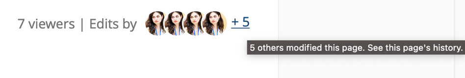
who modified the document (collaboration) - This would underline the idea of collaboration between people in a knowledge base. We’d showcase the first 4-5 users that last modified the document by listing their profile pictures. If there are more modifiers than 4-5, we add a clickable text like “+ 5 others”. This clickable text links to the history of the document.
We can explore other ideas for sure! Let me know what do you think about all of these
Proposal
My proposal is combining ideas 1 and 3 or 2 and 3, based on the level of technical effort.
Will have a seperate discussion for chaning all profile pictures to circles.
Also, I’ll probably need to change the word “her” into something more general as I don’t think we have a gender field for users. Maybe the second sentence of the tooltip could be “Click to see profile” or “Click to see their profile”.
I’ve implemented the HTML and CSS for the prevvious mockup, but I’m going to post it after we’ve established the direction of the revamp to not make this post longer than it needs to be.
Questions to answer
The answers to there would help a lot:
What do you think about the 3 ideas I’ve included for the revamp?
What do you think about the mockup and its states?
What other ideas would you like to see included in this revamp?
Hi! I like all three revamp ideas. I think people are pretty fond of analytics, so I would actually consider even a combo between all three or between 1 and 2.
For 2, perhaps a decision would need to be taken if they would be unique views or all views.
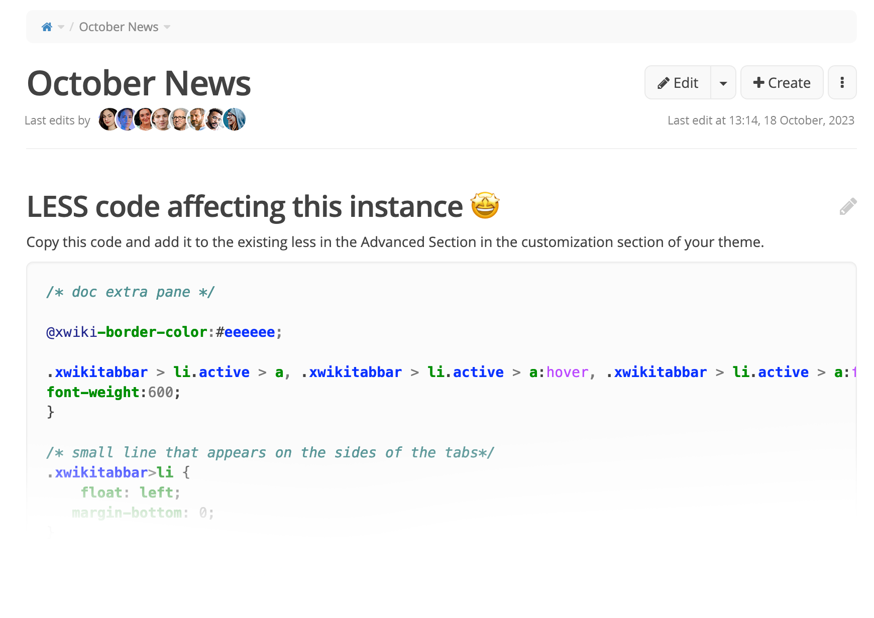
For 3, as on the top of the page there is “Last modified by User, day, hour”, couldn’t the “Edits by icons of last 3 or 4 editors +5” or “Latest editors icons of 3 or 4 editors +5” be used on the top, replacing the current one?
Still related to 3, if it’s the same editor, will we see a repeated icon or would we see “Latest editor 1 icon”?
For the bottom section, then there would remain only the viewers and views details (perhaps better to keep it that simple):
7 viewers | 7 views
Disagree with this, mostly admins of XWiki will either leave it enabled or disabled globally Controlling Page Tabs. If information regarding the creator will be moved into Information tab that will be hidden, other users won’t see it on their UI.
Whether it will affect the performance of the platform if it is applied to all existing pages in the XWiki platform from a box (clean install)? For tracking views/visits there are extensions and configurations that can be used.
Answering the questions in sequence:
first 2 I mentioned above. About the last - UI is user-friendly and both options are acceptable, but
what is the purpose of the layout? As an advanced and admin user I can find this info in a faster way, if it is intended for registered users or visitors - what is the display result of this? If consider myself a visitor, I would be interested to see avatar icons with usernames by hovering without afterwards navigation into the History tab.
Unfortunately, I don’t have enough information to give you a more specific answer.
Thanks a lot for your feedback, Andreea! It’s very helpful!
Moving the list of users after the page title
It’s a pretty good idea. I did have this in mind at some point, but there is one little problem: the two areas (the top one and the bottom one) have slightly different usecases - in my mind at least.
I feel like some people look at the last editor section both for the user that modified it last AND for the date at which the document was edited.
In a way, that area serves more as the answer to the question: “when was this last updated and by who?”. If we transform this area in a list of all editors, we might not be able to fit the date too without making the interface slightly more crowded. I’ve tried the idea below and, while it looks pretty good, I’m worried if it’s not slightly a bit too detailed especially considering it’s in the beginning of a page and we don’t want to overwhelm the user.
We could do a little something extra that clearly signifies the creator based on the list of users, but that, of course, implies more technical effort which might be more useful somewhere else at the moment.
The idea could be:
if the creator of the page is not the superadmin
his profile pic in the user list has a small icon in the bottom right (this would stay visually cohesive with the notifications revamp, too)
his profile pic is showcased before the “+5 others” text even if he didn’t do other edits from the creation.
if the creator of the page is the superadmin nothing happens
This would look something like (the last user has a circle with a plus in it):
Is it that you don’t find it very useful to showcase the stats regarding views/viewers for non-advanced/non-admin users? If this is what you meant, I think many people that create a page in a wiki would be interested into seeing how much their page has been viewed for different reasons. I can dwelve in that if you to discuss this side of the proposal.
Regarding the user list, well, yes, I totally agree it would be ideal to just showcase all profiles one after another in a tooltip when hoovering on the “+5 others”, I just thought that not doing this might simplify and thus speed up the technical implementation.
Note that it should probably be easier to make it a pronoun field rather than a gender field
From what I know, we avoid using pronouns so far, so I’m +1 for a second sentence without a pronoun.
The text of this header is set as a muted-text. From my understanding, we want it to be deemphasized so that the user can quickly focus on the main content of the page. Adding user icons up in this section would attract the eye and remove focus from the main content.
-1 from me to move last editor icons in the content header.
In my opinion, it’s not critical to have the two statictics in the footer. Those can be easily mistaken for one another so I don’t like putting them next to each other. I think I’d only keep the number of views, and add the number of unique views in the information tab.
This way, if I discuss with someone about the view count on a page, they don’t have to wonder which one, because it’s implicit that the one I’m talking about is the ‘easy to find’ one.
I would not want to remove the last editing date. I agree both are important.
It is indeed a bit crowded.
I agree that having the user icons up could remove focus from the main content (it would also depend on the content, I would say). Having just text as it currently is “Last modified by username on 2023/09/18 15:29”, it’s indeed more subtle and having it just on one side is also leaving more white space available.
That plus leads me to think of the create action button from the top, perhaps it could be confused with the possibility to create a user or something.
Technically, it can happen for the admin to choose to not keep the information tab at the bottom of the page and so, the detail of the page creator could not be that quick to reach if it would be there (it would remain to be accessible from the more options menu > Information). However, I do agree that the Information tab would be a good place for this kind of detail.
Tooltips on hover:
This is Adina Milica. Click to see their/the profile.
5 other modifications. More details in the page history.
So then, if it would be a combo of 1 and 2, for two I would prefer to see fewer icons, 3 and then the +5 if there are others.
Thank you very much for this proposal. Some notes from my side:
We currently don’t collect any statics about viewers. Before we decide to display them somewhere we first need a proposal to implement such statistics and whether they should be enabled by default. Also, it is not clear what a “viewer” is, are these different people that viewed the page, does this include bots (crawlers), … I think this is rather something that a statistics application should add. We already have a way for extensions to add content in that footer through the content footer UI extension point so I think this should rather be a feature request for an extension like the Matomo extension.
We currently also don’t have the information about all editors of a page easily available so it would also be significant work to compile that information.
This proposal puts a lot of weight on who modified the page. I’m not sure this is warranted or if a wiki shouldn’t be focused on the content and not who created it. Also, this could create a false impression that people contributed equally to a page while in reality most of the content was created by a single person.
In XWiki, the last author and the creator of a page are special: The creator can always delete the page and is therefore kind of an “admin” of the page. The last author is the one whose rights are used by scripts on the page, at least in most cases. This is actually more complicated in practice as there can be several authors involved. I agree this is not obvious but I think this is the reason why we display these two authors.
For me, the information when the page has last been updated is also quite important as it gives an important first hint if the information on this page is recent or outdated, moving it to the right makes it kind of more difficult to access I think as it is removed from the regular reading flow.
I think if we want to display all editors, it should be in the footer and maybe a bit more subtle. Maybe display names with small avatars?
Generally speaking, I agree with Michael’s points.
Good point. I started discussing this topic in Move xwiki-platform-statistics to XWiki Attic - #10 by vmassol. It seems heavy to have to install an external system like matomo to get this type of feature. Also, I believe we might be better off with an XWiki stats api as Matomo might be replaced by something else in the future and we need to allow for other implementations.
Another good point. We probably need to work on our history store in the future and be able to query it (like finding all the authors of changes in a performant way - Right now it’s doable but we need to iterate over all revisions). Ofc we could rely on the stats module but I feel it would be even better to refactor our history store to provide that info.
Hello! Came back to create a conclusion to this proposal.
This proposal is a feature addition (not a very important one, more focused on UI & philosophy), and not an improvement → not urgent in any way. Thus, its implementation shouldn’t take long at all.
If we revisit this idea, this is what I propose:
Based on this, we could iterate over the last 10 revisions and display the users related to these revisions.
If this takes longer than 2-3 hours to implement (and I think it might) I propose to note this proposal as abandoned for now. @vmassol what do you think?