We need an XWiki roll-up when going to conferences.
The next conference we are going to is FOSDEM 2019, so see you in Bruxelles in February. We need your feedback on some roll-ups proposals.
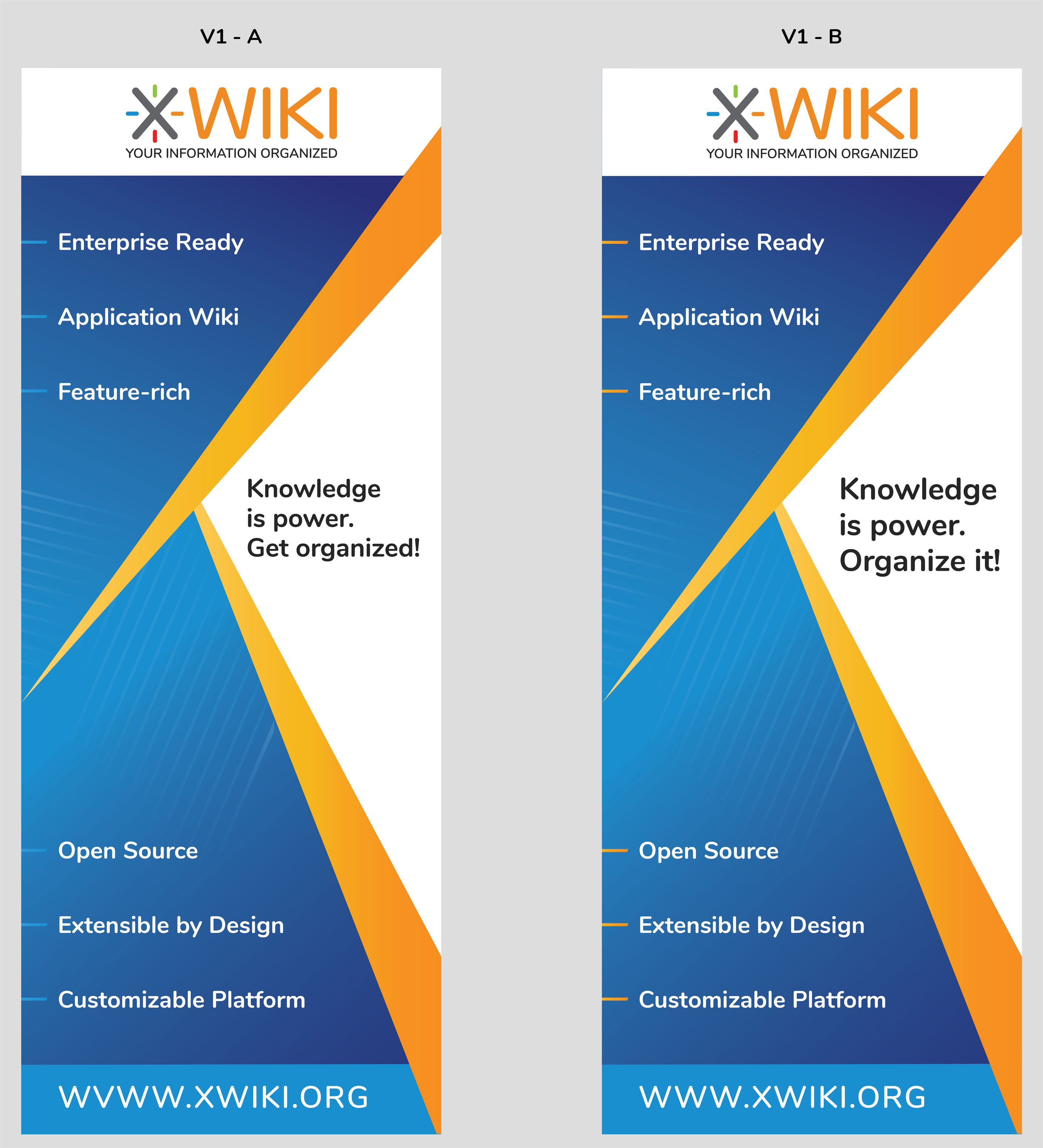
Before voting the one you like, I would like to thank you @evalica, @Enygma and vmassol for the input so far.
I don’t fully understand the separation between Enterprise Ready, Application Wiki and the other 3 boxes (open source, feature-rich & extensible platform).
Also, right now “open source, feature-rich & extensible platform” is more highlighted than “Enterprise Ready, Application Wiki”. Sounds weird to me.
Similar question for V1 which separates the characteristics into 2 groups. Is there an order?
Personally I’m not very fond of either but I don’t want to make more work for you guys, so I’ll vote for V1 because I don’t understand V2 (I don’t understand V1 fully either but I have less questions for it).
Separation is mostly caused because of the design elements so we had to prioritise some of them and decide what to display where. Also some characteristics have longer or shorter character count, so we tried to align them in order to be symmetric.
So, in banner design, yes the message is super important, but you also need to take into consideration the aesthetic and symmetry challenges.
I understand but why decide that “open source, feature-rich & extensible platform” is more highlighted than “Enterprise Ready, Application Wiki”? Is that on purpose?
For me “Enterprise Ready & Application Wiki” are really the two main differentiators of XWiki compared to other wikis. Why not have some diamonds around them too so that they are more visible?
In theory, they were prioritised (the enterprise ready and application wiki), because of their position (more top, closer to the logo, on both sides of the X). But in practice, the black background makes the 3 ones be more visible, be having a higher contrast.
Regarding both versions, I don’t like “Knowledge is power, organize it”. I don’t see how you could “organize power”. I know the (intended) subject is “knowledge”, but since “knowledge is power”, I assume the verb “organize” should apply to both.
Regarding v1, are the dots / bullets really necessary?
Regarding v2, I like the big X in the design, but the black background color of the diamonds doesn’t match the rest of the colors IMO. I would try for instance the color of the X from the XWiki logo, but that may be too strong also.
I like the verb ‘organize’ because under our logo we have “XWiki - you information organized”. So the phrase “Knowledge is power, organize it” could come as a phrase before or after the tagline.
Eduard, suggested that we could use “Knowledge is power, share it”, where the verb ‘share’ could apply to both ‘power’ and ‘knowledge’. Currently, I still prefer the verb ‘organize’ since I believe XWiki is better at this purpose, but I’m curious what others think too or if someone else has other ideas.
The bullets are needed in order to read the characteristics as individual phrases. The separation of the characteristics is done also with spacing and capitalization. Catalin suggested that we could try to remove the bullets and instead use some lines under to delimit the characteristics.
Indeed it might looks like a presentation, but at least from an usability perspective it’s very clear that the lines are separate entities. What do others think?
We also tried with the gray from the X: it looks too dull. We also tried with a blue background that had gradients directed to center: the contrast white text on blue is not as good as the dark gray. So, I agree we don’t have black in our branding, but we opted for this version because of good readability and good reading of the characteristics because of the contrast.
Even if I voted for V1-A, I would have preferred V1-A with orange dashes and with higher font-size for the message in the middle (Knowledge is power. Get organized!).
Higher font-size is impossible because of the character count for “Get organized!” (14 chars) compared to “Organize it!” (12 chars), plus the need for spacing before and after.
IMO, “Get organized” sounds a bit insulting to the reader. It either sounds like we’re schooling them (like you would a child) or like we are condescending, assuming they are not organized persons.
Not a big fan of the dashes (as they are now), particularly the fact that they are not indented and start directly from the edge, when I would perceive them as being part of the text/content and not of the layout. I had no particular problem with the bullets. If we want to stick with dashes, I’d prefer to have them half their size (i.e. with a bit of a padding from the left edge). Maybe it’s just my preference, but I see them as quite uncomfortable (because of the conflict of perception)
the lines have been made on purpose to look like the other decorative blue lines, in terms of final angle and going outside of the edge. They should be perceived more as decoration and to support readability, than as part of the text.
So if initially the lines were blue (consistent with the other smaller decorative lines), the orange variant was made in order to balance the big angles / lines orange color, so we went for the orange consistency / symmetry with the big lines, instead of the small ones.
From my experience, most of the people are not organized . Anyway, I find this better than telling them to organize their power. As for “sounds a bit insulting”, nowadays anyone can be offended by anything…

 so we had to prioritise some of them and decide what to display where. Also some characteristics have longer or shorter character count, so we tried to align them in order to be symmetric.