Filtering & hiding/showing annotations UI

Hello guys! :blush: Here to discuss the filtering & hiding/showing annotations UI.

Current situation

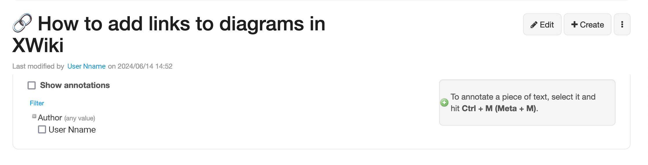
To see annotations, you have to enable viewing them from the following UI.

This UI is opened from any page > More > Annotate menu item. You close it from the same menu item.

To see the list of annotators, you have to click on the Author button that expands a vertical list of names.

Issues

Issue #1: Enabling annotations from a certain UI implies quote a lot of active thinking & effort for the user.

Proposal #1: We should have showing annotations enabled by default. See the detailed justification in the design page.


Issue #2: The filtering & hiding/showing annotations UI doesn’t have good visual structure.

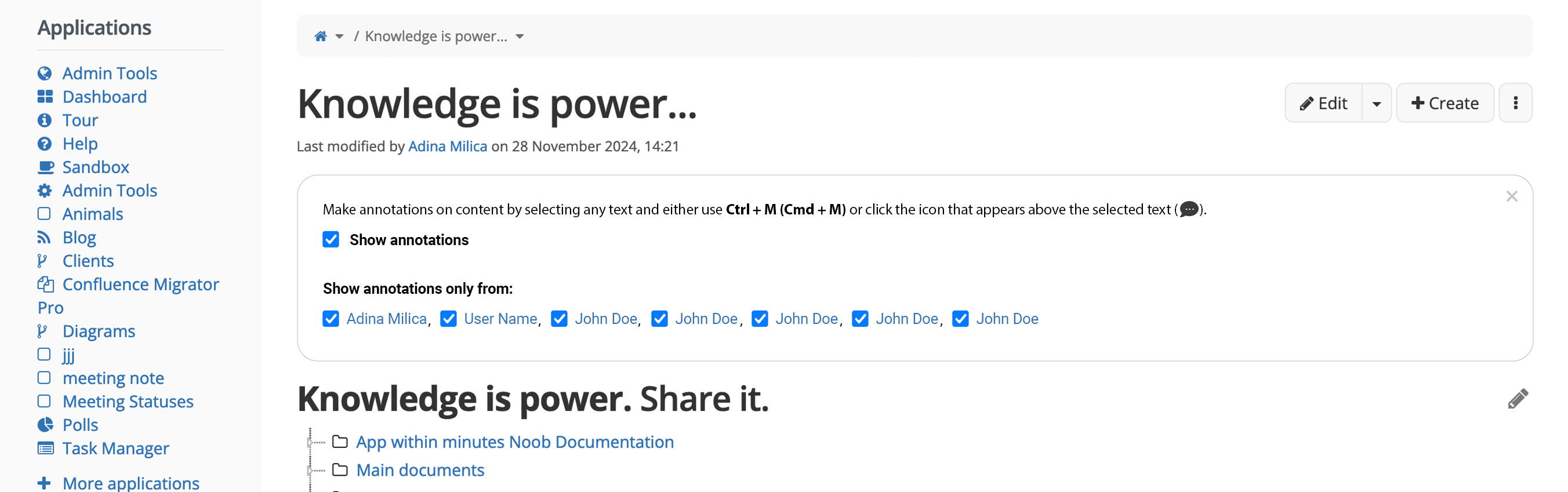
Proposal #2: We should improve it. See improvements below. :arrow_down:

New Look :star:

If the list of users is NOT longer than 1 line

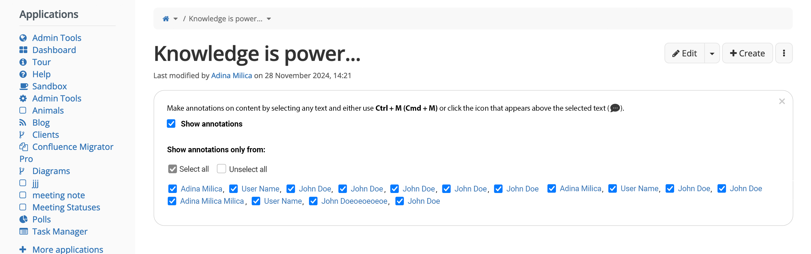
If the list of users is longer than 1 line

  • The names will wrap on the next line.
  • There will appear the options to select all or unselect all.

Detailed improvements

#0 Seeing annotations should be enabled by default.
Disabling and filtering annotations is done from the same menu item (any page> More > Annotate), but the UI is a bit different.


#1 Users are shown one after another horizontally, saving more vertical space between the page title and the content. For lots of user, the list wraps on the next line.

The users are ordered alphabetically by their first name so the author can find a certain person in a long list easily.


#2 For long lists, we should also have a Select all and Unselect all button.


#3 This UI would also have an “x” icon to close it in 1 click. This way the user doesn’t have to do 2 clicks and quite a lot of mouse movement to not see this UI component (as it is currently)

What do you think?

Do you think the changes are beneficial?

Note: the border-radius for the outer border of the UI should be 10px. Will update it.

1 Like

This looks great! Annotations are very useful for collaboration so in my opinion it is key that this topic is getting some focus. The most important change would be the new default setting as I can guarantee you that maybe a quarter of thee users in my instance finds this options by themselves and enables it. Would the filtering UI be displayed as soon as annotations are present on the page or is it hidden by default (just in enabled state as new default)?

I believe - but I’m not sure, so please do a technical check about it - that when enabled, annotation cause extra client-server traffic for each page, even if there are no annotations in.
That may be the reason annotations are default off.

Not that I’m against having them always enabled (I do find them a tad… uncomfortable too), just that maybe that could imply more technical side effects.

Just a detail: I’m wondering if it would not be better (as in more consistent) to display the users with their image, like we do in most other places where users are listed.

Hi @amilica thank you for this proposal.

I am mostly +1 on the changes, the only thing I am on the fence about is " #0 Seeing annotations should be enabled by default.". I can see use-cases for it being on and off by default, it depends heavily on the context XWiki is being used.

Notion have them on all the time, even on public websites.

I think I prefer that it is not enabled by default for the following reasons:

  • When you’re viewing pages, the most common use case is to view the content, not the annotations. I’d say 99% of viewers don’t care about the annotations. Those who care are the persons working on that page (editors, reviewers, etc), and they’re clearly a small minority. Thus we’d be making the UI a lot heavier than it should be for most users.
  • Displaying the annotations has a cost and it’ll slow down the page display for everyone, which is pretty bad.

I think we should work so that we can view annotations with 2 clicks only (vs 3 now):

  • One click to the more menu
  • Another click to enable/disable annotations (the menu action would be a toggle)

Then, when enabled we’d display the top UI to perform filtering, if needed, with an option to close it/fold it (to be defined).

This looks good to me (even if it’s not very scalable). I don’t think it’s an important feature (I don’t even know if it’s used, I’ve never used it myself).

See above, we might need to also fold it. Clicking the close button would disable displaying the annotations for me (if not, then we have an issue of how to re-enable the filtering UI).

Note that we also have the Alt+A shortcut to enable/disable annotations, which makes it very easy to use. Maybe we need to display a hint somewhere (e.g. in the annotation filtering UI) to let the users learn about it.

WDYT?

Thx

1 Like