Help us improve XWiki

Hi everyone,

I hope this message finds you well. We’re excited to share that we’ve been working on some notification changes for XWiki, and we would love your input to make it the best it can be.

Your feedback is incredibly valuable to us. By participating in a quick usability test, you can help us ensure that this changes enhances your experience with XWiki. The session will only take about 5 minutes of your time and can be done at your convenience.

To participate, please click on the link below:
https://dev.quant-ux.com/#/test.html?h=a2aa10aDO5BZ3legXwvGxkQzrlN3uQhy1KpyJ4xsGaJOsnYzlYe5Efdi32Ty&ln=en

Thank you for your support!

8 Likes

I really liked this. Glad to be of help.

2 Likes

Thanks, it was a cognitive activity. I noticed some issues in UI, see my feedback in first input field.

Do more tasks exist?

1 Like

done. I hope you share what you discover if you find anything interesting in the results.

1 Like

Done! Feel free to send more tasks this way :blush:

1 Like

Yes, we want to give at least a summarized version of the results =). Thank you for participating!

For now, we don’t have any more experiments planned, but in the future certainly!

Hey everyone, I’m back with some results of our experiment.

Participant Summary

We had a total of 43 participants. Here’s a breakdown:

  • 13 participants stayed for less than 30 seconds.
  • 18 participants stayed for more than two minutes (including the time taken to write feedback).
  • 17 participants had used XWiki before (more on this later).
  • 11 participants had used other KMS type software.

XWiki Usage

Most users reported having used XWiki before. However, considering where the test was shared, this number should be higher. It’s possible that some users just marked any response to start the test quickly. While this is just a conjecture and not the test’s focus, it’s an interesting observation.

Heatmaps

We anonymously recorded each session. These recordings allowed us to trace specific user paths and create heatmaps.

Heatmaps visually aggregate different actions on a page, helping us understand the participants’ mental models for a particular task. Every click is included in the heatmap, even those not on an “active” area of the prototype.

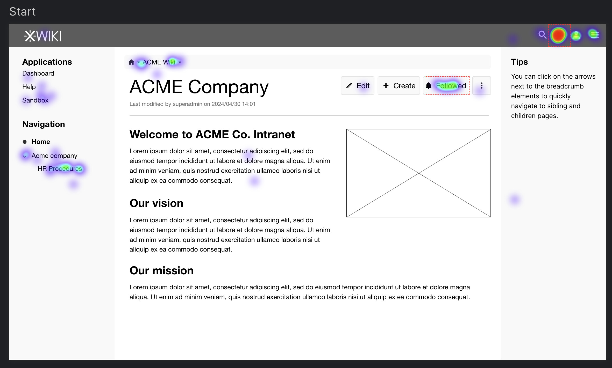
Heatmap: First 3 Clicks

Here’s the heatmap showing the first 3 clicks on the first page.

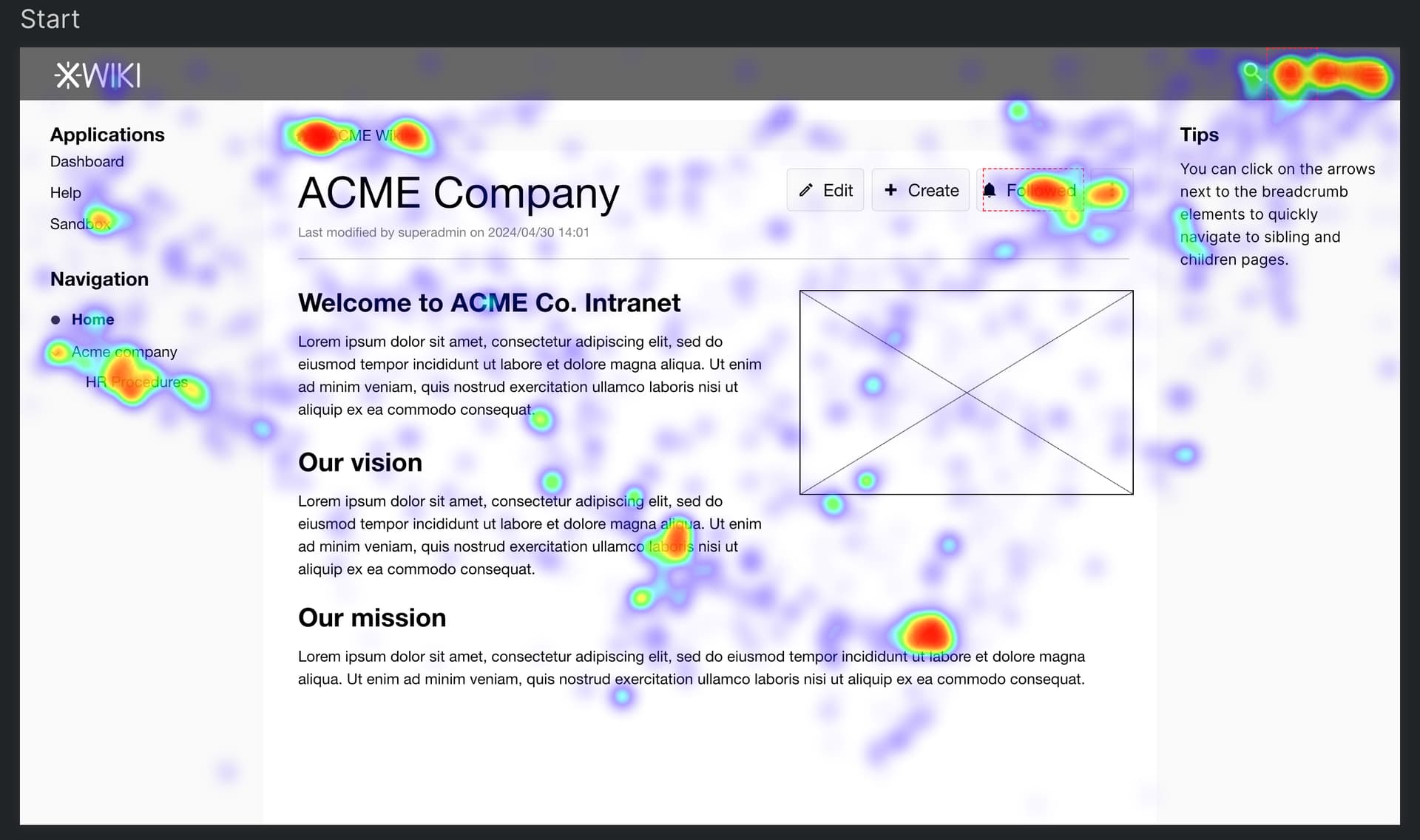
Mouse Travel and Resting Places

This map shows the common paths users took while exploring the prototype and where they paused to think.

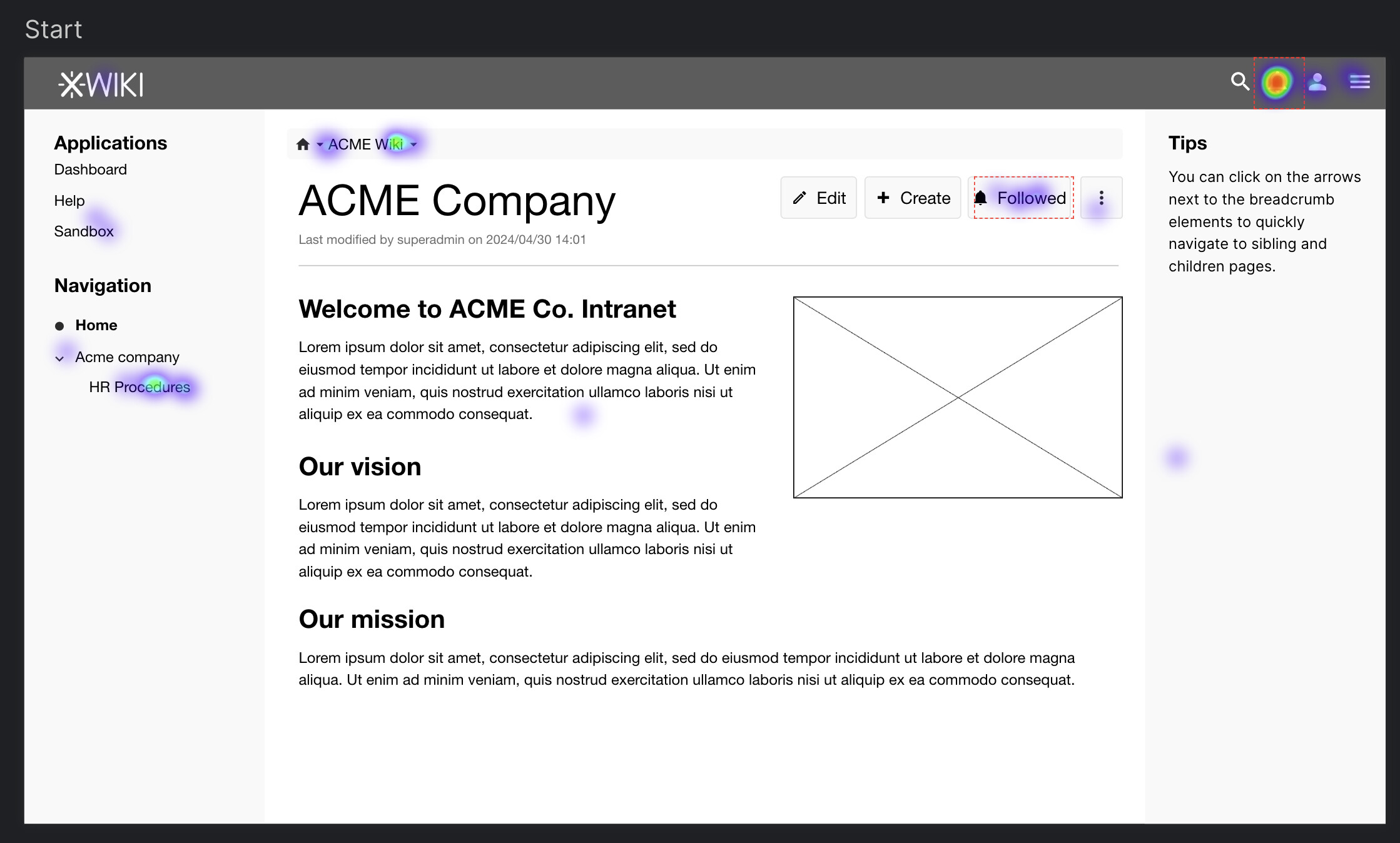
Absolute First Click on the First Page

The Bell icon at the top of the page was the most accessed, as it aggregates notifications in XWiki.

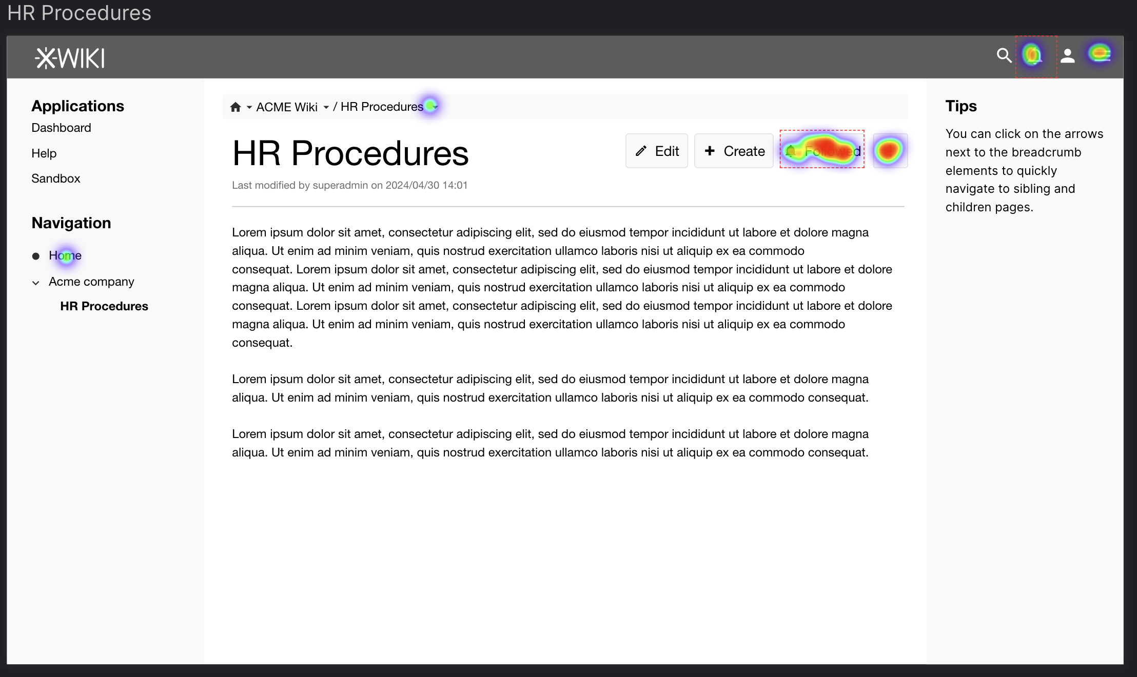
Target Page: “HR Procedures”

On the “HR Procedures” page, most users quickly understood the purpose of the new button. However, there were still many clicks on the Bell and “More” icons. Feedback suggested some users might prefer the new button under the “More” icon to give more space to the page title and avoid cluttering the main buttons. Another suggestion was to have it as an icon only for a cleaner look.

Feedback on Title Length

One piece of feedback was that the title was unrealistically short, which rarely happens. We’ll keep this in mind for the next test.

Block vs Ignore

We received a lot of feedback on using “block” vs “ignore.” Both versions performed well overall. However, there were conflicting opinions on the semantics of the words. Some perceived “block” as more aggressive than “ignore,” while others felt the opposite. We also got feedback on using “unfollow” or “unsubscribe”.

Conclusion

While our main objective was to gather feedback on word semantics, this experiment also helped us test the general navigation and experience of the changes in the Watch feature. We received valuable feedback and plan to share these experiments more widely in the future to reach people who might not be as familiar with XWiki.

Thank you all for participating, and please reach out if you have any suggestions

4 Likes

Thank you for sharing the results of the experiment.
I look forward to seeing the others! :partying_face:

1 Like

Thanks @tkrieck for the report!

Personally I think that we should in the future limit these experiment to only gather paths / heatmaps as provided by the screenshots you shown, and not use that tool to get written feedbacks: IMO they’re difficult to exploit, and the UI of the tool itself is not providing a nice way to have the feedback displayed along with the actions the user performed.
So if I had to do it again I’d probably do a poll separated from the usability test.

That being said, I think we should do more often quick usability test, but I think I’d do them like this: have encoded 2 ways of doing something, present to user UI for way A, ask them to achieve task, present to same user UI for way B and ask also to achieve the task. Ask at the end what they prefer (only a boolean value). And randomize what appears first between A and B.

IMO if we do that it allows to get very fast an idea of what’s best between two proposals, it allows a small set of users to actually test the 2 proposals, randomizing A and B should avoid a bit a bias on being more comfortable the second time for achieving the task.

I think that would help. I propose:

  • Expand this to more options if applicable (A, B, C, etc.)
  • Use of page content that reflects a more real-world situation (in which a title of only one word is not)

I agree partially agree with @surli about the heatmaps, I really don’t see the use of it. While it does provide some info on what users do on screen, it does not explain the ‘why’ behind the behavoir. Worse still, in the end these can be used to promote utterly horrible design ideas by people who do not know the first thing of design.
When we turn the job of designer into a democracy, why not just use a poll and be done with it. :+1::no_mouth: