Hello! ![]() I’m here today to discuss a fast improvement we can do to the icons in Global Administration.
I’m here today to discuss a fast improvement we can do to the icons in Global Administration.
Proposal
The idea would be to get advantage of solving a low-hanging fruit:
- changing the files of the icons in Global Administration with more modern images, high-res ones.
Pros & cons
Pros of the proposal - We easily modernize GA, thus improving the perceived value of the product
Cons of the proposal - The documentation will not be cohesive with the reality of GA. I think it’s worth changing things even with this con, as we don’t change the contents of GA - the text items stay the same, in the same order, in the same layout.
Current situation 
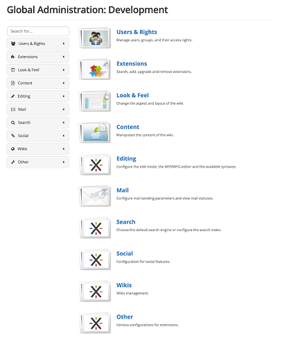
GA has icons that are not cohesive in a style with the rest of the UI (which is mostly flat, minimalist, limited in color). Their respective style is also pretty old-looking, making the whole UI feel unpolished and lowering the perceived value of the product for a first-time user.
Proposal Implementation 
The ideal implementation needs to be very low effort so we don’t take time from more important things. Also, note that a revamp for Global Administration has been more or less validated, and that proposal doesn’t contain any big icons.
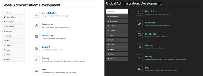
The idea for this proposal would be to replace the .png files in only one color for all themes (a medium gray, that work for light themes and dark themes at the same time).
Color contrast
In the following proposal, the icon itself (not the border) has the color: #939598 (has 3:1 contrast against the white background in Iceberg).
Icon set
The icon set used in the final icons are from Font Awesome 7.
New icons - 2 versions 
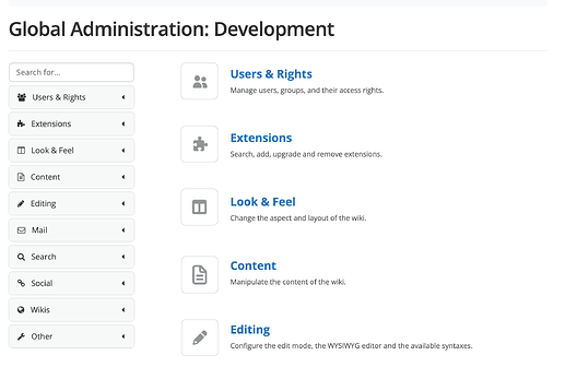
Version 1 - with border
Version 2 - no border
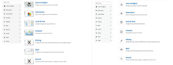
Before & after 
In the after version (right side), the UI feels a bit more modern and even cluttered.
Used on light & dark themes
All icons
If you want to see all icons made for this proposal, covering all sections of GA, see the extended proposal.
What do you think? 
- With border or with no border?
- Should any of the icons be improved/changed?


