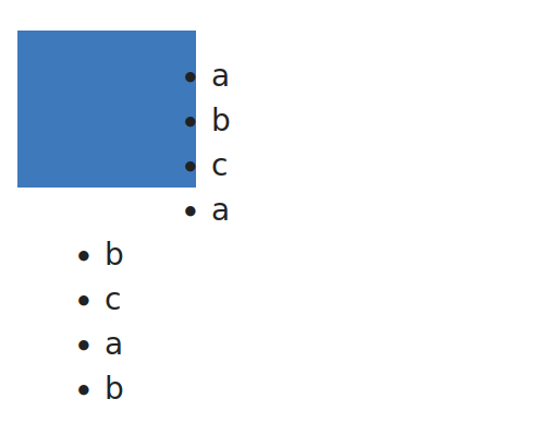
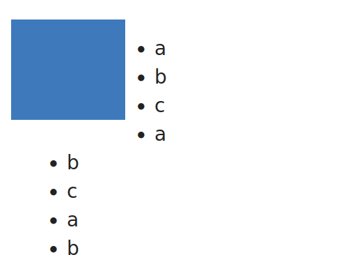
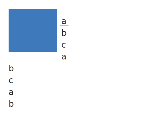
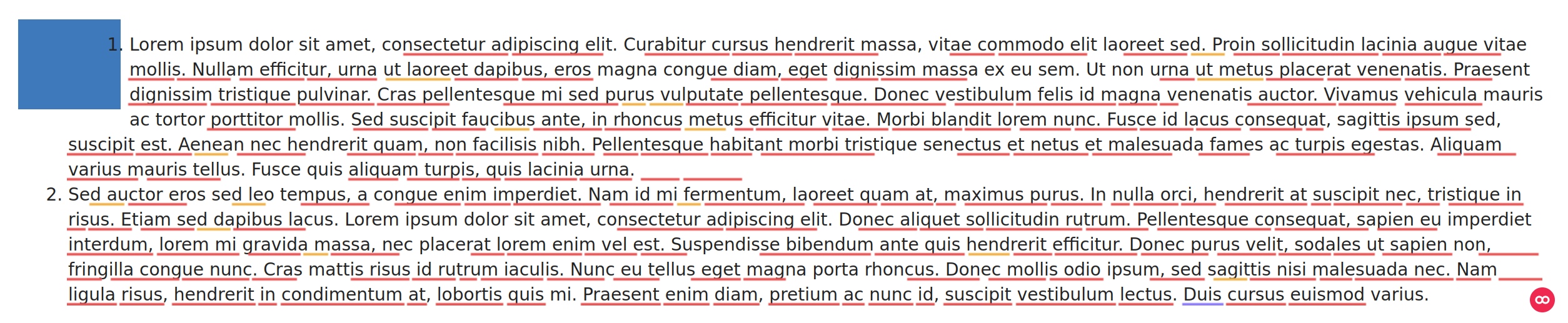
The list if not overlapping with the image. But, if the list takes more vertical space than the image, the list is not “flowing” around the image (i.e., the last items are not left aligned, but aligned with the rest of the items)
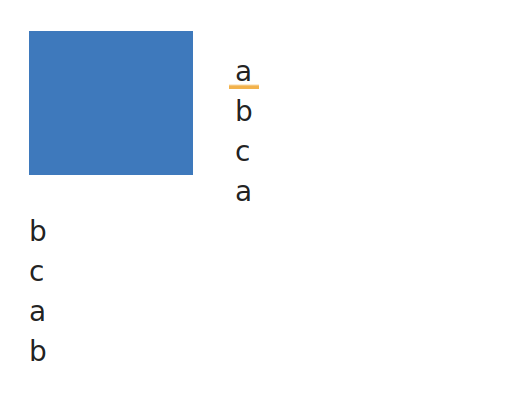
This is looking better, but the padding is also applied when the elements aside the image are not lists, meaning that any text will have a noticeable space with the image.
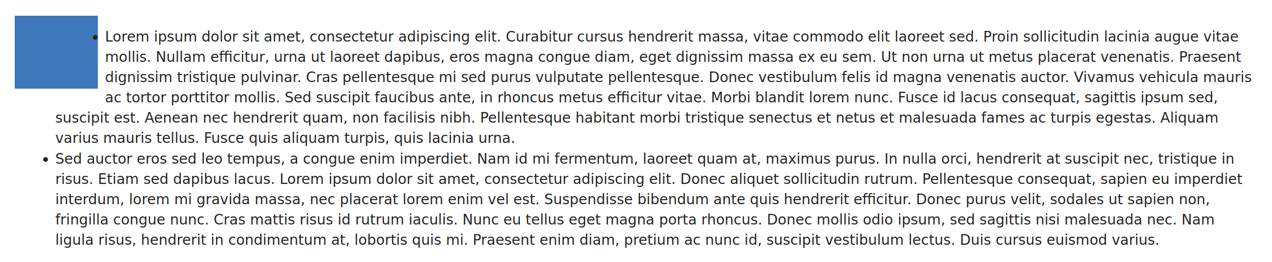
There too, this is looking better and we preserve the text wrapping the image.
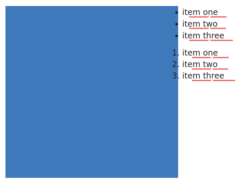
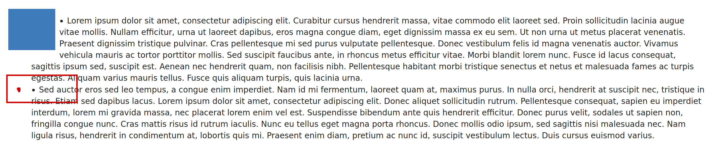
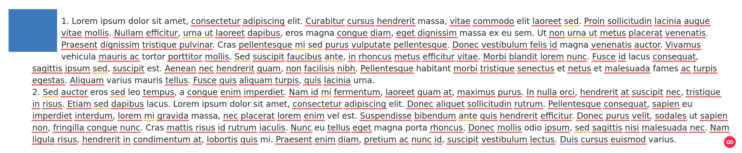
The main cons being what I have highlighted in red. The bullet is now wrapped inside the text, instead of being clearly outside the text.
Conclusion
I’m -1 for Option 1.
I’m +0 for Option 2 as I think it’s preferable we don’t impact the presentation of elements others than ul/li
And +1 for Option 3 as I think it’s acceptable to see bullet points wrapped like this.
WDYT?
(the title of the topic looks inconsistent with the actual content image floating right vs image floating left)
+1 for option 3, this looks like the most stable option.
-0 for option 1 because we lose the main advantage of an inline layout , the text flow.
-0 for option 2 because it looks like a recipe for technical debt. If we can somehow find a more specific selector to set this margin next to pictures only for ul/ol I’d be +1 on this, but changing how the text flows around the picture just for this relativively niche case is definitely something I’d want to avoid.
For the record, the fourth option was css - How to make a <ul> wrap nicely with floating elements? - Stack Overflow but can be discarded as it does not work nicely when applying on CKEditor content. The lists have a large left margin, overlapping the images and preventing users from clicking on a large part of the image.
Therefore, the number of options stays at 3 and the discussion can be resumed.
My opinion is that we should not change the default list appearance or behavior to fix this edge case. Therefore, I’m -1 to 3. I’m also -1 to 1 for similar reasons, as it changes the behavior when there are elements that are wider than the content of the list. Option 2 has a very weird effect when you combine regular text and lists as it changes lists to no longer be indented compared to the text, -0 for that as having some margin on floated images doesn’t sound too bad in general.
There is a variant for 1 that I would find more acceptable, but that has other bad side effects: display: flow-root. While not leading to scroll bars for wide content, it lets elements that are too wide like wide tables overlap with an image that is floated to the right.
Overall, I think there is no really great solution for this. To me, option 2 seems like the option that has the least amount of unintended side effects for content that doesn’t use images that are floated to the left.
I think images that are floated to the left are something that’s rarely used, and I wouldn’t be surprised if there were also aesthetic or maybe even accessibility arguments why they shouldn’t be used - I think normally images are either full width or on the right. For this reason, I’m against applying a change that causes regressions for other use cases.
In my opinion, Option 1 seems too hacky and is equivalent to making the flowed element a block, so the flowing of text around the image is lost.
Option 2 seems more stable, the added margin on other elements is not a problem specifically as it helps the content to “breath” a little bit. I agree with @MichaelHamann, it seems to be the options with the least side effects when not dealing with images.
Option 3, makes it harder to scan through list items visually. IMO, this defeats the purpose of a list a little bit, so I would not go this way.