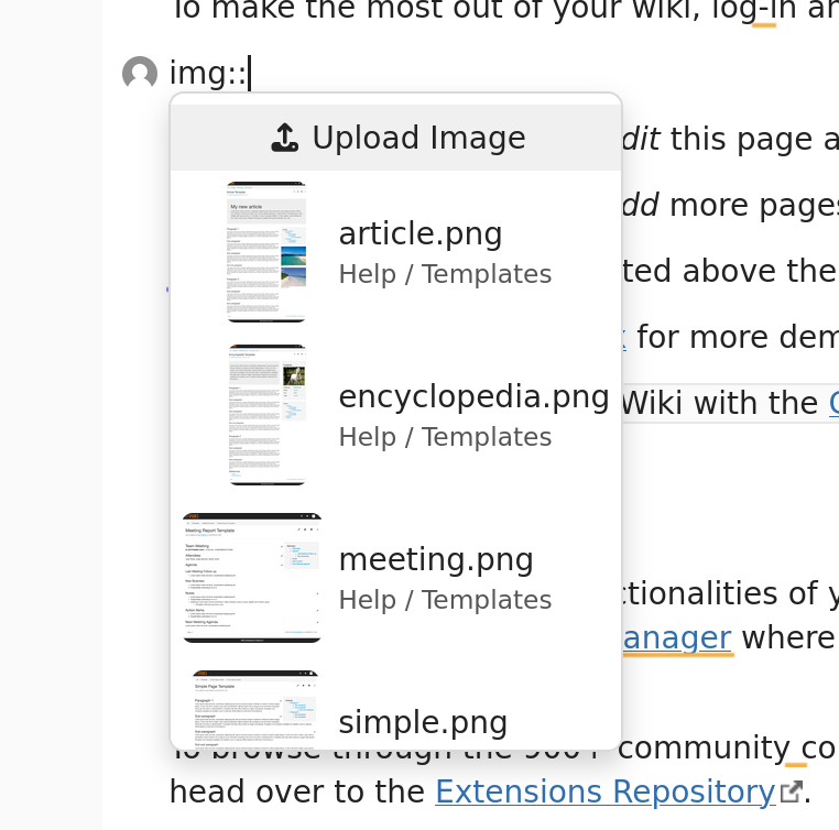
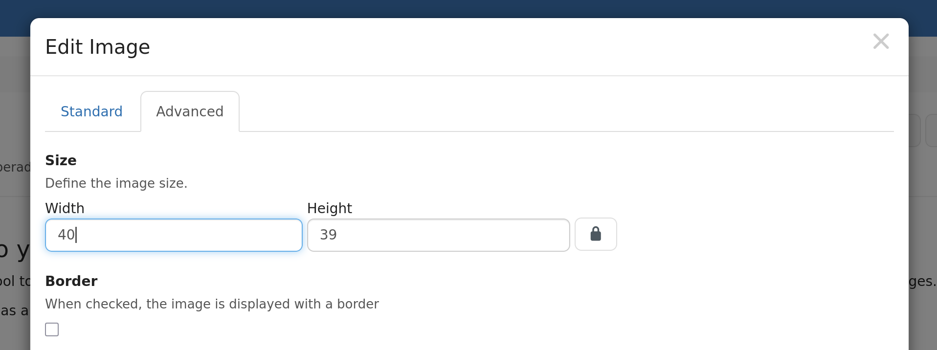
Currently in BlockNote we have a single way to insert an image: by typing /image, which triggers the image popover (see below), in which one can search for existing images or upload a new one.
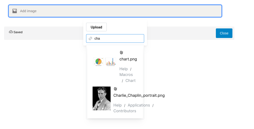
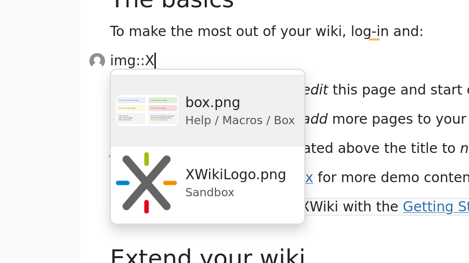
In order to improve the user experience, it was decided to replace that with a simple suggestions menu, like the one already existing in CKEditor 4:
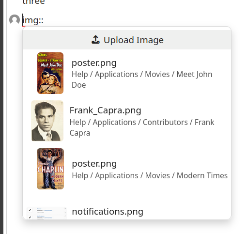
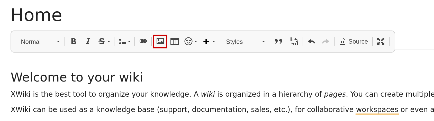
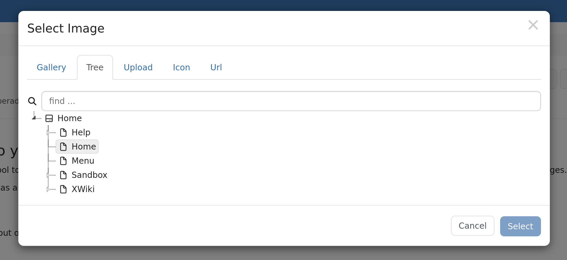
The thing is, CKEditor has a fixed toolbar at the top of the editor, which BlockNote lacks. So with that kind of menu, there is no way to open an actual modal to search properly for images with additional filters for instance.
So what UX should we strive for in the new suggestion menu for BlockNote?
- Mimic the exact same UX/UI as CKEditor 4 (upload button as first item then suggestions)
- Use the same menu but insert a second item that would open a modal with more complete options (so for instance upload button, modal button, then suggestions)
- Use the same menu but add a second slash menu item that would open the menu
I would personally go for option n°2, as it would allow access to everything in a single, unified menu. Having a separate slash menu item might be confusing for users, and leaving out the ability to open the advanced modal would be problematic.
What do you think?
(P.S. feel free to tell if anything wasn’t clear in my proposal)