Hi all,
With this topic, I’d like to discuss some improvements currently being considered for the Distribution Wizard. These ideas stem from a series of existing Jiras (some quite old), as well as from the need to evolve the DW so it can serve more effectively as a general onboarding tool.
To make this easier to follow, I’ve divided the post into the following sections:
General Overview
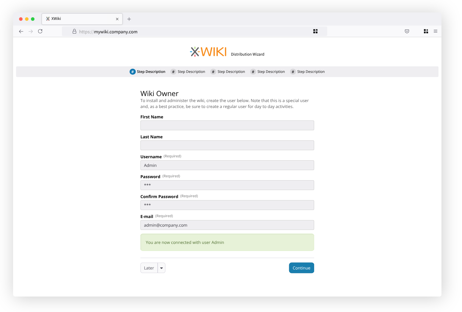
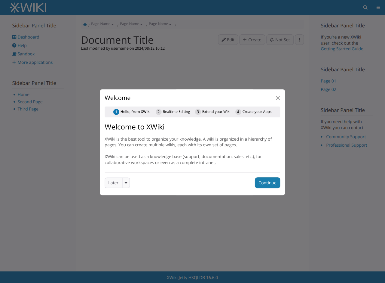
Here’s an example of the DW in the new layout, describing the main parts and featuring the creation of the first user (see more in the Jira section).
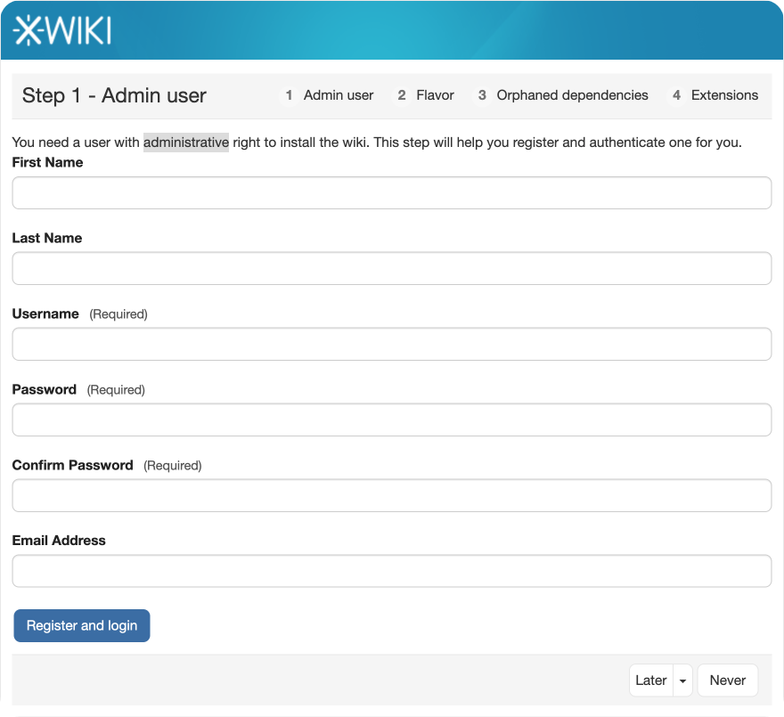
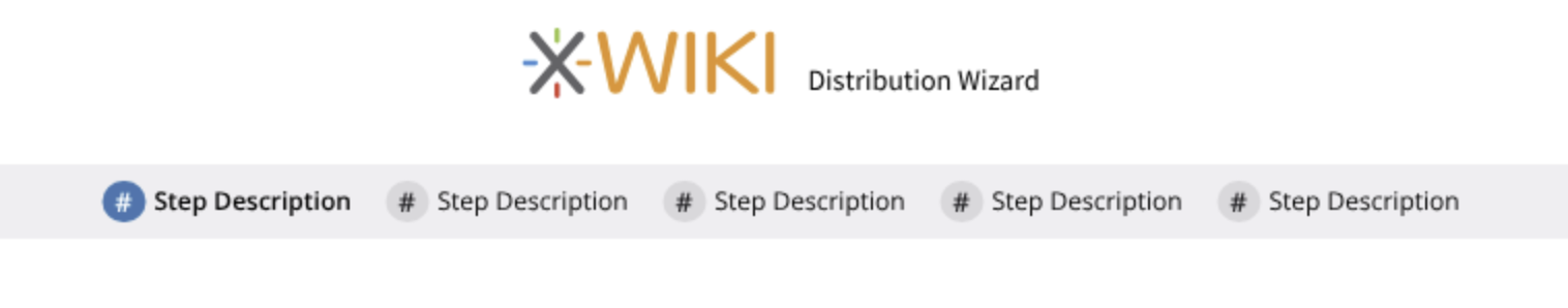
For context, here’s the same screen in the current implementation
List of individual Jiras
https://jira.xwiki.org/browse/XWIKI-10769
Updated the order of the buttons: the primary action is now consistently placed on the right, while all “Later”-related actions are grouped on the left, reducing conflicts and improving predictability.

With the menu expanded:

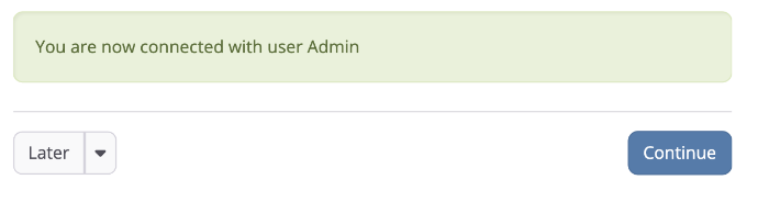
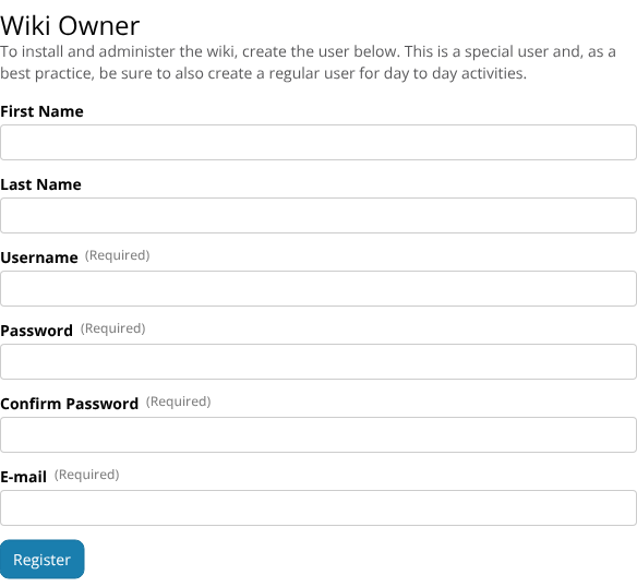
Still regarding button order, I’d like to propose that the “Continue” button is never hidden, only disabled based on the required actions in each step. For instance, in the Admin user step, the Continue button is hidden and the “Register” button takes the priority on a different place in the UI. This can cause users to be confused because 1 - the position of the button changed 2- the button text is different, pictured below:

In this case, we could keep Continue visible but disabled, while still giving Register priority.

After the user registers, we remove the Register button (no longer useful), display a “connected” confirmation message, and re-enable Continue.
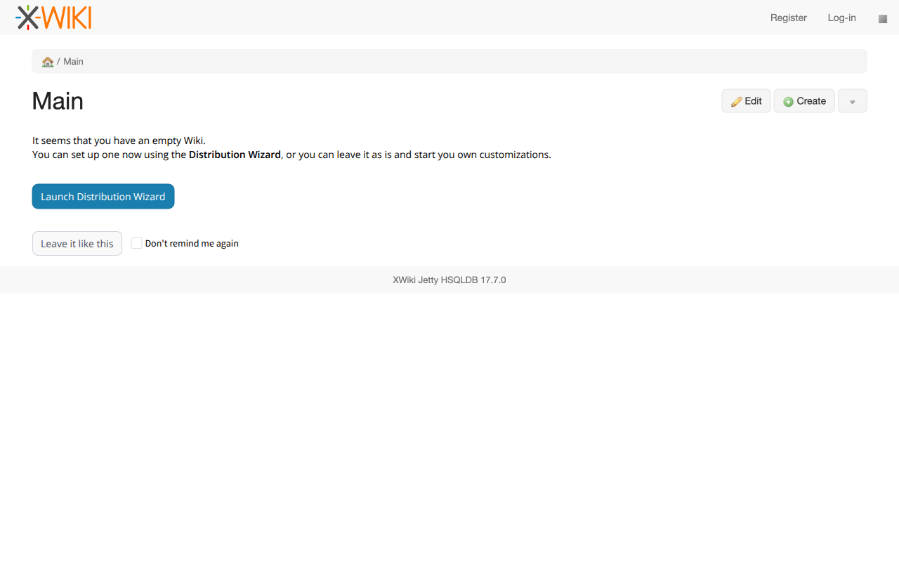
https://jira.xwiki.org/browse/XWIKI-9818, https://jira.xwiki.org/browse/XWIKI-9112
For these issues, we could display a custom home page specifically designed for this scenario. This page would explain why the screen is empty and offer the user two options: launch the DW again, or keep the page as-is (temporarily or permanently).
Open question: What are all the conditions that should trigger this page?
https://jira.xwiki.org/browse/XWIKI-20688, https://jira.xwiki.org/browse/XWIKI-14726
Here, we slightly revise the introductory text for the Admin user step. The goal is to explicitly clarify the type of user that is being created.
https://jira.xwiki.org/browse/XWIKI-20714, https://jira.xwiki.org/browse/XWIKI-17600
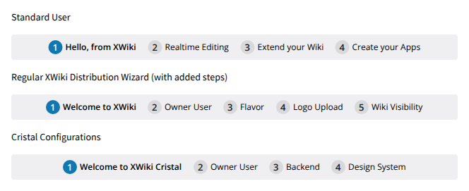
The DW steps should reflect only the tasks that are truly required. For this reason, the step navigation bar should become dynamic, adapting to the work that actually needs to be completed.
This requires further analysis to determine the best technical approach.
![]()
https://jira.xwiki.org/browse/XWIKI-22704
Proposed is a simpler header layout that doesn’t rely on special styling.
https://jira.xwiki.org/browse/XWIKI-17840
This Jira is being handled by this proposal.
https://jira.xwiki.org/browse/XWIKI-17251
Improvements for Onboarding
When it comes to onboarding, it’s important that the DW can support different use cases. One of them is enabling the DW to be launched from a modal dialog. This would allow us to present educational slides to new users (the slide content is outside the scope of this proposal).
Example below:
Below are examples showing how different users might see different steps at different moments:
That’s all for now.
Thank you for taking the time to read this, and as always, any feedback is welcome.
Thiago