When editing objects in XWiki, especially classes with StaticList fields (single choice radio), the default object editor layout can become hard to read:
StaticList radio buttons are rendered inline, without line breaks
Listed object blocks visually blend into the surrounding UI
Important objects are easy to overlook (even when already selected)
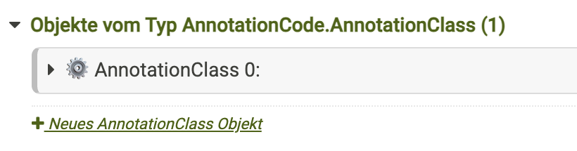
radio button list ist more readable and accessible
Object purpose is immediately visible
So I improved the layout for certain class object that i want to see better by using only a XWiki.StyleSheetExtension, without JavaScript or template overrides.
Reproducible Example (Sandbox)
To make this easy to reproduce on a clean XWiki installation, this example uses the Sandbox.
Setup
Create a class in Sandbox.WebHome
Add a Static List property:
Single choice (radio buttons)
No multiselect
Example values: value1=Test 1|value2=Test 2|value3=Test 3
Add one object of this class to Sandbox.WebHome
Open the Object Editor
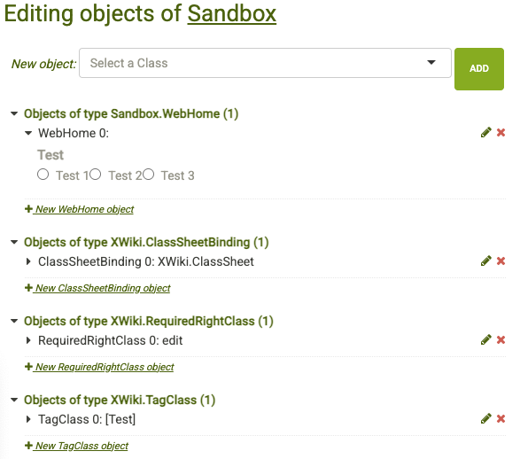
Default Rendering (Before)
Typical issues with the default rendering:
All radio buttons appear inline
No visual grouping or container
Class purpose is not obvious
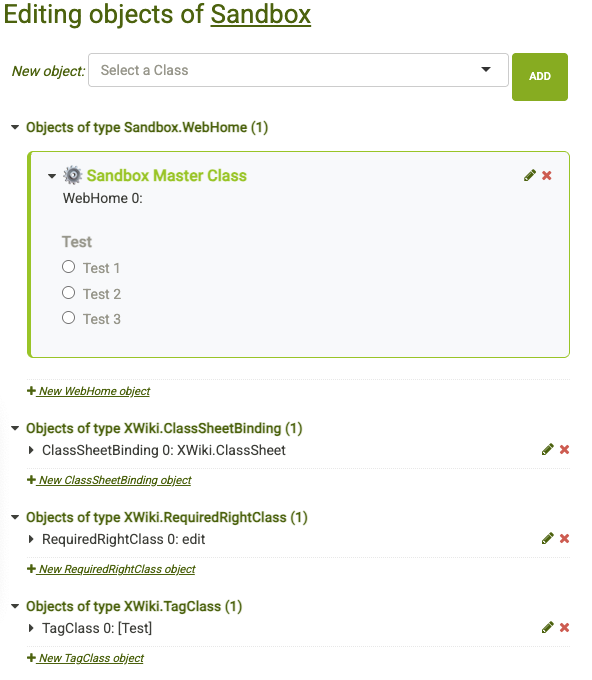
CSS-Based Enhancement using StyleSheetExtension
The following CSS is applied via an object of type XWiki.StyleSheetExtension just for the selected class.
Goals
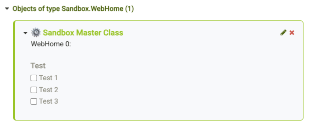
Add a visual container around the object
Render StaticList radio buttons one per line
Improve object header readability
StylesheetExtension Example
/* Improve Object Editor Usability (Sandbox Example) */

/* Visual container for ALL Sandbox.WebHome objects (0..n) */
div.xobject[id^="xobject_Sandbox\.WebHome_"] {
  background: #f8f9fb;
  border: 1px solid #94c600;
  border-left: 4px solid #94c600;
  border-radius: 6px;
  padding: 0.5em;
  margin: 0.5em 0 0.5em 0;
}

/* StaticList (radio buttons): one option per line */
#xclass_Sandbox\.WebHome_content
dd > label.xwiki-form-listclass[for^="xwiki-form-test"] {
  display: block !important;
  margin: 0.25em 0 !important;
  cursor: pointer;
}

/* De-emphasize technical class name */
div.xobject[id^="xobject_Sandbox\.WebHome_"] > .xobject-title h3 {
  font-size: 10px;
  color: #999;
}

/* Human-readable object title */
div.xobject[id^="xobject_Sandbox\.WebHome_"] > .xobject-title h3::before {
  content: "⚙️ Sandbox Master Class";
  display: block;
  font-size: 16px;
  font-weight: 600;
  color: #94c600;
  margin-bottom: 0.4em;
}

/* More spacing at the top of the object content */
div.xobject[id^="xobject_Sandbox\.WebHome_"] > .xobject-content {
  padding: 25px 14px 8px;
}
As i adopted this for the most common objects in my system this turns the Object Editor from a purely technical list into a visually structured configuration dashboard.
Thank you for sharing your improvements! It’s an interesting idea
The display of the radio buttons for static list look like an oversight. I agree that they look off and we should at least add spacing between the items ^^’
Did you raise a bug ticket about this? If not, I can create the ticket (and I’ll probably provide a solution soon enough too).
The fact that the radio buttons are inline could be a feature in some other use cases. We want to make sure we don’t break what was working before by changing that. I kinda agree with changing it (IMO the benefits are significantly higher than the drawbacks), but we would need to put the change in the release notes so that admins migrating can notice.
From what I understand, the object purpose is the pretty name of the class? I personally agree it would be nice to display those. The cost of displaying those is that we increase clutter. This might not be something worth on a technical page like the class editor. If we rethink a bit the way we show the technical name, the improvement would be similar and we wouldn’t add any clutter. I’m on the fence for this.
I’m not yet sure how we’d implement this for XWiki Standard. Looking at your CSS, it doesn’t seem like it would scale easily to cover all classes. We really don’t want people to have to write a CSS ruleset to have a working class, so we pretty much have to fill one up from a set of metadata for the class we’d ask for in the class creation/edition form. Things like:
Pretty name
Box color (we might want to force the choice in a list of standard XWiki colors so that we’re sure it’s always in the colortheme… )
Icon
Note that App Within Minute already has an icon used for presentation.
I agree. That’s exactly why I reduced the margins in the edit of my first post – to avoid adding unnecessary visual clutter.
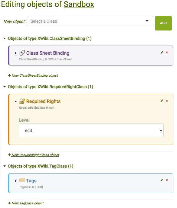
In my day-to-day work I often deal with custom macros, which means pages containing many objects such as XWiki.StyleSheetExtension, XWiki.TagClass, XWiki.TranslationDocumentClass, XWiki.WikiMacroClass, and multiple XWiki.WikiMacroParameterClass instances. In that situation, the object editor can indeed feel quite “dense” if the layout gets to big.
That said, I’ve found it extremely helpful to visually distinguish object types at a glance. Using a consistent color and icon scheme allows me to quickly identify the right object without reading technical class names – especially on pages with many objects. For me, this significantly improves usability
No, I didn’t open a ticket yet, because I wasn’t sure which parts of the idea would really fit as a core enhancement.
My intention was to first gather feedback, and then hopefully create a more focused and actionable ticket.
I added a default setting in gray colors, without a bold heading, along with a few color and icon sets for testing. Below the screenshot, you’ll find the full ready-to-test CSS snippet
Hi @CycleSEC and thanks for the proposal! I really like it, and it makes the overall reading of the page much easier.
I guess from a consistency point of view, it makes sense to keep the pretty name as a default for each object (and the “real name” as a hint), since that’s the way it’s being presented on the select box to add a new one. I don’t think that’s possible to make with CSS alone, but I’d be +1 to change it in the appropriate piece of code responsible for this page.
Not only that, but I would even include some sort of categorization like we have on the select itself.
The icon is a tricky subject, you’d need an icon for each item, otherwise its purpose is lost. @CharpentierLucas do you know if extensions can add new objects types? That would make things even more complicated. For ease of maintenance, I’d drop the icon.
@CycleSEC I guess in general, to have this solution scale properly, would be to link as much as possible the CSS values to theme variables. Like colors, font size, border radius values, etc.
Some documentation I found regarding this subject. @CharpentierLucas might know of additional ones
Yup, you can create your own object type with the class editor or AWM, it’s a strong point of XWiki.
From what I understand they were just sharing their prototype, if we ever implement this in XS, we should follow our code rules and don’t hard code colors: https://dev.xwiki.org/xwiki/bin/view/Community/CodeStyle/XhtmlCssCodeStyle/#HCSS Outside of XS, using those variables is a bit harder/XWiki specific than hard coding things.
IMO if we decide to implement this, we should just give a color picker in the UI to make it easy for customizations to use this parameter.