Inconsistency of actions vs. icons

Hey everyone,

While investigating XWIKI-21914, related to the inconsistency of the “X” icon, I encountered a much bigger inconsistency problem. Basically we have a lot of different icons being used for the same actions OR different actions using the same icon.

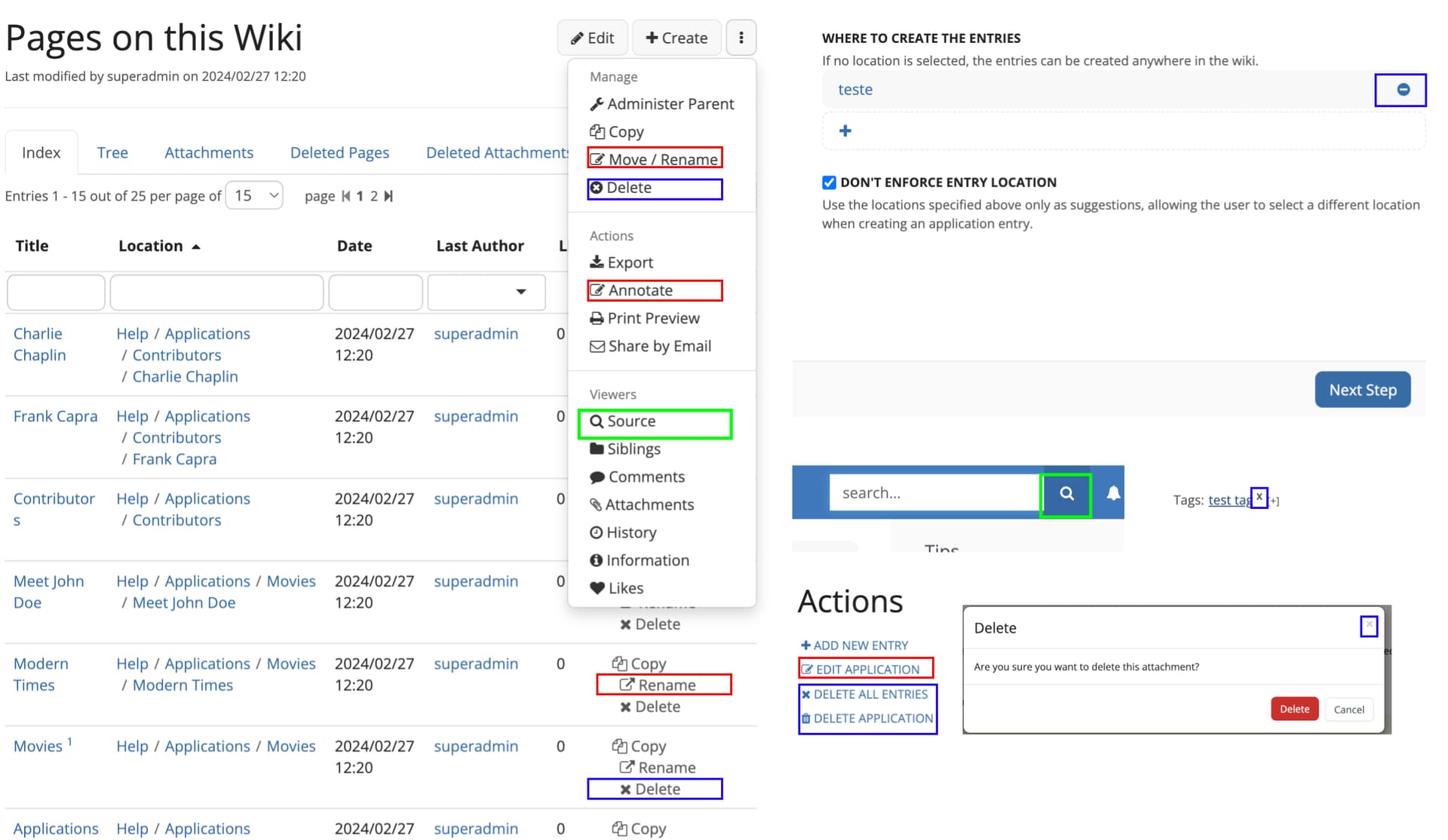
Take the example below, it’s a collage of different screens and sections within XS. Each marked color is a concept or icon with some sort of inconsistency.

inconsistencies

Researching other applications, a lot of them limit the use of icons, especially in context menus. See below for examples.

other apps

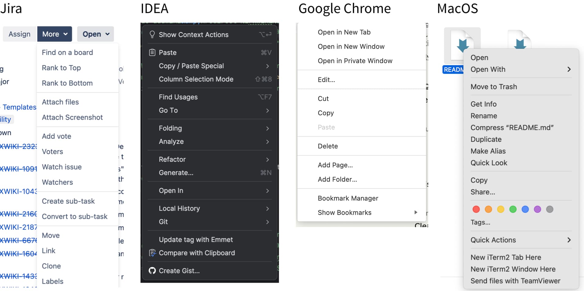
In my opinion, we could follow suit. We would have a cleaner interface and less ambiguity of actions (greater consistency). But, some users might be attached to the current icons, leading to complaints should we remove them.

We could also retain the use of icons, however it can be difficult to find alternatives on different icon packages (FontAwesome, Glyph, etc) as we need to follow the iconTheme.

Delete x remove

Now, speaking exclusively about the actions for remove and delete, I would like to propose:

“X” icon: Standardize as a ‘remove’ action. As in, being removed from view or association, but without deleting or sending to trash. Examples: remove tags, close dialog (remove from view), cancelling (as removing the intention of action)
Trash icon : Standardize as deletion only or moving to the trash (potentital for deletion)

So, without going too much into more details, I would like to know from you.

What’s your opinion on this problem?
How do you feel about clearing a lot of icons from the interface?
Would you suggest something else?

As always, thank you for reading!

Hi!

Side note, there’s already some ongoing work to reduce some of these inconsistencies for the X icons

Feel free to open more issues with the consistency label on Jira :slight_smile:

I think removing the icons in the page action dropdown could unclutter a bit this dropdown. However, we need to make sure the design is still udnerstandable enough without those. Icons bring focus and visibility to items, when we remove them we also reduce visibility of the actions they are highlighting. In my opinion this removal would pair nicely with more padding around the action themselves and/or a slight increase in font-size (similar to what was done on the examples you provided :slight_smile: ). It would be nice to have a prototype to view what it would look like without icons.

While we’re at it we could also introduce a standard icon for the cancel action. It comes up quite often, and in my opinion it’s quite a stretch to call it a remove. It could use the left icon (a straight arrow pointing left) to represent going back to the previous step in the process (or to the default state if we were at the first step of a process).
I just checked, and all trash, cross and left icons are mapped properly in the different icon themes.

The source / search collision on icons is a really bad one…
The cross/trash icons are used in a lot of places, so we need to make sure we discuss the difference in their meaning thoroughly and keep some traces in the documentation to avoid losing over time the consistency we try to introduce here.

Thank you for bringing this topic up and the research you already did on it!
Lucas C.

I wasn’t aware. Thank you!

Indeed, I wanted to gather opinions on this before starting the mockups, so I can already take these in consideration.

Lol, yeah when I was writing it crossed my mind about this categorization.

It’s an interesting perspective, I never thought about it. But IMO, a left arrow goes too much in the idea of navigation. Akin to the back button on Android or the browser. Sometimes it makes sense. But on a dialog, for example, I don’t think it would work too well (in this case the left arrow would close the dialog).

I’m fine with your proposal on standardizing the delete icon.

I agree with you. Most of the time Cancel doesn’t mean go back, but stop the current process. And sometimes we even have a Back / Previous button, like on the AWM wizard, so using the left arrow icon for Cancel would be confusing in that case. I’m not even sure we need an icon for Cancel.

I wouldn’t remove the icons unless they are really far-fetched. Most of the icons from the More actions menu look good to me. I would try to find an alternative for “Move / Rename”, “Annotate”, “Source” and “Siblings”, and if there’s no better one, then drop. But for the rest, I would keep the icons.

Thanks,
Marius

+1

I tend to agree with Marius, with the addition that this menu might also have entries introduced by extensions: so if you remove all icons in XWiki Standard, it might feel inconsistent when installing an extension that does provide an icon in the menu. Unless we change the code to not take into account at all the icons of the UIX.

Same as Marius and Simon for me:

  • I don’t see a problem of keeping icons in menus and I’d prefer to keep them
  • +1 to use consistent icons (ie same icon for the same action)

Thx