I everyone I would like to discuss with you the proposal below, this one is quite straight forward.
This proposal discusses the use of hints in Cristal. Conceptually, these hints are the same to those found in XWiki Standard.
Defining Hints
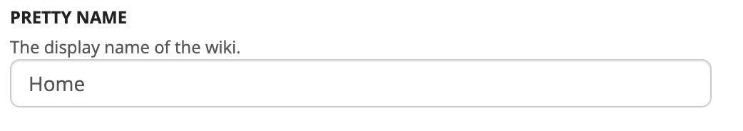
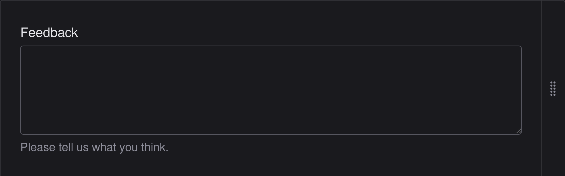
Hints are small pieces of text attached to an input form. Their primary function is to provide users with contextual guidance and assistance when filling out a form field. In other applications, they are often referred to as “Helper text,” but in XWiki, the correct term is “Hint.”
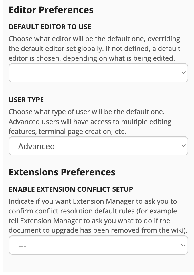
One key difference between Cristal and XWiki Standard is the placement of hints. In XWiki, hints are positioned between the field label and the input field. However, this placement can cause issues when the hint text is too long or when the screen size is small (see image below).
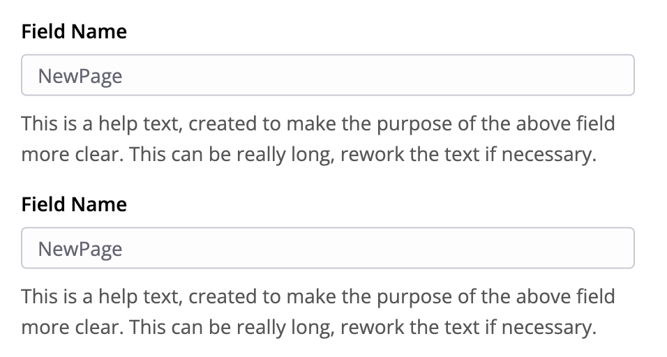
Proposal for positioning in Cristal and XS
To address this, the proposal suggests moving hints after the input field instead. This placement emphasizes their helper role while keeping them unobtrusive for more experienced user
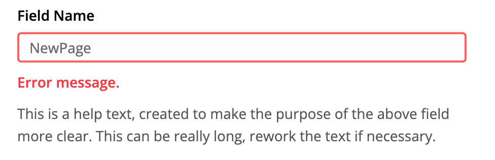
A potential conflict arises when both a hint and an error message are displayed simultaneously. In such cases, the error message should take precedence, pushing the hint text further down to avoid confusion.
While this proposal is focused on Cristal, it could also be applied to XWiki. However, due to the scale of XWiki, implementing this change across the entire platform may be impractical unless hints are part of a reusable component.
Thank you all for reading, and as always I would like to know your opinions on it.
I doubt we can define the way hints are displayed in such a concrete way, because each design system has purposefully a specific way to display hints.
And, we want to keep the specificities of each design system when embedding them in Cristal. What’s the point of having several design systems if in the end they all look the same?
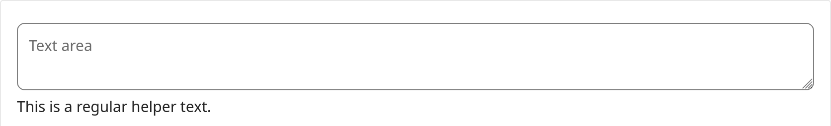
For instance, this is how a textarea with a hint is displayed in Shoelace (Textarea)
In Vuetify, there is no facility to define hints for form fields.
And to give an example of a design system we do not support yet, here is how a hint is display with Nextcloud design system (Nextcloud Vue Style Guide)
As we can see, each design system has its own way to display and place hints. And the same is true for error messages.
So the rules we want to express should emphasize what needs to be displayed, possibly with accessibility constraints.
Then, it’s the job of the developers doing the binding with a given design system to:
check if the design system provides enough options to fulfil our rules
find a way to implement missing parts. For instance, as Vuetify has no support for hint, we’ll need to define a custom way, while staying as close as possible to the look and feel of Vuetify
I hope my explanations are clear enough. If it is not the case please ping me
For XWiki, which is not bound to a specific design system, +1 to define a more concrete display, and here I’m +1 for what you propose, looks nice and clear to me.
Definitely, the strategy is usually:
changing as many UI elements in XS as we can to comply to the new design
update or introduce reusable UI elements to make it easier for extensions to follow the rule
Hi Manuel, thanks for these remarks, it was perfectly clear. So given that some DS define these rules and others don’t, could we emphasize these rules for those DS that don’t have them? Some kind of fallback.
Definitely, it’s always nice to have default.
I’m not 100% this default is applicable to 100% of the DS system, but it should be a good ground for discussion if that ever happen.
As long are more abstract rules are defined as well of course.
Those rules should be sentences such as:
a form field must have a hint (unless X, Y, Z)
a form field must have a placeholder (unless X, Y, Z)