I’d like to introduce new variables for base colors in our theme.
First one is a variable to have an highlight color: the idea is to have the same color to use in background of words for mentions, annotations, conflicts etc. By default I’d use a yellow or a light yellow. Note that I also need that for my work on Word-based notification application (same UC as for mentions basically).
The two other ones are related to the diff: right now colors for the line added / removed and characters added/removed are hardcoded (see current CSS for diff). The proposal would be to have two variables: one for diff added elements and one for diff removed elements.
Note that right now colors are not exactly same in diff for a line added and a character inserted, but we can just play with the opacity of a base color for this.
So to sum up the proposal is about adding 3 variables:
Note that there’s currently three colors used for mentions AFAIK: regular mentions, mentions towards the current user, and mentions of disabled/deleted users. I’ve worked a bit on updating those colors recently, see this PR.
As this is a background color, we must make sure it has enough contrast with @text-color (#222222 in Iceberg). It would be better if it had enough contrast with @text-muted (#555555) too . You can check contrast with websites such as https://colourcontrast.cc/ .
I agree with this addition of background colors. Same as above, the default values for those should fulfill some contrast requirements. Couldn’t we use @brand-danger and @brand-success for those?
Overall I’m for this addition because the semantics we want are far from danger and success
As a rule of thumb, I don’t agree with using non-full opacity in places where a full color would do the job (IMO we should leave its use for when we want actual transparency). This allows to create a whole range of colors from a single color in the theme. This is a strong tool to make new colors, but it allows to easily bypass the checks and validation we make when we consider the values for new colors. It can create a lot of bugs down the line. E.g. I want to style a new button. I want it to be lighter when pressed down. I can’t find exactly the right color in the color theme so I decide to just add some transparency to the default color. It might look good in my example, and even if I did some contrast checks, someone might use this style in another context later and the background of the parent is black instead of being white, and the contrast is broken.
In this situation, I’d rather have two more variables. I don’t know what’s our policy on the gestion of color theme variables, so I can’t say that’s for sure the correct solution, it’s just my opinion.
I would append a -bg instead of -color to all of those to keep in line with the convention in other variable names (e.g. the button variables). It makes it less easy to misuse this color. We don’t want devs to use it as a foreground color, because it’d likely lack contrast on most backgrounds.
With the addition mentionned above, it would become something along the lines of:
@highlight-bg
@diff-added-bg
@diff-added-strong-bg
@diff-removed-bg
@diff-removed-strong-bg
There is a few, but AFAIK that’s because we want to avoid users changing them because it’d break the interface in most cases. This way it can still be edited from the Advanced color theme parameter, but an unknowing admin will not break the UI. I think exposing the ones proposed here is important, especially for the highlight color
Thanks, I checked it and actually added a comment: feels like to me we’re missing also the text color of mentions toward the current user as configurable color.
Also maybe we should discuss the capability for extensions to add new color theme variable that would be injected in the color theme edition: e.g. it doesn’t really make sense to configure the colors for Mention in the Mention section, as an Admin might look at it directly in the Theme Color edition. It’s a bit off topic though.
Ok, thanks for the heads up on this.
Yes for me there’s a real semantic difference, and I’m not sure we could always consider that the colors will be the same.
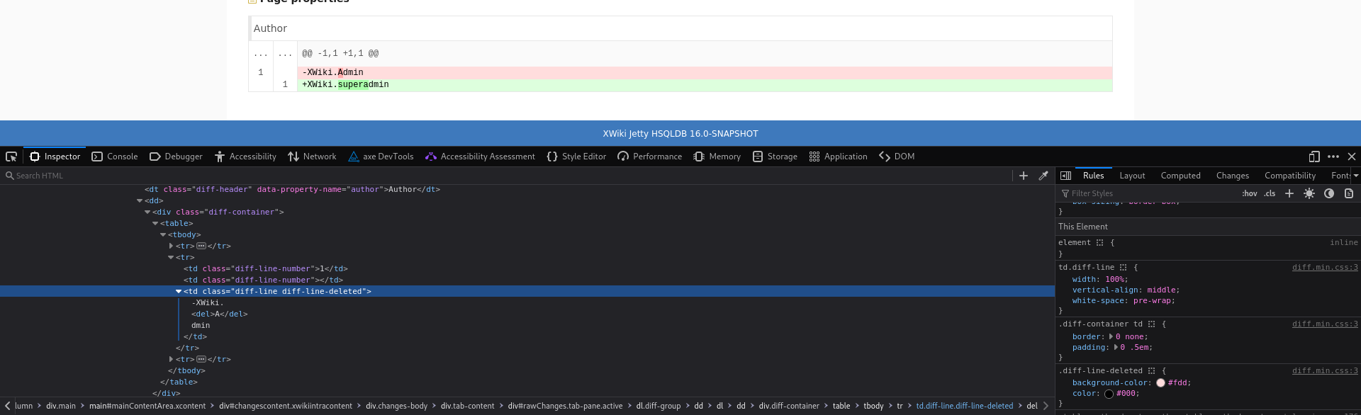
Ok, that needs a bit of discussion. Right now we don’t use same colors, but I’m sure we have a contrast issue: we use #DDFFDD for a line added and #AAFFAA for a character added (respectively #FFDDDD and #FFAAAA for line/character removed), and a character added is often on a line added. See for example:
My idea of using same color with a difference in opacity comes from this current usage, and I fear it becomes a bit tedious if we use 4 variables for this. Now I’m all ears if you have a different proposal.
Thanks! I need to check it again but I don’t remember why we needed a specific color for this text
Maybe we can just do without and keep the default text color (just like the diff color). I’ll continue the discussion on the PR itself
This idea would be nice An additional tab in the color theme editor for any extension that needs it would be neat for admins.
In this example, from what I can understand, we would need transparency on the line background so that the character background is less transparent and more pronounced. The line background ends up on whatever is the background for the diff text, which could very well change from theme to theme. From what I can see, as of now the current colors don’t use opacity.
I don’t think it’d be very tedious to add a couple more variables to the theme and use full colors.
Maybe an alternative solution would be to use the less operator saturate (see this LESS doc) to build those two secondary colors. It’s not really better than transparency regarding the arguments I mentionned above, but I think that in practice this would be more difficult to break contrast with this…
Sorry, I got a bit lost here. What I was thinking of was a bit off what was described. Some variables are exposed in LESS without being in the theme. E.g. Loading... (discussions to remove it altogether after all though), and @text-muted from bootstrap.
 . You can check contrast with websites such as
  for this addition because the semantics we want are far from
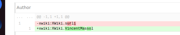