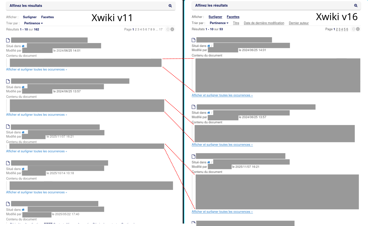
After a big migration of a very old Xwiki v11 database to a new Xwiki v16, users noticed that search results are much less compact. Is “page preview” section resizable in Xwiki v16 to be more compact ? (different default rendering options, probably)
To illustrate my question, here is the same search in Xwiki v11 vs Xwiki v16, with preview sizes compared :
The difference you pointed out is the highlight feature. I’m not sure since when we have it, but it can be disabled by the user by clicking Surligner on the French UI. The localization is a bit off, I’d probably have translated it as “Surlignage” (highlight in english, which is a noun in this context and should probably be translated with a noun too).
To remove this by default, I advise you to update the page Main.SolrSearchConfig that should be on your wiki. With the wiki editor you can find the highlight option in the content of the velocity macro on this page and switch it from true to false.
To completely disable it, you’ll probably need some further customization.
Can you share an example with values where we can compare the highlights to understand the difference? Since it’s consistently longer it should be easy to set a page up with dummy data and share how this page shows in a search both in XWiki-11.X and XWiki 16.X .
If it’s just a matter of layout and style, there’s likely no customization possible and you’ll need to update the stylesheet on Main.SolrSearch.
That’s frustrating : a brand new test page (full of “lorem ipsum”) gives roughly the same single line appearance in test results between our former v11 Xwiki environment and our current v16 one. For other existing pages (that I can’t copy-paste here, for confidentiality reasons), in the search results, it’s always one line in Xwiki v11 and sometimes more than 1 line in Xwiki v16. If in can forcefully constrain the height of the text preview through a CSS small patch, that would be a satisfying workaround, I guess.
to blockquote.search-result-highlight objects in search results form could do the trick… but which files should I patch in the Xwiki folder ? Nothing appears in cleartext anywhere (a recursive grep returns nothing). I suppose that some files have to be unpacked and repacked… or is there a more elegant solution, that can be applied as an overlay, without complicated surgery in Xwiki “engine” folder ?
I obtained the expected result following this procedure, that I put here, hoping to help future Xwiki beginners like me. Let me know if it follows the Xwiki best practices or if it can be improved/corrected.
Making sure that my user profile is “Advanced” (I’m an administrator), I did the following :
On the Xwiki search page, I clicked on “Modify” → “Objects”
In the “New object” dropdown list, in the Xwiki section, I selected the StyleSheetExtension class then clicked Add.
In the Name field, I put a description.
If the Code field, I put the following CSS snippet : blockquote.search-result-highlight { white-space: nowrap; overflow: hidden; text-overflow: ellipsis; }
In Use this extension, I selected For this page or on demand.
In Parse content I selected No.
In Caching policy, I selected Default.
In Content type, I selected CSS.
I then saved my modifications and voilà : more compact search results. Of course, to reverse this, it’s only a matter of editing the same page in “Objects” mode then deleting the previously added object. Quick and easy.
We do our style changes in one page alone to collect them all and to have a good overview. In this case you have to chose for “use this extension” “in this wiki” for this dedicated style “article”.
Having our styles not on xwiki standard pages omits the need to merge our changes with further versions of the delivered (e.g. search) pages in future xwiki versions. But this is not a real problem. Merging changes like this didn’t fail in our instances for 4 years.