Hi everyone,
We have an issue regarding the new style for the pagination block on Live Data tables, available since 17.10.3. The issue specifically states that what we have now is overemphasized.
To give it some context, this is what we had before:
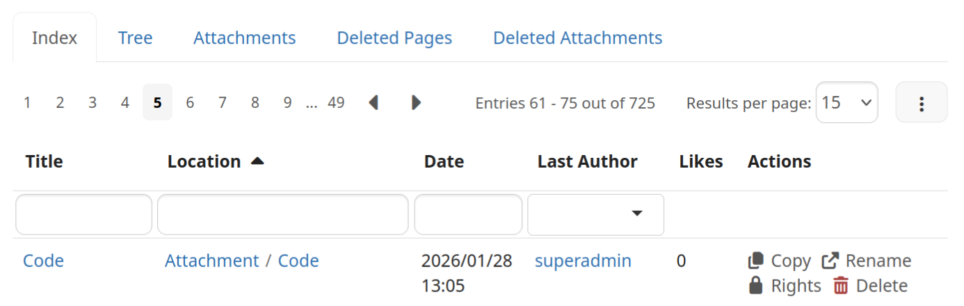
After discussing the proposal the visual design was changed to this:
The height of the selected page was changed a bit from the original proposal, but that it’s not the main issue.
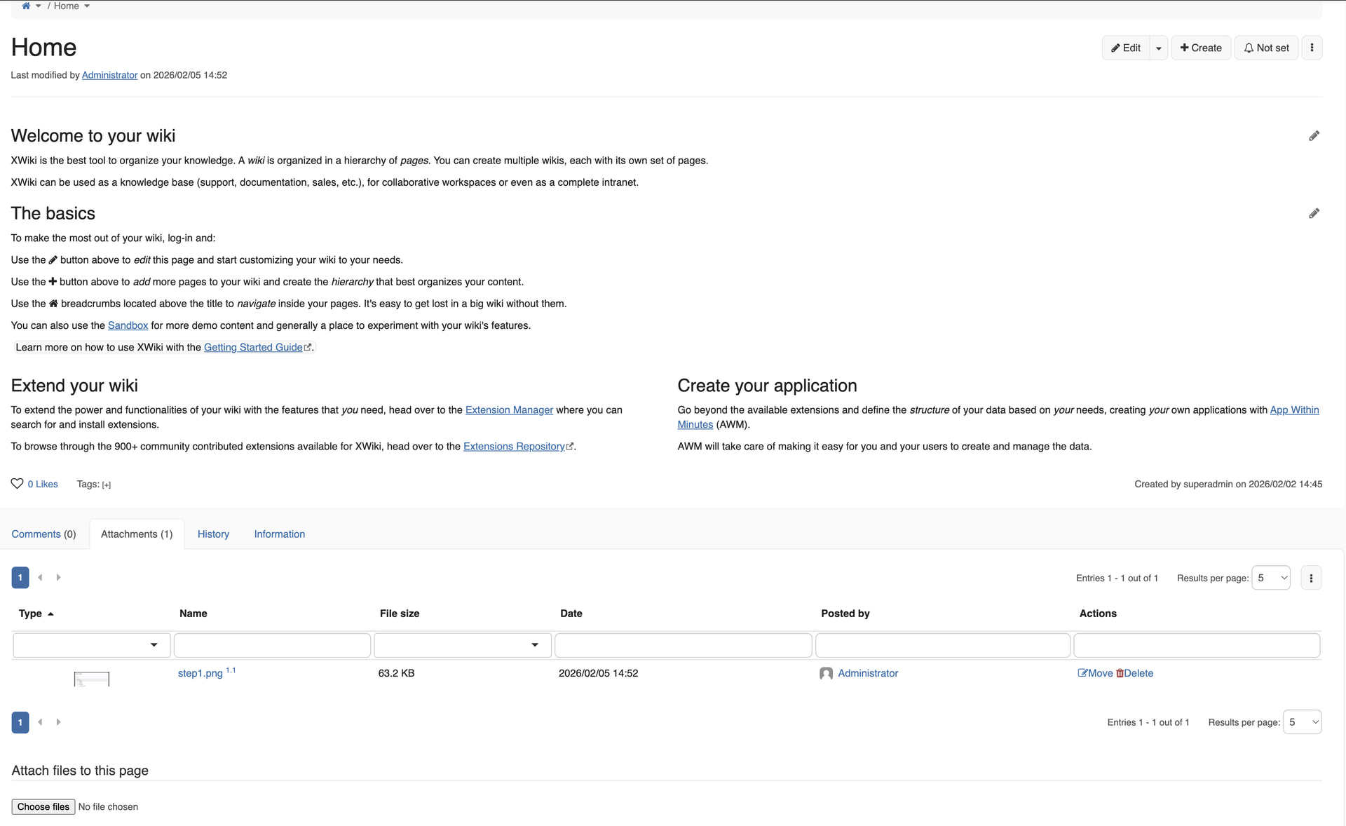
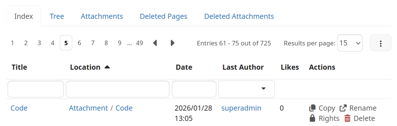
Depending on the content of the page the blue boxes from the selected page might draw too much attention from the user from a secondary UI element, see the image below, taken from the Jira.
To alleviate this problem, we can change this element to something in between from what we had before (too light) to what we have now (too strong). See below some ideas.
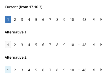
Alternative 1 takes colors from the main edit buttons and sticks with the bold font from the original component.
Alternative 2 uses the “info” colors from the color theme, the font is still bolder than the rest, but not as much as alternative 1.
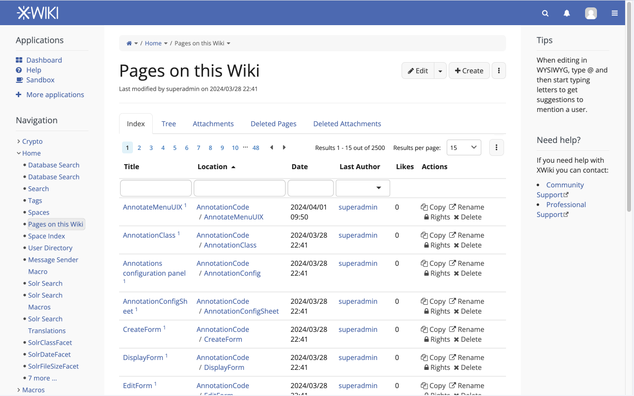
See below these changes in context.
Alternative 1

Alternative 2
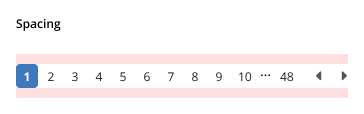
Spacing issues
Another point raised during conversation on # xwiki chat (and also on the original PR, which I failed to address) is that these elements lacks proper margins. I don’t know if this is new or not, but I suggest having @padding-large-vertical from the standard Bootstrap .less classes, this would translate to a 10px safe margin on top and bottom of the element.
Let me know what you think, do you prefer alternative 1, 2, something else perhaps?
Thanks!