When opening Lightbox for an image, a semi transparent modal appears. The color of the background of this modal was hardcoded, and this created some issues with button color on hover:
In order to solve this, I propose to use the panel color scheme in the lightbox modal (instead of hard-coded colors). This has a very noticeable influence on the Iceberg color theme, changing the background of the modal from black to white.
Here are a few pictures to give an idea of the changes proposed:
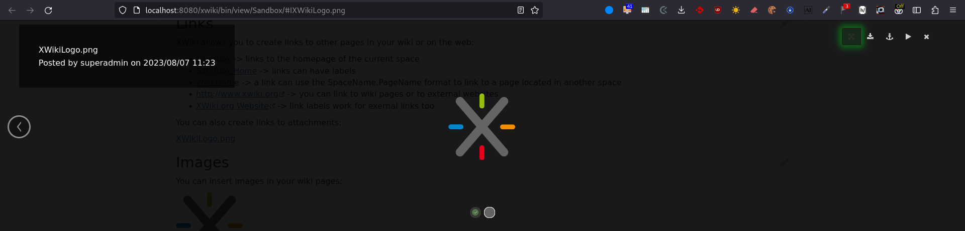
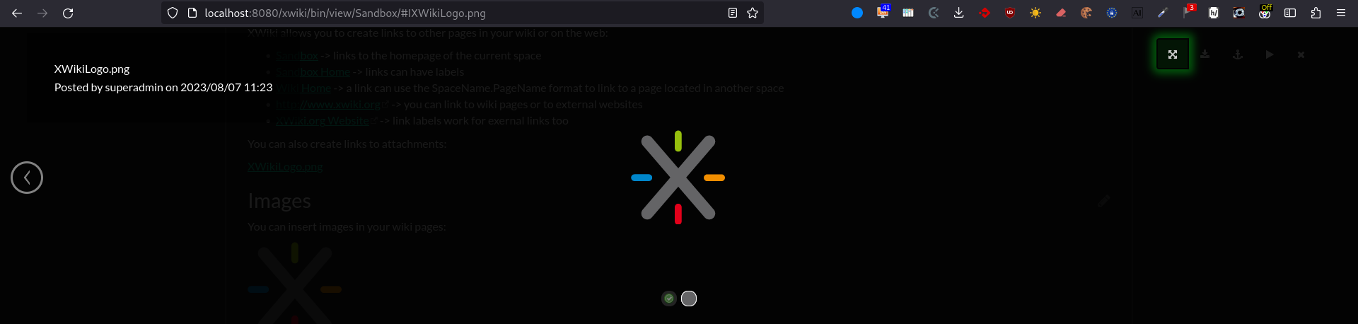
vv (a) Iceberg theme, before the proposal
I think this case is the only issue actually that needs to be discussed, the dark version working fine, I think (even though, after the change, there seems to be less visual contrast between the elements).
Going back to the white lightbox: Just based on familiarity people may expect the background of an expanded image to be dark. It makes sense why most UIs went with this, the image is in the front so in a way it casts a big shadow on the background.
While I do prefer the dark version much more (because of familiarity), I don’t think the light version has any negative impact on understanding the UI and it is okay from an esthetic point of view.
If this is the only solution to ensure enough color contrast in all cases, +1.
I was wondering if we could hardcode color in these specific buttons to make sure that the icons are always white (and keep the background black). The only thing that would change based on theme would be the glow of the button which could take the color of the primary button (which most likely won’t be black). I know it’s not good to hardcode, but this is one case in which all themes could have the same values
We could also hardcode our colors here, but this is against our CSS codestyle and I preferred a solution that also fixed this non respect of the codestyle. From my understanding, one of the main points we want to answer here is whether the improvement of user experience is worth keeping this breakage of the codestyle or not.
For me the question is: do all UI elements have to adapt to the current color theme? Aren’t there any exceptions? For instance what if you make an integration with an external service and for that you need a button / (font) icon that needs to match the visual identity of that external service?
The lightbox is not an external service obviously, but it covers the entire XWiki UI so it could be seen as a separate thing, that doesn’t have to follow the XWiki color theme (entirely).
Correct me if I’m wrong, but from my understanding such integrations are not a part xwiki-platorm. This image Lightbox application is in the standard distribution, so in my opinion it should be in line with the style of the standard distribution.
The white dropdown change is not okay, I’ll update my proposal for solving this ticket while keeping the hardcoding
<EDIT> The proposal is updated. </EDIT>
Leaving this topic open to finish the discussion