We discussed orally with @amilica about this and:
- @amilica’s proposal was related to some old behaviour of some platform that used to show likers on hover and also like propose the like action, on the same icon.
- I convinced her though that it’s best to keep 2 separate buttons (for mobile which is hoverless), also looking at the like control of discourse (this forum) which is very misleading for showing likers and like action in the same control
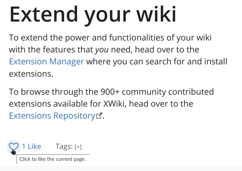
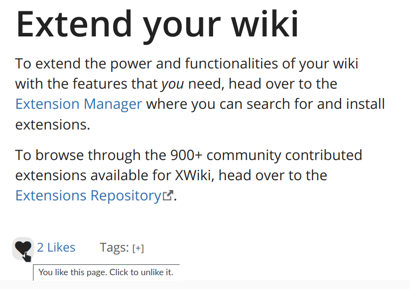
- we worked a little more on the UI to add a background when hovering the heart icon, to make a contour around it to make sure that it’s isolated as a single item - the hover on the heart itself were not strong enough…
Here’s the result:
Before like:

After like:

The background color is computed as a color blend between the foreground color used in that place (@link-color or @text-color depending on the state) and the background (mix with 89% of the background color). The contrast is 4.51 for the blue and white of the Iceberg theme and 12 for the black & white @CharpentierLucas is this acceptable?
Everyone else, any remark about this new update to the UI?