Hey Anca! Thanks for working on this! It’s good that we can finally use the outlined heart for the Like states. I’m not sure if you’ve had the chance to see the more recent discussion on the like button revamp. The idea of my proposal was to have the like button in a container, very close in appearence to other buttons for consistency reasons, but also for making it more obvious to the user. Let me know what you think about these two proposals in relation to each other: 1 & 2 (this one has recently updated html & css). I still have to update the way I set the icon, but I’m looking to see if our visions are aligned on the look of the button
We can add the “likes” word after the number of likes to make the meaning of the button cristal clear.
Also the list of likers can be rendered in a tooltip along with a simple explanation of the button(“click to like”/“like the page”).
We can use a simple tooltip (not great) or a fancier one if we are open to it (a tooltip with structured content in it, essentially a seperate div that becomes visible while hovering on the button, containing the list of likers with their profile pictures and names, one user below the other).
@amilica’s proposal was related to some old behaviour of some platform that used to show likers on hover and also like propose the like action, on the same icon.
I convinced her though that it’s best to keep 2 separate buttons (for mobile which is hoverless), also looking at the like control of discourse (this forum) which is very misleading for showing likers and like action in the same control
we worked a little more on the UI to add a background when hovering the heart icon, to make a contour around it to make sure that it’s isolated as a single item - the hover on the heart itself were not strong enough…
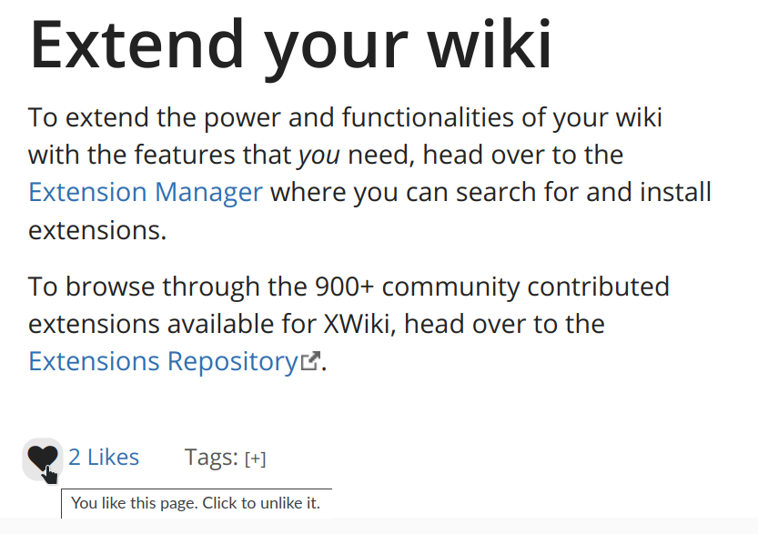
Here’s the result:
Before like:
After like:
The background color is computed as a color blend between the foreground color used in that place (@link-color or @text-color depending on the state) and the background (mix with 89% of the background color). The contrast is 4.51 for the blue and white of the Iceberg theme and 12 for the black & white @CharpentierLucas is this acceptable?
Everyone else, any remark about this new update to the UI?
it kept the “one control multiple purposes” aspect of the current implementation, which may be a little hard to grasp (and we suffer for the tooltips messages trying to cram all information in)
it was difficult to envisage a clean way to add an access to the list of likers: having a single button with 2 links inside is totally misleading, so we needed 2 separate controls.
For now I dropped all outline on focus and active because it didn’t look great on Chrome (the outline was too big and the button is small).
We could have used a bigger button so that outline looks good but it’s awfully hard to align with the Likers link & also with the tags row which is just after. If, indeed, we revamp the whole footer, we could do a better job at this, having an explicitly bigger button (a heart with a frame around it).
We can add the same decoration as on hover on focus & active, if you wish.
we could have 2 buttons stuck together in a single button: half of it is for the like, the other half for accessing the list of likers, but that would indeed require an updated design (a follow-up on @amilica’s proposal).
However, with the current tags, it will probably still be badly aligned so we need to implement that along with the tags revamp.
It will obviously not be the same for all color combinations. The background is 89% of the page background and 11% of the link color. I guess that “should be enough for everyone” but well…
I totally sacrificed the contrast between the hover background and the page background, which is almost nonexistent (and will probably be completely invisible whenever we’re on greys & bad gamma), as:
this is not the only decoration on hover, so I considered it not critical,
there is not much room between page background and link color, so it’s tough to fit a color in that would ensure proper contrast with both.
We also envisaged adding full button colors on this hover in order to ensure contrast, but it was very strong on hover, it was bothering that it was popping that much…
I wasn’t suggesting to have a single control. I’m fine to have two: the “heart” button and the likes link. Still, I’m not sure why the button style on the “heart” button was dropped. The likes link is a link, so no need for a button style IMO.
I don’t think we need the button style for the likes link.
Isn’t think an accessibility issue @CharpentierLucas ? Doesn’t WCAG mention anything about knowing where the focus is when navigating with the keyboard?
because it was not initially proposed for this thread and for ticket XWIKI-18545 (which was also voted, even if in the mean time there was that other discussion that was started)
as long as the tags are not revamped with similar controls (buttons or pills with paddings), I found it technically hard to align with the likers link & with the tags control; I’m not saying there is no solution, I am just saying that it required a different time investment,
I wanted to have the patch for XWIKI-18545 not delayed by additional work (e.g. tags or footer revamp) so that it can get in on the 15.x cycle, since it’s already waiting since 12.10.6 (at least, when I made the proposal for XWIKI-18545).
Indeed, there are a couple of reasons above which are not absolute aesthetic reasons but more like operation reasons. They are good reasons too, from my pov, and better is always better (let’s strive to do the best we can, but let’s not have “best” kill “better”).
So I am not against improving that further to add the button style around the likes, as part of the whole revamping of the footer. This implementation is aligned with current footer styles. Maybe this is a good reason to re-open @amilica’s thread about the like in the new footer, but then the proposal needs to be visually aligned with the presence of the likers button as a separate control (which is what I initially asked above).
also, while we’re on accessibility, the new button contains only the heart now, which is an icon. It means it’s a labelless button for screen readers (the label before was not much more semantic - the number of likes - but well, at least there was one!).
@CharpentierLucas can you help me with a piece of code / link to documentation about how to add a hidden something for the icon to be read by screenreaders?
There’s no need to have the button zone visible if the item in the button itself has enough contrast.
A button which has a distinguishing indicator such as position, text style, or context does not need a contrasting visual indicator to show that it is a button, although some users are likely to identify a button with an outline that meets contrast requirements more easily.
So as long as the icon inside respects contrast, we’re good
Considering the hover state, for now on my end I consider it as a best effort. There’s a lot of moving parts in XWiki and sometimes it’s not possible to have a clean style for hover that would satisfy all contrast needs. So for this solution from me.
If I remember well, I added a proper label for the button in its title HTML attribute in 15.x
If appropriate, I’d use the title attribute on the button again. Another solution is to put a text alternative with .sr-only next to the icon. The title is better IMO because you can see it when hovering, which can provide extra help for visual users.
I updated a rule related to this a couple days ago in our HTML codestyle
Only use icons along text alternatives. The text alternative can be visually hidden.
And further:
Hiding visually and showing semantically:
E.g. a label for an interactive element that would just clutter the visual UI.
HTML: Use the class: sr-only. (abbreviation of “screen reader only”)
I didn’t drop the title of the button, if the title is enough to achieve this, then it’s fine.
This:
is great and definitely should be in a documentation dedicated to WCAG implementation, as this is not really codestyle, it’s more than code style. Each technique or usecase should have its own chapter in this new documentation.
I really like this alternative especially the separation of like button from the liking status (how many likes).
The count label provides a clearer indication of function for the heart button. The user can see the icon + the # Likes, it becomes an indication of correlation.
My only change would be to drop the “click” term and just use the label “Like this page” and “Remove like from page”. It becomes shorter, faster to read and the relation between action and status is still there IMO (if I can like this page than it means that it is neutral right now).
 for the idea, @mflorea .
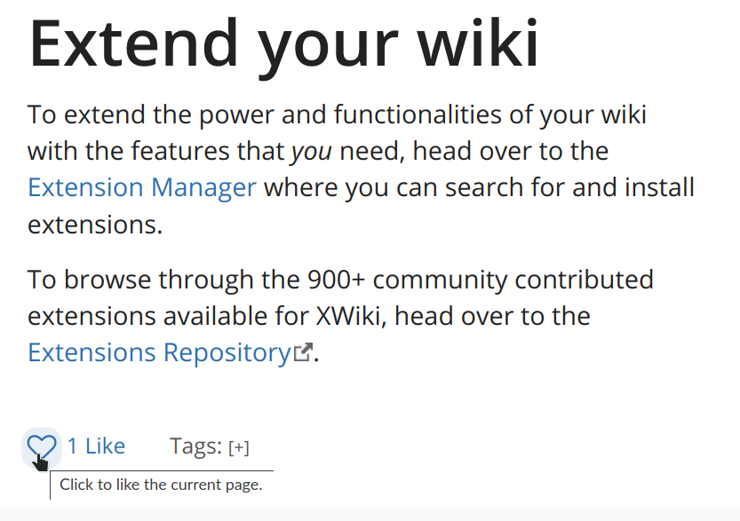
 so we need to implement that along with the tags revamp.