Wanting to make the whole revamp easier to tackle, I want to split that initial proposal in multiple parts, this being the first one.
New look
Description
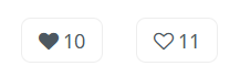
The new like button is a default button with a full or outlined heart icon (depending on the state of the like button) and the number of likes shown in its right.
if it’s liked - full heart
if it’s not liked - outlined heart
The tooltip messages could be improved at the same time with the revamp or at a later time:
tooltip for state 1: Click to like this page. 10 other people already liked it!
I think it’s shorter, it’s got more personality, it invites the user to join the other 10 people.
This does require conditional rendering. For 1 or 0 people the message would sound weird so we change it to: Click to like this page. 1 person already liked it!
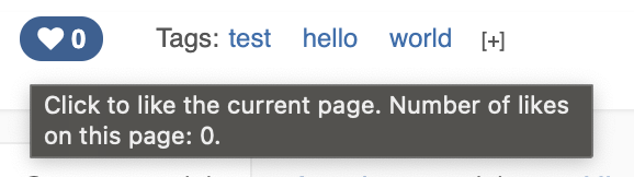
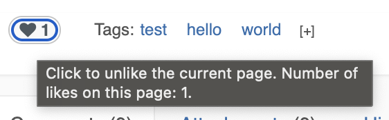
tooltip for state 2: Click to unlike this page. Current number of likes: 11.
taking out the badge class (there are many other instances in which it just shouldn’t exist)
changing btn-primary into btn-default
using icons for each state (let me know if I didn’t use icons the right way in the XWiki context, would like a practical example because I don’t know another way of doing this better)
Not liked state
<div class="like-container">
<input id="is-liked" type="hidden" value="false">
<div class="like-button btn btn-default" title="Click to like this page. 10 other people already liked it!">
<span class="fa fa-heart"></span>
<span class="like-number">10</span>
</div>
</div>
Liked state
<div class="like-container">
<input id="is-liked" type="hidden" value="true">
<div class="like-button btn btn-default" title="Click to unlike this page. Current number of likes: 11.">
<span class="fa fa-heart-o"></span>
<span class="like-number">11</span>
</div>
</div>
CSS / LESS
The font-size would be the same with the body size. Is the @font-size-base variable the right one to use for that?
Thanks for the proposal! Keep them coming that’s great
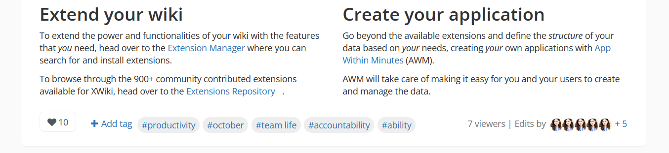
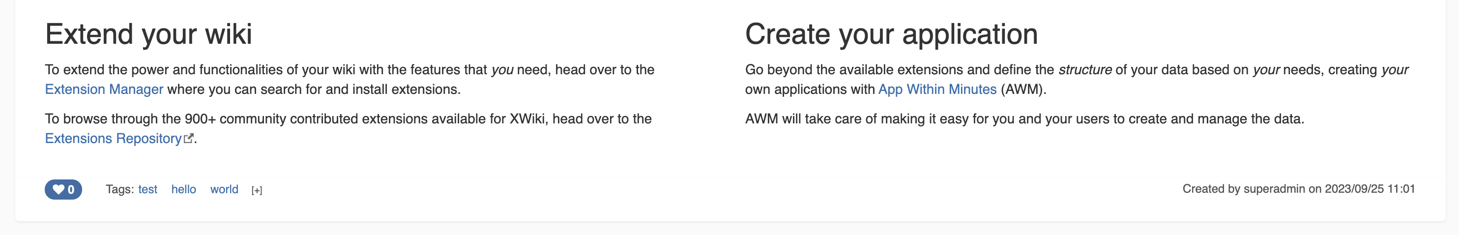
I’m not 100% sure what this proposal is about as the screenshots shows a lot of different changes:
like button colors (no more blue when unclicked) + outline
tags have a different look
like is no longer aligned with tags (as noticed by Marius too)
there’s some concept of live viewers
there’s a listing of editors and the removal of the page creator concept
I can guess that these are other changes you’d like to propose but it makes it hard to see your proposed change in context. It would be nicer IMO if you could just focus on one proposal, or you could show both if you also want to show it could look like in the future with other changes. Personally I had to start an XWiki instance to see how it looks like ATM.
Globally it looks fine to me. However I don’t like too much the Click to like this page. 10 other people already liked it! text. Sounds slightly too “marketish” to me, especially with the exclamation mark. I think I prefer the current text which is more neutral.
Oh, I thought we have the whole set. Will look into that.
Will rework the implementation and come back on this, Thank you for your feedback!
I did link the initial discussion and current version of the like button, though I do agree that a visual reminder would’ve helped. Will keep it in mind
yes, + also, changing the icons, but as @mleduc reminded me, we don’t yet have the specific icon I’d want for this proposal
I understand your point. I’m thinking that a more friendly tone can improve slightly the perception of the user on the functionality. Liking a page is anyway focused on showing appreciation. The number is there to show how appreciated is that page. It makes sense in my mind to increase the habit of showing appreciation by encouraging it.
I think we need consistency. We don’t write “Edit the page to make it better with your own content!” or something like this when the mouse is over the Edit button. Same for any other alt text we have. So far we use a neutral tone everywhere. For me, using your proposed text is not in the spirit/tone of what we have elsewhere. Now, we could decide to change our style/tone and progressively change all our alt text everywhere. I think that would require a discussion and personally I prefer a neutral tone.
BTW do we say “10 other people” or “10 other persons” in US/English? Also, I don’t think a sentence should start by a number (but I could be wrong).
I’m ok with the current text but if we want to remove some redundancy, we could have: Click to like this page (10 likes)or Click to like the current page. Number of likes: xx.
+1 for this change. The new look keeps it clean and in check with the secondary function of this feature.
As for the tooltip IMO we could simplify it as only “Like” and let the number speak for itself as I cannot like a page more than one time and the number will go up when I do the action. In case we really need to be clear (I don’t think we need) maybe we could have the icon and the text separated. Like my mockup made of emojis right here → 20 likes

 20 likes