Live Data's edit mode UI integration

Hi everyone,

This proposal is a follow-up to UI improvements for Live Data's edit mode, focusing this time on edit mode’s integration in XWiki.

As a reminder, edit mode is currently reachable through a checkbox in the live data’s dropdown menu (when the source declares hasEditMode=true). A problem of this approach is that it’s basically hidden: a user in front of an editable live data has no indication that it supports edit mode at all.

For this problem, I’ve prototyped the following possibilities based on previous feedback:

1. An “in-place” edit button

image

The same pencil button that in-place editing displays next to section headings, but attached to the live data.

It reuses a UI element users already know, but it might be positioned akwardly (either on the right, moving the LD to the left, or on top which doesn’t look great). There’s also a concern around the in-place editing integration: clicking it should turn on in-place editing for the whole document for consistency, but it then displays a Save / Cancel bar for the page content that has no incidence on the LD itself.

2. Automatically enable when in-place editing is on

As an alternative, it’s possible to not rely on an explicit button but just turn edit mode on when the user clicks the page’s edit button (or another section’s edit button). It also displays a Save / Cancel bar that has nothing to do with the actual data of the LD, but at this point it’s expected by the user to see this bar (since they started edition of the document explicitly).

3. An edit action

The live data gets its own edit button in the top bar, left of the dropdown menu, which simply turns edit mode on and off.

It has no relation to the document’s edition, so there’s no Save / Cancel bar to explain away. It also doesn’t depend on page edition at all (meaning it could technically be used by users that have edit rights in the location holding the data while being restricted to read-only on the document showing the LD).

Maximized view

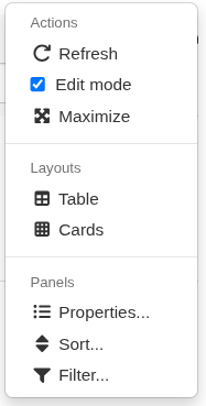
Another point to consider with edit mode is that the table can grow quite large when every property is displayed. Which is why an optional “maximized view” was suggested, making edit mode easier to use. When pressed, it would simply open the LD in a maximized popout, which is quite easy to do. The question is where to display the toggle:

a) a visible button in the top bar, next to the dropdown menu, always
b) a visible button in the top bar, next to the dropdown menu, but only for edit mode
c) an entry inside the dropdown menu, always
d) an entry inside the dropdown menu, but only for edit mode.

image

Conclusion

Personally, I’m +1 for having both 2 and 3, at the same time, and -1 for 1.
For the maximized toggle, +1 for a, +0 for c and -1 for the others (I don’t really see a point in hiding the feature outside edit mode).

What do you think? Don’t hesitate to add anything I might have missed.
Thanks.

Not good as it uses one more vertical line. Space is scarce vertically.

Now I wouldn’t mind a Edit button to the left of the hamburger menu, similar to the xwiki page content menu (when a LD is editable).

Not great and not the xwiki operation mode. If we do this then we also need to edit wiki pages automatically IMO, for consistency. But it’s not how xwiki works today.

Yep, my preference and what I suggested above before seeing the proposal, so that’s a good smell :slight_smile:

I don’t think we should the maximize button by default since it’s not needed all the time.

I’d say c).

Thx

+1 for c as well

The position of the pencil icon looks awkward indeed. I don’t like it.

Have you tried it? This may sound plausible in theory, but in practice you’ll have conflicts with the WYSIWYG editor. I’m not sure about BlockNote, but CKEditor is preventing some clicks on the read-only (macro output) areas so you’ll have to fight a bit with CKEditor. So I’m not convinced by this option either.

+1. How do you leave edit mode (save or cancel)?

Same, making it available in the drop-down is enough.

Thanks,
Marius

Hi @pjeanjean thanks for the work on Live Data, shaping up to be a really nice addition.

I like it :slight_smile:

One of these two, with a slight preference for a

My opinion is not to hide the expand button. It allows users to have a quick glace at possibly hidden information without too much effort especially when editing content. Yes, it places another element on the UI, but we can get around that with a simpler button style (like we have with the section edit button), a better icon and more space around the button area to let them breathe.

At least for me, this action is much more relevant when editing than “Entries 1 - 15 out of 20
Results per page: 10” that we also have on the top bar (maybe we could hide this on edit mode?)

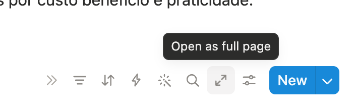
The image below is from Notion. They call it “full page” though, because the database (table) is effectivelly a different entity for them, embeded in the current document. But the behavior the close. All the buttons stay visible all the time, no mouseover.

I would contend that showing this to readers of the wiki for all tables is just nonsense, and way too complex. I don’t think we should copy Notion when it does weird stuff :slight_smile:

I’d be in favor of removing that too if we can (but still allow to navigate ofc). The “results per page” should indeed probably be moved to the LD menu.

Ultimately we need to be able to have very simple tables, taking static content as source, and displaying only a filter and sort features.

For me it’s a bit similar than if we were always displaying the max button when rendering images in XWiki. That would be visually painful. It’s only when we hover over an image that we have the lightbox options. By default it should be as clean as possible.

My 2 cents :slight_smile:

PS: I’m playing the devil’s advocate here because I’d really want that we stop adding UI elements and instead that we remove more than we add. It’s always harder to remove but we need to do that effort. Otherwise the clean Cristal look that you proposed will soon disappear.