LiveData for Cristal

Hi everyone, here’s a proposal for LiveData in Cristal (and potentially XWiki). Because this is a somewhat larger proposal, I will link it to the proposal page https://design.xwiki.org/xwiki/bin/view/Proposal/UIforLiveData.

Below, you can check the main differences and new features being proposed from the current LiveData in XWiki. Again for more details I ask you to take a look at the linked proposal. Note that a lot of these features would need further improvements and detailing, but I wanted to get something out for discussion as soon as possible.

Thank you all very much for reading.
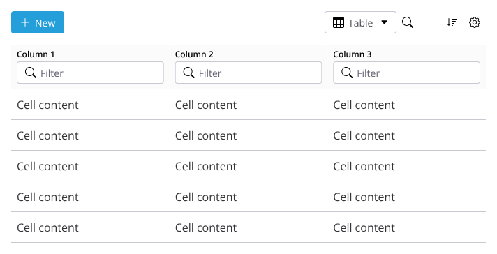

The Toolbar

The toolbar is a grouping mechanism to gather most actions that are done globally in LiveData, meaning things that are not done “per line”.

Some of the actions described here are:

  • New, for tables that allow adding new items to itself
  • Table/Grid views, and possibly other types of views in the future
  • Search
  • Advanced Filtering
  • Advanced Sorting
  • Properties

Example toolbar featuring a “New” button.

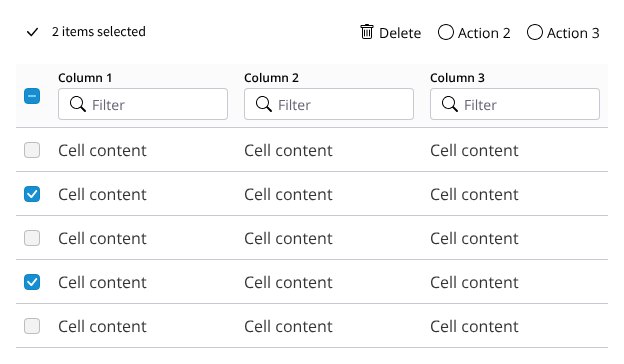
Toolbar in batch editing mode
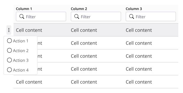
Batch Editing - selected

The Action button

This button appears at the beginning of each line and serves to group all actions that affect the item being highlighted
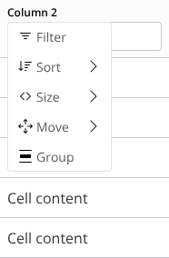
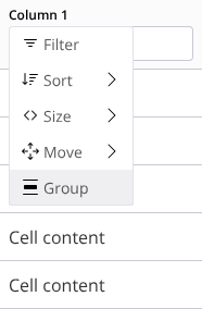
actions 2

The Column menu

This menu groups all actions that can be taken on the column itself, including basic sorting. It’s accessed by clicking anywhere on the column header.

menu move 1

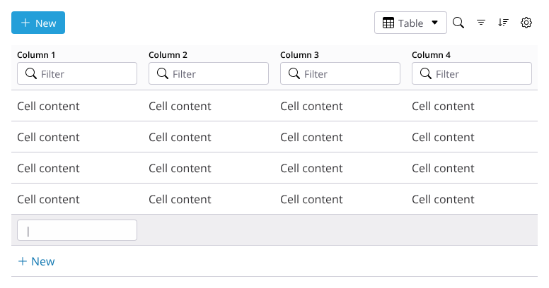
Inline Inclusion/Editing

Inline Editing allows users to quickly edit data directly within a table cell, without needing to open a separate form, modal, or page.

  • User hovers over a cell and clicks to activate editing.
  • To include a new item the button “New” on the bottommost line should be used
  • The cell switches to an editable state.
  • User updates the content and exit the cell.
  • The cell updates in place and reflects the new value.
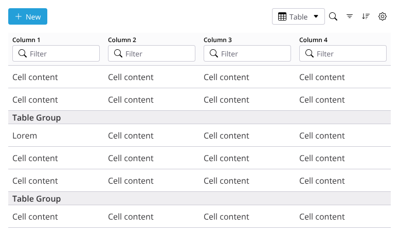
Content Grouping

Grouping allows users to visually and functionally organize rows by shared attributes or values in one or more columns.

It is initiated by opening the column menu and choosing “Group” on the presented options.

Group option

The table re-renders with the grouped sections.

3 Likes

Thanks for working on this!

Note: this is difficult to make right because of the following constraints:

  • support for touch-based devices
  • good accessibility and keyboard navigation
  • the potential presence of interactive elements (e.g., hyperlinks) inside the cell content

Interesting feature!
How does this work in combination with pagination?
Do you know if others web table UIs provide that feature?

Another UI/UX related aspect that is not covered but that we identified when working on LD edition is the in-place editing of long or rich content.
The WYSIWYG editor requires quite some horizontal and vertical space that is difficult to fit nicely in an LD cell.
Ideas we considered (but never implemented):

  • when editing this kind of content, the content of the cell is displayed in a larger modal with a form allowing to 1) edit all the values of the cell at once 2) provide enough horizontal and vertical space to make the rich editor usable
  • force the cell to be larger (and push the rest of the content around) while editing
1 Like

I see no problem in the group names being repeated on each page that they are relevant. Groups are mostly a visual aid for the current page being viewed.

Notion have this, but their solution is not very compact. See A, B and C below are groups of the same table.

Prime faces also has something like this (perhaps this is not dynamic though, I’m not sure) PrimeFaces Showcase

The new editor have a floating toolbar correct? I am a little off on the BlockNote implementation, but we could try to have the editing cell and the toolbar floating in the UI. This way we don’t disturb the rest of the content of the table and still provide a way of editing content that’s fairly large. I just don’t know how scalable this would be to whole pages of content for example.

Very nice proposal @tkrieck !

I’m wondering about the Standard actions displayed on the left of the entries, because it looks very much like the 6 dots used to move entries in other software (like editor blocks or Notion entries), and I feel it could be misleading.

I think it might be clearer on the right of the entries, what do you think?

1 Like

My initial test were indeed with action on the right. The problem with that is that we never know how many columns the table will have, so the action could be pushed outside the view area. This assuming the actions are the right-most column, of course. Notion uses the same button for actions and for drag, the different actions are start based on the type of interaction, click or drag.

But regarding your concern, we could explore a few options:

  1. Just change the icon.
    • This is the simplest one, we just need to find a good icon for this.
  2. Make the actions appear as the second or third column
    • This could make the actions appear more contextual to the column rather than the whole line.
  3. Position the actions to the right, but make sure it always stays in the viewport.
    • We would need to check if this is technically feasible, as this options probably would need some kind of “sticky” position or absolute positioning.

From the top of my head, these are our main options. But let’s see if someone has a better idea.

Thanks for the feedback!

First, thank you the proposal, very interesting.

I feel that this toolbar makes the tables very heavy in general, but I think this can be solved by displaying this toolbar only on hover (ie when the mouse cursor is over the table).

Ideally we should be able to use the LD for all tables in XWiki/Cristal, be them very simple tables or very complex ones. So I think we need a default L&F that is just a simple table when not hovering over it.

The same could be applied for the column filters: they could be displayed only when hovering over the table. This would allows the tables to be very simple visually when not hovering over them.

WDYT?

What’s the proposed mechanism to switch to selecting more than 1 row?

If it’s about clicking on a row (which would trigger the checkboxes on the left), then there’s a contention with the activation of cell editing, which is also proposed to be done on clicking on a cell.

I’m assuming that this action button appears when hovering over a table row, right? Or does that row needs to be clicked? I think it should be on hover to make it more discoverable, WDYT?

I feel we’re missing a visual indicator that there’s a menu. Also, when clicking inside the filter, I wouldn’t expect the menu to appear as it would block the typing. Maybe by “column header” you were referring to the part above the input field? Even so, there’s still the discoverability issue.

I think users may want to click without editing (to select a row for example), so we need either:

  • To toggle and editing mode (inside the toolbar) before allowing clicking (my preference by far)
  • Or to replace clicking with double-clicking (what we have now in XS)

I think we need a few more things to make it as easy to use as a spreadsheet (which is what we want IMO). First, we need an editing mode, as mentioned above.

Then, once in that mode:

  • Navigation with keyboard keys to move left/right/up/down
  • Use enter to validate (and alt+enter to add a newline)
  • A new toolbar when in editing mode, with an undo/redo
  • A global save/cancel to validate all the changes or discard them (or a mechanism similar to RT editing with a similar action bar, with history of the changes to be able to rollback)

Technically, this means changing the query on the server side and being able to express this grouping (either in SQL or in SolrQL), and then redrawing the LD content and pagination based on the returned results.

Do you have some real world examples of usage? Right now I don’t see the interest versus the filtering at the column level.

Thx a lot! :slight_smile:

First of all, great, great proposal, Thiago! :star_struck: I have only a few questions and suggestions that I also looked into today for my batch actions proposal for XS.

Do you think it would be a good idea to change the color of each row selected to better signal its selection in a batch?

This is a common UI pattern in most software and I thought that it would be benefic in the case of:

  • large selections
  • or selections with items that have a big variation in their row height (because of paragraphs or images as values). Does row height stay the same in Cristal (like in Notion) or does it scale (like in XWiki) in case of adding images or big paragrahs?

I was also thinking if it would be better to keep batch actions immediately after the number of items selected, thus everything being left-aligned.

While in the case of a narrow table the actions are easily identifiable, I’m worried that in a wide table (with lots of columns) maybe they wouldn’t be as easy to spot as they would be pushed on the right side. Possibly overthinking lol, but let me know what you think :grin: