Jira for this discussion: Loading...
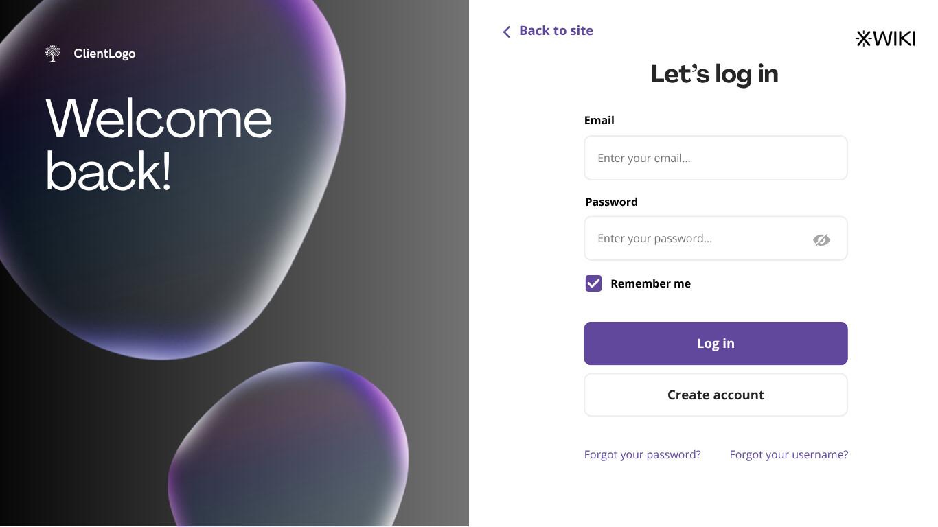
Hello everyone, here is the login and registration flow for Cristal.
Accessing
To access this area, we will incorporate a single button positioned beside the main logo, typically located where the user’s photo appears once logged in. The proposed button will be labeled “Sign-in.” Upon selecting this button, users will be directed to a new screen where they can choose between logging in or creating a new account.
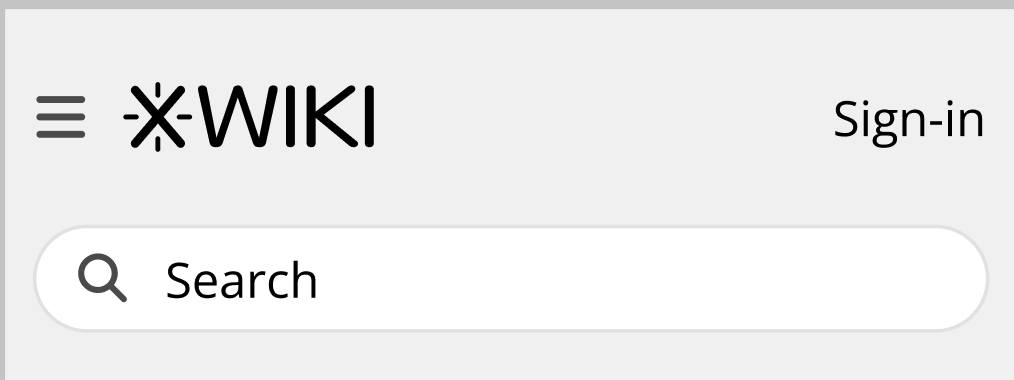
To accommodate this new button, the help icon has been relocated to the bottom of the sidebar. In compensation for its decreased visibility, we have included a label “Help Center” alongside it.
The label is just a proposal, what do you think of it?
The help link will mirror that of XS, directing users to the Cristal equivalent of https://www.xwiki.org/xwiki/bin/view/Help/.

In context:
Making it fullscreen
The intention of making the login/register flow “fullscreen”, is to streamline the user experience, ensuring that users are fully engaged in the registration and login processes. As such, these tasks will occupy the entire screen space, removing users from the wiki context and immersing them in the login/register flow.
To return to the main wiki, a button labeled “Back to site” featuring an arrow will be prominently placed at the top of each screen, effectively terminating the current flow.
For users who wish to navigate back one step only, they can use the default browser back button. While we could provide an additional back button within the interface, doing so may unnecessarily clutter the user interface without offering significant benefits.
Individual steps
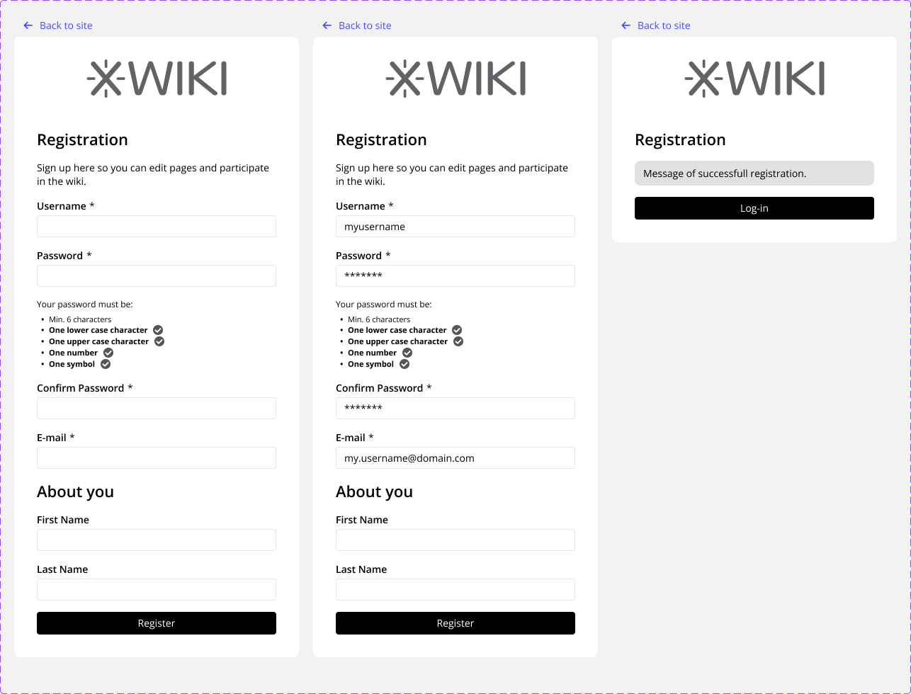
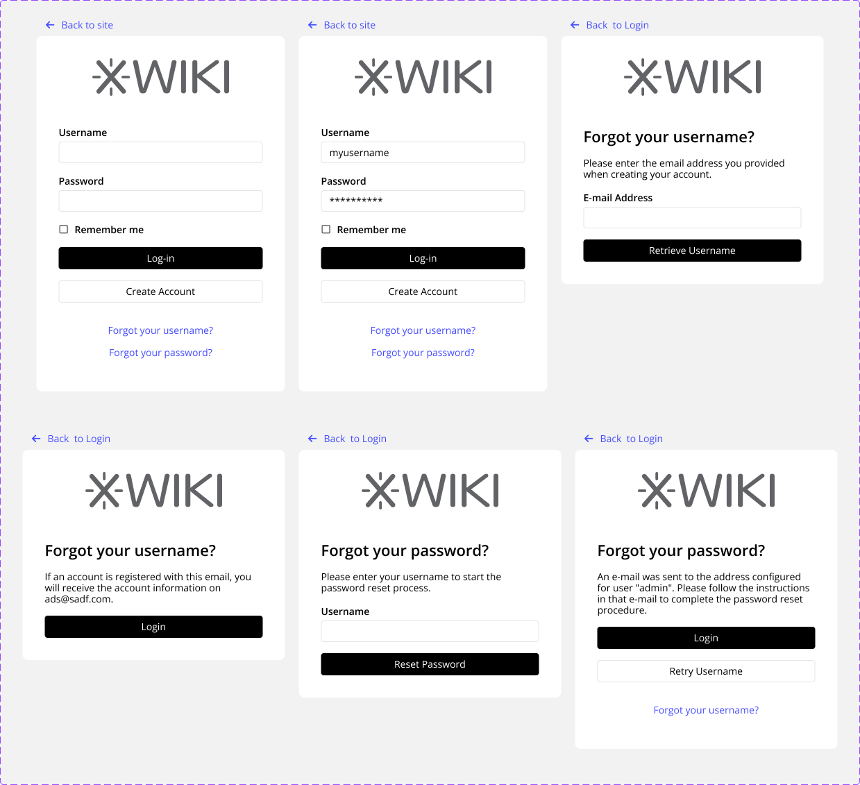
The individual steps were taken from XS. Some may require adjustments as we progress further into development, but these will suffice for the current stage. Please note that the wireframes provided below represent the content area for each step, which will be centered on the user’s screen. This formatting is optimized for viewing within this forum.
Registering
After clicking in sign-in the user is directed to the start of the flow (the login page) where the “Create Account” button is available.
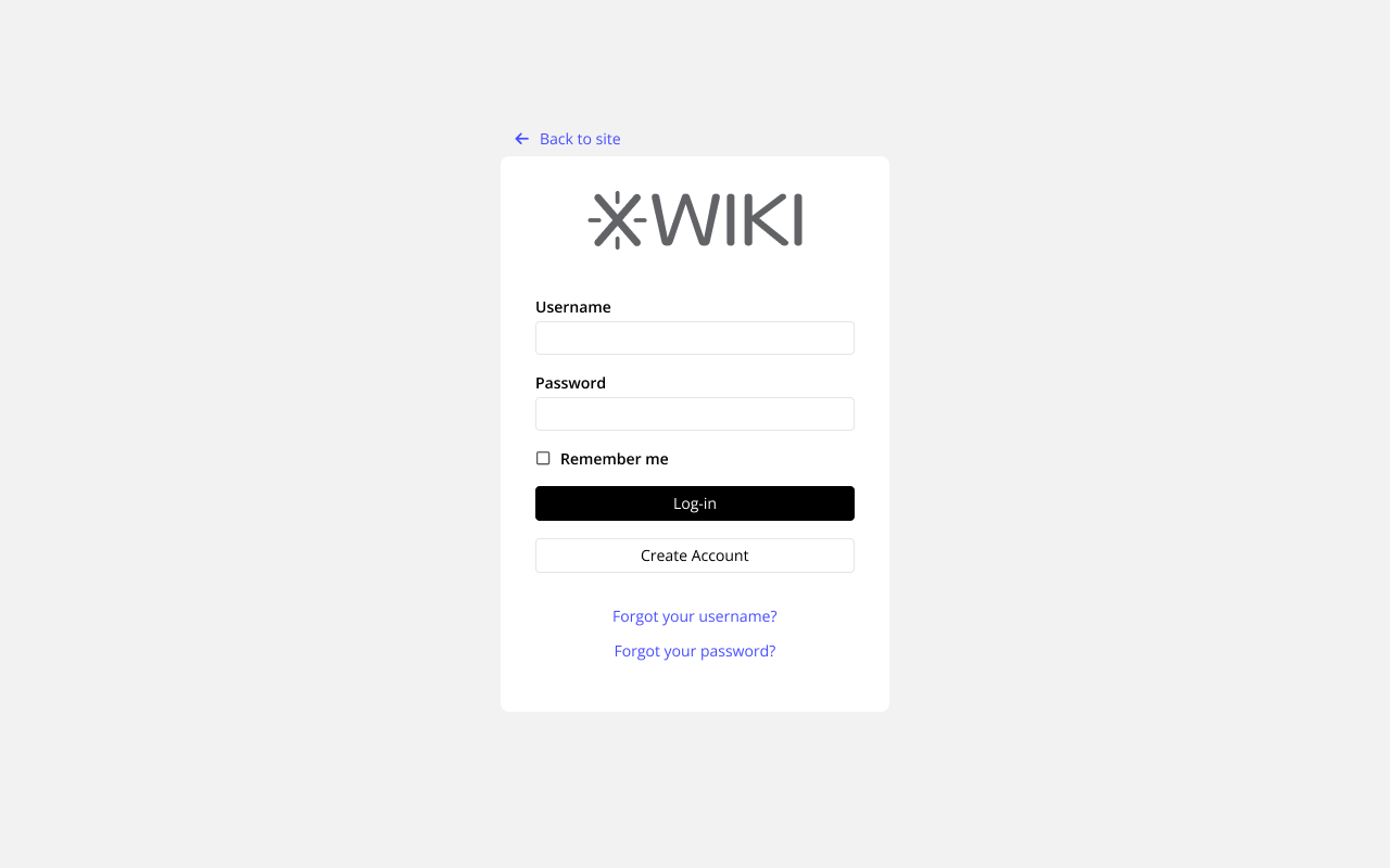
Logging in and forgot user/password
So that’s it for today, people. I hope you have enjoyed the reading and please, tell me what do you think of these ideas.
Thank you all for reading, see you soon!