This discussion arose when searching a solution for this Jira issue.
There is a need to remove the hard-coded tab-index from the form.
When removing them, the DOM order is used instead for tab indexing.
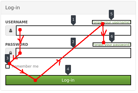
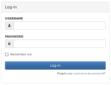
However, the login form needs this tab order:
Username —Tab–> Password —Tab–> Remember me —Tab–> Log-in
This cannot work with the former presentation of the login form (and without heavy css hacks).
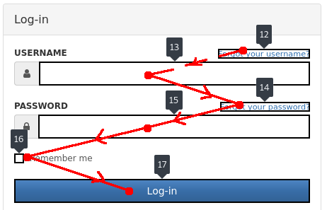
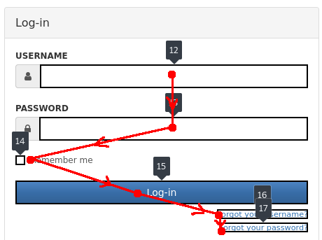
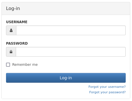
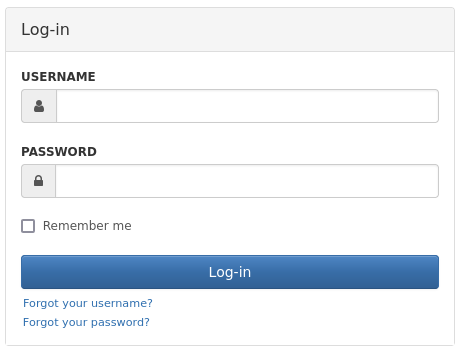
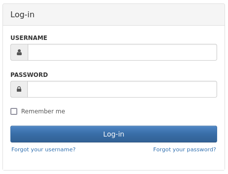
The initial state: The state without tab-index: The state we want, without tab-index or css hack:
There are a few solutions on how to display the two links, while keeping them after the submit button in the DOM and tab orders:
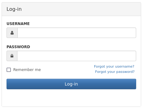
Like Sign in to GitHub · GitHub : sacrifice some accessibility and use a heavy css hack to make the visual order different from the DOM order (but keep it as it was in the initial state)
Recovery links one under the other, right side
Recovery links one under the other, left side
Recovery links on both sides
Light css hack to get both the recovery links above the submit button.
Combine the two links in one prompt displayed under login
Notes:
Those are quickly put together images, they don’t correspond to the expected result exactly but give an idea of the changes.
Those are only a few possibilities, any other proposition is welcome
I think the most promising solutions are 6. and after it 4. . 1. should be avoided if possible, and 5. might become a bit cramped on smaller devices.
For 6., the exact content of the text and position of the links are not trivial and should be discussed if this is the solution we select.
What do you think is the solution we should select?
To be honest I like proposal 6 but I’m afraid it could be problematic for some other languages, so I’d be -0 for it without knowing how it would be handled in japanese for example.
Then I don’t have a strong opinion between 2, 3 and 4: they’re all good to me so +1 for any of those.
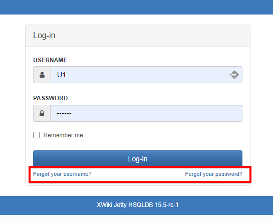
Why do we want the forgot username / password links to be after the login button in keyboard navigation? I think most of the users relying on keyboard navigation never use the submit button on the login form. You just press Enter after typing your password. So to me these links can be moved before the login button in the DOM. This leads to:
option 4.1: same as 4 but with the links above the login button
option 6.1: same as 6 but with the links above the login button
My preference goes towards 6.1 but I’m also fine with 4.1 or 4.
Tech-savvy keyboard users wouldn’t have an issue. But some disabled users relying on screen readers need to use a keyboard, and are not all tech-savvy.
Those users might still search for a login button to submit the form and not rely on submission from the password input field. I think making sure the login button is not too far away from the main content of the form would help non-tech-savvy keyboard users a lot.
I’ve missed this discussion and I’m discovering it now after Ilie raised it as a possible regression today on the matrix chat. I agree that the implemented solution looks a bit strange in term of styling.
Whatever solution, I think we should join the username and password together so that it takes less space. Something like Forgot you username or password? as was shown in option 6.
Thoughts? Am I the only one to not be very fond of the current implementation?
I don’t understand ‘It blocks everything’. The login button is a more important UI element so I think it’s okay if the user’s eye need to go over it to see the recovery fields. I like it being large, so that whatever the language we’re in, there’s enough space between the two recovery options to understand that they lead to different processes.
See the post n°4 on this discussion. In a few words, both of those functions hold very different importance and will be interacted with at very different frequencies, so they shouldn’t fit in the same spot in the flow of the page. And with two option recoveries, it might not look as nice as on the examples you shared.
Just as a reminder, for accessibility, we want a good match between semantic structure, visual structure and focus order. If you could share the pages themselves or screenshots with the focus order indicated that’d be great help. I’m pretty sure some of those solutions rely on heavy css hacks or just mess with the focus order like we used to (the other alternative is to sacrifice the power-user’s speed, but I doubt that’s a choice made often).
(the resolution on the picture you shared here is not high enough to see anything)
I didn’t really think about spacing here. I just figured it was close to the input fields before, so I’d keep the same formatting with a small text size and close to the main element.
If we keep it in this place (aka out of the ‘main’ part of the form, under the login button) +1 with the idea to make it look a bit more important by increasing spacing.
The fact that there’s no margin on the sides might also be a cause to this bad feeling with the new UI.
I don’t know how we would implement l10n cleanly on this UI element if we follow the option 6.
Something similar would be “Forgot your login details?” and then the user is moved to a page where they can choose whether they want password recovery or username recovery. It’d be a big change to the UX and make the path to recovery one click/page load longer so I didn’t propose it earlier.
I might be very biased, but it seems to me like the best alternative. I prefer it to the former where the focus order just went all other the place ↓