You’re right, I’ve modified my mock to use the standard, directly from the text:
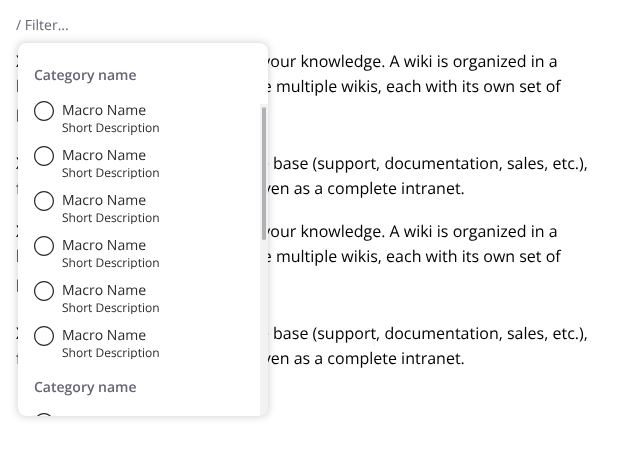
From what I’ve seen, most editors rely on drag and drop. Now, there are accessible ways of moving blocks by keyboard shortcuts (ctrl+shift+arrows). The advantage of up/down icons is that there’s a visual cue for it (besides the drag handle). Perhaps we can simplify and go with the standard of the editor and check for feedback on this feature.
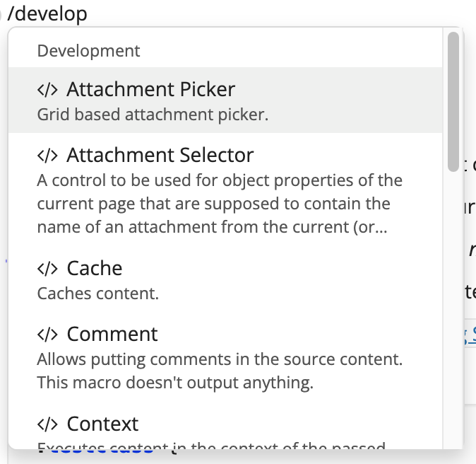
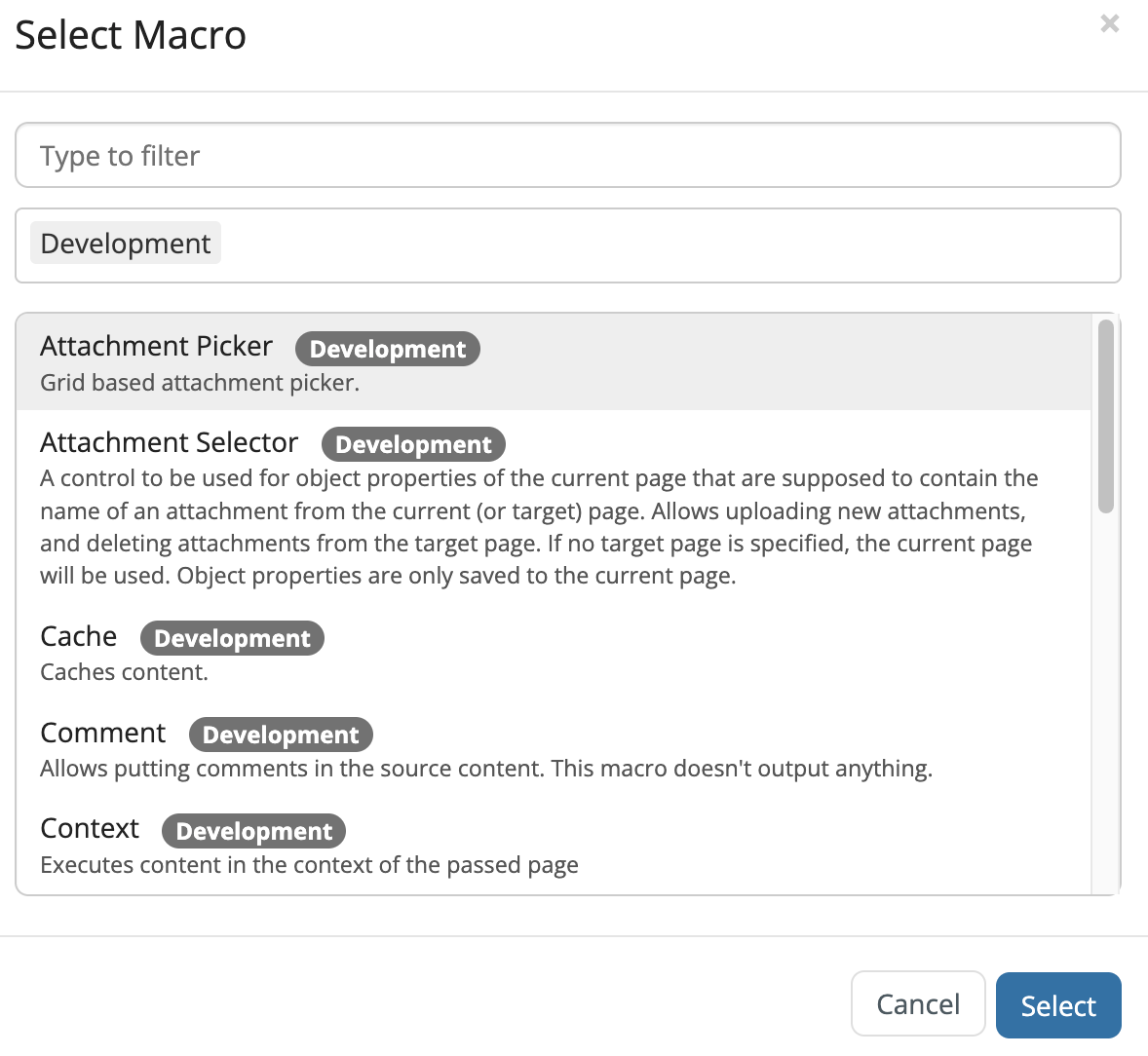
I don’t find that modal to be very usefull to be honest. The slash command does everything that the modal do in a more streamlined way. For example searching for development tools, in the slash command I can just type “development” and all appropriate macros are filtered. In the dialog I need to use the category field for it.
Slash command
Dialog
That doesn’t mean that we shouldn’t have a discrete icon on the toolbar, though (for visibility reasons) I would just open the same menu as the slash command.
I couldn’t find a complex macro inline on XWiki, most of them are just styling options, so I wouldn’t develop something too advanced for them (maybe just a button to remove the styling).
That’s a good option, I think we could have a reserved space (and rules) about them. The reserved space would be contextual to the macro being edited of course, the fixed buttons should always remain in their places.
That’s an interesting use case, but I guess it should only be available when two identical macros are selected, right?
I had to dig a bit but found the ctrl+shift+arrows on Notion and Blocknote.
Thanks for the reminder. This is a UI paradigm that needs to have the same behavior as the one in the editor.