Hi everyone,
This proposal comes as a two-in-one because it is for Cristal, but also for XWiki. For Cristal this is, of course, the first implementation, but in XWiki we have some Jiras regarding this subject as well. The proposal is the same for both.
We have three processes in here which are important.
1 - Adding a macro
2 - Configuring the macro
3 - Moving the macro
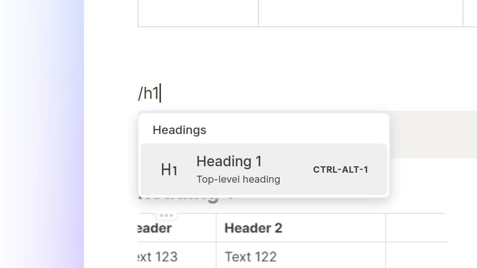
Adding a Macro
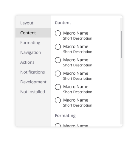
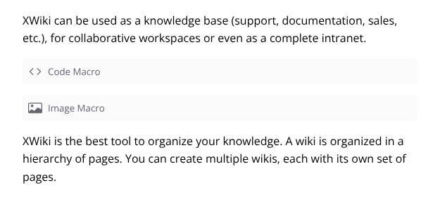
This is already done as a slash menu. It is the same as selecting the heading styles, inserting attachments and so on. This menu features a list of macros and blocks and a search bar at the top.
It also the default that comes with BlockNote, TipTap and others, a pretty standard in block level editors right now.
Slash menu
Configuring the Macro
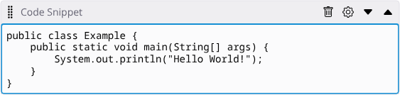
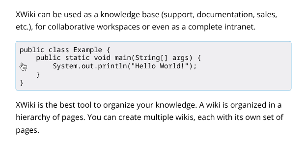
Configuring the macro however is where things get different. On XWiki this is done by double-clicking a macro, but this is visually hidden, and users needs to discover this feature on their own.
Code Snipped macro in an XWiki editor
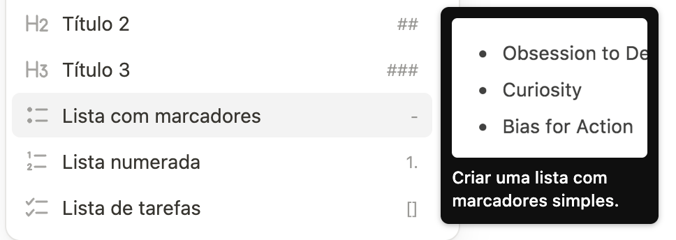
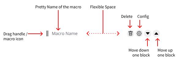
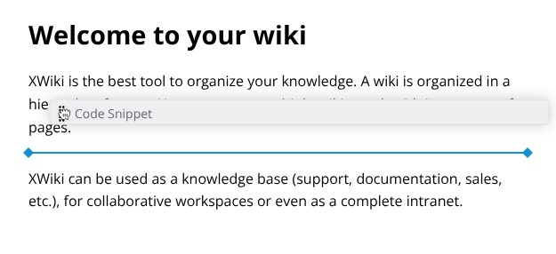
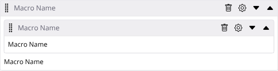
To make it more friendly, I propose that we present a toolbar above every macro when they are focused.
This toolbar should not occupy its own space in the flow of text but rather float above it, this is only for edit mode of course. This toolbar should have the macro name, a drag handle (for moving), configure and delete icons and also a way of moving by touching, clicking or selecting via keyboard (I propose two arrows for that).
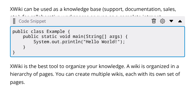
Example of macro with the toolbar visible
Anatomy of the Toolbar
Visiblity of the toolbar
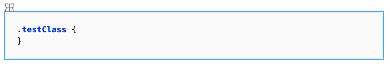
When the macro is not focused, this toolbar should be invisible, giving way for the text that may be behind it when active. A blue border helps the user distinguish where the macro content starts and ends.
Examples:
Focused Macro
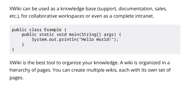
Unfocused Macro
To help the user understand what piece of content can be selected, I propose a light shade of blue on hover
Hovering a macro block
Moving Macros
There are two ways of moving a macro between blocks, drag-and-drop and clicking (perhaps a keyboard shortcut also? @CharpentierLucas ).
Drag-and-drop
The same as it works in XWiki right now. Starting the drag on the drag handle and moving to the new place. When dragging the contents of the macro disappears and only the toolbar is visible, this is because the macro can have big dimensions and make it difficult to move. The destination block should be visually marked.
Example of drag and drop move
Move buttons
Another way of moving macros is using the move buttons featured on the toolbar. This is mostly for accessibility reasons, as drag and drop can be very taxing on some users.
Empty Macros
It is important to clearly show the user where in the document the macro is, but is empty. For that I propose a standard block, with a light shade stating the Macro icon, name. Hovering this empty state show the remainder elements (config, delete, move, etc.).
Two empty Macros, code and image
When hovering or on touch the rest of the buttons are visible:
![]()
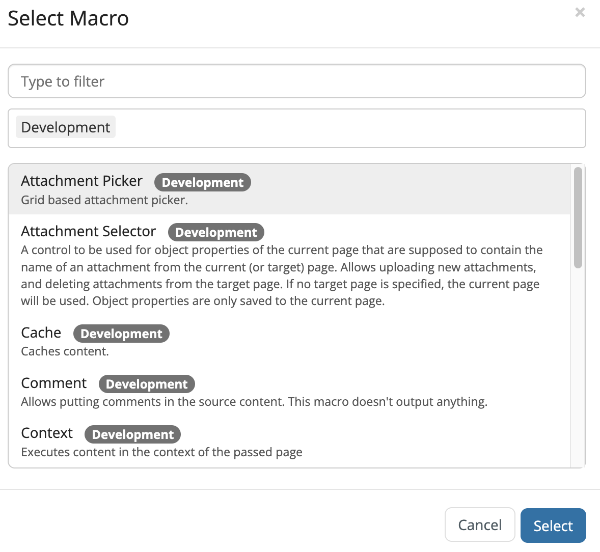
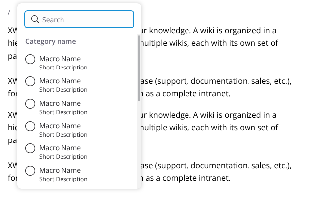
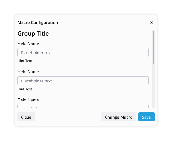
When selecting the cog icon the config dialog should appear. This dialog will be different between each macro, so it’s difficult to predict all the fields in this proposal. @amilica has a pretty nice ongoing proposal for tackling issues inside this dialog.
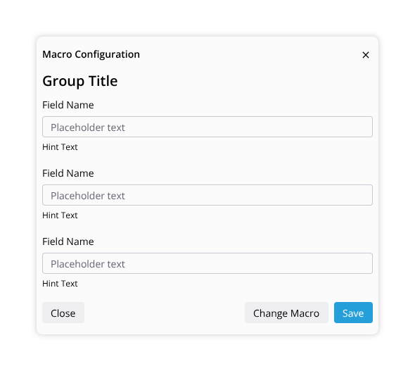
Configuration dialog example
It is important to make sure that the main buttons of this dialog remain visible even if a scrollbar is present.
Scrolling example
Nested Macros
Macros can be nested (a code macro inside an info box, for example). In this case, all of the above rules stay true, and two toolbars should be present. Here it’s even more important to have the macro name visible to differentiate them.
Finishing thoughts
I think this covers most of the usability use cases for the macro integration, but let me know if you have some more.
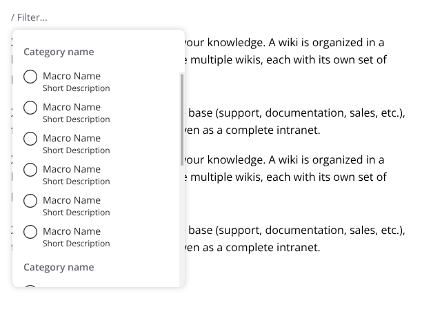
One last thing that I would like to show you is that I made an alternative view for the slash menu, featuring a grid of blocks and macros.
This layout has the advantage of showing more blocks in a given space, but also has the disadvantage of making the user eyes move in two dimensions instead of just one. I am unsure if this is the right way to go, so give me your thoughts please.
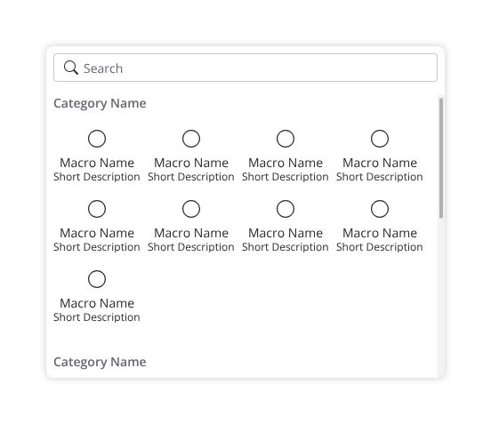
Grid layout for blocks example
That’s it for now, thank you very much for reading. As always, I welcome any feedback that you might have.
Thiago