Macros for newbies | blank states + scary set up

Hellooo everyone! Today we play detective. :female_detective:

Can you see where a macro has been used, but not yet defined, in the following picture?

image

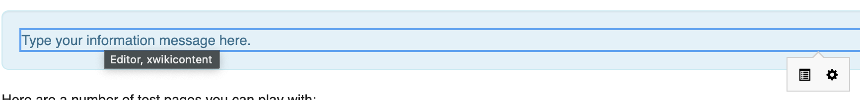
The answer is… here:

Screenshot 2024-03-26 at 18.23.02

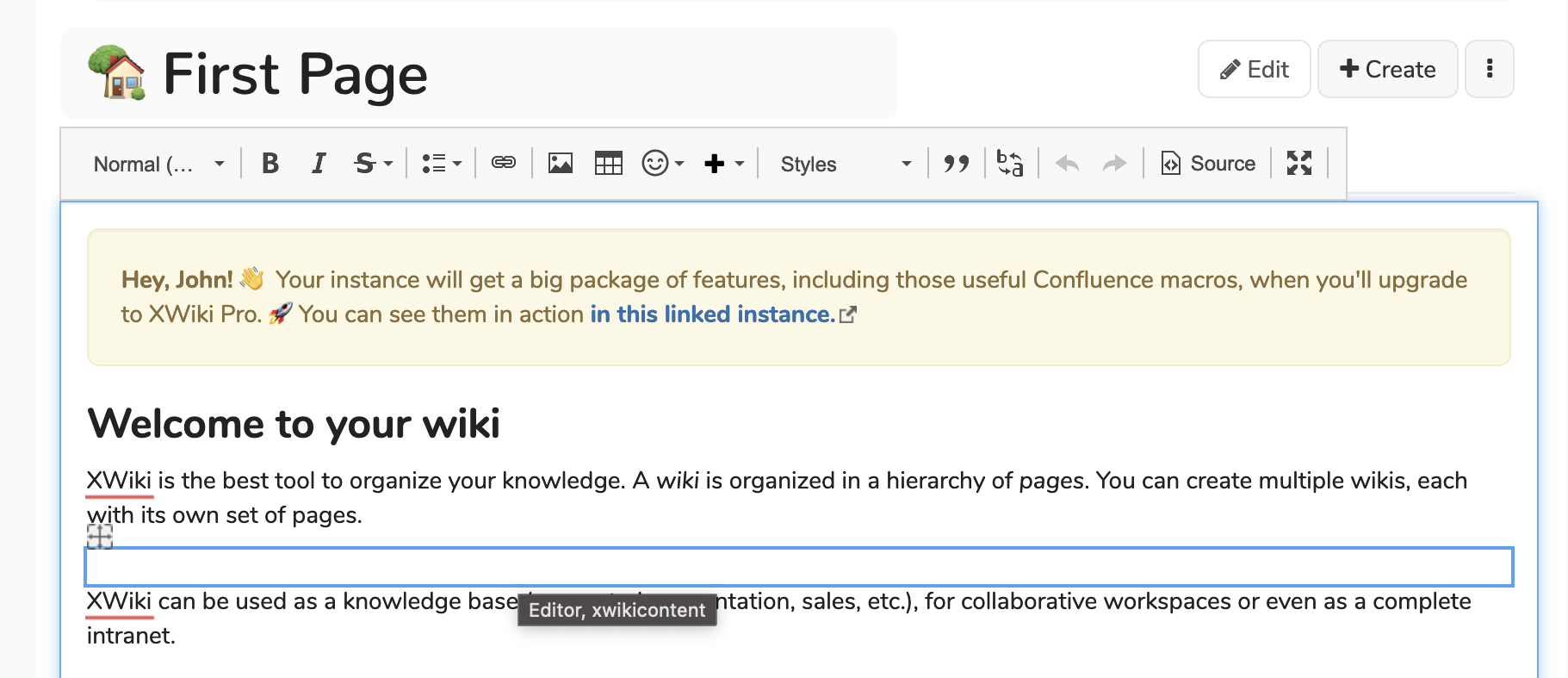
Newbie users & blank macros

For people not accustomed to XWiki or, maybe in general, knowledge management software, double-clicking on a macro doesn’t seem intuitive at all…

…especially when the macro you chose opens in a blank row as if it was bugged.

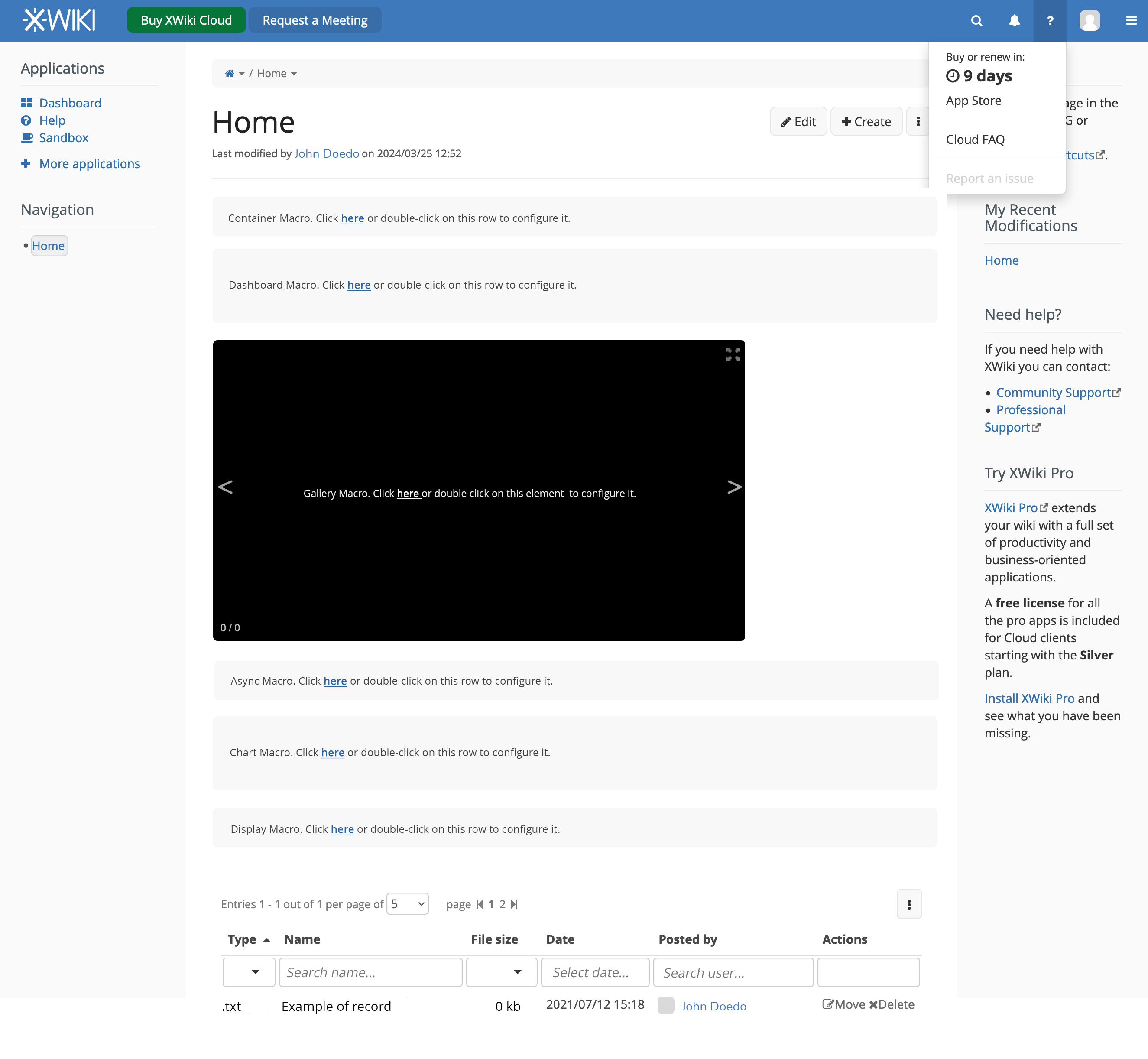
Why is this important

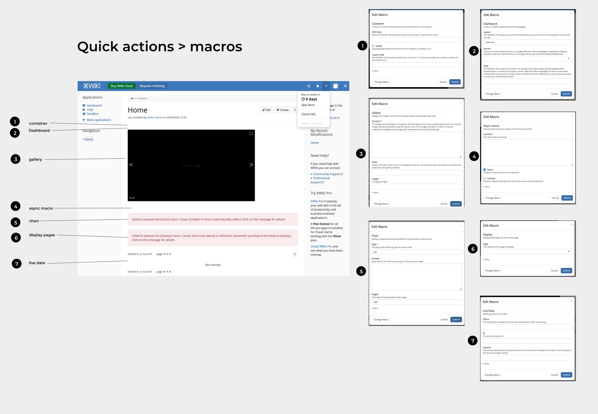
The XWiki demo is supposed to present the product’s potential to a new user.

When entering the editor in the demo instance, one of the first things the user is encouraged to do is to use the Quick Actions feature, which is really great.

Problem is, if he tries out the macros in the Quick Actions list, most of them will open in a blank row that doesn’t say anything to the user.

This might make the user feel uneasy about the product, maybe thinking that it is complicated or, the worst case, bugged.

What if he figures out double-clicking?

In the cases in which the user knows or just supposes that they should double-click on the row, they will get the modals for configuration, which, to be honest, feel daunting and/or confusing.

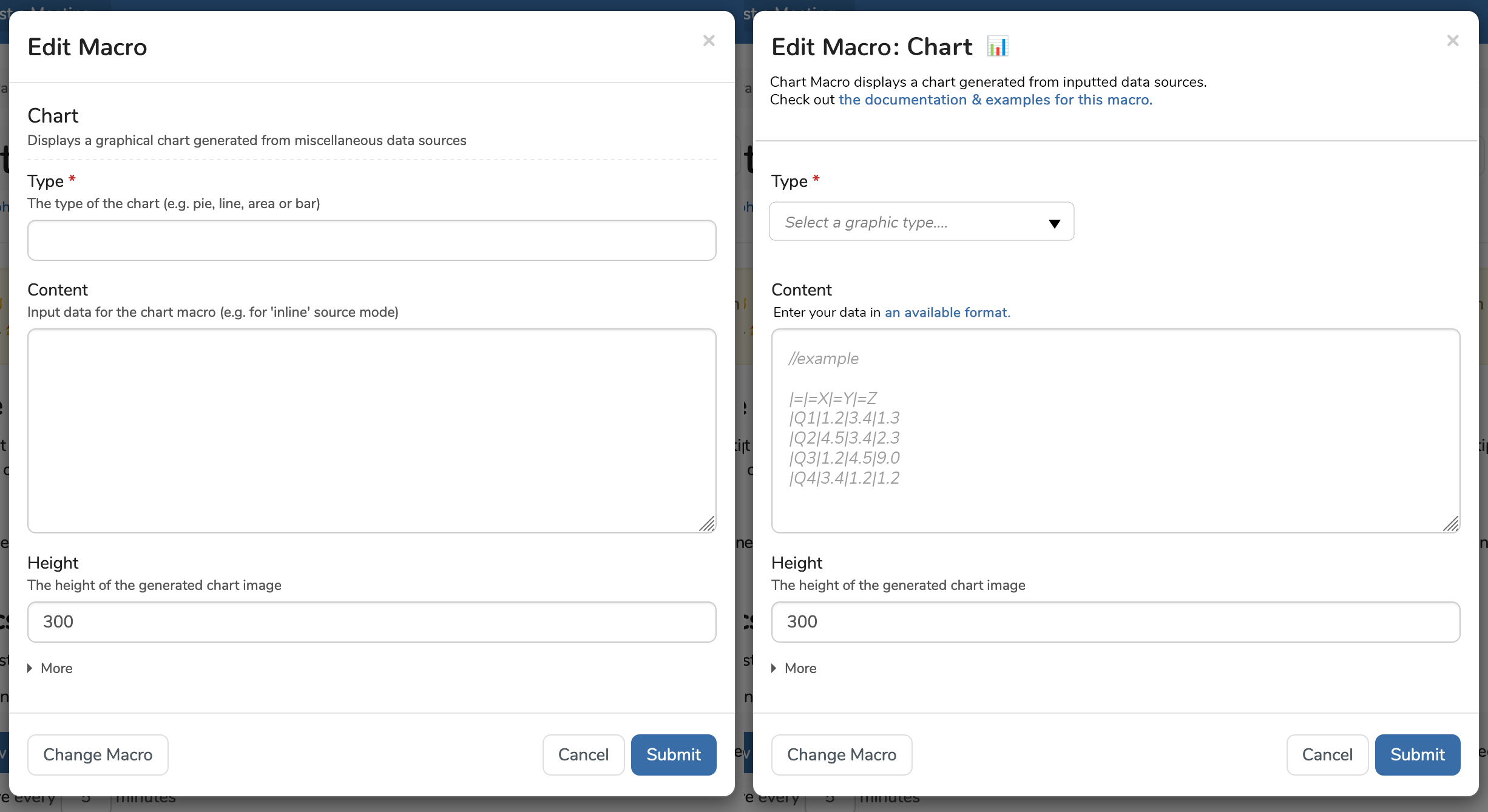
Why are macro configurations confusing?

#1 Usually the input fields do not have any type of placeholder text/hint that informs the user what type of info should they input.

#2 In some cases, there’s a lot of text in a little space, making the set-up of the macro feel like a big task.

#3 Language-wise, feels technical.

#4 There’s no link to the documentation of that specific macro.

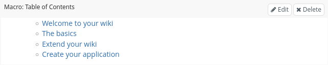
Solution to non-blank macros

The easiest solution would be to open by default any macro in a simple box different from the other boxes in the product with a simple text on it that just says:

[Name] macro. Click here or double click on this box to configure the macro.

Ideally, the box would have a height dependent on what kind of content would be in it, to indicate the larger space it will occupy once configured.

Example:

blank state of macros

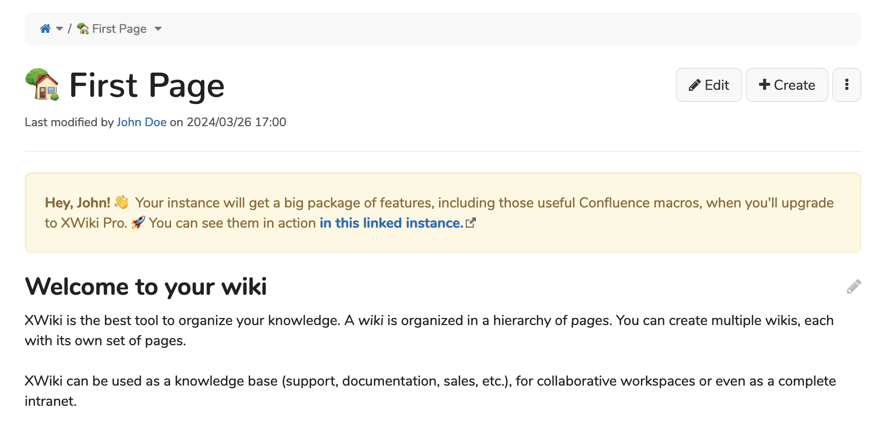
Example of improvement for modal configuration

The idea is to:

  • include links to documentation,
  • simplify language,
  • offer examples as part of the placeholder text,
  • use dropdowns when the options are limited,
  • delimit better the header of the modal from the rest of the modal (I’ve forgotten what modal I clicked on and couldn’t figure out, even though the macro name is literally in the second row)

Example:

chart macro

Conclusions

  1. What do you think about this problem?
  2. What do you think about the improvements?
  3. In the current state they are open right now (blank), are the macros accessible?

Thanks a lot for reading! :blush:

2 Likes

Hello,

Yes.

For translation in java applications, a property that is not yet translated is usually shown the same way.
The raw [property name] appears in place of the translated text.
That is usefull to provide the translation piece.

Here, it is the same.

Plus : The improvement for modal configuration you propose are not just decoration…
They are usefull tool for every day work with macros.

It is mandatory, for so many macros available now.
Even for no newbies, advanced user and customizers of their wiki.

I toadly agree on your proposal.

1 Like

Admin since more than a year, with several years of programming experience, so I’m biased here.

However:

Well, not sure what macro is in that page, but a blank row is a bug (at least in some cases).
IIRC, empty macros sport a “macro:something” or similar text, when in edit mode (but I can’t reproduce it).

Beside that:

Nice. Having a technical profile, I never had a problem understanding how to interact with a macro, but adding this would make the macro box easier to interact with and more friendly.

1 Like

Hello,

What is the XWiki demo?

I don’t understand this part. I’ve tried with 2 macros (chart and info) and I haven’t seen the behavior you mention with a blank row. For the chart macro, I get a dialog and for the info box (which is inline editable), i get the following:

Screenshot 2024-03-27 at 09.36.53

Which has:

  • A text inviting to type
  • A popover menu with actions

The height will depend on what the user puts in it in almost all cases (there are cases where it’s constrained like for the gallery macro but for most macros, it’s not constrained). We could imagine introducing the concept of preferred height in the macro descriptor though, and honor it when used.

All good ideas. I remember that some were discussed in the past. See also https://design.xwiki.org/xwiki/bin/view/Proposal/MacrosBrowser & https://design.xwiki.org/xwiki/bin/view/Improvements/GadgetsDirectory

Technically this means enriching the macro descriptor.

This is already supported but it needs to be implemented for each macro. It’s done for a few. We need specific jiras for each macro.

Thanks

PS:For the chart macro which is very complex to use for users (they need to know what to put in the content), there’s the idea of a chart wizard, see https://design.xwiki.org/xwiki/bin/view/Proposal/ChartWizard

I’ve tried many of the macros present in quick actions and this is how most of them look (ignore the modals, I’ve placed them there for another issue)

problematic macros for newbies

This was done in the demo instance made by filling in the instance creation form on xwiki.com (version 15. 10. 7)

Alright, I can look into that either around the end of the month or in the next one.

@yves2 & @watery thanks a lot for your feedback. It’s really useful to get perspectives from users and yours are very helpful!

It looks like a bug. A text is displayed and quickly removed. We need a jira issue as it’s likely a regression.

As @watery said, if you get some empty line, it’s a bug.

Re chart, it opens a dialog (it’s not inline editable). Your screenshot shows that you’ve not entered some invalid content, that’s all, nothing to do with a blank line.

Same for include/display/livedata.

alrighty, thanks for letting me know!

I also thought about this recently, in particular after seeing cases like this where with several nested macros you have absolutely no idea which macro is which and where you could/should add content. This is partially the fault of these macros as their styling is really not adapted for WYSIWYG editing, but I think we could also do better in general. We make it currently incredibly hard for macros to provide a nice editing experience with the aim of being close to view mode. I think we should get away from this idea and instead allow macros to provide a nice editing experience. As an example, imagine you want to add a box macro with a table of contents inside and a bold title. This could work as follows:

  • Add a box macro.
  • In contrast to information or warning, its content is empty and cannot be edited directly. To add a table of contents macro without knowing XWiki syntax, you thus need to:
    • Open the edit dialog and enter a dummy content
    • Close the macro dialog again
    • Delete the dummy content and insert a table of contents macro instead.
  • As next step, you want to add the bold title. The steps you can follow are:
    • Open the edit dialog
    • Set your title
    • Close the edit dialog
    • Select the title and click on the bold button in the editor

These steps are not straightforward, I have no idea how a new user would discover them. In my opinion this should work as follows:

  • The content of macros like box should always be editable directly, even when it is empty. For this, the macro should know that it is rendered in edit mode and produce an empty but editable content in this case.
  • There should be a way to directly add a title without having to open the edit dialog such that the title can directly be edited with the tools of the WYSIWYG editor. This could either be a small toolbar in the macro that allows adding an empty title with one click or the title input could also simply always be present in the editor even when it is empty.

Alternatively/additionally, I think we should display a WYSIWYG editor for any field that supports wiki syntax in the macro edit dialog. That way, a user could for example directly insert the table of contents macro in the edit macro dialog or directly format the title as bold. This is also important for inline macros whose content cannot be edited directly but still supports basic formatting - for a user not knowing XWiki syntax it is currently not possible to have bold text in an information macro that is used inline.

Further, I think macros should always display a simple toolbar in edit mode that at the very least provides the macro’s name and the button to open the settings. The macro could then add further actions to this toolbar like adding a title in the case of the box macro.

In addition to that, I agree with @amilica that we should include a link to the documentation of the macro in the macro dialog. It is currently impossible for users to discover the documentation of the macro. I believe this link could even be automatically generated if the macro is installed as an extension from extensions.xwiki.org as we can simply link to the documentation of the extension that contains the macro.

I also noticed that some macros are lacking pickers. For example, the document tree macro is incredibly useful to display pages of a space but the format of the root of the document tree is not easy to understand for users new to XWiki, we really should provide a picker for it.

I think there is also an operation around macros that we currently don’t support in the WYSIWYG editor: Removing a macro while keeping its content. Imagine you have complex content including images and macros inside an info box, and you want to remove that info box wrapper. How do you do this without knowing how to edit XWiki syntax?

2 Likes

You could edit the macro, copy the content and then paste it as text in the doc, or paste the content inside a code macro if you don’t want to execute it, or paste it inside a content macro.

Note that the content of a macro is in a syntax that depends on the macro. Examples: the container macro, chart macro, jira macro or gallery macro. Just extracting the content to be rendered may not display something relevant. What you suggest makes the most sense in the case of a macro that contains markup.

The WYSIWYG editor doesn’t display the content in the macro edit dialog when it is directly edited in the WYSIWYG editor, at least not for the information macro. So the only way to get access to the content in a way that can actually be copied is to open the source view - and as I said, this shouldn’t be the answer.

I understand that this doesn’t work for all macros. I was primarily talking about macros that have wiki content and can therefore contain complex content that cannot simply be copied. I wouldn’t offer this in general, just for this specific but common case of wiki content. For other cases, I agree that removing the containing macro doesn’t make much sense and there I also don’t think users will expect this.

ah indeed, had missed this (it used to be always the case before and we lost this when we moved to inline-editable macros).

What prevents you from copying the content of the macro directly from the WYSIWYG editor where it is editable inline? See Up1 .

This actually works better than I thought even with macros, I was worrying that this doesn’t really work. I would still be worried that this breaks things that aren’t properly preserved by copy & paste, though, but maybe my worries aren’t justified. So indeed this is a possibility, it would still be nice to have a more explicit way to do this.

Easiest? Why would we show this box / message for macros that have meaningful output with the default parameters? I’m pretty sure that any user inserting:

  • an info box, is expecting to be able to edit the info message right away, as it currently happens, without having to click or double click
  • a Table of Contents or Children macro, is expecting to see the output right away without having to open the Edit Macro modal just to close it with default values

It’s not easy for the WYSIWYG editor to assess whether a macro produces meaningful output when default parameters are used. What the WYSIWYG editor does is:

  • show the Macro Edit modal if the macro has mandatory parameters, as indicated by its descriptor, which is controlled by the macro developer
  • show the macro placeholder if the macro has no visible output, in order to allow the user to edit or remove the macro

The WYSIWYG editor currently assumes that if a macro has visible output then that output is meaningful for the user. So currently it is the responsibility of the macro (developer) to ensure that the macro produces meaningful output when default parameters values are used. If that’s not possible then maybe some parameters need to be made mandatory.

A blank line is visible output from the point of view of the editor: you can hover over it and double-click on it. That blank line can have a border or more advanced CSS styling. It could display some text from CSS. It’s not feasible for the WYSIWYG editor to check if the macro output has a border or other specific CSS styling that makes it meaningful. The editor simply checks if the macro output is visible (height or width > 0). So the macro developer has to decide:

  • if it makes sense for the macro to be hidden in view mode in some cases (e.g. when there’s no data to display) then don’t produce any output in that case, or make the output hidden
  • if it doesn’t make sense to have the macro hidden in view mode then show a message, like “No entries” or “No content”, when there’s no data to display

This would improve the edit mode also.

I find it a bit strange to show the macro description in the modal header. I’m fine to show the macro name.

Thanks,
Marius

1 Like

I’m sorry, I didn’t explain my thinking right. My idea was directed to the visible output macros with blank output/content. You’re right, in the other cases, there is no need for what I said.

I agree about mentioning No content/entries, but also I’d specify the name of the macro and include a button for opening the modal dialog like @MichaelHamann suggested (if I understood right)

I find it weird to have the description separated from the title (title which should be something related to the name of the macro).

@tkrieck , if you have time I’d appreciate a lot an opinion on how the general macro structure could be improved with small edits. You can see above how I envisioned them, but if we are to move this modal issue into a separate discussion, it would help to have a bit more feedback to work with.

1 Like

The problem is, how do you define precisely what is visible blank output? Take for instance an empty DIV. Is it blank if it has a border? A background? A shadow? Some content displayed from CSS? There are many CSS styles that could make it a meaningful output for a macro.

Yes, what I imagine is something like the following:

image

The styling should definitely be improved, this is just a quick example to demonstrate the idea.

This first line above the macro would be automatically generated, but macros should be able to replace this with their content. For example, the box macros could have an extra “Add title” button that would add a directly editable title to the output. Further, macros could display important configuration values that help the user understand their configuration. As an example, a macro for defining columns could show the column width or the display macro could show which page is displayed.

My proposal here is to have such a wrapper for every macro, regardless if it displays output or not. The background is that when a user edits a page, the user has no idea what part of the page is which macro, and it is currently not possible for the user to see easily which yellow boxes correspond to which macro without double-clicking on each of them.

I’m open to the design aspects, though. For macros that cover the full width of the page, I could also imagine displaying this information left of the macro itself such that it wouldn’t change the presentation of the content itself. As we have macros that define columns, and you can have floating macros etc. I’m not sure, though, if this is possible in general.

Further proposals from my side to improve the situation that I already mentioned above but want to summarize here:

  1. Embed WYSIWYG editors for all fields that support wiki syntax in the macro edit dialog such that you can, e.g., when inserting a macro via the macro dialog, directly edit the content in the WYSIWYG editor.
  2. Add a link to the documentation in the macro dialog.