I’d like to initiate a brainstorming session on the horizontal menu’s look and feel, as I’ve noticed some visual inconsistencies compared to other page elements.
Based on these observations, I’d also like to propose a few layout adjustments to enhance its overall appearance and improve the user experience.
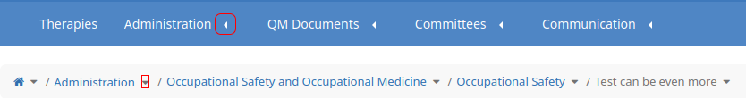
1) Inconsistency of arrows, compared to hierarchy. On hierarchy, the arrow points down as there is the expanding area, while the menu arrow points to the left to indicate the menu item to be expanded.
I would like to propose to update the menu to have the same behavior as the hierarchy:
On top menu items display down arrows (as the section to expand is down) and on submenu items to display right arrows (as the section to expand is at the right).
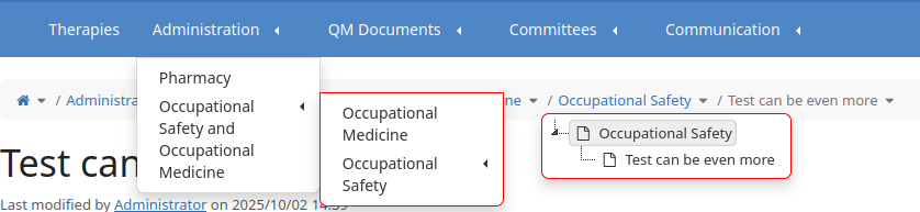
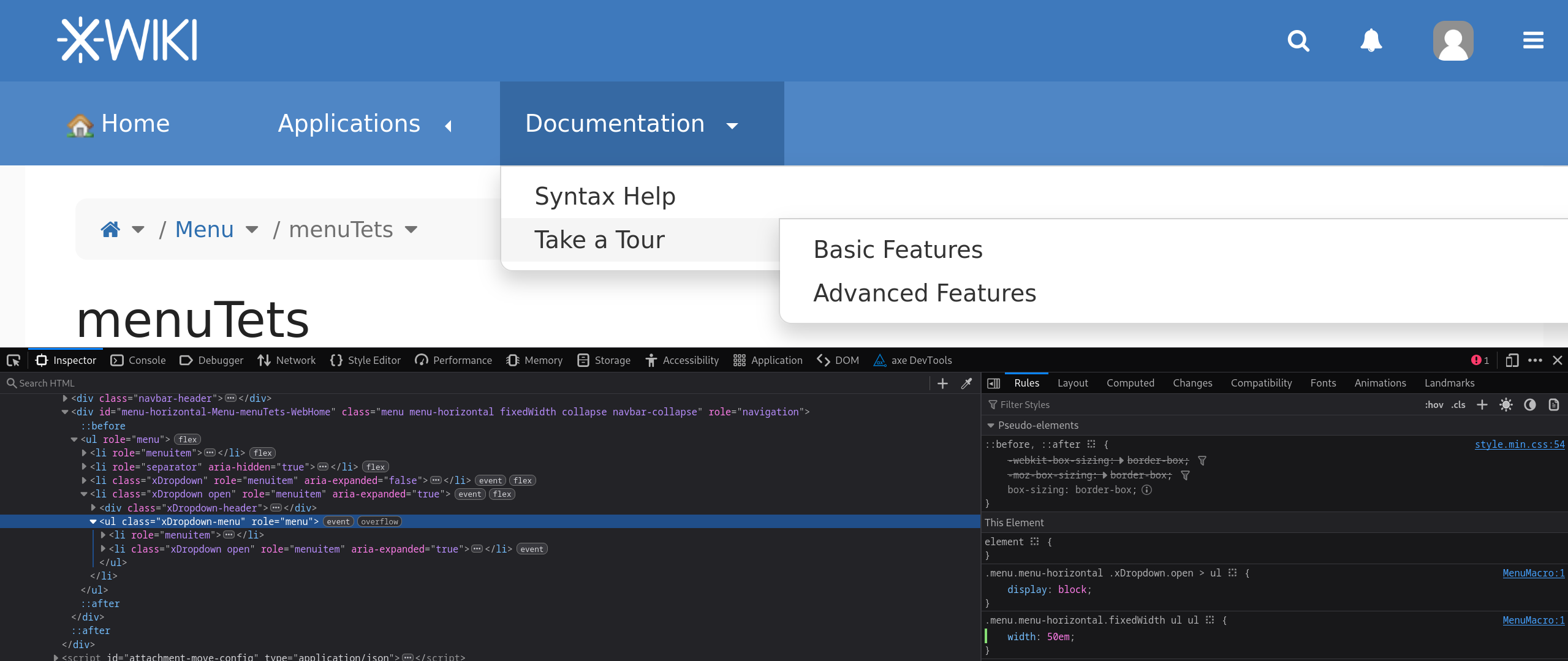
2) Inconsistency on expanded section’s border. There’s a visual inconsistency in the border styling of the expanded section.
The general design rule across the page is to use rounded corners for expanded elements.
In the image below, the hierarchy border is highlighted, and similar components, such as the content menu (Edit, More actions), also follow this rounded corner convention.
I would like to propose to round all the corners of the expanded sections’ border.
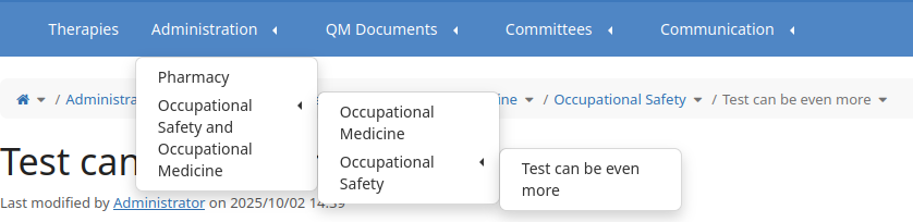
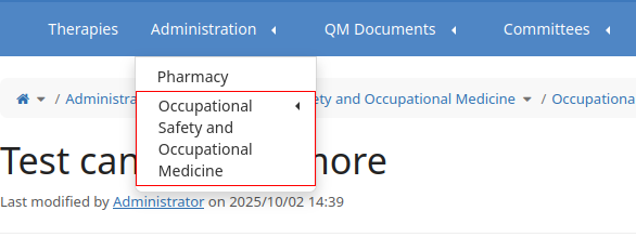
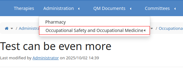
3) Display the item name on a single line. With the current implementation, the menu width is limited to 12em and it could easily become too small for longer name of the menu item. Here it how it looks for “Occupational Safety and Occupational Medicine“:
-1 from me to change the menu arrow directions.
+1 for the hovered direction of the submenu arrow. Currently they point down but it would make more sense for them to point to what was revealed on the right
+1, this inconsistency is my fault and I don’t remember it so it was probably just a style I forgot or some custom existing style that I tried to keep as is.
-1. It could be a usability regression for some menus that rely on this linewrapping.
Imagine instances with a 4-depth menu, it would be longer/harder to navigate if every level had a random width and possibly go over the edge of the screen.
We can consider increasing this 12em size (or even making it easily customizable), but I’m against trying to fit everything on one line. What would be the limit? Where do you cut the line when this limit is reached? How do you make sure submenus don’t go off screen?
I guess we have 2 possible situations that could have the same attention:
menu with multiple levels (4, 5 …) that could make the submenu items to leave the screen
menu with long names on the same level (4, 5 …) that could take easily 3-4 rows (each item) and we can end up with all the page’s height filled with menu
In both cases, I think the user that configures the menu should do proper adjustments to make sure the menu looks nice.
However, reading a sentence on multiple lines isn’t that desirable, isn’t it?
-1, this can induce some very strange layouts when only one page is much longer than others.
What I propose instead is to change the paddings and line heights of the menu items so they stand out better from its siblings while maintaining readability.
@CharpentierLucas While the proposal you mentioned does remove the arrows (which could also be a topic for discussion regarding the top menu entries), it doesn’t aim to replicate the same arrow style used in the Administration section.
I also agree with @tkrieck that there’s a meaningful distinction between accordions and tree views, and I still find the current menu arrows visually unappealing.
Would you be open to reconsidering your -1 on this?
Thank you for the explanations! I’m definitely biased so my opinion on this design choice is probably not the most accurate. I helped implement some of the current menu but I barely use this feature myself
-0 from me. My preference goes towards keeping things as they are but it’s definitely not a good reason enough to stop this change.
arrow direction consistency through elements, IMO it’s a very minor improvement
all changes always come with at least small cost of usability for current users
Understandably I can’t edit my initial message after people answered it.
I’m now -0 on the question.
Note that I’m not a committer and this is a not a vote, my messages contain only my opinions and XWiki can change even if I don’t completely agree with the changes personally
Thank you for pushing for these improvements!
Lucas C.